Icon - Arrow LeftAn icon we use to indicate a rightwards action. Icon - Arrow RightAn icon we use to indicate a leftwards action. Icon - External LinkAn icon we use to indicate a button link is external. Icon - MessageThe icon we use to represent an email action. Icon - Down ChevronUsed to indicate a dropdown. Icon - CloseUsed to indicate a close action. Icon - Dropdown ArrowUsed to indicate a dropdown. Icon - Location PinUsed to showcase a location on a map. Icon - Zoom OutUsed to indicate a zoom out action on a map. Icon - Zoom InUsed to indicate a zoom in action on a map. Icon - SearchUsed to indicate a search action. Icon - EmailUsed to indicate an emai action. Icon - FacebookFacebooks brand mark for use in social sharing icons. flipboard Icon - InstagramInstagrams brand mark for use in social sharing icons. Icon - PinterestPinterests brand mark for use in social sharing icons. Icon - TwitterTwitters brand mark for use in social sharing icons. Icon - Check MarkA check mark for checkbox buttons.
You are reading

Kitchen of the Week: New York Architect Elizabeth Roberts’s Own Kitchen Update, Before and After

Search

Kitchen of the Week: New York Architect Elizabeth Roberts’s Own Kitchen Update, Before and After

August 5, 2021

Architect Elizabeth Roberts’s 1866 Italianate townhouse remodel—from SRO to charmingly orderly family quarters in a black-and-white palette—was the first project we photographed for Remodelista: A Manual for the Considered Home. During the long process of working on our first book, we returned to Roberts’ place in Brooklyn so many times that it became something like a friend. And so we were happy to receive kitchen update photos out of the blue from Roberts, whose firm, ERA (for Elizabeth Roberts Architects)—then huddled on her top floor and now a team of 21—is one of NYC’s most sought-after design studios: see, for instance, Serial Remodelers Settle Down and A Very Proper Townhouse Remodel.

“I struggled with renovating my own kitchen,” wrote Elizabeth, who in addition to her architecture credentials has a masters in historic preservation from Columbia. “It’s hard to find time to work on my own home, but also, though my 12-year-old Ikea cabinets and roughly poured concrete counters were wasting away, I really liked my old kitchen. So when it came time to update my old faithful, I realized that I didn’t want to replace the parts that were perfectly fine. And yet I wanted something fresh and new to show for all of the work that would go into replacing cabinets and counters.”

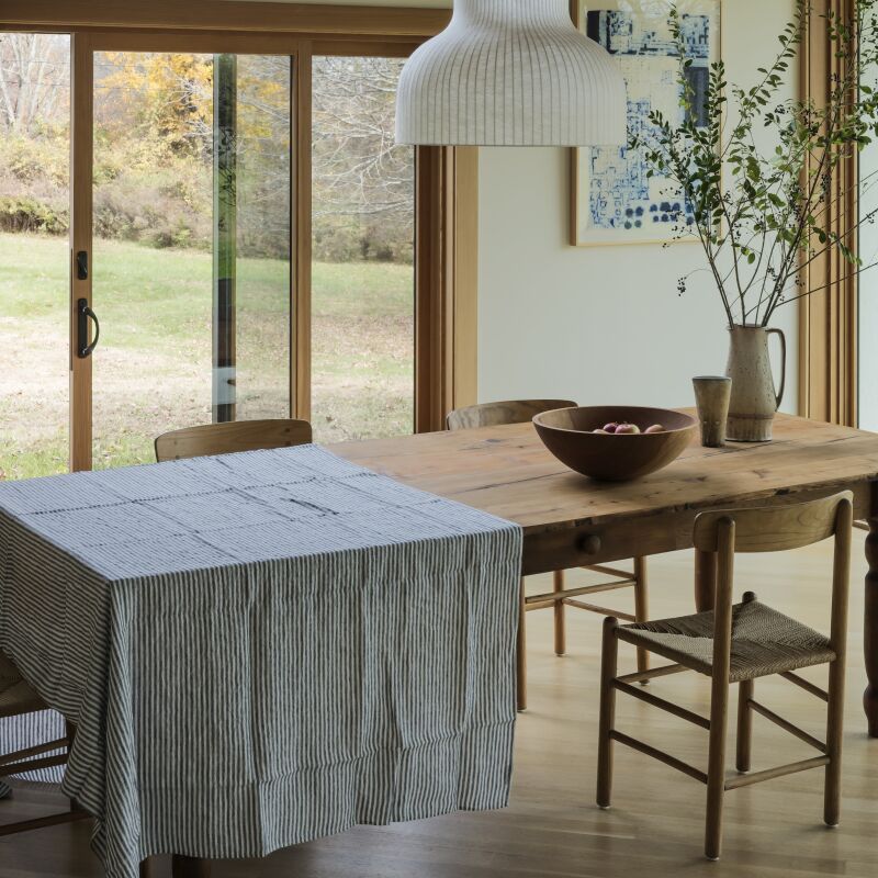
Roberts put a lot of thought into the makeover—and what she initially envisioned evolved significantly over time. Which elements were deemed worth preserving, and which  called for replacing? Come see the kitchen as it was, and the results of the new upgrades.

Photography courtesy of ERA (@elizabeth_roberts_architects), unless noted.

Before

captured when it was new, the kitchen was a model of inventive, cost conscious  17
Above: Captured when it was new, the kitchen was a model of inventive, cost-conscious design: Ikea cabinets, a cast concrete counter, full-height backsplash of honed Carrara marble tiles, and Wolf range purchased used on Craig’s List. Because the space is visible from the dining room, Roberts opted against overhead cabinets: “they make a kitchen feel very kitchen-y.” Photograph by Matthew Williams from Remodelista A Manual for the Considered Home, pages 76-91.

After

when the room started to feel worse for wear, roberts stepped back and assessed 18
Above: When the room started to feel worse for wear, Roberts stepped back and assessed what was working and what could be improved. “The layout was fine, the Wolf range was great, and the marble backsplash was in perfectly good condition,” she tells us. “Replacing those elements seemed not only wasteful but unnecessary.” But more storage was needed, so Roberts introduced new custom cabinets—even overhead.

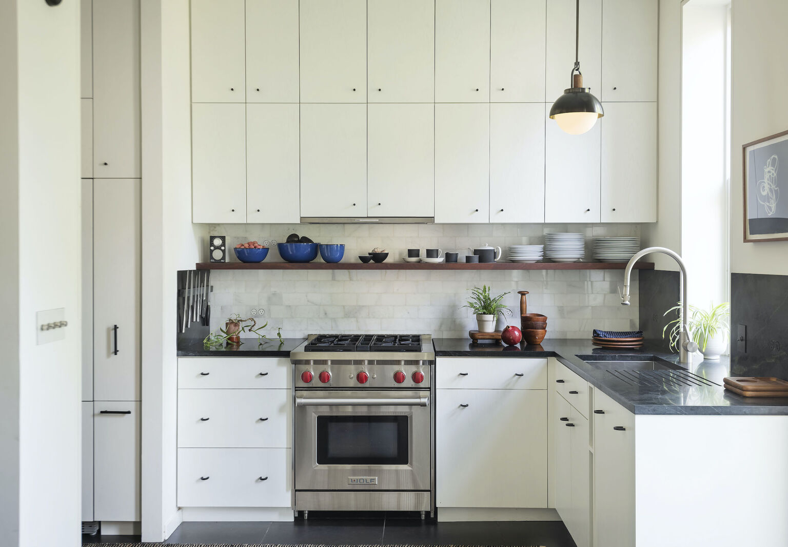
Her current thoughts on the subject? “After many years of very little storage and a spare wall, I was ready for a change. I think that the very simple new cabinets add a sort of grid to the wall that doesn’t feel overly ‘kitchen-y.’ And I love the storage.”

roberts replaced her crumbling concrete counter with china black soapstone from 19
Above: Roberts replaced her crumbling concrete counter with China Black soapstone from BAS Stone in Queens, NY. Also new: the Pull-down Faucet from Waterstone, Allied Maker Arc Dome pendant light, and Miele dishwasher concealed behind a panel. Not all was a splurge: the cabinet hardware is from Ikea—the U-shaped pulls are the forged-iron Borghamn Handle, and the small knobs are the Nydala, both $7 for two.
the soapstone counter was extended into a sidesplash for storing knives. &# 20
Above: The soapstone counter was extended into a sidesplash for storing knives. “It took a lot of experimentation: we finally got it right when we found a magnet strong enough to hold the knives while embedded in the stone.” The stainless steels knives with the dimpled handles are by Santoku of Japan.
roberts tells us that her original vision for the makeover was &#8\2\20;to  21
Above: Roberts tells us that her original vision for the makeover was “to dive deep into a favorite combination of warm dark wood with dark stone. But after a good six months of research, I accepted the fact that teak and other hardwoods with that old, reddish teak tone I love are unattainable—it’s entirely unethical to use old-growth teak. I also explored reclaimed Burmese teak from dismantled buildings, but the work holes and nail holes did not go with the idea in my head.”

Ultimately, she went with white oak—”a domestic wood”—that’s brush-painted to show a bit of grain.”Instead of creating a countertop and cabinets of teak,” she adds, “I now collect mid-century tableware that looks beautiful on the black counters. I delight in the woodwork details found in my 75-year-old wooden bowls, plates, and cutting boards.” Search “vintage Danish teak tableware” on Etsy, eBay, and Chairish to find pieces like the ones shown here. The Flush-Mount Outlets are by Bocci. Wood accents may be welcome, but Roberts still hews to an overall black and white scheme: the tea set on the shelf is vintage Wedgwood.

the walk through pantry, located in the passage from the front hall to the kitc 22
Above: The walk-through pantry, located in the passage from the front hall to the kitchen, also received a makeover. Roberts introduced new cabinets and drawers, a panel-faced Fisher & Paykel fridge, plus a “coffee shrine” for her husband.

The walls, trim, and ceiling are painted in Benjamin Moore Cloud White, one of our Architects’ 8 Favorite Pure White Paints. The straight black pulls are Ikea’s Gribbol Handle, $6 for two.

the coffee area—&#8\2\2\1;probably my favorite part of the kitchen,& 23
Above: The coffee area—”probably my favorite part of the kitchen,” says Robertshas a soapstone counter and backsplash detailed with sapele, a precious hardwood that’s a nod to her original vision for the kitchen. The blue Large Mugs and Serving Bowls are by Heath Ceramics.
the rotary light dimmers and toggle switches introduced throughout are from for 24
Above: The rotary light dimmers and toggle switches introduced throughout are from Forbes & Lomax. The artwork is a seaweed print by Roberts, a souvenir of a trip to Brittany—for our how-to, see DIY: Pressed Seaweed Prints.
a view of the updated kitchen from the dining room. like the coffee niche, the  25
Above: A view of the updated kitchen from the dining room. Like the coffee niche, the running shelf is sapele wood: “I used a small piece for mid-century-inspired, furniture-like details,” says Roberts.

Before

a star feature of the dining room, shown here as it looked nine years ago, was  26
Above: A star feature of the dining room, shown here as it looked nine years ago, was its fireplace, an existing element that Roberts raised and turned into a pizza oven by inserting a Tuscan Italian Grill from Bella Cucina. Note: the firewood niche below.) The Crate & Barrel dining table had bench seating that fit as many as five people on each side—”but you get pretty chummy with the person next to you,” said Roberts. See more of the kitchen and dining room as they were in our 2011 House Call. Photograph by Matthew Williams from Remodelista A Manual for the Considered Home.

After

the raised hearth and wine glass chandelier (a discontinued design) remain in p 27
Above: The raised hearth and wine glass chandelier (a discontinued design) remain in place, but a Saarinen Dining Table now holds center stage surrounded by vintage Poul Voultier for Frem Røjle chairs: “much better flow through and around the room,” says Roberts of the switch. The vertical bookshelf and other accessories have been supplanted by Mae Shelving from furniture company Radnor—Roberts recently co-curated their NYC showroom.
the kitchen and dining room&#8\2\17;s existing wood floor &#8\2\20;just 28
Above: The kitchen and dining room’s existing wood floor “just did not hold up to the abuse.” Roberts replaced it with outsized porcelain tiles—and during the construction process introduced energy-efficient radiant heat. “The tiles clean beautifully: they feel cool in the summer, and we keep them warm in the winter.”

What will these rooms look like in another 10 years? Stay tuned.

More Elizabeth Roberts Architects designs:

(Visited 2,429 times, 7 visits today)
You need to login or register to view and manage your bookmarks.

Frequently asked questions

What was the main objective behind updating Elizabeth Roberts's kitchen?

The main objective behind updating Elizabeth Roberts's kitchen was to create a functional, efficient, and modern space that could accommodate her family's needs.

What were some of the key changes made to the kitchen?

Some of the key changes made to the kitchen included removing the wall that separated the kitchen from the living room to create an open layout, installing new cabinets and appliances, and adding a custom-made island with a marble countertop.

What inspired the kitchen's design?

The kitchen's design was inspired by Elizabeth's love for classic, timeless design and the desire to create a space that would complement the aesthetic of her historic Brooklyn townhouse.

What materials were used in the kitchen?

The kitchen features a mix of traditional and modern materials, including white oak cabinetry, marble countertops and backsplash, and black steel hardware and fixtures.

Was sustainability a factor in the kitchen update?

Yes, sustainability was a factor in the kitchen update. Elizabeth opted for energy-efficient appliances and incorporated natural materials, such as wood and stone, which are renewable and durable.

How was the storage capacity of the kitchen enhanced?

The storage capacity of the kitchen was enhanced by installing custom cabinets with ample space, including a pantry cabinet that provides additional storage for food and kitchen staples.

Have a Question or Comment About This Post?

Join the conversation

v5.0