Icon - Arrow LeftAn icon we use to indicate a rightwards action. Icon - Arrow RightAn icon we use to indicate a leftwards action. Icon - External LinkAn icon we use to indicate a button link is external. Icon - MessageThe icon we use to represent an email action. Icon - Down ChevronUsed to indicate a dropdown. Icon - CloseUsed to indicate a close action. Icon - Dropdown ArrowUsed to indicate a dropdown. Icon - Location PinUsed to showcase a location on a map. Icon - Zoom OutUsed to indicate a zoom out action on a map. Icon - Zoom InUsed to indicate a zoom in action on a map. Icon - SearchUsed to indicate a search action. Icon - EmailUsed to indicate an emai action. Icon - FacebookFacebooks brand mark for use in social sharing icons. flipboard Icon - InstagramInstagrams brand mark for use in social sharing icons. Icon - PinterestPinterests brand mark for use in social sharing icons. Icon - TwitterTwitters brand mark for use in social sharing icons. Icon - Check MarkA check mark for checkbox buttons.
You are reading

Kitchen of the Week: A Waste-Conscious Remodel for a Ceramic Tile Designer

Search

Kitchen of the Week: A Waste-Conscious Remodel for a Ceramic Tile Designer

December 22, 2022

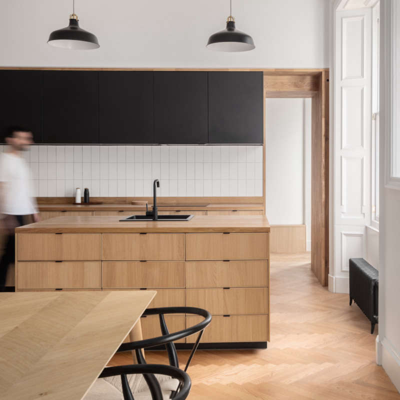
Here’s a kitchen that thoughtfully references the period and place the home was built (sometime in the 19th century, in London), yet feels thoroughly modern. It belongs to ceramic tile designer Sophie Caulfeild and her husband, James, a fund manager. The two hired architect Thom Brisco, of Brisco Loran, last year to brighten, update, and customize it for their busy life with two young daughters. “We wanted to have more seating in the lightest part of the house (the extension), to improve the look of the extension from the outside, and to improve the connection between the outdoors and indoors. It’s a north-facing room and it was very grey so we wanted it to feel a lot warmer,” Sophie reports.

In designing the new kitchen, Thom took his cues from what was already there: “Much of the design emerged from our observation of the house’s historic window and door framework. We looked to emulate the lacy qualities of its joinery with a timber framework of our own.” But instead of gutting everything and replacing it all, Thom and his clients were determined to minimize waste and  “to work with what we had,” he says. “Ours is a project of many small tweaks and measures producing a new comfortable whole, without resort to wholesale replacement.”

Some examples of their conscious efforts to salvage and reuse: “Brickwork that was removed to reshape a door would become the new sill of an incoming window. The faulty porcelain floor that we took up was moved to the garden, where it became the base material for the new garden patio,” he shares. “In addition, several of the appliances in the former kitchen were retained and reinstalled in the new fit-out, whilst the old cabinets became a resource for the builder’s other projects across London. Whilst of limited impact, these small moves are examples of our necessary shift toward a circular material economy.”

Below, the results of their considered, waste-conscious renovation.

Photography by Agnese Sanvito, courtesy of Brisco Loran.

the wall and windows on the right were once the exterior of the edwardian era h 17
Above: The wall and windows on the right were once the exterior of the Edwardian-era home; an extension done by prior owners turned them into an interior partition. The new kitchen, on the left, mimics the original framework.
the ash wood cabinetry, designed by brisco loran and built by constructive and  18
Above: The ash wood cabinetry, designed by Brisco Loran and built by Constructive and Co., is “lightly finished with a whitening oil produced by Osmo,” he says. Terra-cotta tiles line the new floor. “The floor we replaced was a featureless grey porcelain tile, beneath which the underfloor heating system had failed, ensuring it was cold both to the touch and the eye. In contrast, the terra-cotta tile is rich in tone and texture, warming the spaces with colour and a renewed heating system.”
the kitchen has two distinct spaces: a room that holds the sink, refrigerator,  19
Above: The kitchen has two distinct spaces: a room that holds the sink, refrigerator, and much of the storage space; and a cooking and dining area just beyond that looks out onto the patio. Note that the two spaces are connected by the single latticework of cabinetry. The wall lights are from Dyke & Dean.
one of the most arresting features is the single row of hand painted tiles abov 20
Above: One of the most arresting features is the single row of hand-painted tiles above the counters (the sink and stove areas get the backsplash treatment). They’re from Sophie’s ceramic tile studio, Feild, and are “a design which I created based on a motif found in the ceramics of the Victorian ceramicist, William De Morgan,” she says. “They are hand-painted by a wonderful team I work with in Stoke-On-Trent using a traditional Victorian glazing technique called tubelining. It’s a modern interpretation of a ceramic style that was popular when the house was built.”
open shelving lends the space a lightness and airiness. the countertop is a ter 21
Above: Open shelving lends the space a lightness and airiness. The countertop is a terrazzo produced by specialist Diespeker.
i told thom i thought the cabinetry had a japanese look to it. his response: &a 22
Above: I told Thom I thought the cabinetry had a Japanese look to it. His response: “It certainly nods towards the same half-timbered Tudor construction that the house’s Edwardian builders were referencing, but perhaps the slenderness of the elements and the junctions are closer to an Edo-period Japanese building. Edo-wardian?”
sophie with her daughters. this spot, where she cooks and her children get to w 23
Above: Sophie with her daughters. This spot, where she cooks and her children get to watch from their perch on the bench, is her favorite part of the kitchen.
thom also overhauled the exterior, replacing an old wood deck with a terra cott 24
Above: Thom also overhauled the exterior, replacing an old wood deck with a terra-cotta patio and widening the window that looks out from the kitchen.
&#8\2\20;the designers suggested building in a permanent table on the patio 25
Above: “The designers suggested building in a permanent table on the patio. It was an inspired idea, and they placed it perfectly so it catches the last of the evening sun in the summer,” says Sophie.

For more kitchens designed by Thom Brisco, see:

(Visited 828 times, 1 visits today)
You need to login or register to view and manage your bookmarks.

Product summary  

Have a Question or Comment About This Post?

Join the conversation

v5.0