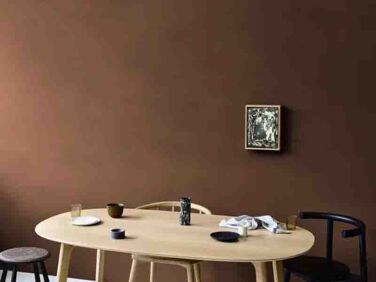
Brown paint is an underutilized design tool: Whether it’s used as an accent color or a total commitment, the effect is mesmeric. “Browns are true gem colors,” says architect Anais Blehaut. “Once you pass the rational brain block behind a brown, which is often associated with dark/dirty/sad, you can explore and enjoy.” Blehaut goes on: “Brown is chocolate and all the shades of treats associated. Brown is soil, earth, the cradle for life, and is synonymous to creation and regeneration.” Here are 10 favorite shades of brown paint from a host of architects and interior designers.
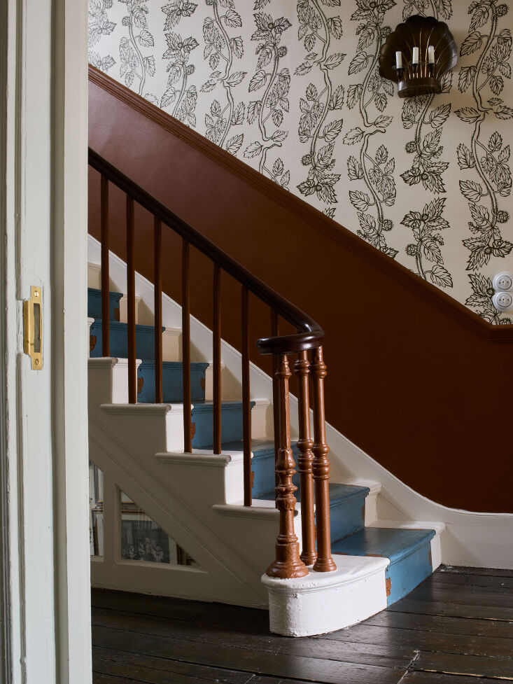
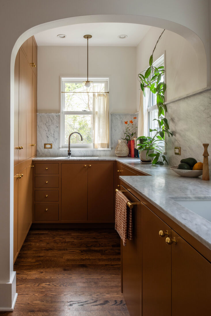
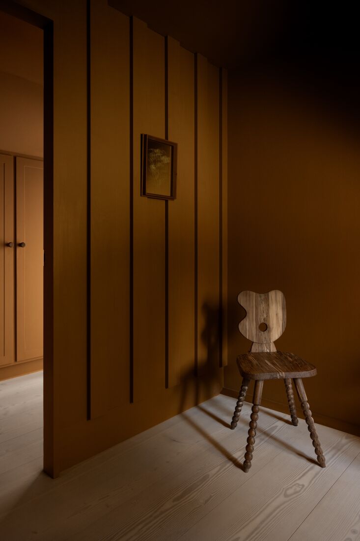
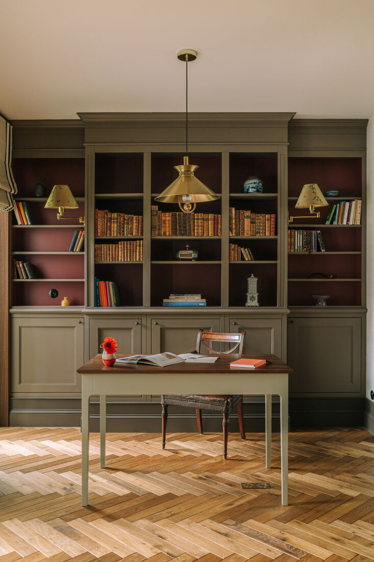
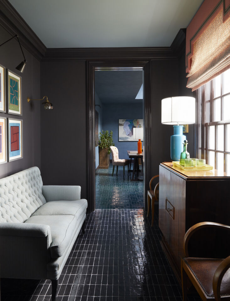
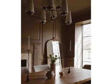
Above: At Beata Heuman’s own home, the stair rail and wall is painted in Cigar, a shade from Heuman’s own collaboration with Mylands. “Cigar is inspired by Shaker pieces from the 1800s and the color of a good cigar. It is a surprisingly effective and a modern-looking, graphic alternative to natural wood.” Photograph by Beth Davis for Beata Heuman LTD, courtesy of Beata Heuman. Above: Architects Chelsie Lee and Emily Knudsen of Portland, Oregon-based Attend Interior chose Benjamin Moore Fort Sumner Tan 1119 for the kitchen cabinets of a remodel in Westmoreland. The color, Chelsie explains, “is a rich, caramel-y, saddle leather color that doesn’t go too brown or too orange. It pairs well with the peachy-pink dining room and feels both bold and somewhat neutral.” Photograph by Malcom Lee for Attend Interior. Above: Architects Mathias Mentze and Alexander Ottenstein of Copenhagen-based firm Mentze Ottenstein implemented a deep ochre paint color, Oxydbrun Ground Color Paste from Linolie & Pigment, in the bedroom and hallway of the Dinesen House in Denmark. Above: Architect Anais Blehaut of Daab Design in London applied Farrow & Ball London Clay No.244 to the upper wall and ceiling of a Paris kitchen. Says Anais: “Farrow & Ball London Clay is a perfect balance between depth (provided by absorption of light by the dark tone) and reflectivity (provided by the light tone). It changes radically with the surrounding luminosity and provides different ambiances. London Clay is also very warm and comforting but equally works with metal and cold colors, which is great for a kitchen/dining room.” Above: In a 1640s Georgian house in East Sussex, Cassandra Ellis implemented a shade from her own line, Atelier Ellis, called Paper & String, “a deeply pleasurable brown.” Photograph from In the Stillness: A 1640s Georgian in an Affecting Palette by Cassandra Ellis.
This error message is only visible to WordPress admins
Error: No connected account.
Please go to the Instagram Feed settings page to connect an account.
v5.0
×
Join the Remodelista Family of Websites
Become a Member at no charge
When you register as a free Member of the Remodelista family of websites (Remodelista, Gardenista, and The Organized Home), you gain access to all current posts plus 10 archived posts per month, our internal bookmarking tool, and the community bulletin board.
Access 10 archived posts (older than one year) per month on each site
Use of our internal bookmark tool, so you can save products, posts, and other pages for quick reference
Access to our community bulletin board so you can ask and answer design-related questions
Unlimited access to the Product Catalogs, Design Travel sources, and Architect & Designer Directory listings
Choose from our ten newsletters to keep up with the latest on the sites
Or Subscribe for Maximum Value!
For $5/month ($59.99 paid annually) you'll enjoy unlimited, ad-free access to Remodelista, Gardenista, and The Organized Home and all the benefits of Membership.
Annual subscribers pay 50% off the monthly subscription price of $9.99
×
Subscribe to the Remodelista family of websites
For $5/month ($59.99 paid annually) you'll enjoy unlimited, ad-free access to Remodelista, Gardenista, and The Organized Home and all the benefits of Membership.
Annual subscribers pay 50% off the monthly subscription price of $9.99
×
Sorry! As a registered member you get 10 free posts from our archive (posts more than a year old) every 30 days. You have reached your limit for this 30-day period. If you would like to access unlimited posts from the archive (ad free, too), become a subscriber today, and keep reading as many articles as you want.
Full Access Individual Subscription
Benefits include:
Unlimited access to Remodelista, Gardenista, and The Organized Home sites
Ad-free browsing environment
Unrestricted access to 30,000+ archived posts
Receive the full-text daily newsletters
All features that Members have access to
Annual subscribers pay just 50% off the monthly subscription price of $9.99
Sorry! You have reached your limit of three (3) free posts from our archive every 30 days. You can increase this to 10 posts by joining as a free Member, or read unlimited posts with no ads by becoming a paid Subscriber.
Subscribe to the Remodelista family of websites
For $5/month ($59.99 paid annually) you'll enjoy unlimited, ad-free access to Remodelista, Gardenista, and The Organized Home and all the benefits of Membership.
Annual subscribers pay 50% off the monthly subscription price of $9.99
Become a Member at no charge
When you register as a free Member of the Remodelista family of websites (Remodelista, Gardenista, and The Organized Home), you gain access to all current posts plus 10 archived posts per month, our internal bookmarking tool, and the community bulletin board.
Congratulations on becoming a Subscriber to Remodelista, Gardenista and The Organized Home! You now have access to many great features across the sites:
Unlimited access to all three sites
Ad-free browsing environment
Unrestricted access to 30,000+ archived posts
Receive any of the newsletters, including the the full-text daily Remodelista and Gardenista newsletters
Use of our internal bookmark tool, so you can save products, posts, and other pages for quick reference
Access to our community bulletin board so you can ask and answer design-related questions
Congratulations on joining as a free Member of Remodelista, Gardenista and The Organized Home! You now have access to many great features across the sites:
Access to all posts published in the past year
Access 10 archived posts (older than one year) per month on each site
Use of our internal bookmark tool, so you can save products, posts, and other pages for quick reference
Access to our community bulletin board so you can ask and answer design-related questions
Unlimited access to the Product Catalogs, Design Travel sources, and Architect & Designer Directory listings
Choose from our ten newsletters to keep up with the latest on the sites
If at any time you want to become a Subscriber and enjoy unlimited, ad-free access to all our content, just go to the My Account link and choose Subscribe.
We use cookies to ensure that we give you the best experience on our website. If you continue to use this site we will assume that you are happy with it.


Have a Question or Comment About This Post?
Join the conversation