When we happened upon Colombe Studio’s Instagram account, we discovered image after image that activated our endorphins. It was clear that we had to share founder Marta Chrapka’s sophisticated projects on our site. A while ago, we did just that—see A Glamorous Pre-War Flat in Poland, Courtesy of Colombe Design (and eBay). Here’s another refreshingly grown-up home by the Warsaw-based designer.
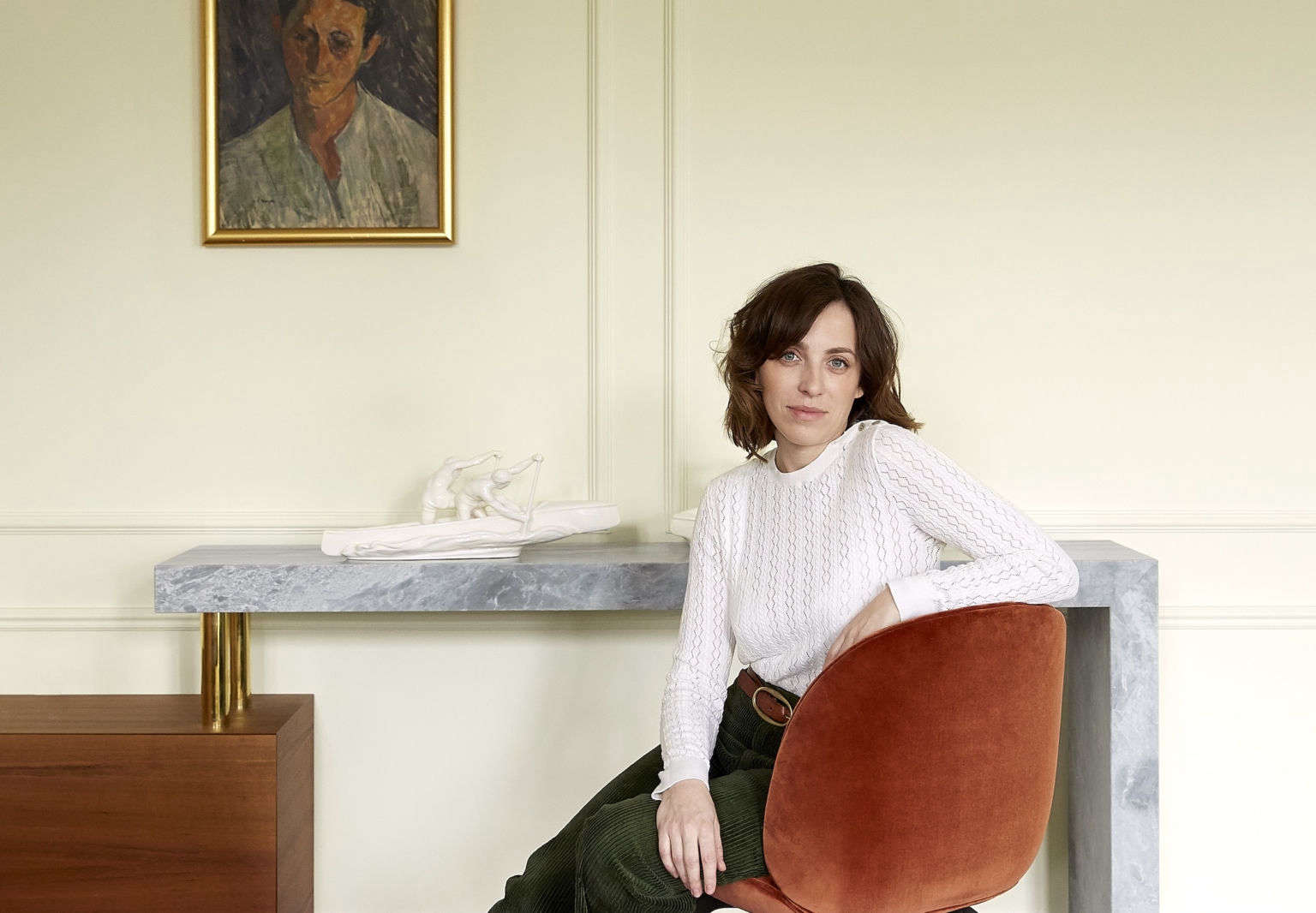
This one belongs to a couple (a writer of historical novels and his wife) who asked Chrapka to transform a renovated-for-the-worse apartment into a sophisticated pied-à-terre that was worthy of its prewar shell. As Chrapka very succinctly explains, “Everything outside—the beautiful building, the parks, the Vistula River, the view, the light—[was great].” And the bad? “Everything inside.”
After reinstating period details via moldings, herringbone oak floors, and new grand windows, Chrapka went about appointing the space with pieces—a mix of custom, new, and vintage—that, together, channel eclectic elegance. But it’s the colors in this project, a warm mix of rust and brick red punctuated with gold accents, that we so admire.
Have a look.
Photography by Kasia Gatkowska, courtesy of Colombe Studio.
Above: “The style began when we found the golden rhubarb lamp. That was the first and the most important decorative point,” says Chrapka, who picked it up at Galerie Canavese in Paris. The pendant light is by French lighting design company Magic Circus. Above: The wraparound teak cabinet, nicknamed “the worm cabinet,” was designed by the Colombe Studio team. Above: The cabinet culminates in a marble console/desk. Chrapka, pictured, who graduated from the European Academy of Art in Warsaw, has a painterly eye when it comes to colors. The white on the walls in the living room is JdM White from Belgian paint company Emente. Above: Chrapka had free rein to make creative decisions. “I had no limits, total trust,” she says. Case in point: “The clients told me that the only color they do not like is yellow,” she says, referring to the curtains. “But when I showed them the Pierre Frey fabric, they fell in love.” Above: The kitchen, open to the living room, was inspired by a Josef Frank-designed sideboard featuring walnut discs and glass doors. “I love this cabinet so much that I thought it would be great to make a [similar] kitchen,” says Chrapka. Continuing the theme, she selected Josef Frank dining chairs from Svenskt Tenn. The walnut dining table is custom. Above: While the upper cabinets have a whimsical look, the lower cabinets, painted Farrow & Ball Studio Green, are traditional. The brass Semi Pendant light is by Gubi. Above: Confirmation of Chrapka’s genius when it comes to colors: an arresting and wholly unexpected color pairing in the powder room—Skylight and Picture Gallery Red, both by Farrow & Ball. The colors reappear in the painted wood floors. Above: The designer’s favorite part of the project are these statement doors, carved from solid walnut and inspired by Krakowian design (the owner is from Kraków), that separate the public spaces from the private ones. The sleek brass Plate and Sphere ceiling light is from Atelier Areti. Above: A quirk of the apartment is that nearly every room has a diagonal wall. In the bedroom, Chrapka straightened the room with the help of a built-in headboard and cabinet. The Bestlite sconces are by Gubi. Above: The Two Spheres pendant light from Atelier Areti hovers over the room, which is painted Alabaster, by Emente. Above: In the spare bedroom/study, William Morris wallpaper provides a backdrop for the vintage Knoll daybed. Above: On the walls, a moody Mouse’s Back by Farrow & Ball.
For more of our favorite European apartments, see: