Icon - Arrow LeftAn icon we use to indicate a rightwards action. Icon - Arrow RightAn icon we use to indicate a leftwards action. Icon - External LinkAn icon we use to indicate a button link is external. Icon - MessageThe icon we use to represent an email action. Icon - Down ChevronUsed to indicate a dropdown. Icon - CloseUsed to indicate a close action. Icon - Dropdown ArrowUsed to indicate a dropdown. Icon - Location PinUsed to showcase a location on a map. Icon - Zoom OutUsed to indicate a zoom out action on a map. Icon - Zoom InUsed to indicate a zoom in action on a map. Icon - SearchUsed to indicate a search action. Icon - EmailUsed to indicate an emai action. Icon - FacebookFacebooks brand mark for use in social sharing icons. flipboard Icon - InstagramInstagrams brand mark for use in social sharing icons. Icon - PinterestPinterests brand mark for use in social sharing icons. Icon - TwitterTwitters brand mark for use in social sharing icons. Icon - Check MarkA check mark for checkbox buttons.
You are reading

Architects’ 12 Favorite Blue Paints for Kitchen Cabinets (or Anywhere in the House)

Search

Architects’ 12 Favorite Blue Paints for Kitchen Cabinets (or Anywhere in the House)

March 13, 2018

Looking to dip your toe in the blue-painted cabinet trend? (See also Trend Alert: The Cult of the Blue Kitchen.) We asked a few experts in the Remodelista Architect & Designer Directory for their favorite blue (and green-blue) paints for kitchen cabinets. Here are their picks.

the selection of blues, from bright to moody to barely blue. 17
Above: The selection of blues, from bright to moody to barely-blue.

on the super subtle end of the scale, meg joannides of mlk studio considers far 18
Above: On the super-subtle end of the scale, Meg Joannides of MLK Studio considers Farrow & Ball’s Skylight a favorite.
lauren geremia of geremia design chooses farrow & ball’s teresa& 19
Above: Lauren Geremia of Geremia Design chooses Farrow & Ball’s Teresa’s Green for a lighter blue with a greenish cast. (It “owes its freshness to a rich blue base and its warmth to soft green undertones,” the company says.)
 \2michaels likes farrow & ball’s parma grey, which they descri 20
Above: 2Michaels likes Farrow & Ball’s Parma Grey, which they describe as an “airy, watery blue that has undercurrent of gray.”

 nickey kehoe tends to choose kimono by portola paints & glazes for ki 21
Above: Nickey Kehoe tends to choose Kimono by Portola Paints & Glazes for kitchen cabinets.

 kriste michelini counts benjamin moore’s new york state of mi 22
Above: Kriste Michelini counts Benjamin Moore’s New York State of Mind among her top picks of blues for interiors.
 michael howells, of howells architecture and design, picks farrow & b 23
Above: Michael Howells, of Howells Architecture and Design, picks Farrow & Ball’s Drawing Room Blue for blue kitchen cabinets.
 jon call of mr. call designs chooses farrow & ball’s stiffkey  24
Above: Jon Call of Mr. Call Designs chooses Farrow & Ball’s Stiffkey Blue when, he says, “I want to use navy, but I don’t want it to look like a crayon color. It’s the perfect blue with a slight gray undertone to round the color out a bit.”
 when looking for darker shades of blue, lauren geremia of geremia design& 25
Above: When looking for darker shades of blue, Lauren Geremia of Geremia Design picks Farrow & Ball’s Hague Blue.
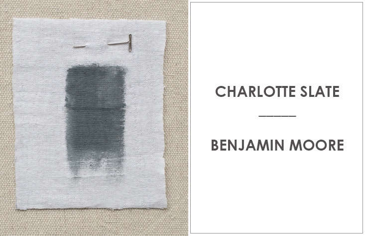
 amy a. alper turns to benjamin moore’s charlotte slate when she wa 26
Above: Amy A. Alper turns to Benjamin Moore’s Charlotte Slate when she wants to incorporate a blue tone.
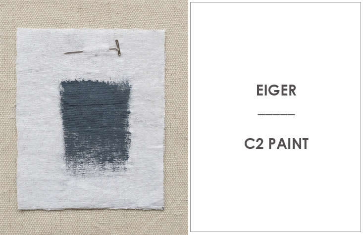
 ellen hamilton, from hamilton design associates, loves c\2’s eiger 27
Above: Ellen Hamilton, from Hamilton Design Associates, loves C2’s Eiger, which she describes as “a knockout.”
 medium plenty tends to go for benjamin moore’s gentleman&#8\2\ 28
Above: Medium Plenty tends to go for Benjamin Moore’s Gentleman’s Gray. “It’s a deep rich blue that we think has presence,” they say.
lindsay crozier of brooklyn based made also turns to benjamin moore’s we 29
Above: Lindsay Crozier of Brooklyn-based Made also turns to Benjamin Moore’s Westcott Navy—so dark it appears almost black here—in the kitchen.
For more architects’ paint picks of varying hues, see:

Finally, get more ideas on how to evaluate and choose kitchen cabinetry and hardware in our Remodeling 101 Guide: Kitchen Cabinets & Hardware.

(Visited 978 times, 1 visits today)
You need to login or register to view and manage your bookmarks.

Product summary  Item 6 179Item 7 180

Have a Question or Comment About This Post?

Join the conversation

v5.0