
When it comes to choosing gray paint, looks can be deceiving: Often grays that look fine on a swatch end up being too blue-toned on a wall, making the room feel cold. For warm grays without the guesswork, we rounded up the most popular grays from our experts in the Remodelista Architect/Designer Directory. Here are their picks.
Photography by Mel Walbridge.

Above: London-based interior design firm Imperfect Interiors loves Farrow & Ball’s Cornforth White. Designer Beth Dadswell says, “It’s a bit of a chameleon and can look warm in a sunny room or cooler in a north-facing room. It always looks elegant, particularly if used on skirting, woodwork and cornicing.”
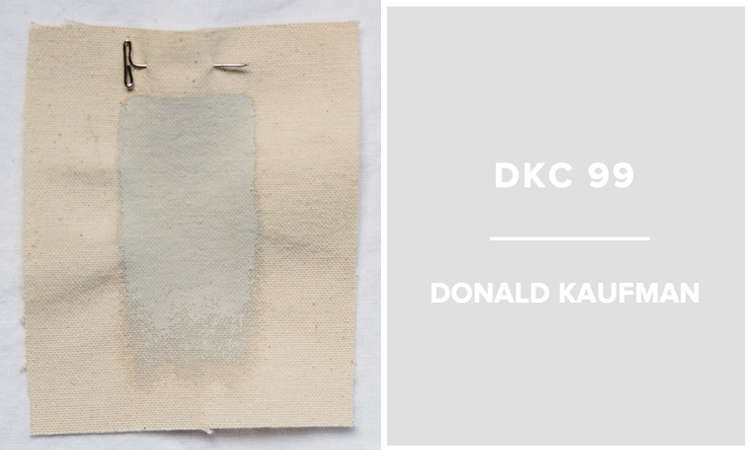
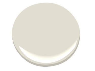
Above: Kevin Oreck Architect in Los Angeles likes Donald Kaufman’s KC-99: “A great paint is marked by its depth and resilience under shifting light conditions,” they say; DKC-99 adapts “as light changes and shadows deepen.”

Above: San Francisco–based Jeff King & Co. recommends Sherwin-Williams’s Passive, one of the more silvery options on this list.

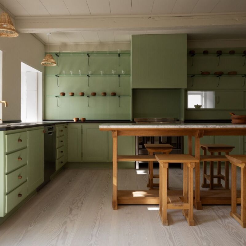
Above: Studio One San Francisco recommends Benjamin Moore’s Graystone for its suede-like quality and “not too light or too dark” tone. Designer Lisa Collins says, “I find it a very soothing color. I have it in my office and have used it in bathrooms and bedrooms as well.”

Above: Lauren Rubin Architecture’s favorite warm gray is Benjamin Moore’s Gray Owl. “It is light, subtle and warm and compliments white as well as bolder hues perfectly. We love it so much we all have it somewhere in our own homes,” they say.

Above: Portland, Oregon, architecture firm Emerick Architects loves Ralph Lauren’s Mombasa Mist. “It adds a nice grounding, earthy element to projects without being too heavy,” says Melody Emerick, who uses it for both interior and exterior projects.

Above: NelsonDaly and Turett Collaborative Architects both recommend Farrow & Ball’s Elephant’s Breath, a “warm contemporary gray” that looks beige but goes on gray.

Above: Aamodt/Plumb Architects loves Benjamin Moore’s November Rain. Mette Aamodt recommends this hue for its versatility: “It goes with everything. We have it in at least half the rooms of our house. It is sophisticated and subtle.”
Learn more about architects’ and designers’ favorite paint colors here:
- Greek-Inspired Cerulean and Aegean Blues
- 10 Paint Colors with Cult Followings
- 10 Easy Pieces: Architects’ White Paint Picks


Have a Question or Comment About This Post?
Join the conversation