Icon - Arrow LeftAn icon we use to indicate a rightwards action. Icon - Arrow RightAn icon we use to indicate a leftwards action. Icon - External LinkAn icon we use to indicate a button link is external. Icon - MessageThe icon we use to represent an email action. Icon - Down ChevronUsed to indicate a dropdown. Icon - CloseUsed to indicate a close action. Icon - Dropdown ArrowUsed to indicate a dropdown. Icon - Location PinUsed to showcase a location on a map. Icon - Zoom OutUsed to indicate a zoom out action on a map. Icon - Zoom InUsed to indicate a zoom in action on a map. Icon - SearchUsed to indicate a search action. Icon - EmailUsed to indicate an emai action. Icon - FacebookFacebooks brand mark for use in social sharing icons. flipboard Icon - InstagramInstagrams brand mark for use in social sharing icons. Icon - PinterestPinterests brand mark for use in social sharing icons. Icon - TwitterTwitters brand mark for use in social sharing icons. Icon - Check MarkA check mark for checkbox buttons.
You are reading

Texture and Gloss: 10 Ideas to Steal from a Hip London Cafe

Search

Texture and Gloss: 10 Ideas to Steal from a Hip London Cafe

July 18, 2017

A recent discovery in our submissions in-box: Catalyst Café & Coffee Roasters in central London, with interiors that strike a “balance between roughness and sensitivity, as a good cup of coffee does.” We like its quirky mix of granite and marble, small-space storage solutions, and glass floor looking into the “lab,” all designed by Thessaloniki-based 157 + 173 Designers. Here are 10 ideas to take away.

Photography courtesy of 157 + 173 Designers.

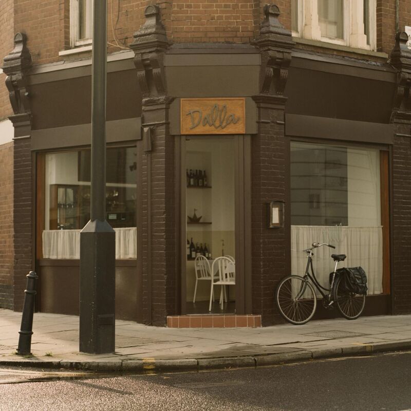
1. Hide surprising design inside a traditional exterior.

the café&#8\2\17;s simple exterior belies the mix of materials inside. 17
Above: The café’s simple exterior belies the mix of materials inside. Designers Babis Papanikolaou and Christina Tsirangelou hoped to add “a humble glossiness and brightness to the gray London mood.”

2. Up the contrast: Balance rough stone with wood and glass.

inside, the designers took inspiration from stones collected on their travels.  18
Above: Inside, the designers took inspiration from stones collected on their travels. (“We usually return with some bags full of extra-heavy rocks,” they explain.) They uncovered an old textured wall behind the bar, which they left intact, and built a rough stone-block island (for a similar look, see Steal This Look: A Low-Cost Kitchen for Serious Chefs). As a contrast, they added light wood furniture, copper accents, and a clear glass wall behind the counter that serves as a whiteboard. “Watching the wall lit behind the glass facade feels like watching a nice old item in a museum,” the designers say.

3. Keep surfaces streamlined with cutout cabinet pulls.

cutout pulls keep behind the counter storage from feeling cluttered. for m 19
Above: Cutout pulls keep behind-the-counter storage from feeling cluttered. For more, see Remodeling 101: Cutout Cabinet Pulls and Cutout Kitchen Cabinet Pulls: 17 Favorites from the Remodelista Archives. The bank of drawers ends in a bench, an ideal one-person perch.

4. Mix stone for maximum texture.

for visual interest, mix two or three kinds of stone—with care. at  20
Above: For visual interest, mix two or three kinds of stone—with care. At Catalyst, the counter is a patchwork of white marble, speckled granite bricks, and gray-green eucalyptus granite (the team used the reverse side, for a rougher texture). Extra points for visual commonality, as shown here: the gray granite bricks echo the gray veining of the marble. (The designers also added granite detailing to the birch plywood floor to create patterned “stone carpets,” not pictured.) See Remodeling 101: Marble Countertops and 10 Favorites: Architects’ Budget Kitchen Countertop Picks.
mossy eucalyptus granite alongside granite bricks. 21
Above: Mossy eucalyptus granite alongside granite bricks.

5. Add a pegboard for additional storage.

a large pegboard at the back of the space gives an empty wall the potentia 22
Above: A large pegboard at the back of the space gives an empty wall the potential for all-purpose storage; for a similar idea, see Versatile Function: Pegboard Organizers by Yvonne Mouser. (In the foreground: a custom-built communal table and chairs from Greek company Electra.)

6. Use shelves as a counter space.

 a two in one small space idea: when set at the right height, the bottom p 23
Above: A two-in-one small space idea: When set at the right height, the bottom portion of shelving can serve as a low counter or table, as it does here. Pair with low stools for below-storage seating. (Also shown: the patterned “stone carpet,” granite inlaid into the wood floor.)

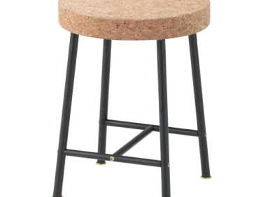
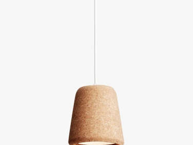
7. Incorporate cork.

for warmth, the designers added cork details: material pendant lights from cope 24
Above: For warmth, the designers added cork details: Material Pendant lights from Copenhagen brand New Works and cork-top Sinnerlig stools by Ilse Crawford from Ikea. (See Ilse Crawford’s New Collection for Ikea.) At right: A glass floor peeks into the downstairs coffee lab; for more, see No. 9.

8. Faucet as focal point: Install an exposed-pipe fixture.

an unexpected focal point: an exposed pipe brass faucet above the small ha 25
Above: An unexpected focal point: an exposed-pipe brass faucet above the small hand-washing sink. For similar options, see Trend Alert: 10 DIY Faucets Made from Plumbing Parts.

9. Play with the structure you’re given.

to unite the upstairs cafe with the coffee lab and open kitchen below, the 26
Above: To unite the upstairs cafe with the coffee lab and open kitchen below, the designers tore up a section of flooring and installed a glass panel in its place, preserving and exposing the original beams and inviting visitors to peek underground. “We thought that a glass floor would be ideal, to both reveal the lab downstairs, and some hints of the old building,” the designers say—crouching down for a look encouraged.

10. Keep the background simple.

pick what to experiment with and what to keep simple. even with mix and ma 27
Above: Pick what to experiment with and what to keep simple. Even with mix-and-match stone, patterned floors, and cork and copper details, the Catalyst space looks bright, not busy, thanks to simple white walls: For vetted white paints, see 10 Easy Pieces: Architect’s White Paint Picks.

More ideas from the summer’s most popular restaurants:

(Visited 463 times, 2 visits today)
You need to login or register to view and manage your bookmarks.

Product summary  

Have a Question or Comment About This Post?

Join the conversation

v5.0