Icon - Arrow LeftAn icon we use to indicate a rightwards action. Icon - Arrow RightAn icon we use to indicate a leftwards action. Icon - External LinkAn icon we use to indicate a button link is external. Icon - MessageThe icon we use to represent an email action. Icon - Down ChevronUsed to indicate a dropdown. Icon - CloseUsed to indicate a close action. Icon - Dropdown ArrowUsed to indicate a dropdown. Icon - Location PinUsed to showcase a location on a map. Icon - Zoom OutUsed to indicate a zoom out action on a map. Icon - Zoom InUsed to indicate a zoom in action on a map. Icon - SearchUsed to indicate a search action. Icon - EmailUsed to indicate an emai action. Icon - FacebookFacebooks brand mark for use in social sharing icons. flipboard Icon - InstagramInstagrams brand mark for use in social sharing icons. Icon - PinterestPinterests brand mark for use in social sharing icons. Icon - TwitterTwitters brand mark for use in social sharing icons. Icon - Check MarkA check mark for checkbox buttons.
You are reading

St. Lawrence in Vancouver: A Sultry, Blue-Hued Bistro, Right Out of a Painting

Search

St. Lawrence in Vancouver: A Sultry, Blue-Hued Bistro, Right Out of a Painting

March 12, 2018

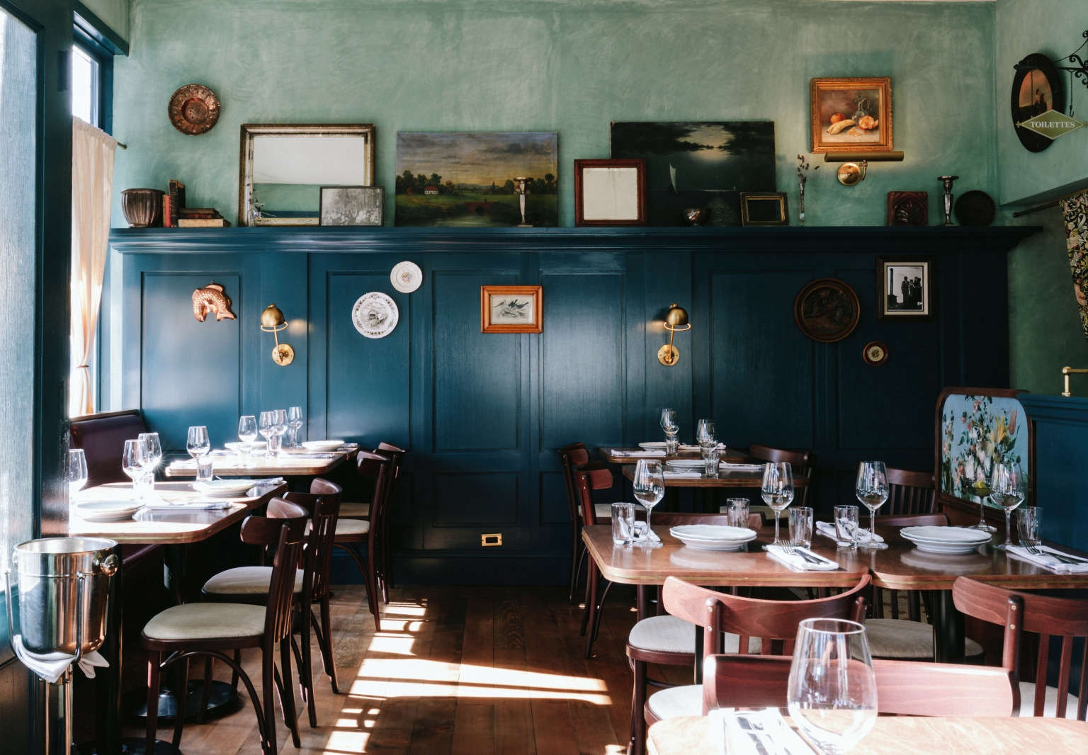
This is what I imagine it might feel like to dine inside an Impressionist painting, like Renoir’s Luncheon of the Boating Party: Recently I’ve been poring over the interiors of St. Lawrence, a French-Canadian bistro in Vancouver, sent to us by local design studio, Ste. Marie Art & Design, which was founded by Craig Stanghetta (himself a restauranteur). Chef JC Poirier wanted a space that felt “undesigned,” inspired by his native region of Quebec.

The designers’ approach? “We wanted the space to depict a Quebec mémère’s (or grandma’s) home, turned into a restaurant in the middle of the city,” the designers say. We like the hues of blues and greens (a last-minute design swap), the unexpected antiques throughout, and the subtle nods to old-world streets: “Although the space is very small, we used more materials in St. Lawrence then in most of our projects,” the designers say. “The desire for a space accrued in time necessitated this approach. Current design trends often focus on a few beautiful materials. In order to remove the hand of the designer, we had to work the opposite way: In this case, more is more.” Take a look inside.

Photography by Chris Amat, courtesy of Ste. Marie Art & Design.

the space was formerly a butcher shop. now even the entryway is blue, complete  17
Above: The space was formerly a butcher shop. Now even the entryway is blue, complete with the original gates.
the front dining room. the designers took on a &#8\2\20;full gut&#8\2\2 18
Above: The front dining room. The designers took on a “full gut” renovation, replacing the butcher display case, laminate floors, and palette of “mostly white and brown” with an old-world-inspired interior.

The blue/green palette was a last-minute decision: “We had designed the whole restaurant to have a much lighter palette: creams, muted yellows—more of a faded image of a Quebec country home,” Stanghetta says. “But as we were waiting for building permits, the chef was hosting dinners with some guest chefs at his neighboring restaurant Ask for Luigi (which we also designed). After attending a few of these dinners we started to feel the food was much more rich, romantic, and sultry, so we completely rethought the whole palette.”

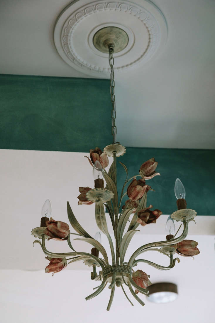
The millwork was inspired by an old Quebecois armoire: “It has this straightforwardness that feels humble and really works in the space,” the designers say. It’s painted in a high-gloss royal blue, inspired by the building facades of Montreal. The walls are a washed green plaster.

the textured walls were a two step process: first, a plaster finisher applied a 19
Above: The textured walls were a two-step process: First, a plaster finisher applied a layer of troweled-on plaster; then the design team asked the painter to mix a diluted paint wash. “The chef and one of the co-owners went through wall to wall washing on the diluted paint finish while the the other following behind would wipe it dry,” Stanghetta says. The chairs are Thonet with custom fabric seats; the tables are custom. Note the brass inlay around the edge, a detail by Goodweather.
most of the antiques that fill the interior (&#8\2\20;family photos, silver 20
Above: Most of the antiques that fill the interior (“family photos, silverware, and old French cookbooks”) are from Poirier’s collection.
adding to the vintage feel: custom st. lawrence plates from cascadia tableware. 21
Above: Adding to the vintage feel: custom St. Lawrence plates from Cascadia Tableware.
&#8\2\20;the service stations are some of our favorite pieces, inspired by  22
Above: “The service stations are some of our favorite pieces, inspired by old telephone stands like our grandmothers had,” the designers say. They’re decoupaged with still-life paintings.
Above: Rich hues on the backs of the service stations, and on a heavy curtain that separates the front dining room from the smaller back bar areas.
behind the curtain: a small hallway leads to the chefs&#8\2\17; counter and 25
Above: Behind the curtain: a small hallway leads to the chefs’ counter and small bar. The articulating wall lights are from wholesaler Mercana.
a vignette in a recessed niche. 26
Above: A vignette in a recessed niche.
in the next room, a small bar is to the right. the pebbled glass cabinets are a 27
Above: In the next room, a small bar is to the right. The pebbled glass cabinets are also painted in blue; the bar top is a high-gloss dark walnut.
behind a row of brass taps, a blue and white backsplash in tiles by the winches 28
Above: Behind a row of brass taps, a blue-and-white backsplash in tiles by The Winchester Tile Company in the UK.
cocktails and dried flowers on the bar top. 29
Above: Cocktails and dried flowers on the bar top.
the chefs&#8\2\17; counter has above bar metal and wood storage shelves. th 30
Above: The chefs’ counter has above-bar metal and wood storage shelves. The counter is “a light blue granite with an almost watercolor quality,” Stanghetta says.
the designers salvaged a row of bar stools and had them reupholstered in kabuki 31
Above: The designers salvaged a row of bar stools and had them reupholstered in Kabuki Twine by Robert Allen. “The light textiles offset the overall palette; these reference the family home and the cabane a sucre of Quebec”—traditional maple sugar shacks. The authentic-looking tiled floor is from Heritage Tile.
vintage paintings, lit from below. 32
Above: Vintage paintings, lit from below.
the front dining room, looking toward the entry. the crystal chandelier above t 33
Above: The front dining room, looking toward the entry. The crystal chandelier above the velvet curtains is from local shop Gild & Co.
Above L: An iron chandelier is “a simple fixture that seemed like something you’d find at your grandmother’s home,” the designers say. Above R: High on one wall is a ceramic candleholder that’s left to drip with wax. “Most of the vintage collectables came from chef JC Poirier’s personal collection that he’s cobbled together over the years while he was waiting to do this, a restaurant he’s dreamed up forever; we also shopped for many curios, art objects, unique pieces of furniture from our good friend Scott Landon Antiques & Interiors.”
the front host station. 36
Above: The front host station.
from the street. 37
Above: From the street.

More in Vancouver:

(Visited 1,099 times, 1 visits today)
You need to login or register to view and manage your bookmarks.

Have a Question or Comment About This Post?

Join the conversation

v5.0