Icon - Arrow LeftAn icon we use to indicate a rightwards action. Icon - Arrow RightAn icon we use to indicate a leftwards action. Icon - External LinkAn icon we use to indicate a button link is external. Icon - MessageThe icon we use to represent an email action. Icon - Down ChevronUsed to indicate a dropdown. Icon - CloseUsed to indicate a close action. Icon - Dropdown ArrowUsed to indicate a dropdown. Icon - Location PinUsed to showcase a location on a map. Icon - Zoom OutUsed to indicate a zoom out action on a map. Icon - Zoom InUsed to indicate a zoom in action on a map. Icon - SearchUsed to indicate a search action. Icon - EmailUsed to indicate an emai action. Icon - FacebookFacebooks brand mark for use in social sharing icons. flipboard Icon - InstagramInstagrams brand mark for use in social sharing icons. Icon - PinterestPinterests brand mark for use in social sharing icons. Icon - TwitterTwitters brand mark for use in social sharing icons. Icon - Check MarkA check mark for checkbox buttons.
You are reading

Expert Advice: Three No-Fail Color Palettes for Walls, Ceiling, and Trim

Search
the home depot logo 300x180 7

Expert Advice: Three No-Fail Color Palettes for Walls, Ceiling, and Trim

March 19, 2018

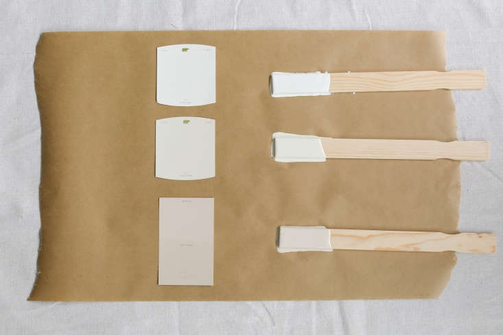
Never underestimate the power of paint—a fresh coat goes a long way toward reframing a space without the time or commitment of a remodel. But choosing a color palette for walls, ceilings, and trim is easier said than done.

For advice, we asked architectural and interior designer Katie Hackworth to share some tips for creating a cohesive palette. She provided us with three no-fail color schemes to try at home: a neutral palette of off-whites, a “can’t-go-wrong” classic palette, and an on-trend palette featuring Remodelista’s Color of the Year 2018, mignonette green.

Photography by Leslie Santarina for Remodelista.
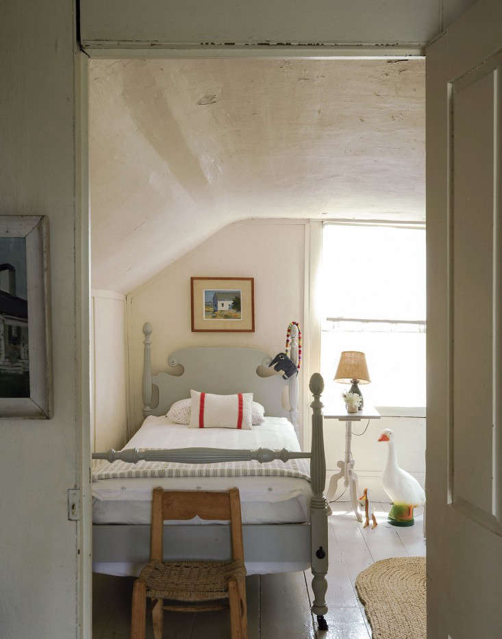
paint palette mixing sticks
Above: Hackworth’s color palettes, from left: three off-whites, a classic palette of neutrals, and an on-trend palette with mignonette green.

Off-Whites

for the palette of off whites, katie chose (from left) behr&#8\2\17;s  19
Above: For the palette of off-whites, Katie chose (from left) Behr’s Antique White in eggshell finish for the walls, Glidden’s Swiss Coffee in flat for the ceiling, and Behr’s Loft Light in satin for trim.

To create her suite of off-whites, says Katie, “I kept the ceilings clean and calm and added a touch of warmth to the walls.”

katie paired the ceiling and walls with millwork in &#8\2\20;muted, putty t 20
Above: Katie paired the ceiling and walls with millwork in “muted, putty tones, which are reading very historical and European to me right now,” she says. Shown, from top: walls, ceiling, and trim.

Classic Neutrals

katie&#8\2\17;s classic palette features (from top) behr&#8\2\17;s varn 21
Above: Katie’s classic palette features (from top) Behr’s Varnished Ivory in eggshell finish for the walls, Behr’s Papier Blanc in flat for the ceiling, and Behr’s Magnet in high-gloss for the trim.

For a classic palette that still makes a statement, Katie chose a dramatic charcoal in a high-gloss finish to accentuate the millwork. White tones for the walls and ceiling “quietly complement the bold statement,” she says.

&#8\2\20;there are no hard rules to painting millwork,&#8\2\2\1; katie  22
Above: “There are no hard rules to painting millwork,” Katie says, but she likes “going up a sheen or two” in the trim finish (like the high gloss she chose here). Shown, from top: walls, ceiling, and trim.

If you’re wary of painting your millwork in a dark shade, try painting just the window sashes instead: “It’s the perfect way to make a statement without getting out of your comfort zone,” Katie says.
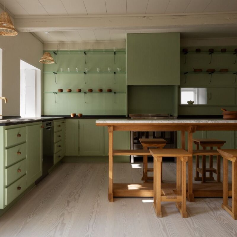
On-Trend

the designer created an of the moment palette featuring remodelista&#8\2\17 23
Above: The designer created an of-the-moment palette featuring Remodelista’s Color of the Year 2018, called mignonette green. From left:  Behr’s Papier Blanc in a flat finish for the ceiling, Behr’s Mossy Bench in eggshell on the walls, and millwork in Behr’s Black Evergreen in a satin or high gloss finish.

“When making a bold statement like this as your wall color,” Katie says, “I would suggest anchoring it with a deep and rich tone” on the molding (Behr’s almost-black Black Evergreen).

think beyond millwork for the dark green, says katie: &#8\2\20;it would mak 24
Above: Think beyond millwork for the dark green, says Katie: “It would make for showstopping interior doors, especially in a high gloss.” Shown, from top: ceiling, walls, and millwork.

For more paint color ideas, see our posts:

(Visited 1,260 times, 3 visits today)
You need to login or register to view and manage your bookmarks.

Have a Question or Comment About This Post?

Join the conversation

v5.0