
Stephen O’Sullivan felt ready for a better bath. The dual Irish-French citizen had been living in his apartment in Paris’s 9th for almost 20 years when he gave architect Suleïma Ben Achour a shout. The daughter of an old friend of his, Suleïma, a 2016 graduate of the École Nationale d’Architecture de Paris la Villette, was working at the time for a Paris design firm. She and her favorite collaborator from architecture school, Antoine Lallement, met up with Stephen, and quickly the discussion evolved from showers and sinks into an entire rethink of the flat: a translator and writer, Stephen was in the process of setting up his own company out of the apartment and realized that the time was right for “a makeover that is going to be with me for the rest of my life.”
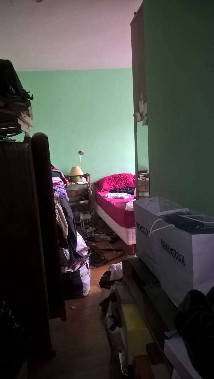
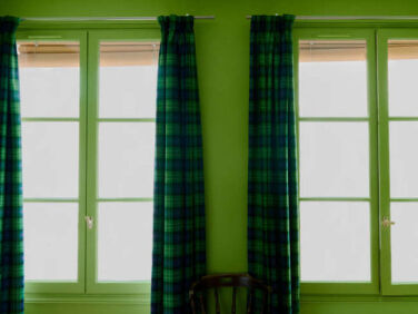
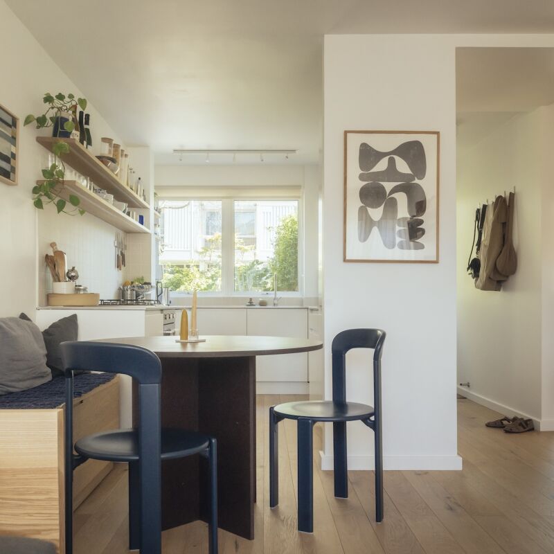
The architects applied a rigorous assessment of the 55 square meters (less than 600 square feet), and suggested flipping the locations of the bathroom and kitchen to open up the latter to the living space and give each a fresh guise. As a rescue measure, they recommended built-in storage (scroll to the end for a glimpse of the mess that was). And, as a finishing touch, they prescribed joie-de-vivre: checks and plaids for every room, a wink to both the 18th-century building’s rustic history and Stephen’s Irish origins. Stephen himself took the theme to the next level insisting that his entire bedroom be green.
“There is no good project without a good client, and Stephen was the most open-minded client ever,” says Suleïma, who remembers visiting the apartment with her family as a little girl. The work enabled the moonlighting young architects to give up their day jobs and launch their firm, Studio Classico (@Studio_Classico, website in progress). Join us for a look at their first commission—and scroll to the end for links to a trio of the firm’s most recent projects.
Photography by Marvin Leuvrey and Charlotte Robin, courtesy of Studio Classico.

The apartment is set in a former coaching inn, part of France’s pre-railroad postal system, and retains its original herringbone oak floors visible here in the small front room, which Stephen uses as his office, den, library, and guest room. Note the reflective white surfaces and newly introduced glass partition between the rooms: for the architects “luminosity was a top priority.”


That’s the small fridge to the left of the sink: “Stephen lives alone and often eats out, so he didn’t feel he needed more.” The inset green shelves hold a very edited display—in dramatic contrast to what had been on display in the apartment before (see below).

The white walls throughout are painted Ventre de Biche (translation “Doe Belly”) from Tollens of Belgium.

Stephen reports that his former furniture was a hodgepodge of “gifted items and pieces purchased very cheaply from neighbors leaving the building.” The new desk, he says, was “an excellent investment as I spend much time here, translating and writing while giving the odd wave to friends and neighbors passing outside the window.”

The wardrobe is another of the architects’ designs, a sketch that they turned over to 127AF to fine-tune and fabricate. The chrome pulls, also used in the kitchen, are Œillet GM from Manufactor: “they’re discrete and comfortable, and they look like small keys,” says Suleïma


Stephen notes that the bathrooms in his building were, until recent decades, shared on each floor—he thinks the one in his apartment was installed in the 1970s or ’80s “consequently it was easy to break down the partitions and reshape the spaces, as no supporting pillars or outside walls were involved.”


Floor Plans


Before


Studio Classico has continued to produce eye-opening work. Here are three projects that they’ve completed since Stephen’s commission:
- A Porthole Passage and a Moving Bookcase: An Apartment Remodel for a Writer in Paris
- American-Style in Marseille: Studio Classico Designs a Shaker-Inspired Bakery
- A Room of One’s Own: An En Suite Retreat in Paris
Three more small Paris apartments that we love:
- Photographer Marie Hennechart’s DIY Studio Apartment Makeover in Montmartre
- Home at the Office: Designer Marianne Evenou’s Work Quarters and Pied-à-Terre
- Two Paris Architects Completely Redo Their Kitchen for Under $4,300
N.B.: This story originally ran as “Before/After: Order and Pattern in a Spirited Paris Apartment Remodel by Two Young Architects” on October 5, 2020; it has been updated with new content and information.
Frequently asked questions
What is the location of the apartment renovation project?
The apartment renovation project is located in Paris.
Who were the designers of the project?
The designers of the project were Suleima Ben Achour and Antoine Lallement from Studio Classico.
What type of apartment was renovated?
A one-bedroom apartment was renovated.
What was the overall design concept of the renovation?
The overall design concept of the renovation was to create a minimalist and timeless space with a mix of modern and classic elements.
What color scheme was used in the renovation?
A neutral color scheme was used in the renovation, with white, gray, and black being the primary colors.
What materials were used in the renovation?
The designers used a mix of materials, including oak flooring, marble, and brass accents.
What was the biggest challenge of the renovation?
The biggest challenge of the renovation was optimizing the small space while still retaining a sense of openness and light.
What was the most rewarding part of the renovation?
The most rewarding part of the renovation was seeing how the design made the small space feel larger and more open.


Have a Question or Comment About This Post?
Join the conversation