Curves and Cutouts An Inspired Apartment Building Update in Marseille portrait 2 Icon - Arrow LeftAn icon we use to indicate a rightwards action. Icon - Arrow RightAn icon we use to indicate a leftwards action. Icon - External LinkAn icon we use to indicate a button link is external. Icon - MessageThe icon we use to represent an email action. Icon - Down ChevronUsed to indicate a dropdown. Icon - CloseUsed to indicate a close action. Icon - Dropdown ArrowUsed to indicate a dropdown. Icon - Location PinUsed to showcase a location on a map. Icon - Zoom OutUsed to indicate a zoom out action on a map. Icon - Zoom InUsed to indicate a zoom in action on a map. Icon - SearchUsed to indicate a search action. Icon - EmailUsed to indicate an emai action. Icon - FacebookFacebooks brand mark for use in social sharing icons. flipboard Icon - InstagramInstagrams brand mark for use in social sharing icons. Icon - PinterestPinterests brand mark for use in social sharing icons. Icon - TwitterTwitters brand mark for use in social sharing icons. Icon - Check MarkA check mark for checkbox buttons.
You are reading

Curves and Cutouts: An Inspired Apartment Building Update in Marseille

Search

Curves and Cutouts: An Inspired Apartment Building Update in Marseille

January 16, 2026

Architects Suleïma Ben Achour and Antoine Lallement build joie-de-vivre into all of their designs. The two became collaborators as students at École Nationale d’Architecture de Paris la Villette and we have been avidly following their projects since graduation: see A Spirited Paris Apartment Remodel, A Porthole Passage and a Moving Bookcase, A Single Father’s Ensuite Retreat, and A Shaker-Inspired Bakery in Marseille

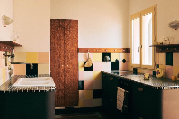
Suleïma runs Studio Classico of Paris and Marseille, and Antoine recently opened his own Marseille studio, Chapitre Architecture. Today, we’re visiting one of their latest joint commissions, the refurbishment of a modest, five-story, old apartment building in central Marseille for a client who planned to turn it into vacation rentals (but pivoted post-completion and sold the units). Working on a tight budget, Suleïma and Antoine aimed to be restrained in their structural interventions, while creating fully reinvented spaces that mingle practicality with playfulness.

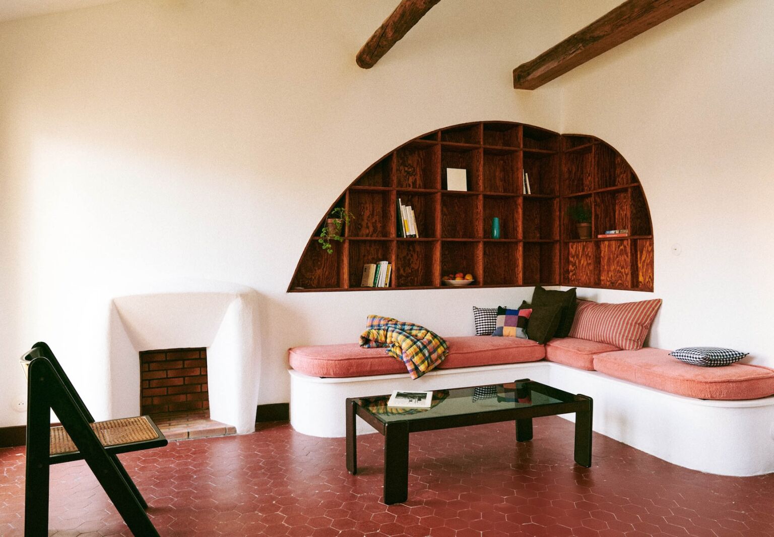
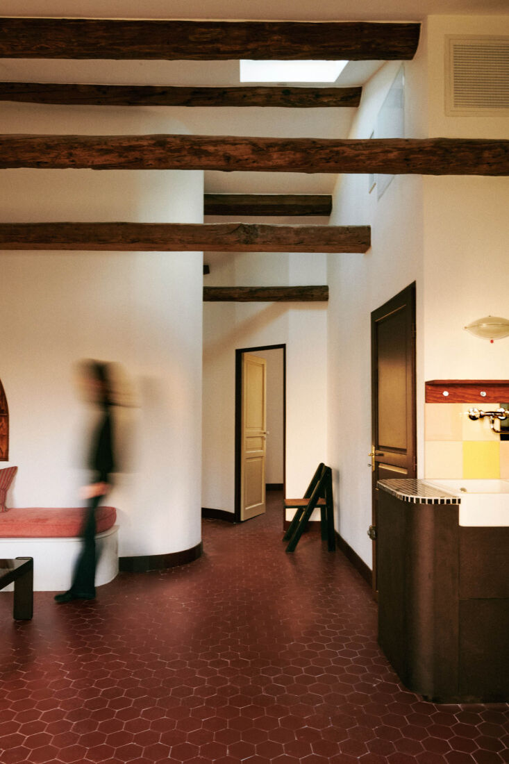
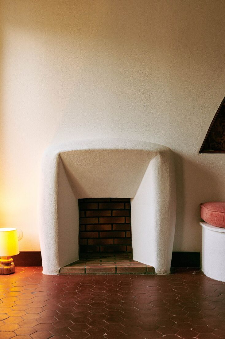
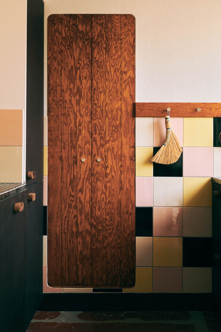
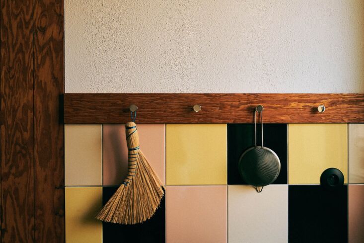
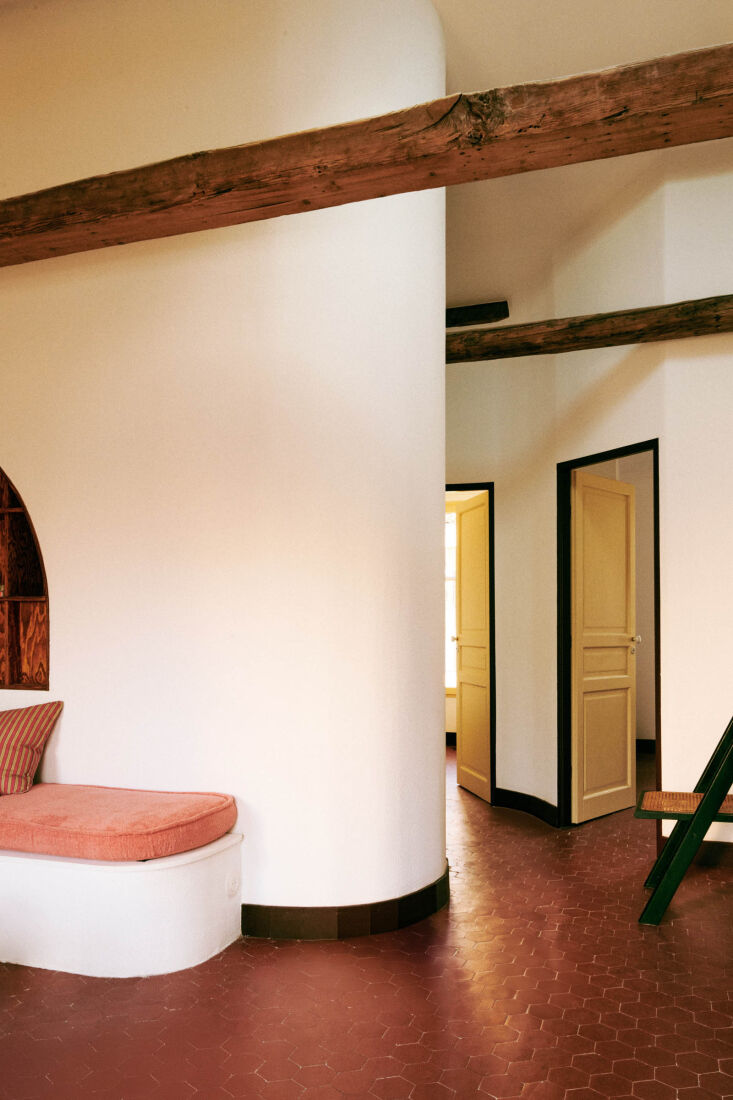
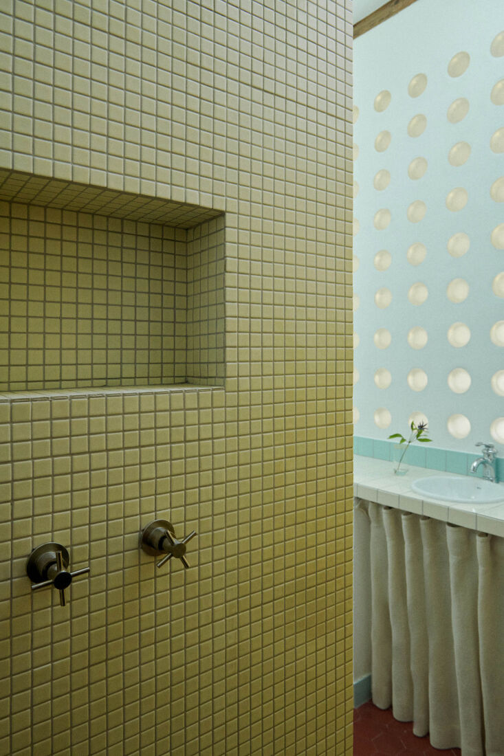
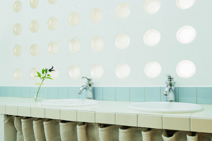
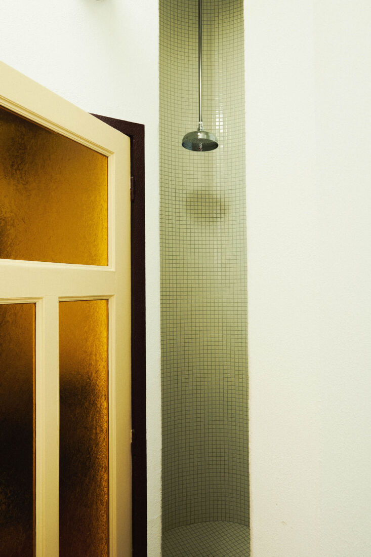
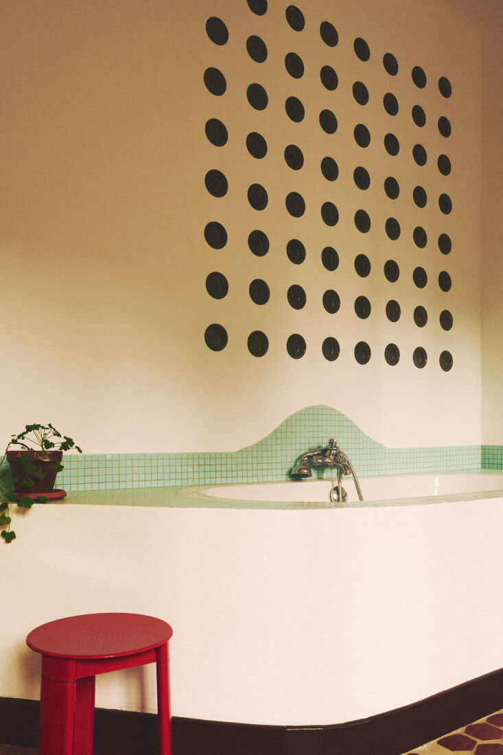
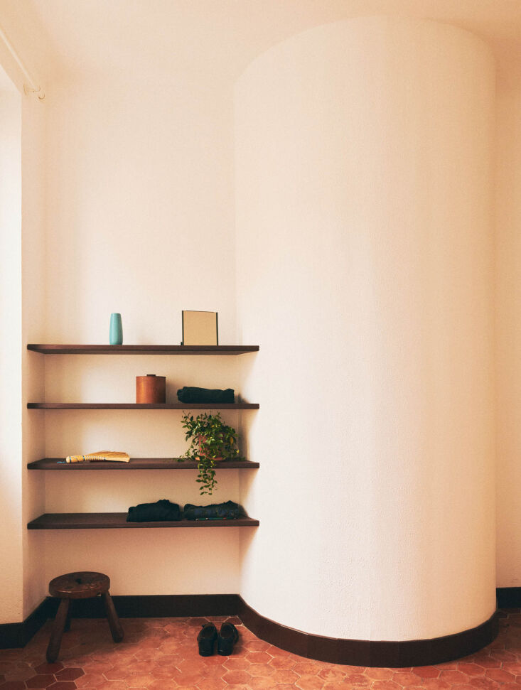
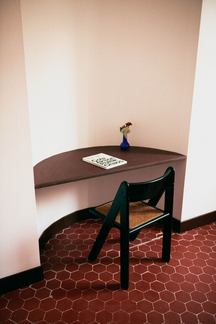
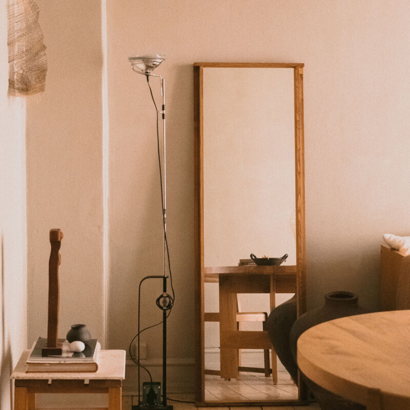
The two always celebrate craftsmanship in their work; in this case, they devised a design language that makes use of curves and circular cutouts to introduce light, ease of movement, built-in furniture, plus a lot of visual interest. Join us for a tour.

Photography by Marvin Leuvrey, courtesy of Studio Classico and Chapitre Architecture.

the front door to the attic opens to a living area and kitchen with tall ceilin 17
Above: The front door to the attic opens to a living area and kitchen with tall ceilings, newly exposed beams, and the original terracotta-tiled floors.
suleïma and antoine say original curves in the some of the apartments inspired 18
Above: Suleïma and Antoine say original curves in the some of the apartments inspired them to build in more. In the attic living room, Suleïma explains, “we took advantage of several existing recesses in the wall to create a sculptural corner library. It helps make this very high-ceilinged space feel more intimate, visually defining the area without closing it off or breaking the continuity of the room.”

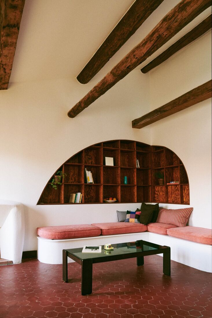
Marseille artist-upholsterer Rémi Marilleau supplied base cushions of terry toweling for the built-in banquette, as well as pillows and a throw stitched from new and vintage fabrics. The architects’ mason hand sculpted the plaster fireplace surround.

&#8\2\20;our approach is to work with simple, non luxurious materials—som 19
Above: “Our approach is to work with simple, non-luxurious materials—sometimes considered quite basic—and to use them in a very expressive way to create singular spaces,” writes Suleïma. Case in point: the graphically patterned tiles—from Ce.Si Ceramica’s Colori Collection—on the attic kitchen walls and counter. The cabinets are MDF finished with a Rubio oil in a “chocolate tone.”
a trim inspired by shaker peg rails &#8\2\20;visually frames the tiled area 20
Above: A trim inspired by Shaker peg rails “visually frames the tiled area while also serving as a rail for hanging objects and bringing a sense of life to the space,” says Suleïma. An existing recess became a built-in tall cabinet.
a closer look at the rail: the round metal knobs were sourced by the carpenter. 21
Above: A closer look at the rail: the round metal knobs were sourced by the carpenter.
in another kitchen in the building, a fresh approach using the same materials.  22
Above: In another kitchen in the building, a fresh approach using the same materials. The wall-mounted mixer faucet, €85.42, is from Euro-Négoce.
the walls throughout were painted in a white called pointing, the doors are yel 23
Above: The walls throughout were painted in a white called Pointing, the doors are Yellow Ground, and the door frames and baseboards are Cola, all from Farrow & Ball.
square tiles and round glass blocks in the attic bathroom. 24
Above: Square tiles and round glass blocks in the attic bathroom.
the glass blocks &#8\2\20;form a true wall of light,&#8\2\2\1; says sul 25
Above: The glass blocks “form a true wall of light,” says Suleïma, adding that the under-the-sink curtain is made out of a traditional Marseille door curtain fabric “designed to let air through while keeping insects out.” Sourced locally from the great home staples emporium Maison Empereur, the material was “chosen for its modest cost and interesting texture.”
the architects made clever use of the reverse side of the living room&#8\2\ 26
Above: The architects made clever use of the reverse side of the living room’s curved wall.
the attic&#8\2\17;s main bedroom has a built in bathtub. this is the revers 27
Above: The attic’s main bedroom has a built-in bathtub. This is the reverse side of the bathroom wall, and here, the glass inserts appear as a decorative pattern of dark circles. See more circular cutouts in Trend Alert: Perforations, Punctures, and Hole Punches.

Curious about the plastic tripod stool? It’s an Olaf von Bohr design from the 1970s. Beds had yet to be installed in the apartments, so are not pictured here.

a niche put to use as bedroom shelves. 28
Above: A niche put to use as bedroom shelves.
in another bedroom, a curved wall serves as a desk. 29
Above: In another bedroom, a curved wall serves as a desk.

Scroll to the top for links to more projects by Suleïma Ben Achour and Antoine Lallement.

More apartment ideas and inspirations:

(Visited 3,011 times, 379 visits today)
You need to login or register to view and manage your bookmarks.

Have a Question or Comment About This Post?

Join the conversation

v5.0