Renovating your home can be a time-consuming and expensive process (I should know; I’ve been slowly working on my 1880s house outside Boston for years now).
But you’d be surprised by how easy it is to refresh a room with just a few simple tweaks. I was reminded of this fact a few weeks ago when I volunteered to help a friend get her house ready for a party. Ostensibly, I was on hand to make the flower arrangements, but I couldn’t resist the urge to move a few things here and there. Before I knew it, we had completely transformed the look of the place, all within a couple of hours and without buying anything new.
None of the things I did would qualify as groundbreaking design, but what a difference it made. Sometimes even the simplest design tenets bear repeating.
1. Rehang your art.
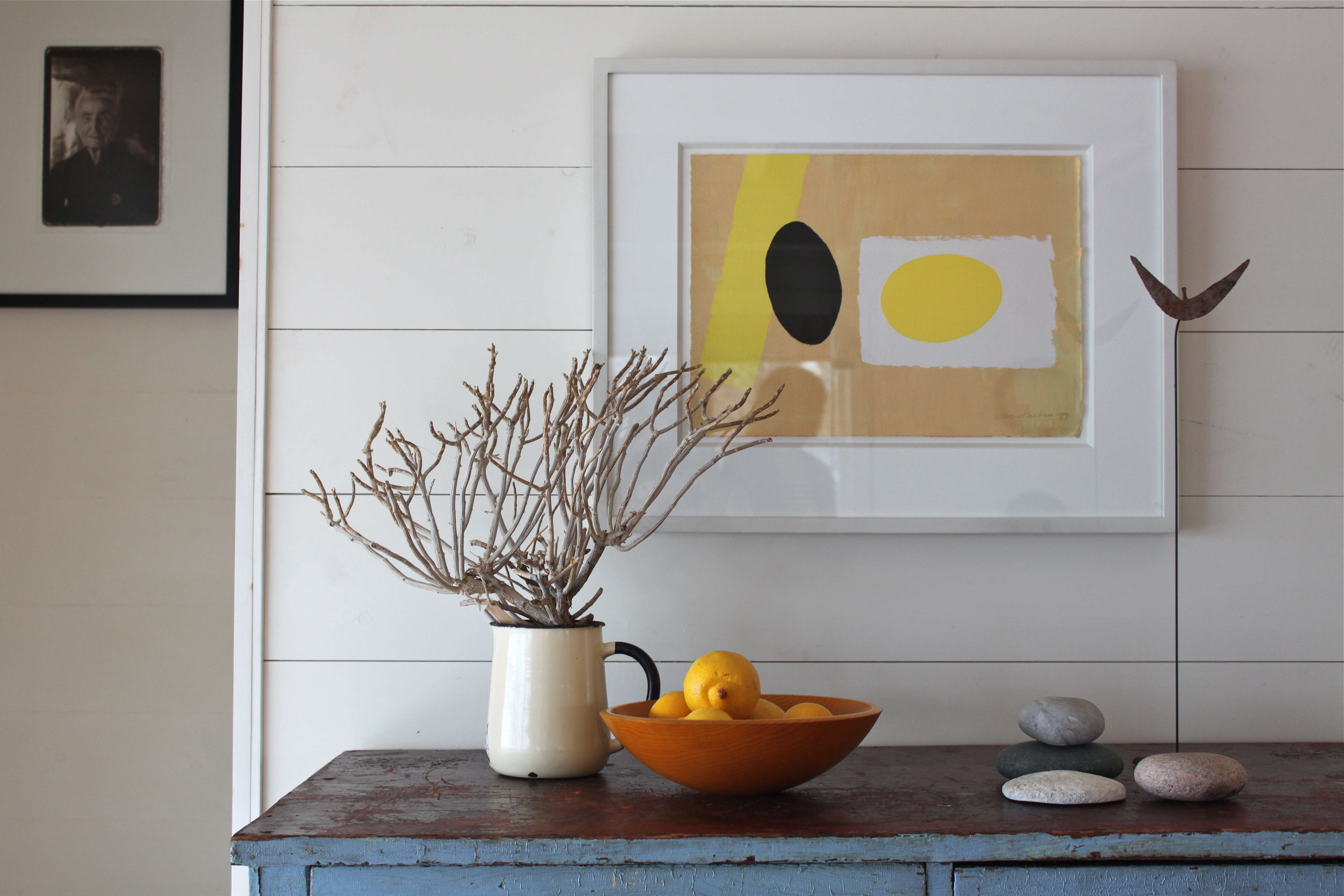
One of the most common design mistakes I see is art that is hung too high. Rule number one with art, it should “relate” to the object(s) around it. I subscribe to the idea that, generally, pictures should be at eye level; you should never have to look up to view art (unless it’s hung over a tall object). My aunt Sheila, an architect, uses her windows as a guide, hanging art so the middle of the pictures hangs in line with or only slightly above the center of the windows.
Since eye levels and window heights vary, another good principle is that art should be viewed as part of a larger composition. For example: If you are hanging a single piece over a desk, it should be hover over the desk, creating a dialogue between the two pieces. If you are positioning a piece over the couch and next to a tall floor lamp, it should rest in relation to both so that it balances out the composition of the three objects.
Another picture principle: Have you ever noticed that the catchiest tunes have recognizable patterns along with periods of rest and syncopation? The same maxim applies to good design. So instead of hanging a single work of art on each wall, compose a dramatic crescendo by grouping several pieces on one wall, while at the same time creating periods of rest by leaving other walls blank.
2. Give your furniture room to breathe.

As with pictures, with furniture the goal is to craft harmonious relationships within a space. Create more of a conscious grouping by pulling furniture away from walls and out of corners. You will notice a greater sense of intimacy within the space, as well as an airier quality.
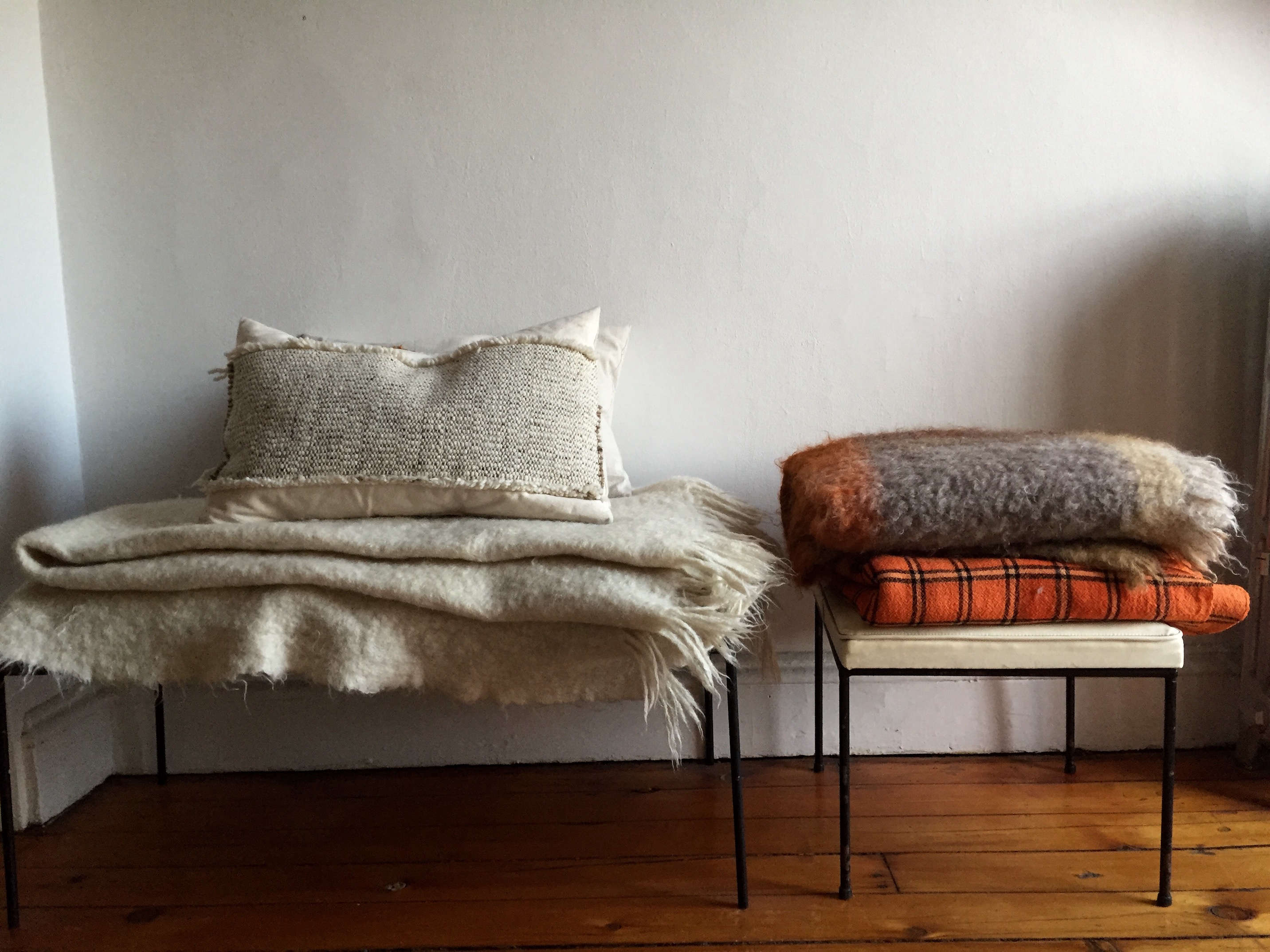
3. Apply circular thinking.

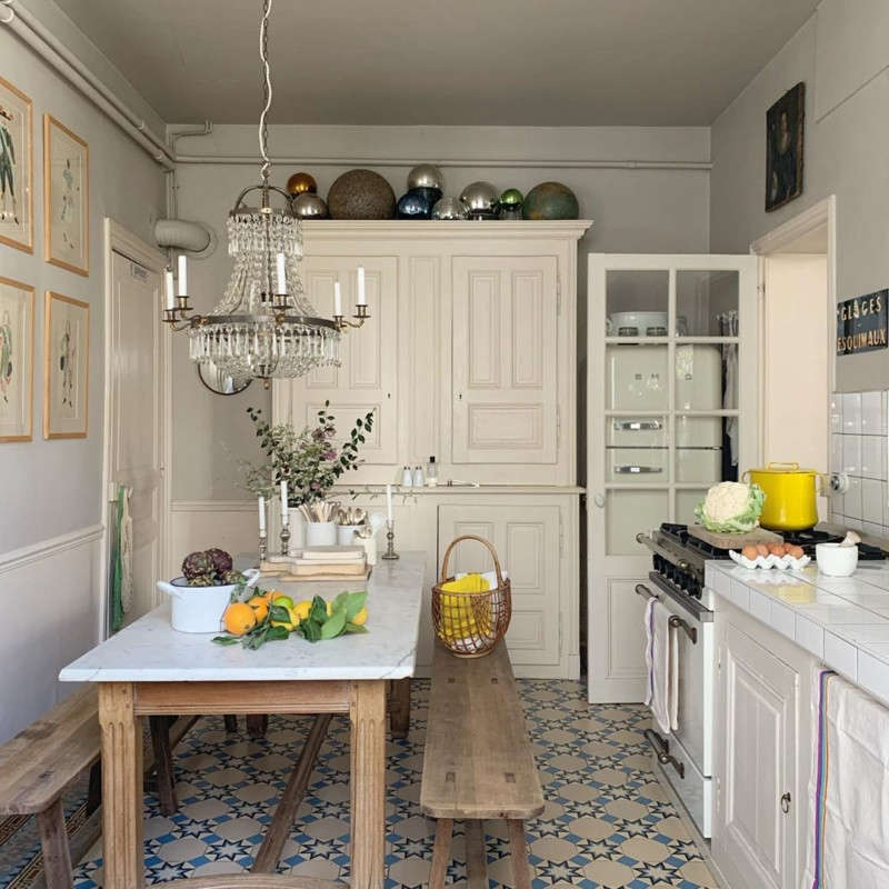
As a former dancer, I believe that all movement, or at least the energy created by motion, occurs within a series of circles, not as straight lines (kind of like the image of Da Vinci’s Vitruvian Man). The same can be said with design. When arranging your furniture, you can create a similar circular dynamic, not by literally placing pieces in a real orb, but by imagining that each is held in place by a kind a centrifugal force. (Note that this concept also works on the horizontal plane. Can you see how the objects in the picture below create a cyclical effect?)
4. Create visual transitions.

Anyone with small children knows how hard transitions can be. That’s why teachers today give five-minute warnings. Harmonious design also involves what I call “transitional” pieces, items that ease the eye’s transition from one level to the next. A spindle-back chair adjacent to a tall armoire or even a pile of books placed beside the bed can serve as transitional objects. At my friend’s house, for example, I created a transitional object by adding a smaller basket next to a chair to create a sense of flow.
5. Revisit your attic.

You never want your home to look too new or too generic. Unearth old items—battered pieces, an old chair, your grandmother’s vase, even an empty frame with a rich patina—and use them to add character to your surroundings. You can even pick up something off the street, as long as it adds a contrarian element to your home. (On the flip side, if your home is all antiques, consider introducing something modern.)
6. Add greens.

Every room benefits from a fresh garden arrangement, but it doesn’t have to be flowers. I am just as likely to liven up a place with a sweeping branch or aromatic bunch of bay leaves. In the winter, evergreens and rhododendrons provide an unexpected bit of greenery. I don’t even dismiss the weeds. Grasses add texture and a breezy aspect.
7. Add white accents.

If you’re a regular Remodelista reader, chances are good that you already embrace white. But I’m amazed at how many other people I meet are phobic (maybe they think white is too cold or impersonal). I find it clean and soothing. Even just a touch goes a long way.
For my friends who seem shy about white, I’ve often gone through linen drawers in search of a crisp napkin that could enliven a dull dresser. I’ve used sun-bleached shells and white beach stones and even a roll of paper across the dining table as a means of introducing some bright, refreshing white.
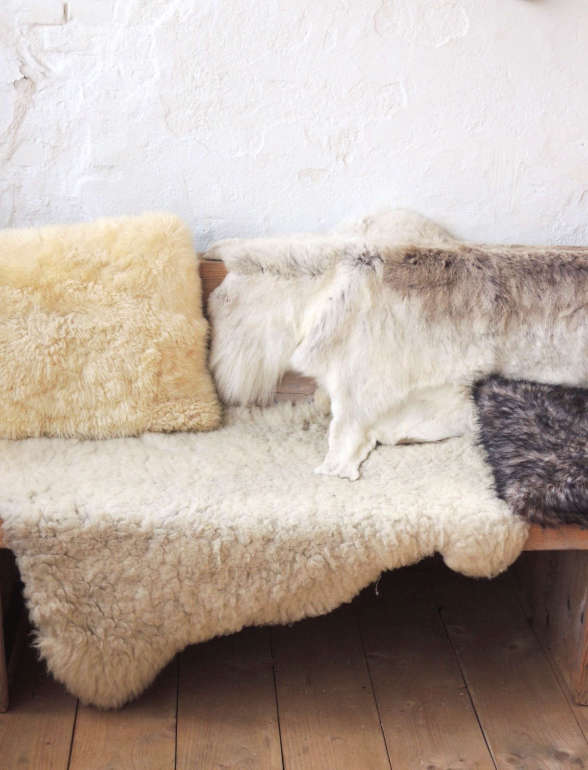
8. Texturize.
Back in 1997, Ilse Crawford’s book The Sensual Home was a real eye-opener for me. Her mantra? Texture, even more than color, is key to creating a space that is warm and engaging. And it’s pretty easy to find texture already lurking in your home. You just need to dig it out. Liberate the cutting board from under the cabinet and rest it in plain sight on the counter. In your entryway, place a neat pile of your favorite fuzzy scarves on a chair next to a walking stick you found in the woods. Leave your leather riding boots out. Or your Wellies. Gather stones. In my friend’s house, I dug out an old basket (remember that “transitional object”?) and filled it with her knitting.
9. Don’t ignore the elephant in the room; tame it.
Most of us are living with pieces we don’t love because we simply don’t have the money or inclination to replace them. My friend was grinning and bearing a worn brown sectional behemoth because she didn’t want to spend the money to get a new couch “that was just going to get ruined by the kids and the dog.” Fair enough. Luckily, a chunky white throw tossed over the back and some white pillows did a lot to break up the monotony of the piece. An ugly dresser can usually be resurrected with paint. You can toss a sheet or a painter’s drop cloth over virtually any sofa, chair, or table (I even swathed a bad brass pendant in my dining room in a gossamer bed skirt). Also consider Swedish company Bemz, which has made a business of Ikea hacking. Their line of linen slipcovers in sophisticated hues take many of this megastore’s favorites from generic to genius. (See 5 Companies That Make It Easy to Upgrade Your Ikea Sofa.)
10. Regroup.

Introduce balance and harmony into your home by taking a moment to organize yourself and your things. Straighten the books on the shelf. Tuck odds and ends away in an artful box. Like you did with your art, you can group like things for visual impact. And consider those useful items that are pretty enough to be displayed in the open.
11. Don’t forget to break the rules and use your imagination.

Remember how I mentioned syncopation? Just as in music, the best design is never too predictable, so feel free to break the rules above and surprise people. Hang one piece of art way out in left field. Go monochromatic. Get crazy. But when you do, make sure that you are “intentional” about how and when you do it. Then you’ll look like a genius.
Want more easy, low-cost home improvements? Try burlap with DIY Rope as Curtain Rod or wallpaper with Emma Cassi’s DIY Wallpaper Headboard.
N.B.: This post is an update; the original story ran on September 16, 2014.


Have a Question or Comment About This Post?
Join the conversation