At Remodelista, we’re longtime devotees of UK premium paint brand Farrow & Ball. Why the love? Farrow & Ball colors are among the most complex we’ve seen, they’re low-VOC, and they’re made with rich pigments using original formulations. The well-edited collection is limited to 132 hues, each with a whimsical name—”Mole’s Breath,” for example—that tells a story grounded in personal anecdotes and real places.
Since the company was founded in 1946, Farrow & Ball paint has been made in a factory in Dorset, England. Today, in honor of its 70th anniversary, the company is releasing nine new colors developed over the past three years, each available in a full range of interior and exterior finishes.
For the next nine days on Instagram, a coterie of Farrow & Ball ambassadors—Remodelista included—will share a favorite new color; follow Farrow & Ball for inspiration.
And in the coming months, Remodelista editor in chief Julie Carlson will be using Farrow & Ball’s nine new colors in her own home. Stay tuned.
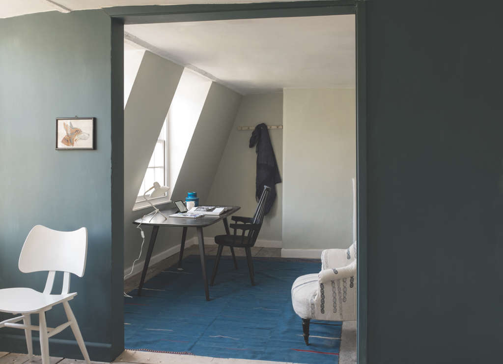
Above: Inchyra Blue is named for the exterior doors of a Georgian house in Scotland, painted in a complex blue to complement the moody Scottish skies. Farrow & Ball color consultant Joa Studholme says, “It may read as gray or even green to some people; it’s perfect for use both in contemporary homes and traditional exteriors.”
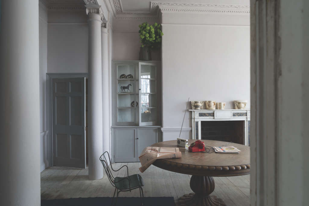
Above: Gray-pink Peignoir is Farrow & Ball at its finest: a subtle hue that morphs with the changing light. Peignoir is inspired by the color of chiffon dressing gowns popular in the mid-20th century. It is “the softest of pinks with a great big dose of gray.”
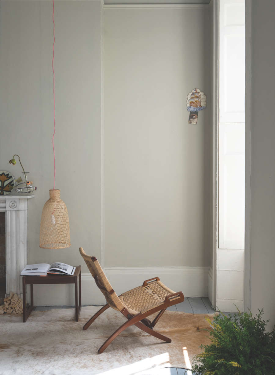
Above: Named for the small outer lobby of a drawing room, Salon Drab is “a classic 19th-century warm drab.” Shown here in a room with millwork painted Yeabridge Green, Farrow & Ball notes that Salon Drab works especially well with neutrals rooted in red or yellow.
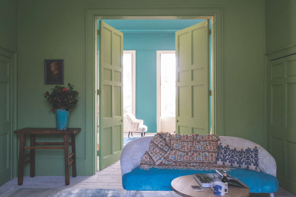
Above: Yeabridge Green is “the most uncomplicated of the Farrow & Ball greens,” named for the Georgian farmhouse in Somerset, where it was discovered.
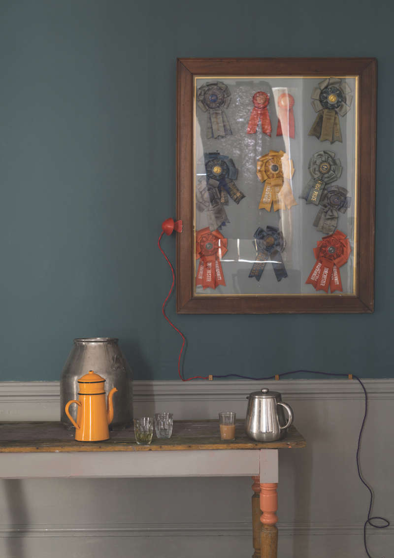
Above: Named after the Norfolk village known for producing worsted suiting fabric, Worsted is a color that “sits happily between the popular but lighter Purbeck Stone and the slightly stronger Mole’s Breath,” according to the F&B colorists. It’s shown here in a room with walls painted Inchyra Blue.
Above: A vardo is a Romany wagon, known in the mid-19th century for its flamboyant decorative colors. Farrow & Ball’s Vardo is “a color full of life and joy,” recommended as an elegant counterpoint to light grays; it is “super sexy” when paired with darks.
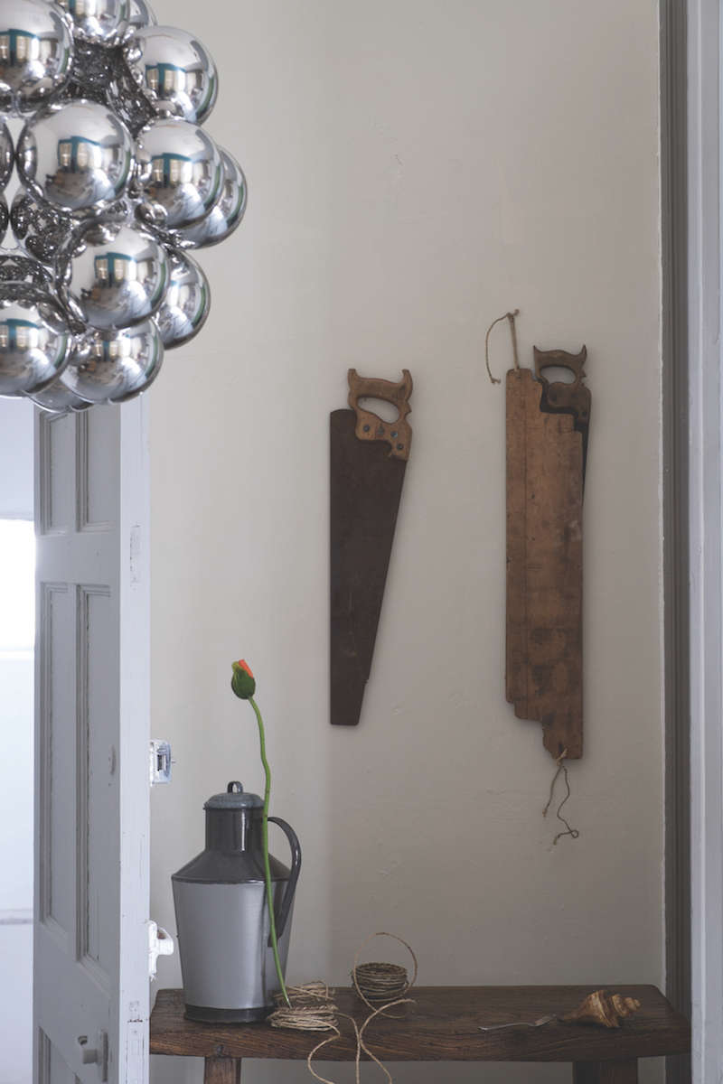
Above: Shadow White is a lighter version of the popular Shaded White, without the yellow overtones of Slipper Satin. “It has no yellow undertone, but also doesn’t read as overtly gray.”
Above: Drop Cloth is a color named for one of our favorite products of all time: the humble painter’s drop cloth. “It’s a nod to all those loyal painters who have flown the Farrow & Ball flag for so long.” Along with Shaded White and Shadow White, Drop Cloth is the darkest “in a trio of colors that are so easy to use in any style of home.”
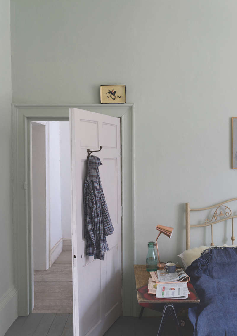
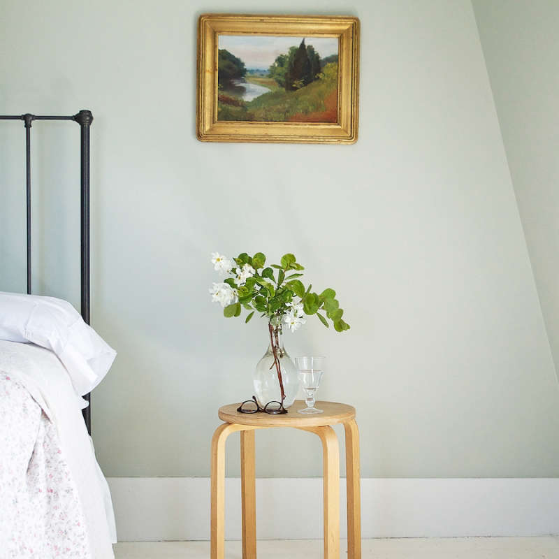
Above: Cromarty is inspired by the “swirling mists and sea” of Scotland’s Cromarty Firth estuary. It is in the same family as, but lighter than, Pigeon and Mizzle; a soft color for rooms “which are neither too blue nor too gray.”
Which is our favorite? Follow Farrow & Ball on Instagram to find out.




Have a Question or Comment About This Post?
Join the conversation