Icon - Arrow LeftAn icon we use to indicate a rightwards action. Icon - Arrow RightAn icon we use to indicate a leftwards action. Icon - External LinkAn icon we use to indicate a button link is external. Icon - MessageThe icon we use to represent an email action. Icon - Down ChevronUsed to indicate a dropdown. Icon - CloseUsed to indicate a close action. Icon - Dropdown ArrowUsed to indicate a dropdown. Icon - Location PinUsed to showcase a location on a map. Icon - Zoom OutUsed to indicate a zoom out action on a map. Icon - Zoom InUsed to indicate a zoom in action on a map. Icon - SearchUsed to indicate a search action. Icon - EmailUsed to indicate an emai action. Icon - FacebookFacebooks brand mark for use in social sharing icons. flipboard Icon - InstagramInstagrams brand mark for use in social sharing icons. Icon - PinterestPinterests brand mark for use in social sharing icons. Icon - TwitterTwitters brand mark for use in social sharing icons. Icon - Check MarkA check mark for checkbox buttons.
You are reading

Narrow Escape: Thoughtful Storage and Design in an Architect’s Small Home

Search

Narrow Escape: Thoughtful Storage and Design in an Architect’s Small Home

January 18, 2022

Architects are commissioned to work on projects both large and modest, but when it comes to their own homes, they, on the whole, prefer small. The challenge of figuring out how to make a tiny space functional and beautiful, it seems, is irresistible to this group of creatives. So when we came across this cleverly designed sliver of a home for a family of four, we weren’t surprised to learn that it belonged to an architect.

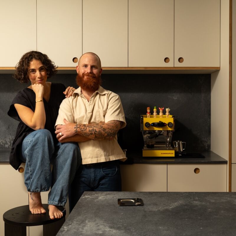
Victoria D’Alisa is the director of Porebski Architects, a Sydney-based firm founded by her father, and her slim two-story home is in the historical neighborhood of Paddington, famous for its Victorian-era houses fronted with cast-iron terraces (New Orleans-style). “All the facades of the terraces have been kept intact,” she says. “But a lot [of the homes] have had some interesting rear modifications to maximize light and space as the sites are generally long and narrow.”

This is exactly what D’Alisa did with her own 1890s Victorian. The first floor of the building is just 645 square feet, the second floor even less. Yet, her home, which enjoys windows on only two sides (front and back), feels light and airy and entirely capable of containing the stuff of life with two young children.

Ready to see how she did it? Join us for a tour.

Photographs by Tom Ferguson, courtesy of Porebski Architects.

the exterior of the building was freshened up and restored to its original look 17
Above: The exterior of the building was freshened up and restored to its original look. D’Alisa had the lacy cast-iron railing and terrace repaired, and the sandstone steps unearthed.
a painting by australian artist ben milne in the entryway. the d&#8\2\17;al 18
Above: A painting by Australian artist Ben Milne in the entryway. The D’Alisas bought the home in 2012 and renovated it in two parts, starting with the upstairs, where the bedrooms are. The downstairs renovation was completed just last year.
classic mid century pieces animate the living room, including an eames lounge c 19
Above: Classic mid-century pieces animate the living room, including an Eames Lounge Chair, a Louis Poulsen PH5 Pendant Lamp, and the Barcelona Table by Mies van der Rohe. The Longreach Sofa is from Thonet NZ, the rug by Nanimarquina.
the view from the dining room into the living room and entrance. these two fron 20
Above: The view from the dining room into the living room and entrance. These two front rooms are part of the original building. A Heavy Metal Pendant by Buster+Punch hangs over the dining table.
built in storage, wherever you can fit it, is crucial for organized living in a 21
Above: Built-in storage, wherever you can fit it, is crucial for organized living in a small home. D’Alisa had the floating shelves and cabinets here painted white for a cohesive look. The Marcel Breuer Cesca Chairs in the dining room were “handed down from my parents who bought them over 40 years ago,” she shares.
the view into the kitchen, in the home&#8\2\17;s addition, and beyond. a wa 22
Above: The view into the kitchen, in the home’s addition, and beyond. A washer and dryer are concealed behind the doors to the left, directly across from the stove and sink area. Also along that wall is a powder room.
the compact powder room just off the kitchen. 23
Above: The compact powder room just off the kitchen.
savoy light marble was used for both the counters and blacksplash for uniformit 24
Above: Savoy light marble was used for both the counters and blacksplash for uniformity (it’s also used for the sink console in the powder room). An integrated refrigerator is to the left; to the right is an appliance cupboard.
d&#8\2\17;alisa turned the awkward space between the paneled refrigerator a 25
Above: D’Alisa turned the awkward space between the paneled refrigerator and upper cabinets into narrow open shelves for cookbooks. The faucets are from Brodware’s City Stik collection.
skylights in the kitchen and this oversized glass sliding door offer an abundan 26
Above: Skylights in the kitchen and this oversized glass sliding door offer an abundance of natural light.
a painting by rocco fazzari hangs above the reading nook. the built in drawers  27
Above: A painting by Rocco Fazzari hangs above the reading nook. The built-in drawers store the kids’ crafting supplies. The sconce is the Collide Wall Light by Rotaliana.
one of the three bedrooms on the second floor. note the wall of built in closet 28
Above: One of the three bedrooms on the second floor. Note the wall of built-in closets surrounding the original fireplace. D’Alisa opted to paint the mantel but kept the green tiles as is; artwork by David Rose and a throw by Wallace & Sewell inject even more color into the white room.
previously, the patio could be accessed only via a side door. now, the sliding  29
Above: Previously, the patio could be accessed only via a side door. Now, the sliding door in the kitchen allows for easy flow between indoors and out. A muted palette continues in the patio thanks to limestone pavers, cream-colored brick, and a painted wood-clad shed.
the patio is d&#8\2\17;alisa&#8\2\17;s favorite part of the project. sh 30
Above: The patio is D’Alisa’s favorite part of the project. She had originally thought about excavating it so that it could be flush with the kitchen, but, loathe to uproot the magnolia tree on the property, she ultimately decided against that plan. Besides, “the difference in levels provides an intimate perspective and makes way for the cozy reading corner—a valuable space off the kitchen that is used all the time,” she says.

For more small homes we love, see:

(Visited 2,103 times, 2 visits today)
You need to login or register to view and manage your bookmarks.

Have a Question or Comment About This Post?

Join the conversation

v5.0