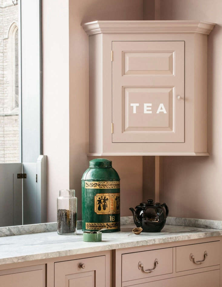
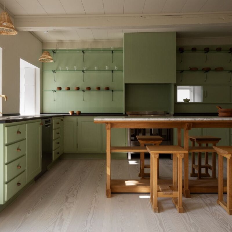
One of our favorite UK kitchen design outfits, Plain English, has teamed up with one of our favorite UK designers, Rita Konig, on a new range of bold paint colors, a dozen in all, which are designed to work in groups of three: an under-the-counter color, a wall color, and an upper cabinet color. We were so taken with the collection that we asked Rita and her Plain English collaborators, co-founder and creative director Katie Fontana and color consultant Kate Shaw, to tell us more. Read on for our Q & A:


- Remodelista: Fill us in; what was the creative process for determining the palette?
- Rita Konig: We started out by getting together with our own inspirations. Mine were images of rooms I admired and paint swatches that I had collected over the years. Kate Shaw’s were mostly objects. What was quite funny is that we produced out of our respective packages very similar colors. We then started putting the colors together in palettes, working in threes to see how they worked together—that was really the guiding principle and inspiration, because when designing a kitchen you often work with multiple colors.
- Kate Shaw: Having revisited the 24 existing colors in the previous Plain English collections, we started a dialogue around what colors we felt were missing. We created a sort of “nature table” of found objects, including stones, fabric fragments, ceramics, and shared our favorite images. Very quickly we came up with 12 colors that we wanted to create.

- Remodelista: Was there a particular historical moment you looked to for inspiration? Or were you aiming for something more modern?
- Rita Konig: I think a bit of both. Given the Georgian style of Plain English and their “behind the green baize door” and “below stairs” vibe I suppose there was a leaning toward prewar/Downtown Abbey domestic quarters. But I was also thinking about using the colors now, and I was looking for something new and fresh.
- Kate Shaw: The colors were all initially created using gauche—traditional pigments, Raw Sienna, Prussian Blue, and Red Ochre. In many ways this mimicked the way the Georgians would create paint colors, as this was all that was available at the time. As a result the colors have a distinct, complex feel with a nod to the past.
- Katie Fontana: There was a definite sense of capturing the past. I was very interested in recreating the tones that timeworn, soft-faded utilitarian fabrics take on.
RM: Advice for the timid?
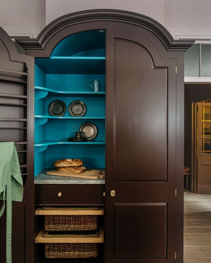
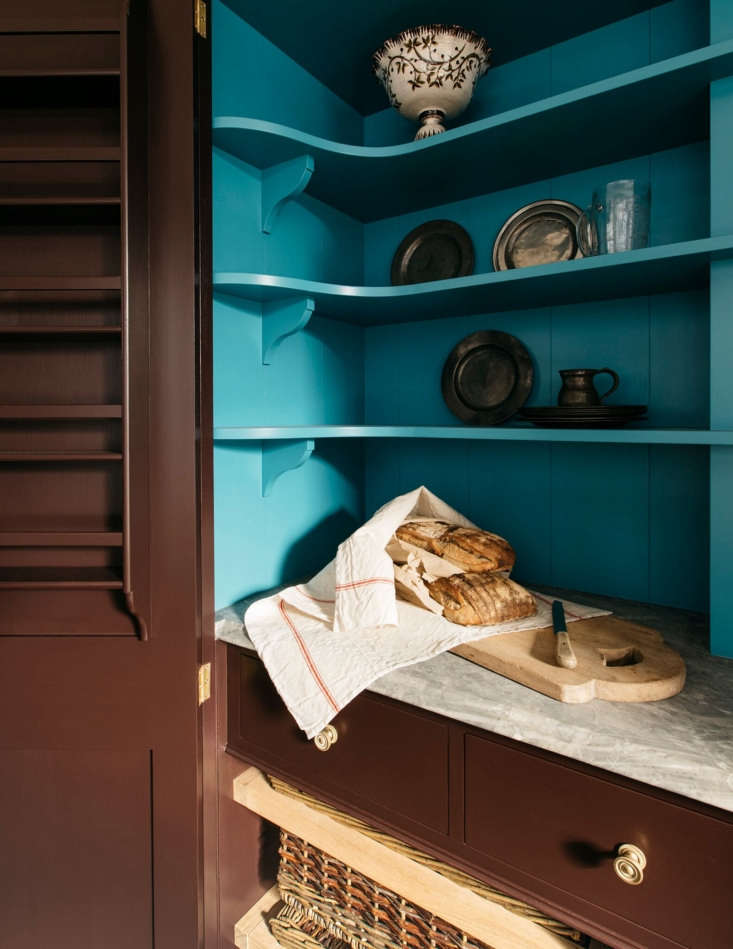
RK: Painting the inside of the cupboard is one strategy, but it is slightly hiding one’s light under a bushel! However, it is glorious when you see something like the Dutch cupboard at Plain English painted in a contrast color inside, but I am not sure I would bother with your standard upper cupboard. One of the things that Plain English does is to paint kitchen chairs or stools in a bright color—you see that a lot in their kitchens, and it is so much fun (and of course if said shy client found it overwhelming they can be repainted). Also, there is a middle ground between a white kitchen and a very strong/colorful kitchen. Burnt Toast is the sort of color that disappears, so if you painted your work table in Burnt Toast and the rest in something more subdued, that would be an option. Color also doesn’t have to come via the paint. For nervous passengers, I like to suggest using objects to bring in color—books spines in the shelves, flowers and plants, china and glass, a lot of the things in a kitchen bring color.

Interested in more color inspiration?
General Paints Group: An Irish Heritage Paint Line Comes to the US
Nine New Paint Colors from Farrow & Ball: A Color Field Trip with Zio and Sons
10 Paint Colors with Cult Followings: Architects’ All-Time Favorite Paint Picks
Have a Question or Comment About This Post?
Join the conversation