Icon - Arrow LeftAn icon we use to indicate a rightwards action. Icon - Arrow RightAn icon we use to indicate a leftwards action. Icon - External LinkAn icon we use to indicate a button link is external. Icon - MessageThe icon we use to represent an email action. Icon - Down ChevronUsed to indicate a dropdown. Icon - CloseUsed to indicate a close action. Icon - Dropdown ArrowUsed to indicate a dropdown. Icon - Location PinUsed to showcase a location on a map. Icon - Zoom OutUsed to indicate a zoom out action on a map. Icon - Zoom InUsed to indicate a zoom in action on a map. Icon - SearchUsed to indicate a search action. Icon - EmailUsed to indicate an emai action. Icon - FacebookFacebooks brand mark for use in social sharing icons. flipboard Icon - InstagramInstagrams brand mark for use in social sharing icons. Icon - PinterestPinterests brand mark for use in social sharing icons. Icon - TwitterTwitters brand mark for use in social sharing icons. Icon - Check MarkA check mark for checkbox buttons.
You are reading

7 Design Lessons to Borrow from Juno Eatery in Australia

Search

7 Design Lessons to Borrow from Juno Eatery in Australia

September 14, 2022

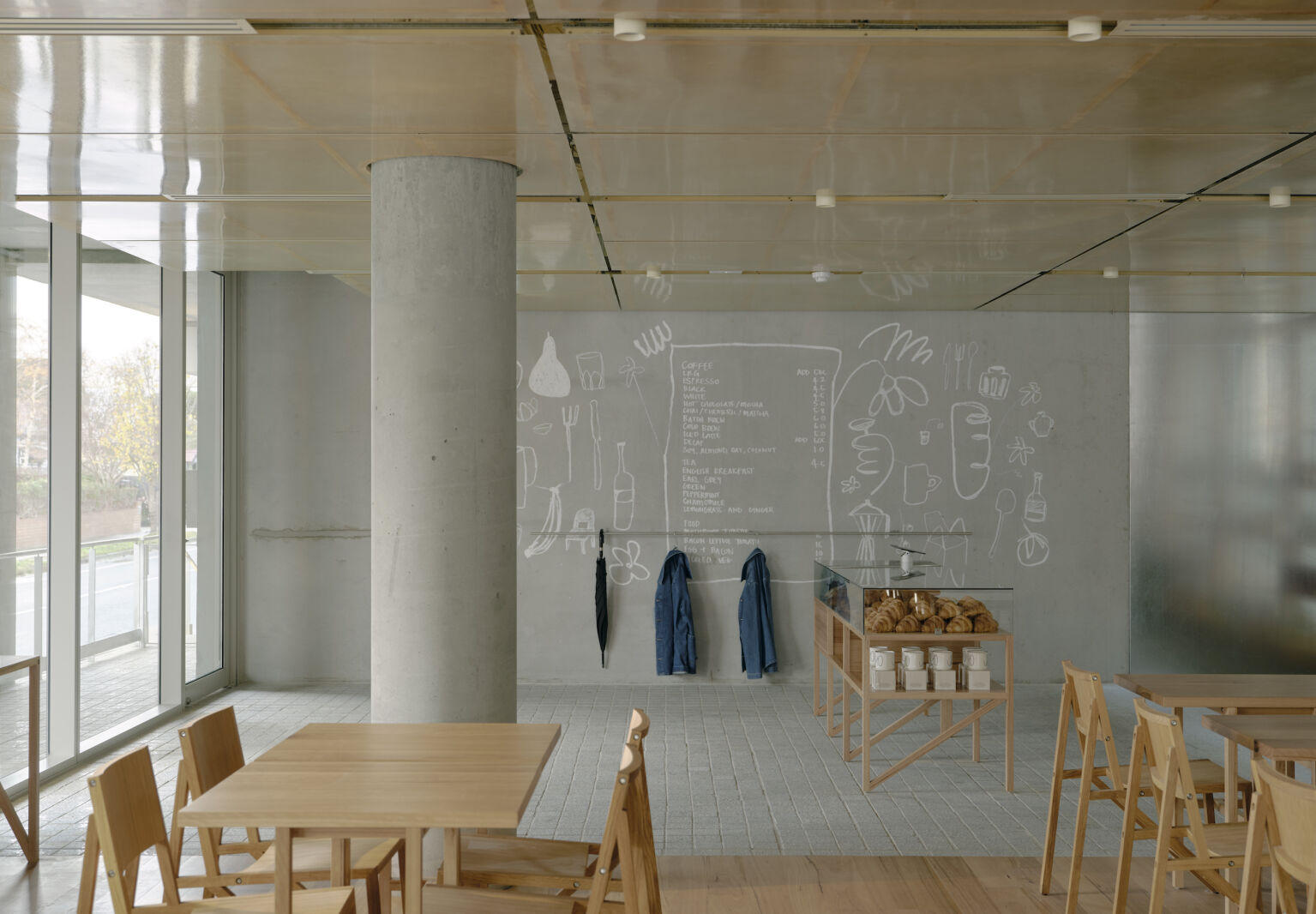
For the team behind Juno in McKinnon, Australia, one question is central. “Can a great local cafe rejuvenate a community?” they ask on their site. “We think so.”

For them, this sense of renewal comes through on the plate, with house-made jams, a “local produce policy,” and Aussie-casual-cool dishes like avocado on sourdough and green juices with bee pollen. But it’s also felt in the space itself.

The eatery is housed on the ground floor of a concrete-clad apartment building designed by Ritz & Ghougassian, and the Juno team enlisted the same firm to fit the interiors. “Not many people are trying to over-design cafes [because] the average spend is so much lower than a restaurant,” owner Ahmed Mekawy told Broadsheet. But, he added, “We’re trying to create something beautiful.”

The result is a lesson in spare interiors that feel cool, laid-back, and anything but cold. Come see.

Photography courtesy of Juno.

1. Arrange the pantry like a boutique.

in the entrance to juno, &#8\2\20;mind bending&#8\2\2\1; house made jam 17
Above: In the entrance to Juno, “mind-bending” house-made jams and confitures and other provisions are displayed with elegance.
pastries and fresh bread get a jewelry case treatment. 18
Above: Pastries and fresh bread get a jewelry-case treatment.

2. Draw on the walls.

chalk illustrations by artist bobby clark add a sense of play to the concrete a 19
Above: Chalk illustrations by artist Bobby Clark add a sense of play to the concrete and clean lines.

3. Call on repeating forms.

ritz & ghougassian told james richardson furniture they look for something  20
Above: Ritz & Ghougassian told James Richardson Furniture they look for something “authentic—i.e. not a ‘copy'” in choosing furnishings for hospitality projects. For Juno, they chose spare, angular tables and Wouter Scheublin’s Frame Chairs from Established & Sons.

4. Enlist double-duty dividers.

a minimal bar doubles as bench seating. 21
Above: A minimal bar doubles as bench seating.

5. Conceal, cleanly.

Above: Fiberglass and timber panels surround the space. Behind the bar, they slide open to reveal storage for dishes and glassware.

6. Add a bit of gloss.

the plexi—on the walls and ceiling—also amplifies the natural lig 24
Above: The plexi—on the walls and ceiling—also amplifies the natural light.

7. Don’t add.

there&#8\2\17;s nothing extra here. leaning into the building&#8\2\17;s 25
Above: There’s nothing extra here. Leaning into the building’s concrete frame and minimal forms, the team committed to clean lines—and resisted any urge to add more.
the commitment to minimalism even continues into the wc. 26
Above: The commitment to minimalism even continues into the WC.

For more Down Under, see:

(Visited 719 times, 1 visits today)
You need to login or register to view and manage your bookmarks.

Have a Question or Comment About This Post?

Join the conversation

v5.0