Icon - Arrow LeftAn icon we use to indicate a rightwards action. Icon - Arrow RightAn icon we use to indicate a leftwards action. Icon - External LinkAn icon we use to indicate a button link is external. Icon - MessageThe icon we use to represent an email action. Icon - Down ChevronUsed to indicate a dropdown. Icon - CloseUsed to indicate a close action. Icon - Dropdown ArrowUsed to indicate a dropdown. Icon - Location PinUsed to showcase a location on a map. Icon - Zoom OutUsed to indicate a zoom out action on a map. Icon - Zoom InUsed to indicate a zoom in action on a map. Icon - SearchUsed to indicate a search action. Icon - EmailUsed to indicate an emai action. Icon - FacebookFacebooks brand mark for use in social sharing icons. flipboard Icon - InstagramInstagrams brand mark for use in social sharing icons. Icon - PinterestPinterests brand mark for use in social sharing icons. Icon - TwitterTwitters brand mark for use in social sharing icons. Icon - Check MarkA check mark for checkbox buttons.
You are reading

Texture and Light: A Designer/Photographer’s Own Family House in the Netherlands, Revamped

Search

Texture and Light: A Designer/Photographer’s Own Family House in the Netherlands, Revamped

January 27, 2020

I read once a clever design tip: If you can’t figure out what to do with a room, photograph it. Something about stepping back and capturing the space as an image helps unlock even the trickiest of design conundrums. (I’ve tried it; it helps.)

Maybe it’s this dual visual sense that makes Holly Marder’s spaces so good. An interior designer and partner, with Hedda Pier, behind Avenue Design Studio in the Netherlands, Holly is also a photographer, and her eye for composition and interest is perhaps why the duo’s spaces are the sort I’d really like to live in: visually balanced but completely livable, structured but effortless, with lots of texture and design-forward finds mixed with Ikea.

And none more so than Holly’s own 1929 row house in Delft, on which she recently trained her designer-photographer lens. “We purchased it in November 2013 after a long hunt,” says Holly. “I wanted character, my husband wanted practicality. We met somewhere in the middle. It wasn’t love at first sight, but it was a good home for a growing family, and we could make it our own in time.”

As a first stage, Holly and her husband Dirk tackled the dark and slightly cramped downstairs living areas. Two structural changes—re-configuring a central staircase and expanding a light-filled back extension—opened up the narrow space. “The new layout makes so much more sense in terms of ‘flow,’ and has facilitated an open-plan, functional, and light-filled living room for myself and my family,” Holly says. (The couple has Lola, age eight; Pippa, almost one; and a cat named Binky.)

The second floor is next on the list; in the meantime, Holly says, it has a few “affordable cosmetic updates.” Curious, I asked if we could see a glimpse. No surprise, the upstairs is lovely as-is, though we’re eager to see what it looks like after the Avenue treatment.

Join us for a look, upstairs and down:
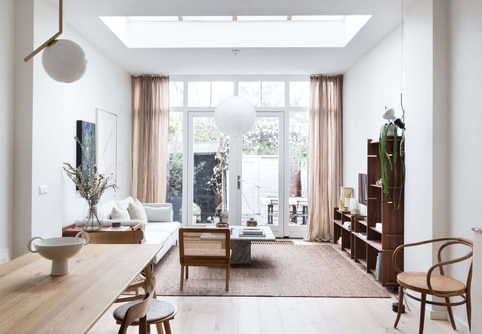
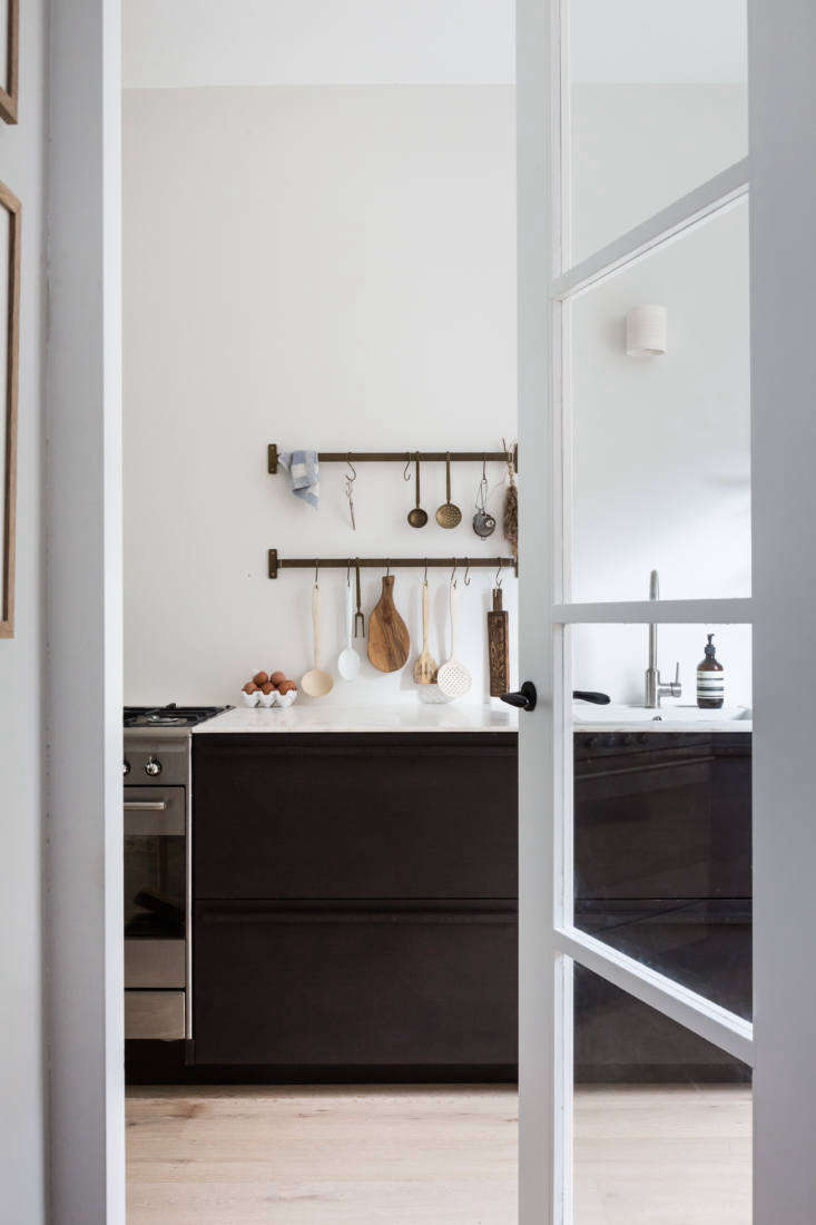
Downstairs

by shifting the entry and stairs just slightly, holly and dirk were able to acc 17
Above: By shifting the entry and stairs just slightly, Holly and Dirk were able to accommodate a longer, brighter kitchen. A glass-paneled door leads to the new space, fitted with a bamboo kitchen by Norwegian sustainable kitchen makers Ask og Eng.
Above: The kitchen is “maximum counter and storage space, minimum fuss,” according to the Avenue website.
the shifted layout allowed for a nook behind the door, fitted with nearly ceili 20
Above: The shifted layout allowed for a nook behind the door, fitted with nearly ceiling-high shelves and cabinets.
the shelves make a perfect spot to store ceramics. 21
Above: The shelves make a perfect spot to store ceramics.
at the other end of the kitchen, the l shaped counter ends in a peninsula that  22
Above: At the other end of the kitchen, the L-shaped counter ends in a peninsula that divides the cooking space from the rest of the downstairs. The mantel was existing, “but the pipes were closed off many years ago due to a previous extension upstairs,” Holly explains. “One of our plans is to reinstate it as a fireplace.”
the kitchen, off to the left of the frame here, opens into the dining area. (al 23
Above: The kitchen, off to the left of the frame here, opens into the dining area. (Also spotted: the reconfigured staircase, now L-shaped instead of straight, and Binky.)
the new dining area features charmingly mixed and matched chairs. 24
Above: The new dining area features charmingly mixed-and-matched chairs.
on the other side of the mantel, the parentesi suspension light adds an ar 25
Above: On the other side of the mantel, the Parentesi Suspension light adds an architectural element.
one of the largest structural changes involved the back of the house. &#8\2 26
Above: One of the largest structural changes involved the back of the house. “We removed an existing extension comprised of a laundry and a guest bathroom and utilized all of that space, which has now become the living room,” says Holly. The guest WC moved into a slim space opened up by shifting the staircase.

With the extension re-done, Holly opted for a full wall of glass doors and a large square skylight to flood the space with light.

the living room is a high/low mix: ikea&#8\2\17;s söderhamn sofa, a fa 27
Above: The living room is a high/low mix: Ikea’s Söderhamn sofa, a favorite of designers, with linen covers by Bemz (“the Brera Lino Natural by Designers Guild, a pre-washed linen, in the regular fit,” Holly says), a sculptural Noguchi-esque paper lantern, and a marble table, all on a natural-fiber rug that defines the space.
holly on her couch. the wheeled cart tucks right beside the couch when not in u 28
Above: Holly on her couch. The wheeled cart tucks right beside the couch when not in use.
the french doors lead to a small garden. on the floor is a good looking grate f 29
Above: The French doors lead to a small garden. On the floor is a good-looking grate for the convection heating.
at left is the layout before, with the mudroom and guest bath at the back of th 30
Above: At left is the layout before, with the mudroom and guest bath at the back of the house and the original straight staircase; the new one is at right, with the necessities cleverly slotted in by the entryway and a sense of expansiveness throughout.

Upstairs

a peek into the master bedroom. &#8\2\20;we applied some very quick and aff 31
Above: A peek into the master bedroom. “We applied some very quick and affordable cosmetic updates,” Holly says of the upstairs. “We painted the wooden floor boards fresh white, exposed the wooden beams in the bedroom, and gave the walls a lick of paint all over, but that was it.” A second-floor revamp is in the works. The grid-patterned sheets are from Magic Linen.
eight year old lola&#8\2\17;s bedroom is papered in tourbillon bp 32
Above: Eight-year-old Lola’s bedroom is papered in Tourbillon BP 4802, Farrow & Ball’s wallpaper. The colorful bedding is a mix: vintage floral sheet, red linen duvet from Zara Home, pom-pom pillow and striped fitted sheet from Magic Linen, and round felt pillow from Rafa Kids.
lola reads and binky looks on. 33
Above: Lola reads and Binky looks on.

More in the Netherlands:

(Visited 1,364 times, 1 visits today)
You need to login or register to view and manage your bookmarks.

Have a Question or Comment About This Post?

Join the conversation

v5.0