Happiness comes in many hues. That’s what we learned when we asked members of our Architect/Designer Directory for the cheeriest shades of paint that they use in their own rooms and clients’ homes. And as we took in their recommendations, we have to say, we couldn’t help but feel upbeat.
Photography by Meredith Swinehart.

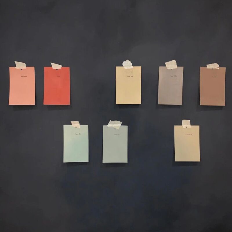
Above: Top row, left to right: Farrow & Ball Citron; Benjamin Moore Palest Pistachio; Farrow & Ball Pink Ground; Farrow & Ball Slipper Satin; and Benjamin Moore Piano Concerto. Bottom row: Benjamin Moore Quiet Moments; Benjamin Moore Pernod; Farrow & Ball Borrowed Light; Benjamin Moore Soft Pumpkin; and Farrow & Ball Arsenic.

Above: Kanan Prasse of Kanashree Interiors (formerly Ka.Va Design) in Brooklyn muses, “A happy place to me is a sunny courtyard with a lemon tree, and a happiness-inducing color is the bright yellow of ripe lemons.” Specifically, Prasse suggests Farrow & Ball Citron, noting that it would be great as a bold accent color on a door or trim.

Above: Larah Moravek of LVMinc in New York singles out Benjamin Moore’s Palest Pistachio, calling it “a fresh and crisp palest light blue with a touch of lavender that imparts a clear, calm sense of joy to any room.”

Above: Lucien Rees Roberts of Rees Roberts + Partners in NYC suggests Farrow & Ball Pink Ground. Says Roberts, “This color gives a pinkish tint to the light in a room, which gives a glow to people’s skin and makes them look younger. I suppose this would induce happiness in anyone!”
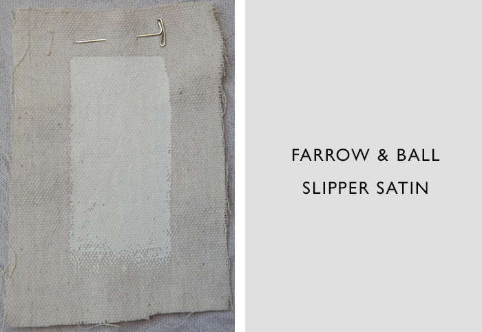
Above: Alison Davin of Jute in Mill Valley, CA, is a “white walls girl” who loves Farrow & Ball’s Slipper Satin. “Light reflects beautifully off it,” says Davin.

Above: Eliza Hart of SF-based Hart Wright Architects is fond of Benjamin Moore’s lavender-gray Piano Concerto, which she describes as “the color of the sky at dusk or the hills in the distance. It’s a soothing purple that makes me calm.”

Above: Rozalynn Woods of Rozalynn Woods Interior Design in Pasadena pinpoints Benjamin Moore’s Quiet Moments, a shade that stands at the intersection of gray and blue. “Grays and lighter blues can be difficult to get right–grays can feel dull and light blues often look too sweet,” she says. She notes that Quiet Moments is ideal for bedrooms: “It’s soft enough to be tranquil, yet interesting enough to be a backdrop for furnishings. And it changes with the light, which I love.”

Above: Elizabeth Bolognino of Elizabeth Bolognino Interiors in New York loves Pernod from Benjamin Moore: “It’s the absolute perfect shade of yellow because it soaks in and holds onto sunlight.” The designer painted her daughter’s nursery walls Pernod in two different apartments, and says, “I genuinely feel that the color has influenced her emotional development as a happy child.”

Above: Carole Magness of Magness Interiors in Santa Barbara singles out Borrowed Light from Farrow & Ball as a mood elevator. She notes that it’s especially effective on ceilings.

Above: Gabriel Benroth of Incorporated Architecture & Design in New York used Benjamin Moore Soft Pumpkin in the master bedroom of a colorful bohemian apartment. The designer’s inspiration was “rich ripe citrus and vegetables colors: fresh food makes us happy.”

Above: San Francisco designer Nicole Hollis recommends Arsenic from Farrow & Ball. She calls it’s a “quirky mod color” and notes that it’s the sort of eye opener that works well in a kid’s room.
Now tell us: what are your favorite happiness-inducing paint colors and where have you used them? Add your finds to the comments section below.
Thinking of painting the outside of your house? See our recent exterior paint recommendations: Architects’ White Exterior Paint Picks; Top 10 Gray Paint Picks; and Architects’ Top 8 Black Paint Picks.
Frequently asked questions
What are the top 10 happiness-inducing paint colors?
The top 10 happiness-inducing paint colors are: Pale Pink, Lemon Yellow, Sky Blue, Soft Gray, Apricot Orange, Lavender, Light Green, Peachy Pink, Dusty Rose, and Light Blue.
What are some tips for choosing a paint color that will make me happy?
When choosing a paint color that will make you happy, consider the emotional associations you have with different colors, think about the mood you want to create in the room, take into account the amount of natural light the room receives, and test multiple colors before making a decision.
What are some of the psychological effects of different paint colors on mood and happiness?
Different paint colors have been shown to have different psychological effects on mood and happiness. For example, pink has a calming effect and can reduce feelings of anger and anxiety, while yellow can increase energy and promote cheerfulness. Blue is often associated with calmness and tranquility, and green can promote relaxation and reduce stress.
What are some of the best rooms to use happiness-inducing colors?
Happiness-inducing colors can be used in any room, but some of the best places to use them are in places where you want to feel invigorated or relaxed. For example, pale pink can be a great color for a bedroom, while lemon yellow can be a good choice for a kitchen or dining room. Light blue and soft gray can both be calming colors for a living room or home office.
Do I need to paint an entire room to feel the effects of happiness-inducing colors?
No, you do not need to paint an entire room to feel the effects of happiness-inducing colors. Even just an accent wall or a piece of furniture painted in one of these colors can have a positive effect on mood and happiness.


Have a Question or Comment About This Post?
Join the conversation