Our judges have selected the finalists, now you choose the winners. Vote for the finalists in each of 12 Considered Design Awards categories, on both
In the Best Amateur Bath Space category, our five finalists are Daniel Meigs, Elizabeth Norris, Taliah Lowry, Zachary L., and R. McDaniel.
Project 1
Daniel Meigs | NashvilleӬ, TN | Modern Bathroom Remodel
Design Statement: “After discovering some extensive water damage, I decided to renovate my second bathroom. This was a new endeavor–I’d only managed basic home repairs before. YouTube, a couple of home repair books, and my local hardware store were my keys to success.”
Chosen by: Guest judge and Bright Bazaar founder Will Taylor, who said: “I admire how great this turned out, especially given the small budget, restrictive space, and that Daniel carried out the work himself–bravo! The handmade brass sconce adds a touch of elegance to the all-white scheme.”

Above: “This Ikea sink, vanity, and mirror fit our budget and add interesting lines.”

Above: “Espresso wood stain against white and light gray tones helps this small space feel open.”

Above: “I found this handmade sconce on Etsy.”
Project 2
Elizabeth Norris | Nantucket, MA | Nantucket Modern Bath
Design Statement: “I wanted a spacious bathroom with lots of natural light. I love the juxtaposition of the organic stone flooring and the clean modern tub. The large sliding barn doors frame the tub and allow the space to be open to the master bedroom.”
Chosen by: Will Taylor, who said: “This space feels sophisticated but not ostentatious. I like the ‘hidden’ barn doors that blend into the white walls, and the marble room divider helps to create intimacy in such a large space. There’s a good mix of textures between the rough stone tile and clean marble and bathtub.”

Above: “A modern master bath.”

Above: “Double sliding barn doors offer privacy or an open space.”

Above: “A marble backdrop. The room opens to the outdoor shower.”

Above: “Two wall-mounted vanities keep the space clean and modern.”
Project 3
Taliah Lowry | Maui, HI | Home Sweet Home
Design Statement: “A selection of my bathrooms throughout three dwellings on our property that we have remodeled or built over the last few years.”
Chosen by: Will Taylor, who had this to say about the project: “I was very impressed by Taliah’s ability to make (seemingly) effortless design statements in each of these spaces. The palm wallpaper looks divine paired with the clawfoot tub and hexagonal tile. In the boys’ powder room, it was an inspired decision to have the piping on display in front of the mix-and-match blue tiles. It would have been so easy to hide the piping and leave the tiles clean, but by not doing so it actually makes an otherwise simple scheme all the more interesting and structural to look at.”

Above: “Antique ship bathroom.”

Above: “Powder room.”
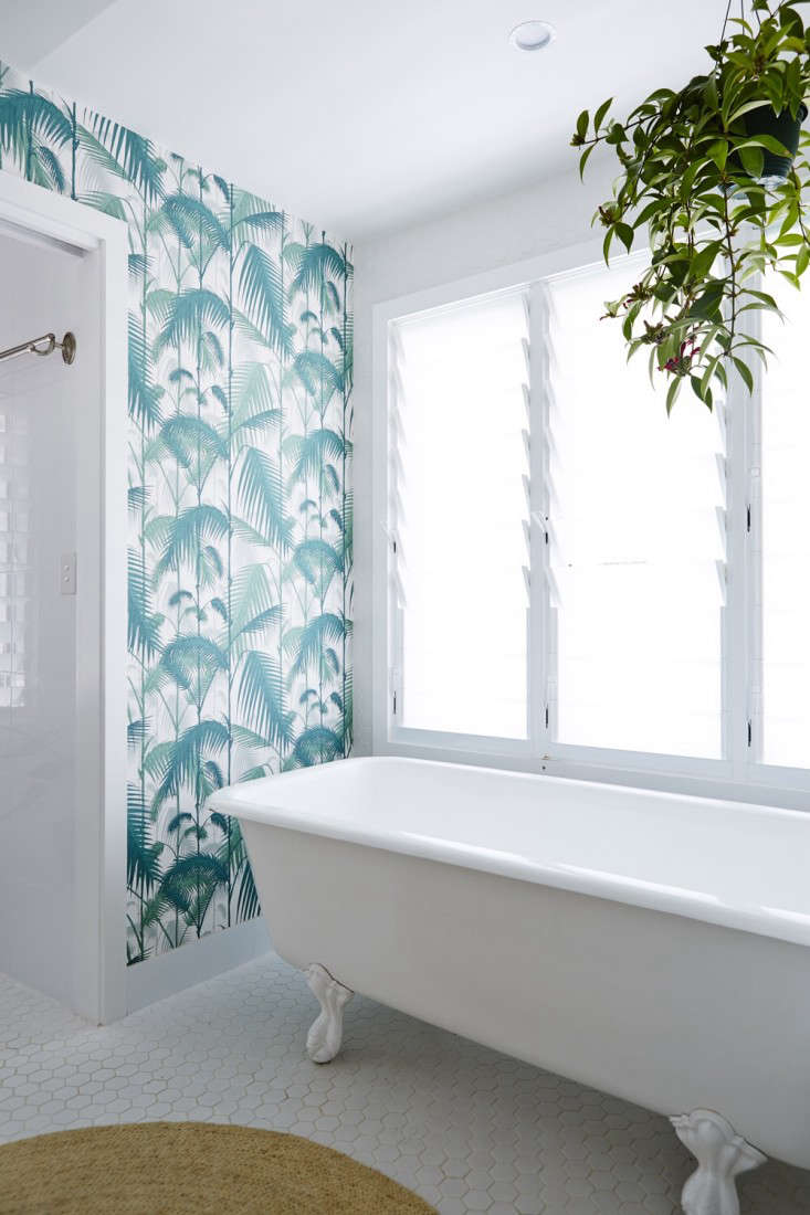
Above: “En suite.”

Above: “Boys’ powder room.”
Project 4
R. McDaniel | Los Angeles, CA | Studio Green Powder Room
Design Statement: “Part of a complete remodel of a 1940 home. I strived to preserve the vintage quality. This powder room is tiny–4.25 feet by 5 feet–and triangular. It has one small window with dappled light. I decided not to fight the dark. All the bathrooms were retiled with hexagonal tiles.”
Chosen by: Remodelista editor in chief Julie Carlson, who said: “The daring dark, dark green paneling, brass faucet, and glass pendant evoke a gentleman’s club loo. And the tilework makes it feel very jaunty.”

Above: “A Newport Brass faucet, eBay towel bar find, and LiveAuctioneers vintage French mirror.”

Above: “I added the chair rail paneling and painted it Studio Green from Farrow & Ball.”

Above: “American Restoration Tile in a custom pattern that I based on one of A.R.T’s designs.”

Above: “The pendant light was in an upstairs hall when we bought the house.”
Project 5
Zachary L. | Toronto, ON | Rowhouse Renovation
Design Statement: “The remodel of a typical Toronto row house bathroom on a budget. The tight space was visually opened up through the use of glass, natural light, mirror, and white walls. A mix of modern and traditional elements updates the bathroom while honoring the history of the home.”
Chosen by: Julie Carlson, who commented: “The gray and white tub on a tile carpet is such a winning combo. It’s a cleanly linear setup that also has a subtle soft touch.”
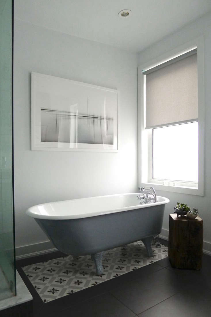
Above: “The clawfoot tub, original to the house, was restored and reglazed.”

Above: “The frameless shower, though compact, was finished in glass to open up the space.”

Above: “The modern floating vanity adheres to the theme of lightness throughout the bathroom.The porcelain countertop and sink feature rounded corners and raised edges as a traditional counterpoint.”

Above: “A few whimsical botanicals add life and warmth to the space.”
Found your favorite? Vote once per day in each of 12 categories across both sites, now through August 15.


Have a Question or Comment About This Post?
Join the conversation