Icon - Arrow LeftAn icon we use to indicate a rightwards action. Icon - Arrow RightAn icon we use to indicate a leftwards action. Icon - External LinkAn icon we use to indicate a button link is external. Icon - MessageThe icon we use to represent an email action. Icon - Down ChevronUsed to indicate a dropdown. Icon - CloseUsed to indicate a close action. Icon - Dropdown ArrowUsed to indicate a dropdown. Icon - Location PinUsed to showcase a location on a map. Icon - Zoom OutUsed to indicate a zoom out action on a map. Icon - Zoom InUsed to indicate a zoom in action on a map. Icon - SearchUsed to indicate a search action. Icon - EmailUsed to indicate an emai action. Icon - FacebookFacebooks brand mark for use in social sharing icons. flipboard Icon - InstagramInstagrams brand mark for use in social sharing icons. Icon - PinterestPinterests brand mark for use in social sharing icons. Icon - TwitterTwitters brand mark for use in social sharing icons. Icon - Check MarkA check mark for checkbox buttons.
You are reading

Passer Domesticus: 12 Ideas to Steal from an Idiosyncratic Urban Getaway in Greece

Search

Passer Domesticus: 12 Ideas to Steal from an Idiosyncratic Urban Getaway in Greece

February 1, 2018

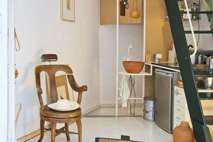
Lately I’ve been poring over Passer Domesticus, a sculptural, somewhat peculiar space in Thessaloniki, Greece, by local 157 + 173 Designers. Housed in a 1924 multilevel storefront (built after a fire destroyed much of the city in 1917; formerly a trade fabric shop, then a fishing supply merchant), the space is now available for “short-term habitation and city break experiences.” (The name, from the Latin, refers to the kind of sparrows common in the Mediterranean: “Passer Domesticus becomes a little nest inside the urban environment to host all romantic urban nomads,” the designers explain.)

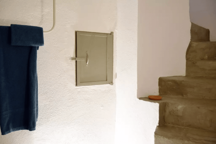
The space seems to reveal more each time I look at it: a terracotta sink; architectural bits and pieces, such as found cobblestones repurposed as a stoop; an artful storage bed; a squash as sculpture in the kitchen. Despite being only 170 square feet on some levels, it feels spacious; despite having two stories, a closer look reveals that, like an Escher drawing, it somehow has five levels. Here are 12 design ideas to steal.

N.B.: For more information on renting Passer Domesticus (also used for “exclusive dinners, private small music concerts, small exhibitions, and guided historic retrospectives”), see Airbnb and Booking.com.

Photography courtesy of 157 + 173 Designers.

1. Go green.

the space is in a traditional building with byzantine style windows framed by s 17
Above: The space is in a traditional building with Byzantine-style windows framed by small columns. Despite a mostly neutral color palette, the shop has elements of green throughout, from the trim around the front storefront to a vintage painted ladder to a slab of green marble in the kitchen. (Green is in: It’s one of our 18 Design Trends for 2018.) Note the custom wood ledges that transform a stoop into someplace to sit, and the window shades, for privacy.

2. Leave it be.

in the main kitchen and dining area at street level, the designers painted the  18
Above: In the main kitchen and dining area at street level, the designers painted the walls and cement floor white. This sets into stark relief the found and sculptural elements inside, as well as places where the designers left the “original faded texturing on the walls” (like the window frame, shown here, with touches of green). “It’s a reminder of the space’s past chroma, which eventually becomes the only color on the walls.” Of note: a grid of cobblestones repurposed as an anchor for the ladder.

3. Use natural tones.

the space ties together the &#8\2\20;multicultural language&#8\2\2\1; o 19
Above: The space ties together the “multicultural language” of the building’s history, including Byzantine, neoclassical, and folk styles, the designers say. But the distinct elements—an antique wooden chair affixed with a lamp, a terracotta sink, custom MDF cabinets—are tied together by a common palette: neutral earth tones of wood, pale brown, and rust. (Note the kitchen tools, and a dried gourd, that hang above the sink.)

4. Embrace idiosyncrasy.

the small kitchen has simple bones, like fiberboard cabinetry and exposed white 20
Above: The small kitchen has simple bones, like fiberboard cabinetry and exposed white pipes that hold the sink. But the vintage painted ladder (which acts as a sort of “wall” for the kitchen) and a piece of green-veined marble, plus shelves stacked high with mix-and-match ceramics, add an element of character.

5. Go small-scale.

small scale furniture keeps the space feeling open, as shown here, in the mix a 21
Above: Small-scale furniture keeps the space feeling open, as shown here, in the mix-and-match dining area. A petite rug emphasizes the empty floor space and keeps the room feeling sparse.

6. Make use of unused corners.

on the other side of the front door, the designers fitted a sharply angled corn 22
Above: On the other side of the front door, the designers fitted a sharply angled corner with a built-in plywood couch, complete with storage. Note how the fuse boxes are allowed to be part of the design.

7. Create a sculptural vanity.

the cement staircase behind the kitchen sink leads downstairs, to the bath, whe 23
Above: The cement staircase behind the kitchen sink leads downstairs, to the bath, where a recessed vanity, built into an archway, evokes the Cycladic style of ancient Greece, with its whitewashed, curved forms. Rust-colored brick around the bath and pale pink marble evoke an Ottoman market nearby.

8. Transform a ledge into an altar.

a window well over the bath is transformed into an opportunity for display with 24
Above: A window well over the bath is transformed into an opportunity for display with “a private garden of plants and stones” plus natural light.
on the concrete stairs leading back to street level, a small ledge becomes a pl 25
Above: On the concrete stairs leading back to street level, a small ledge becomes a place for display. Photograph courtesy of Airbnb.

9. Build in levels.

back on the first floor, the designers took advantage of the lofty ceilings by  26
Above: Back on the first floor, the designers took advantage of the lofty ceilings by creating a clever in-between level with a sturdy fisherman’s net that references the building’s history as a fishing shop. “It offers the space a comfortable area of resting, while becoming an architectural element,” they say.
Passer Domesticus 12 Ideas to Steal from an Idiosyncratic Urban Getaway in Greece portrait 6 27
Above: Looking down.

10. Enlist a storage bed.

up a set of pale green stairs is the bedroom, where the designers painted the o 28
Above: Up a set of pale green stairs is the bedroom, where the designers painted the original wide-plank floors white. A plywood platform bed with generous under-bed storage keeps necessities tucked away and, when set at an angle, becomes a sculptural element in itself.

11. Create an ad-hoc closet.

yet another tiny built in level: a small plywood step leads to a rudimentary cl 29
Above: Yet another tiny built-in level: A small plywood step leads to a rudimentary closet with two exposed pipes and hangers. A mirror becomes an architectural element when leaned against the wall.

12. Rethink ladders.

the designers used vintage ladders throughout as a space saving measure. here,  30
Above: The designers used vintage ladders throughout as a space-saving measure. Here, a well-worn ladder, found on-site, leads to the building’s flat roof and doubles as a place to drape clothing.
blink and you&#8\2\17;ll miss it: the shop&#8\2\17;s subtle sign. 31
Above: Blink and you’ll miss it: the shop’s subtle sign.
how they did it: the plans. 32
Above: How they did it: the plans.

For more from 157 + 173 Designers, see Texture and Gloss: 10 Ideas to Steal from a Hip London Cafe.

(Visited 354 times, 1 visits today)
You need to login or register to view and manage your bookmarks.

Have a Question or Comment About This Post?

Join the conversation

v5.0