Icon - Arrow LeftAn icon we use to indicate a rightwards action. Icon - Arrow RightAn icon we use to indicate a leftwards action. Icon - External LinkAn icon we use to indicate a button link is external. Icon - MessageThe icon we use to represent an email action. Icon - Down ChevronUsed to indicate a dropdown. Icon - CloseUsed to indicate a close action. Icon - Dropdown ArrowUsed to indicate a dropdown. Icon - Location PinUsed to showcase a location on a map. Icon - Zoom OutUsed to indicate a zoom out action on a map. Icon - Zoom InUsed to indicate a zoom in action on a map. Icon - SearchUsed to indicate a search action. Icon - EmailUsed to indicate an emai action. Icon - FacebookFacebooks brand mark for use in social sharing icons. flipboard Icon - InstagramInstagrams brand mark for use in social sharing icons. Icon - PinterestPinterests brand mark for use in social sharing icons. Icon - TwitterTwitters brand mark for use in social sharing icons. Icon - Check MarkA check mark for checkbox buttons.
You are reading

Hoxton x Bauwerk: A New Collection of Limewash Paints, Inspired by European Cities

Search

Hoxton x Bauwerk: A New Collection of Limewash Paints, Inspired by European Cities

October 25, 2023

We’re constantly on the hunt for eco-friendly, non-petroleum-derived paints, so we were pleased to (re)discover Bauwerk Colour, makers of limewash paints. The company was founded in Australia in the early aughts by husband-wife team Andreas and Bronywn Ridel, who set out to create the world’s most beautiful natural paint. Twenty years later, Bauwerk Colour produces zero-V.O.C. limewashes using clay, minerals, and natural pigments and remains committed to sustainability.

“We utilize a simple elemental cycle of earth, fire, water, and air,” Bronwyn says. “Limewash is a thin layer of limestone that dries on your wall by taking in carbon dioxide from the air, just as plants do. With a PH level of 14 and antibacterial qualities, it is free from biocides, formaldehydes, and preservatives.” (You can read more about it in Remodeling 101 and this DIY.)

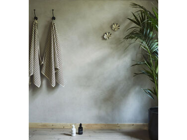
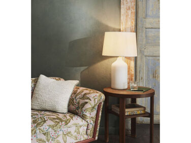
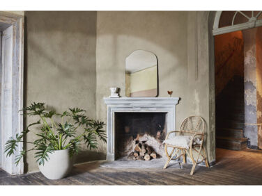
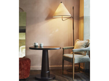
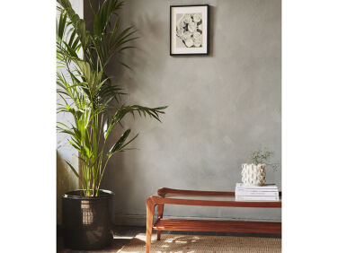
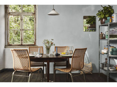
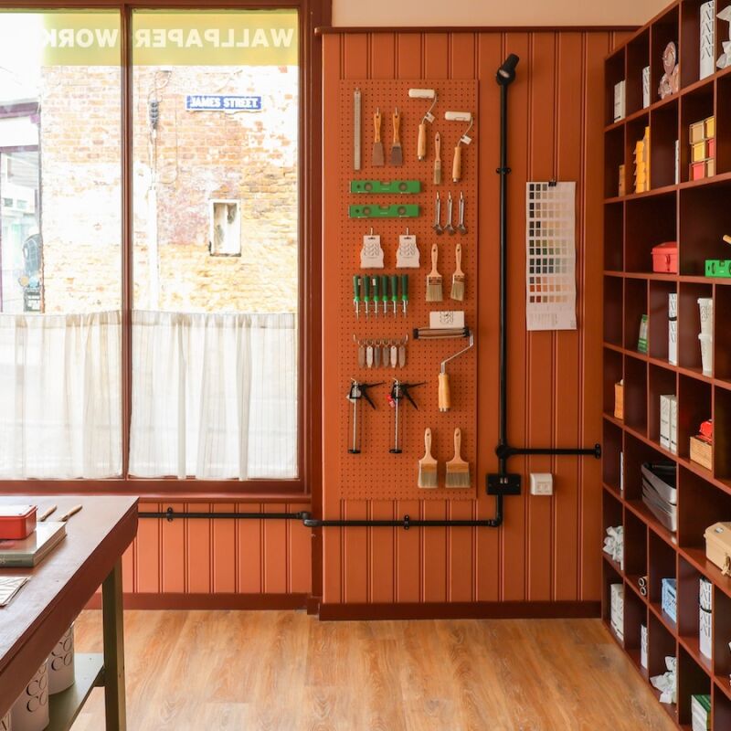
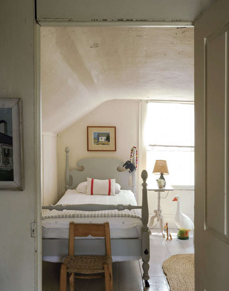
Bauwerk Colour is also known for its collaborations with design world titans like House of Grey and Abigail Ahern. Its most recent release, the Neighbourhood Collection, is in partnership with boutique hotel group The Hoxton. The line is composed of nine earthy paints that correspond with specific locations of The Hoxton, from Berlin and Edinburgh to Amsterdam and Barcelona.

Let’s take a look.

Photography courtesy of The Hoxton.

a soft neutral gray called house represents the humble origins of the hoxton, w 17
Above: A soft neutral gray called House represents the humble origins of The Hoxton, whose first hotel was a converted parking lot in East London.
&#8\2\20;we started by digging out our photography of each neighborhood, wh 18
Above: “We started by digging out our photography of each neighborhood, which we took before designing the properties, and quickly found very obvious recurring colors and tonality for each city,” says Charlie North, global vice president of interior design for The Hoxton’s parent company Ennismore.
kino, a dark sage, was informed by the aesthetic of cabaret clubs, dance halls, 19
Above: Kino, a dark sage, was informed by the aesthetic of cabaret clubs, dance halls, and theaters in 1920s Berlin.
named for the historic edinburgh neighborhood, haymarket nods to the weathered  20
Above: Named for the historic Edinburgh neighborhood, Haymarket nods to the weathered sandstone townhouses in the area.
&#8\2\20;haymarket is my favorite of all the colors,&#8\2\2\1; bronwyn  21
Above: “Haymarket is my favorite of all the colors,” Bronwyn says. “It’s a perfect, modern, new putty color that sits in between beige and green and works for any interior, especially if used with a soft white neutral on the woodwork.”
a muted rose tone, charlottenberg is bauwerk colour&#8\2\17;s interpretatio 22
Above: A muted rose tone, Charlottenberg is Bauwerk Colour’s interpretation of the shell-pink stucco facades of West Berlin.
in edinburgh&#8\2\17;s new town, stone georgian buildings have developed a  23
Above: In Edinburgh’s New Town, stone Georgian buildings have developed a slightly green patina over time. Moss is designed to embody that moody aged finish.
&#8\2\20;moss and house are great bridging colors,&#8\2\2\1; says bronw 24
Above: “Moss and House are great bridging colors,” says Bronwyn. “They can be paired with the rest of The Hoxton Neighbourhood Collection and they will balance out the stronger tones.”
poblenou, a light gray blue, nods to barcelona&#8\2\17;s seaside locale and 25
Above: Poblenou, a light gray blue, nods to Barcelona’s seaside locale and contemporary glass architecture.
&#8\2\20;poblenou is my favorite of the range because at first glance it lo 26
Above: “Poblenou is my favorite of the range because at first glance it looks neutral, but pair it with sunshine through a window and it becomes playful and bright and distinctly Mediterranean—the gray becomes blue and the color comes to life,” Charlie describes.

For our original post on Bauwerk Colour—way back in 2016—see Bauwerk Color: Australian Limewash Paint.

And for more on palettes and paints, see:

For a mobile-first version of this post, check out this content as a web story, or browse all our web stories.

(Visited 7,586 times, 1 visits today)
You need to login or register to view and manage your bookmarks.

Product summary  Item 6 158Item 7 159

Have a Question or Comment About This Post?

Join the conversation

v5.0