Icon - Arrow LeftAn icon we use to indicate a rightwards action. Icon - Arrow RightAn icon we use to indicate a leftwards action. Icon - External LinkAn icon we use to indicate a button link is external. Icon - MessageThe icon we use to represent an email action. Icon - Down ChevronUsed to indicate a dropdown. Icon - CloseUsed to indicate a close action. Icon - Dropdown ArrowUsed to indicate a dropdown. Icon - Location PinUsed to showcase a location on a map. Icon - Zoom OutUsed to indicate a zoom out action on a map. Icon - Zoom InUsed to indicate a zoom in action on a map. Icon - SearchUsed to indicate a search action. Icon - EmailUsed to indicate an emai action. Icon - FacebookFacebooks brand mark for use in social sharing icons. flipboard Icon - InstagramInstagrams brand mark for use in social sharing icons. Icon - PinterestPinterests brand mark for use in social sharing icons. Icon - TwitterTwitters brand mark for use in social sharing icons. Icon - Check MarkA check mark for checkbox buttons.
You are reading

Kitchen of the Week: A Brooklyn Kitchen Designed Around the Keywords “Social” and “Minimal but Warm”

Search

Kitchen of the Week: A Brooklyn Kitchen Designed Around the Keywords “Social” and “Minimal but Warm”

October 3, 2019

Architect Jess Thomas Hinshaw was at work on her own Brooklyn townhouse when she sold a Lindsey Adelman DIY pendant light from her former place on Craig’s List. The buyer who came to pick it up mentioned he was house-hunting in the vicinity himself: “I am very nosey and Jess generously offered a tour of their construction.” A political consultant with a passion for design, he was impressed by what he saw and stayed in touch with Hinshaw as he and his wife, a graphic designer, continued their search. Dozens of townhouses later they found a historic Clinton Hill brownstone, and after interviewing several architects, hired Hinshaw and her design partner, Andrea Fisk. The two had met as project managers at Made Architecture and were about to establish their own firm, Shapeless Studio. The Craig’s List couple became one of their first clients.

The couple were moving from a vast Williamsburg loft and wanted to “re-create some of that big open feel in the new place, even though it’s a traditional home.” Members of the giving circle Radfund, a New York philanthropic group that pools its funds, they regularly host large gatherings and wanted their kitchen and living area to be set up for casual entertaining. Community-minded sorts with an eye for new talent, they loved being part of Hinshaw and Fisk’s startup: “This was a launch point for them, and our project got a lot of attention and enthusiasm.” Join us for a look at our favorite room in the house.

Photography by Hagan Hinshaw of Blurry Hinge, courtesy of Shapeless Studio.

the townhouse is \20 feet wide—&#8\2\2\1;you really feel it when it& 17
Above: The townhouse is 20 feet wide—”you really feel it when it’s only 17 0r 18 feet wide, at least I do,” says the political consultant—and had been divided into three apartments, which it still is: friends of the owners rent the two upstairs floors. The couple, who just had their first baby, turned the garden and parlor floor into their own duplex.

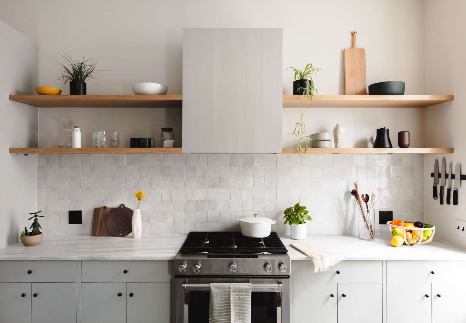
The 1870s structure had few original details and required a complete overhaul—which enabled the owners to install a new kitchen on the main floor in place of two bedrooms (the public rooms had been downstairs; “we wanted to invert this relationship, so the entertaining space would feel that much more grand,” says Hinshaw.)  The graphic designer supplied the architects with “some guiding language to direct the aesthetic: in the kitchen the key words were ‘social’ and ‘minimal but warm.'” With that to chew on, they left the specifics largely to Hinshaw and Fisk, but in lieu of a dining table, requested an island that people could congregate around. The resulting design, of Pentelicus Venato marble, has a waterfall edge that faces the living room and the opposite side has an overhang. The black stools are Hay’s About a Stool.

as with all shapeless projects, the cabinetry is the careful work of james harm 18
Above: As with all Shapeless projects, the cabinetry is the careful work of James Harmon of Workshop Brooklyn, who honed his craft by studying wooden boat building. The flush panel fronts are painted Sea Haze from Benjamin Moore: “balancing wood and soft tones was integral to the design,” says Hinshaw, who notes the color was selected to echo the house’s one original detail, a pale green marble fireplace on the garden level.
shapeless studio classon kitchen brooklyn hagan hinshaw photo 3b
Above:  Like the island, the counters are Pentelicus Venato marble. The range is a KitchenAid. Note the gracefully incorporated ventilation hood and under-the-shelf puck lighting—”it assures the counter is well lit, which just makes it that much more pleasant for cooking,” says Hinshaw.

The porcelain cabinet knobs are from French-inspired Tokyo shop Orné de Feuilles. The fridge isn’t visible in the photos, but is situated to the left of the range.

the backsplash is tiled with with weathered white zellige from clé th 20
Above: The backsplash is tiled with with Weathered White Zellige from Clé that lends the requested human touch: “We wanted the cabinets to be rather minimal and understated in order to let the zellige and stone be the focal points,” says Hinshaw. “That being said, asking for such tight tolerances and minimal reveals is no easy feat. That’s why James is our favorite millworker.”

As for installing zellige, she add, “every time, it’s a bit of a fight with the contractor—they don’t like installing imperfect tile. The trick for zellige is to use a piece of thin cardstock, like a business card, to space them out, so they’re extremely close but never actually touch. We ended up laying out this tile several times in order to assure that it would be installed correctly.” She recommends Clé’s Zellige Installation Guide.

the counter and open shelves are reserved for a few kitchen tools, such as  21
Above: The counter and open shelves are reserved for a few kitchen tools, such as cutting boards and wooden spoons by Allison Samuels of Two Trees Studio and a Terracotta Fruit Bowl by Virginia Sins. Dishes and the couples’ colored glasses collection are stored behind closed doors.
the island&#8\2\17;s black undermount sink is from alfi and the matte black 22
Above: The island’s black undermount sink is from Alfi and the matte black pull-down faucet is the Corsano from California Faucets.

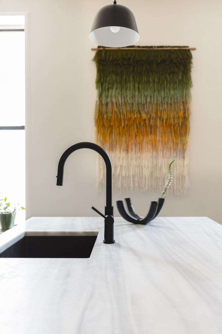
The shaggy Wool Tapestry is the work of Elżbieta Knapik of Lale Studio in Trzebinia, Poland: “she had done a number of chromatic pieces; we worked with her on the color scale.” The light over the island is Muuto’s Ambit Rail Lamp.

the owners wanted to incorporate a lot of storage—while still maintainin 23
Above: The owners wanted to incorporate a lot of storage—while still maintaining “an airy, open feel”—so the back wall was designated for cabinets and shelves. The architects explain that white oak (with touch-latch openings) was selected “to elevate the space” and link it to the adjoining living room.

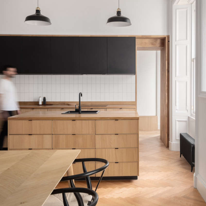
The walls throughout the house are painted Benjamin Moore Silver Satin with trim and moldings in Benjamin Moore White Dove. “One of the goals of the project was to add that brownstone character back in, so we installed new crown moldings and carefully designed the baseboards and casings so they would naturally fit somewhere between traditional and more simple and modern,” says Hinshaw.

the architects inserted a little bench next to the cabinets (cushioned with pil 24
Above: The architects inserted a little bench next to the cabinets (cushioned with pillows and throws from Minna). Of the couple’s many houseplants, they say, “We love how the room is being populated with green. It feels warm and inviting, and wonderfully complements the white oak and soft green of the cabinets.” The cantilevered oak chair is the Sit, Set by Campagna.
the owners initially wanted the kitchen and living room to be one big loft like 25
Above: The owners initially wanted the kitchen and living room to be one big loft-like space. “Jess and Andrea convinced us to have an archway between the front and back rooms, so there’s a visual separation,” says the political consultant. “It brackets the two spaces in a way that  I now really appreciate.”

This was just Phase One of the renovation, he tells us. Soon, he plans to open up the back of the kitchen and install a wall of windows with a balcony and stair to the garden—with a design by Shapeless.

Three more modern kitchen solutions for historic house remodels:

(Visited 1,569 times, 1 visits today)
You need to login or register to view and manage your bookmarks.

Have a Question or Comment About This Post?

Join the conversation

v5.0