When food blogger Eva Kosmas Flores, her husband, Jeremy, and their two dogs, cat, and brood of chickens moved into a 1937 English Tudor-style house in Portland, Oregon, it featured multicolor walls and cheap linoleum—not exactly ideal for Flores’s moody food photography. But it had good bones: “It’s a big old house and it needed a lot of work and elbow grease, but I love every ridiculous square inch of it. Even the parts of the basement with mold,” she wrote on her blog, Adventures in Cooking. The couple set about renovating it slowly, in three parts, doing much of the work themselves to save money. Now the house is a rustic, almost cinematic backdrop for Flores’s photographs, fitting for the drizzly Oregon landscape. Here’s a look.
Photography courtesy of Eva Kosmas Flores.
Kitchen
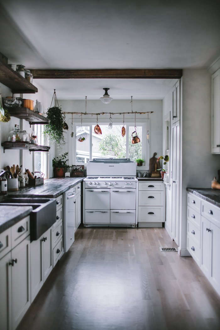
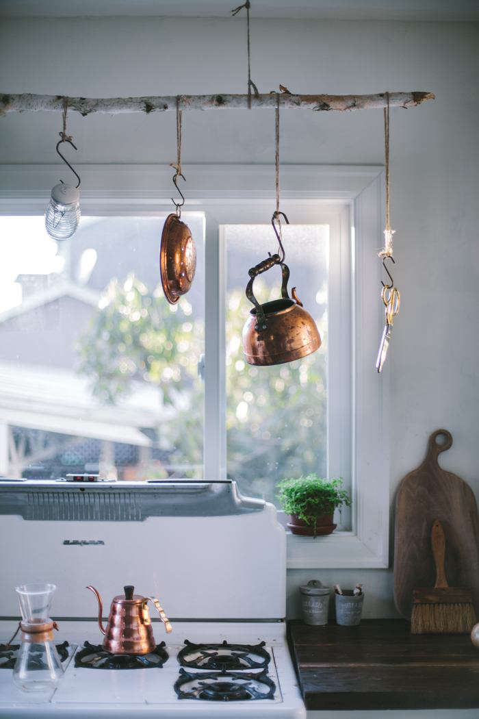
The couple worked room by room and tackled much of the work themselves to save money. The kitchen was a priority: “When we moved in, the kitchen was the eyesore of the house, which is saying a lot since the colors of the various other rooms in our home ranged from sunshine yellow to cranberry red to tan and neon sky blue,” Flores writes on her blog. (The kitchen was mint green.) Flores plastered the walls using historically authentic plaster from Master of Plaster and the couple tore out the Formica cabinets themselves and found a vintage 1950s Roper gas range on Craigslist for $375. The original kitchen wasn’t equipped for gas, so they struck a deal with the worker from the gas company: He took a water heater from an old hot tub and, in exchange, installed a gas line.

Remnants of the house’s history surfaced during the process: The couple found an old baby picture behind the fridge, a 1972 department store ad stuffed into the insulation, and asbestos vinyl beneath the kitchen linoleum. Advised to leave it be, they installed white oak hardwood flooring on top. (A lesson lived and learned, Flores says: Be sure hardwood floors are thoroughly cleaned before the final coat of finish is applied, otherwise you’ll be left with infuriating smudges and specks.)
Living and Dining

In the living and dining rooms, the couple demolished the old fireplace, built a new mantel out of salvaged wood, and painted over the lead paint they uncovered on the trim.

In the living area, the couple endured another case of trial-and-error floor refinishing: They rented a sander and handmade a stain out of steel wool and vinegar, hoping to give the floors a gray-toned finish. Flores writes: “After meticulously washing the floors to get off all the sawdust, we put down the stain. And then we watched in horror as it turned our floors navy blue”—an unfortunate reaction with golden oak. The next weekend they re-rented the sander and stained the floors in a dark walnut instead.
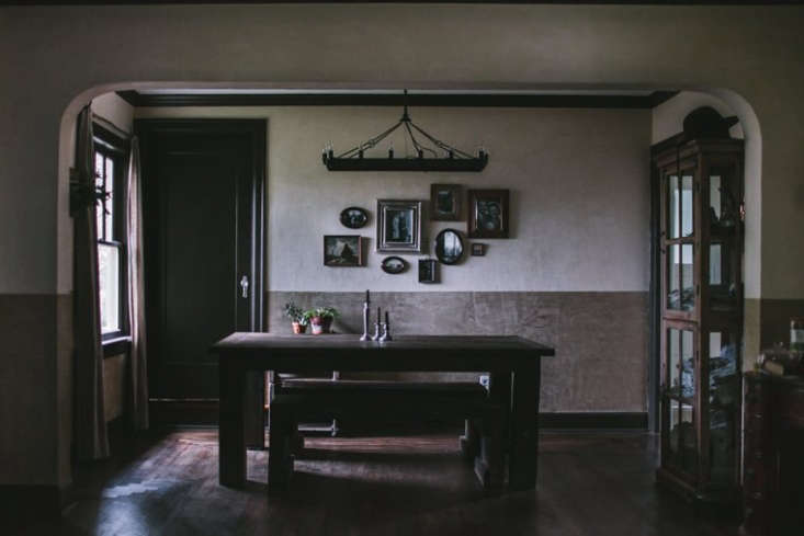
The dining table serves a dual purpose: Jeremy built it by hand out of salvaged wood, and it’s sturdy enough that Flores can stand atop it to capture the moody overhead shots on her blog. Flores, who studied film production, took inspiration for the plaster from The Babadook.

Bed and Bath

The upstairs of the house was cramped and dark: A master bedroom, another small bedroom, closets, and a bathroom—complete with a retro tube shower—were all fitted into the small space. (“The shower was the bane of my existence,” Flores writes.) They reconfigured walls and removed a dropped ceiling to create a more cohesive, workable space.
By the stairway, reclaimed-wood shelving doubles as railing and display.


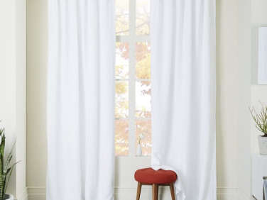
The couple opened the drop ceiling to reveal rough-hewn beams. To create storage despite the room’s apex ceiling and low walls, the couple installed cupboards with drawers and rods all along the eaves. The white linen bedding is from Rough Linen (see: 7 Tips for Creating a Low-Key Romantic Bedroom with Tricia Rose of Rough Linen); the Belgian Flax Linen Curtains and Glass Jar Pendants are both from West Elm.

The Floreses ran into another flooring faux pas in the bedroom: “The floors were original Douglas Fir that had been stained a bright shade of orange.” Once again, the couple took on the floors themselves, this time sanding and whitewashing them by hand. (Read more about their process in Flores’s post, Master Bedroom & Bathroom Remodel.)

The couple worked with a contractor to tear down the wall between the tiny bedroom and bathroom to create a large bath. The claw-foot tub only looks vintage: Flores purchased a new, lighter acrylic version instead. (“I didn’t want it falling through the floor into my kitchen below,” she writes.)
Not pictured: the reclaimed wood vanity, inspired by a Jersey Ice Cream Co. project (see: The One-Month Remodel: A Catskills Guesthouse by Jersey Ice Cream Co.).

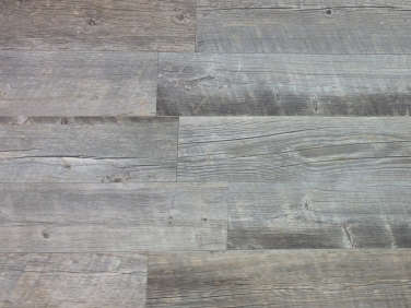
This time the Floreses learned from their previous floor mishaps: The rough-hewn-style flooring is actually Natural Timber Ash Porcelain Tile—no sanding needed.
For much more on the Floreses’ renovation (including lessons learned), check out the Homestead section of her blog, Adventures in Cooking.
Love the moody, vintage look of plaster? Check out our posts:
- Remodeling 101: Moroccan Tadelakt Plaster Finish
- Old Soul: A Revolution-Era Hudson Valley Home Gets an Update from Jersey Ice Cream Co.
- Kitchen of the Week: Urban Tropical, A Simon Astridge Kitchen Addition




Have a Question or Comment About This Post?
Join the conversation