Icon - Arrow LeftAn icon we use to indicate a rightwards action. Icon - Arrow RightAn icon we use to indicate a leftwards action. Icon - External LinkAn icon we use to indicate a button link is external. Icon - MessageThe icon we use to represent an email action. Icon - Down ChevronUsed to indicate a dropdown. Icon - CloseUsed to indicate a close action. Icon - Dropdown ArrowUsed to indicate a dropdown. Icon - Location PinUsed to showcase a location on a map. Icon - Zoom OutUsed to indicate a zoom out action on a map. Icon - Zoom InUsed to indicate a zoom in action on a map. Icon - SearchUsed to indicate a search action. Icon - EmailUsed to indicate an emai action. Icon - FacebookFacebooks brand mark for use in social sharing icons. flipboard Icon - InstagramInstagrams brand mark for use in social sharing icons. Icon - PinterestPinterests brand mark for use in social sharing icons. Icon - TwitterTwitters brand mark for use in social sharing icons. Icon - Check MarkA check mark for checkbox buttons.
You are reading

A Classic English Country House Receives a Mood-Lifting Injection of Color

Search

A Classic English Country House Receives a Mood-Lifting Injection of Color

February 27, 2023

London interior designer Nicola Harding was the right person to turn to. Her clients, a couple with two young boys, were leaving London for rural Berkshire and life in a Georgian brick manse. They appreciated the grandeur of their house—8,600 square feet, seven bedrooms—but how to downplay the stuffy formality and lend the spaces the right energy—and functionality?

First the layout demanded a rethink, says Harding, noting that more than a few spaces felt “confused and uncomfortable” and that a relatively recent extension “sucked life away from the original part of the building. We kept structural work to a minimum but were able to rework the flow by blocking off doorways, making areas feel less corridor-like and more cozy.”

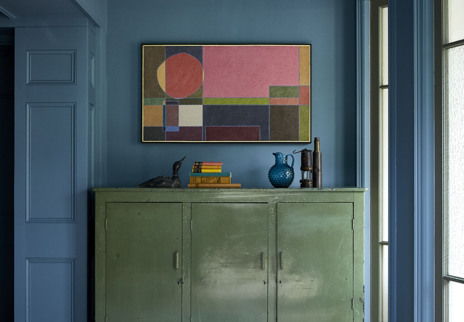
Equally importantly, Harding happens to be a master colorist: She is both deft and bold in her selections not only of paint but artwork and the many seating and lighting choices a dwelling this size requires. Join us for a tour of her transformative blues and greens and stealth pinks.

Photography by Paul Massey, courtesy of Nicola Harding & Co.

the family, longtime londoners, weren&#8\2\17;t sure rural living would be  17
Above: The family, longtime Londoners, weren’t sure rural living would be right for them, Harding explains: “The wife worried she was stepping into someone else’s life, someone older and more sensible. So it was crucial to her that the house feel true to her. It needed to make sense as a country house, but also to feel exciting. It needed to be user-friendly, meeting their practical needs but also to be fun and sexy.”

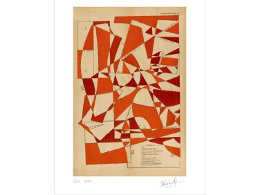
Towards that end, the living spaces, including this corner of the sitting room, are furnished with soft places to flop, arranged, says Harding, “to create a feeling of intimacy.” The sofa and striped pillows are Nicola Harding custom designs. The trio of prints are by Hormazd Narielwalla via UK art site C&B Curates.

harding balanced the upright and formal with the down home: a set of found meta 18
Above: Harding balanced the upright and formal with the down-home: A set of found metal work stools surround the sitting room bar table next to floor-length linen curtains edged with antique lace dyed a deep blue. The dusty pink on the walls is Setting Plaster from Farrow & Ball (go to Steal This Look to see a grand kitchen in the same color by Harding).
the kitchen was opened up by removing what harding describes as &#8\2\20;an 19
Above: The kitchen was opened up by removing what Harding describes as “an awkward wall that bit into the middle of the room.” The built-in cabinets and large island with Silestone counters are by Remodelista favorite deVol. The arched window was existing.
rather than fill the space with a large table, the family opted for an intimate 20
Above: Rather than fill the space with a large table, the family opted for an intimate setup: an OKA garden table and Rocket St. George chairs. The vintage bank of drawers provide extra storage: “They enabled us to limit the amount of built-in cabinets, which kept the cost down and kept the room from feeling too fitted kitchen-y,” says Harding.
the adjacent garden room serves as a less formal living and dining area. the bo 21
Above: The adjacent garden room serves as a less formal living and dining area. The botanical prints are vintage; the sofa is from UK handmade-to-order source Sofa.com.

Harding says she planned the house’s overall palette by “making note of the natural light levels in the different spaces. Where the light was good, I opted for paler colors that would enhance the sense of space. Where the light levels were lower, I went for richer tones that would give a sense of warmth and drama, and provide an exciting, varied experience of color through the house.”

harding chose shades of green, both subtle and bold &#8\2\20;as a color thr 22
Above: Harding chose shades of green, both subtle and bold “as a color thread linking the different spaces. Green is a brilliant color to live with, working well at all times of day and times of year.”

“A trick I like to use is putting a darker color on the woodwork than on the walls,” Harding adds. Here, the walls are painted in Tracery and the trim is Normandy Grey, both from Little Green. “One’s eye stops at the lightest thing we see, so if you paint a window frame in a darker color, your eye is drawn beyond it to the view.” The rattan Wengler chairs are from Sika-Design.

&#8\2\20;color really is a very cost effective magic spell that transforms  23
Above: “Color really is a very cost-effective magic spell that transforms the atmosphere of a space,” says Harding. Here, she paired a 1950s painted kitchen cupboard from Vinterior with an abstract painting by Brighton-based artist John Goodison.

Nicola’s description of the house’s palette as it was? “Various shades of beige, mushroom, and gray: safe and samey—and bland and depressing.”

&#8\2\20;this had been a dark intersection between hallways, with no natura 24
Above: “This had been a dark intersection between hallways, with no natural light,” says Harding of the former library that’s now the dining/reading room. “We closed off a doorway, added floor-to-ceiling bookshelves, painted it a bright blue (Stone Blue by Farrow & Ball) that has bags of personality, and overcame the low ceiling by painting it a similar shade so that it disappears. The combination of the books, the color, and the darker ceiling, as well as redirecting the flow, transformed what had been a really horrible space into one of the most inviting areas of the house.”

The brass table is a Matthew Cox design and the pendant lights are from Cox & Cox. The red velvet-upholstered Safia Dining Chairs came from Made. The OKA block-printed cotton carpet is actually two rugs sewn together.

the entry hall now has an art deco table, vintage tuareg mat of woven straw det 25
Above: The entry hall now has an Art Deco table, vintage Tuareg mat of woven straw detailed in leather, and a blue velvet sofa. The dark space is painted Chelsea Green II and the woodwork is Salvia, both from Paint & Paper Library. “When Nicola suggested that green, all I could think of was Kermit the Frog,” the wife told UK House & Garden. “I thought I would hate it, but it has become the color I like the most.”
to create a flow between spaces, the adjacent home office is painted the same c 26
Above: To create a flow between spaces, the adjacent home office is painted the same color as the entry hall woodwork: It’s the aforementioned Salvia from Paint & Paper Library, which Harding describes as “an off-beat aqua green.” She notes that what looks like blue velvet on the sofa is a corduroy from Brisbane Moss.
the wife&#8\2\17;s office doubles as the homework room: &#8\2\20;rather 27
Above: The wife’s office doubles as the homework room: “Rather than just putting a desk in her study, we found a large kitchen-style table that we placed in the middle of the room, creating lots of space for her to sit with the children, spread out her own work, or wrap presents.”
the parents&#8\2\17; room has a custom upholstered headboard made by natura 28
Above: The parents’ room has a custom upholstered headboard made by Naturalmat and walls painted Farrow & Ball’s Setting Plaster. Vintage metal hospital tables with stone tops serve as compact bedside tables. Harding reconfigured the setup to include his and hers dressing areas—the husband’s room is visible on the right.
an antique chest of drawers introduces a patinated blue to the space. 29
Above: An antique chest of drawers introduces a patinated blue to the space.
the blue theme extends to the main bath: the walls are sobek and the tub samphi 30
Above: The blue theme extends to the main bath: the walls are Sobek and the tub Samphire, both from Paint & Paper Library. The zellige tiles are from Emery & Cie.

For more by Nicola Harding take a look at her collaboration with Howe of London:

(Visited 2,875 times, 1 visits today)
You need to login or register to view and manage your bookmarks.

Product summary  

Have a Question or Comment About This Post?

Join the conversation

v5.0