Icon - Arrow LeftAn icon we use to indicate a rightwards action. Icon - Arrow RightAn icon we use to indicate a leftwards action. Icon - External LinkAn icon we use to indicate a button link is external. Icon - MessageThe icon we use to represent an email action. Icon - Down ChevronUsed to indicate a dropdown. Icon - CloseUsed to indicate a close action. Icon - Dropdown ArrowUsed to indicate a dropdown. Icon - Location PinUsed to showcase a location on a map. Icon - Zoom OutUsed to indicate a zoom out action on a map. Icon - Zoom InUsed to indicate a zoom in action on a map. Icon - SearchUsed to indicate a search action. Icon - EmailUsed to indicate an emai action. Icon - FacebookFacebooks brand mark for use in social sharing icons. flipboard Icon - InstagramInstagrams brand mark for use in social sharing icons. Icon - PinterestPinterests brand mark for use in social sharing icons. Icon - TwitterTwitters brand mark for use in social sharing icons. Icon - Check MarkA check mark for checkbox buttons.
You are reading

Cervo’s: 15 Design Ideas to Steal from a Tiny Portuguese Wine Bar in Manhattan

Search

Cervo’s: 15 Design Ideas to Steal from a Tiny Portuguese Wine Bar in Manhattan

March 7, 2018

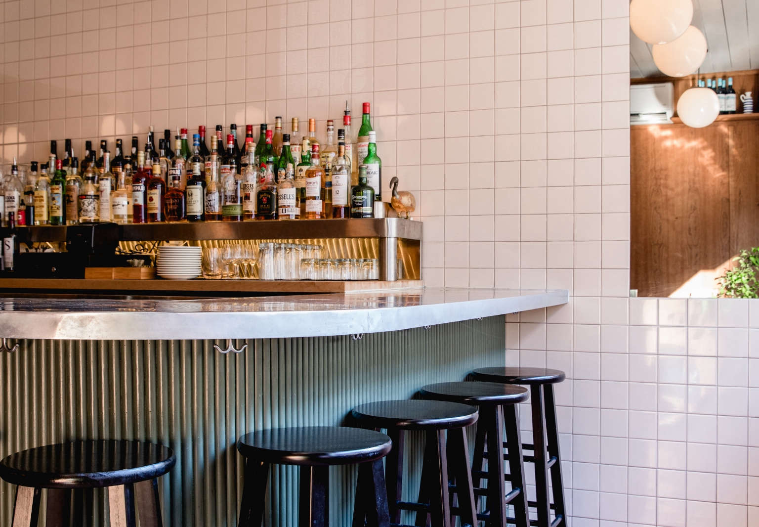
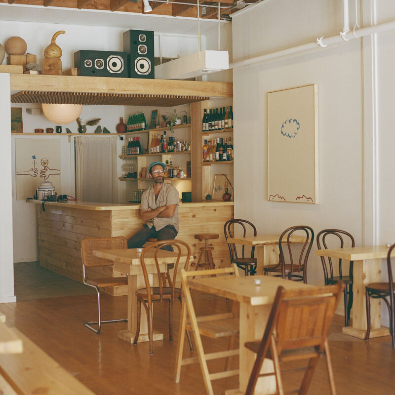
A few weeks back we dropped in on Cervo’s, a tiny Portuguese wine bar and restaurant on the Lower East Side of Manhattan. Online, we’d seen photos of corners of the space that had us intrigued: shiplap ceilings, a sliver of repurposed marble, and a palette of avocado green, terracotta, and yellow that felt chic and retro, not dated. Co-owner Nialls Fallon discovered the space (formerly the Manhattan location of cult favorite restaurant Pies ‘n’ Thighs) because he lives “only two blocks away from 43 Canal,” around the corner. He and his partner/chef Nick Perkins and partner Leah Campbell knew it would make the perfect sister restaurant to Hart’s, their original venture in Brooklyn, and set about transforming it from an all-white space to something with more charm, spearheaded by Russell Perkins (Nick Perkins’ brother), who oversaw the design.

Now, “the restaurant is very much inspired by Portuguese seafood counters and cervecerias,” Fallon and Nick Perkins say. “These spaces usually have a long bar, with the kitchen and seafood as part of the room. They are usually built using tile, wood and metalwork, which are durable and not prohibitively expensive materials. The challenge for the interior was to suggest those spaces without parroting them.” On a cold sunny Friday morning we found the Canal Street restaurant—its façade clad in mustard yellow tile—and stepped inside to get a wider view of the interiors. While we were photographing, the smell of warming olives permeated the space from the compact kitchen behind the bar—the restaurant’s only cook space. Here’s are 15 design ideas to steal.

Photography by Erin Little for Remodelista.

1. Don’t underestimate small changes.

 “the previous restaurant had a long bar running the length of the  17
Above: “The previous restaurant had a long bar running the length of the front room, with small banquettes where our high tables are now. The color palette was mostly white. There was a lot more equipment in the kitchen, and different tiles and shelving. We had very little money for this project so we knew that the remodel had to be a cosmetic one that didn’t change the general layout too much or create a need for a major utilities overhaul,” the duo says. Crucially, it did have the length for a long bar and seafood counter.

A testament that seemingly small changes can make a big impact, the team started by replacing the bar with a curved one, lowering the bar height by three inches (“it opened the space up a lot,” they say), and expanding the generous front window “so it feels more connected to the street.”

2. Counter warmth with metal.

the custom, curved zinc bar is the center of the space (and all of the cooking  18
Above: The custom, curved zinc bar is the center of the space (and all of the cooking takes place behind it). The owners also had a three-level liquor shelf custom-built by a metal shop in Williamsburg. “You draw out what you want with measurements on a piece of paper, talk about a few details, and boom, they build it,” the owners say. The metalwork adds some polish to the space without making it feel industrial. The wall behind the bar is tiled in “almond”-colored Metro Tiles from Nemo.

3. Enlist smoke and mirrors.

a long thin mirror runs above the bar, where the wall meets the ceiling. it& 19
Above: A long thin mirror runs above the bar, where the wall meets the ceiling. It’s a design trick: “The idea was to pull the wood walls into the area behind the bar, to integrate the lighter tile and ceiling colors with the darker color of the cherry,” Fallon and Perkins say. Sitting at the bar, the wall of wood paneling behind is reflected above the tile.

4. Turn shiplap on its head.

 among the team&#8\2\17;s cost saving measures: preserving the shiplap 20
Above: Among the team’s cost-saving measures: preserving the shiplap ceiling left behind by the previous restaurant. They painted it in Benjamin Moore’s Glacier White in eggshell. Against white tile walls, it adds an unexpected element of texture and keeps the space feeling bright. The globe lights are the Luna Pendant Rod from Schoolhouse Electric.

5. Seek out marble scraps.

don&#8\2\17;t overlook scraps of more expensive materials: the statement ma 21
Above: Don’t overlook scraps of more expensive materials: The statement marble ledge in the front window started as a discarded piece at a marble yard in Greenpoint, Brooklyn. “They have lots of scrap pieces left over from bigger jobs,” the owners say. “We spent a couple days going through all these marble scrap yards looking for one that would work with the rest of the color palette. We also all agreed that we wanted one where the pattern mimicked the rolling foam of a seashore.” Just outside the glass is a glimpse of the yellow tile that covers the facade; it’s also the Metro Tile from Nemo.

6. Expect tarnish.

Above: Though the restaurant opened in the summer of 2017, the interiors don’t feel overly polished, in part because the owners allow for imperfection. Above L: They allow the zinc bar to patina; “it changes every day,” Perkins says. Above R: When they started work, the space had a white and red cement tile floor from Brothers Cement Tile in Queens; to tile the newly exposed floor in the front area, they devised a charmingly imperfect solution. “They still had the form for that pattern, so we asked them to invert the colors from the original, knowing that we would never truly match them,” Fallon and Perkins say.
the narrow front room and small dining area behind. 24
Above: The narrow front room and small dining area behind.

7. Splurge on millwork.

in keeping with traditional portuguese cervecerias, the existing whit 25
Above: In keeping with traditional Portuguese cervecerias, the existing white walls were replaced with custom millwork—in this case, cherry—by Carver Farrell at Living Space Design. The row of banquettes was replaced with round high-tops painted in Fine Paints of Europe‘s #S7020-R10B in high gloss.

8. Build in storage under the counter.

with a tight prep space, the team built storage into easy to access places, lik 26
Above: With a tight prep space, the team built storage into easy-to-access places, like this metal shelf that holds serveware underneath the bar

9. Usher in unexpected ceramics.

for an interior window between the front and back rooms, the team sourced vinta 27
Above: For an interior window between the front and back rooms, the team sourced vintage—and surprisingly colorful—Portuguese ceramics online.

10. Match fixtures to the millwork.

a small but impactful detail: the millwork team made small integrated panels to 28
Above: A small but impactful detail: The millwork team made small integrated panels to seamlessly fit the custom linen sconces from Broome Lampshades to the wall.

11. Upgrade upholstery with wood.

from the photographs we&#8\2\17;d seen online, it looked like the banquette 29
Above: From the photographs we’d seen online, it looked like the banquettes in the front and back room (shown here) were upholstered in cloth, maybe velvet. But they’re clad in painted wood, “inspired by the benches our friends built at Ops in Brooklyn,” Perkins and Fallon say. They’re painted in Benjamin Moore’s Medieval Gold in satin.
built in benches also keep the tiny back room from feeling cluttered. 30
Above: Built-in benches also keep the tiny back room from feeling cluttered.

12. Retro-fit built-ins.

in the small back room, a wall of built ins is both artful and efficient. the b 31
Above: In the small back room, a wall of built-ins is both artful and efficient. The benches, cabinets and shelves, and door (which leads to the small bathroom) are all painted in Benjamin Moore’s Medieval Gold in satin.
Above L: Shelves display wine and store extra glassware and place settings. The amber-colored dishes (in front of the lamp) are vintage and are used to present the check at the end of the meal. Above R: The team transformed what was a handwashing station into a wine cooler, by removing the plumbing and having a wine bucket custom-built by the same metal shop that did the bar metalwork.

13. Take cues from what’s there.

the small bathroom is not what you might expect from the rest of the space. &am 34
Above: The small bathroom is not what you might expect from the rest of the space. “The blue fixtures were already there, so we decided to let them dictate the whole palette,” the team says. “The toilet seat was found in a bodega hardware store in Brooklyn, and the wall color is Benjamin Moore’s Calico Blue in eggshell. The bathroom tiles are also Metro Tiles, cut along the diagonal and then mixed and matched. The Anni Albers–inspired pattern is the same as the bathroom at our other restaurant, Hart’s, but in different colors.” Note the basket that holds hand towels.

14. Build in interior windows.

the millwork team built in a small window between the front and back rooms, to  35
Above: The millwork team built in a small window between the front and back rooms, to let light in and to serve as display. (Another source of light in the otherwise low-lit back room: a center skylight.)

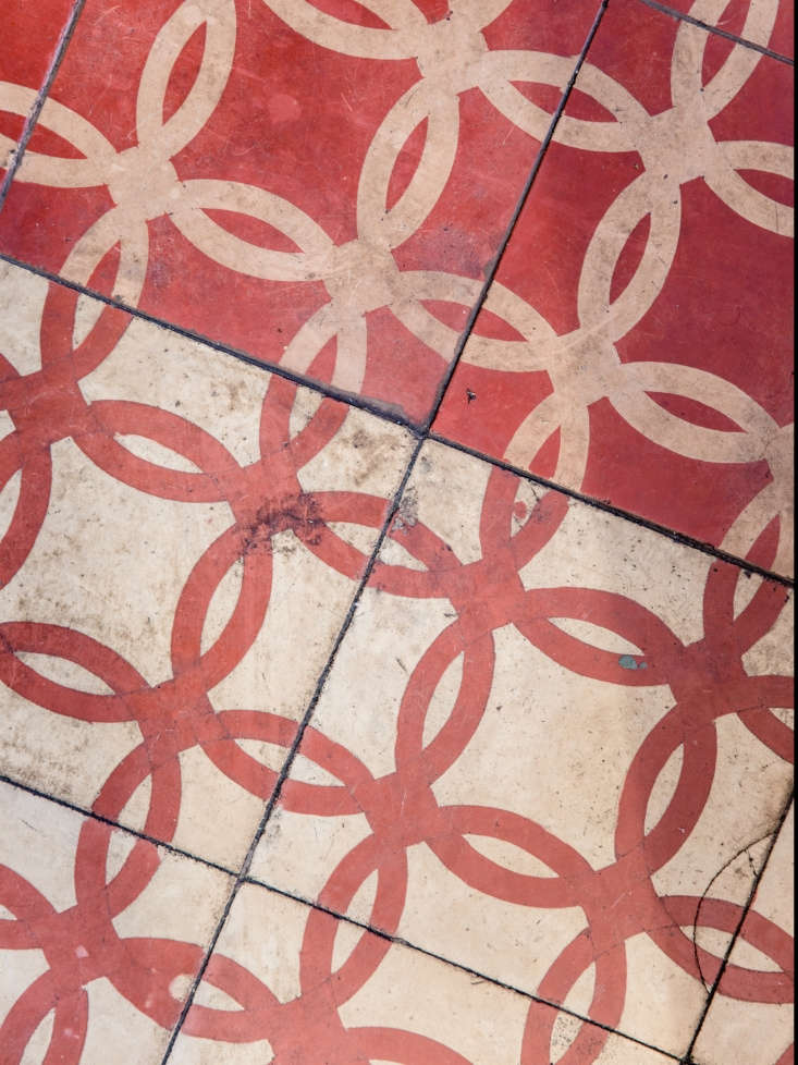
15. Bring back terracotta.

 the restaurant serves small dishes—like warm olives with lemon zes 36
Above: The restaurant serves small dishes—like warm olives with lemon zest—in terracotta dishes called cazuelas from Spain, imported from Despaña.
a moment of light in the front doorway. 37
Above: A moment of light in the front doorway.

For more unexpected ideas to steal from restaurants, see:

(Visited 3,441 times, 4 visits today)
You need to login or register to view and manage your bookmarks.

Have a Question or Comment About This Post?

Join the conversation

v5.0