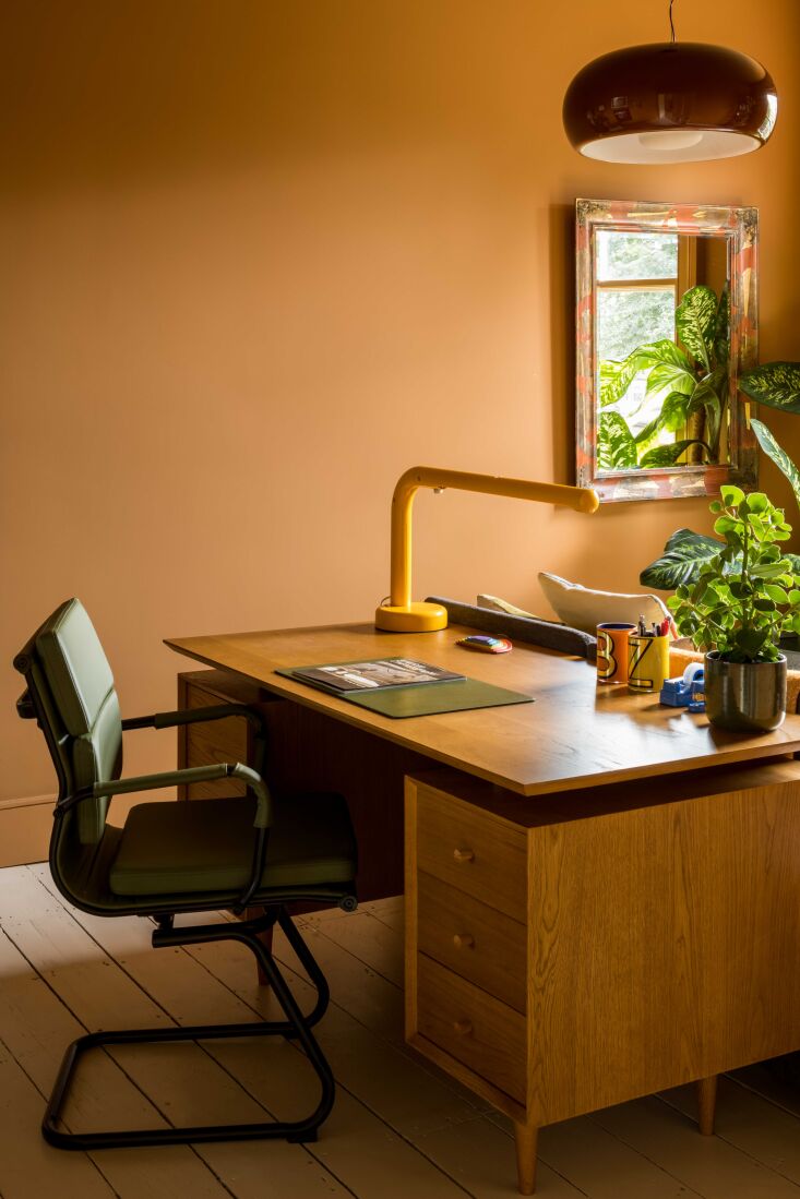
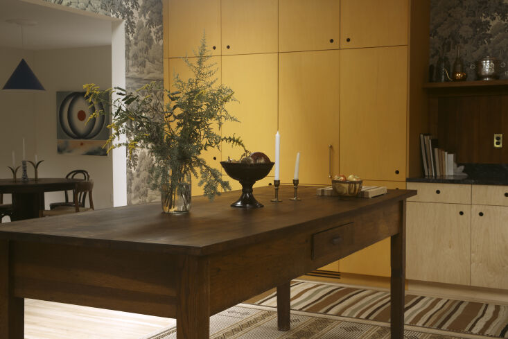
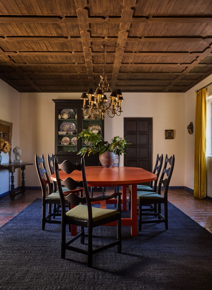
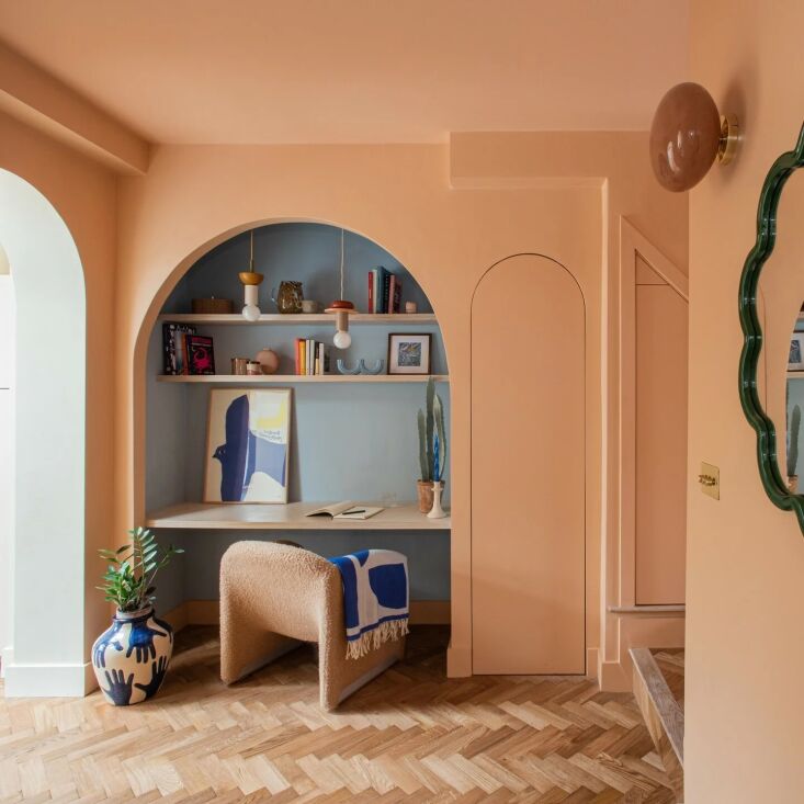
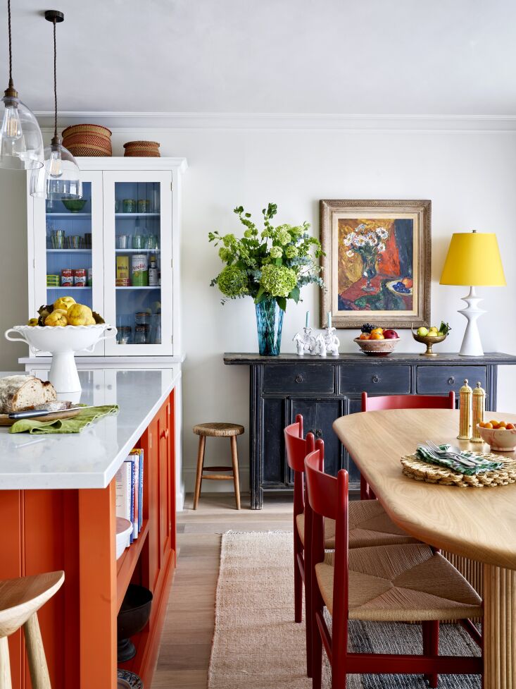
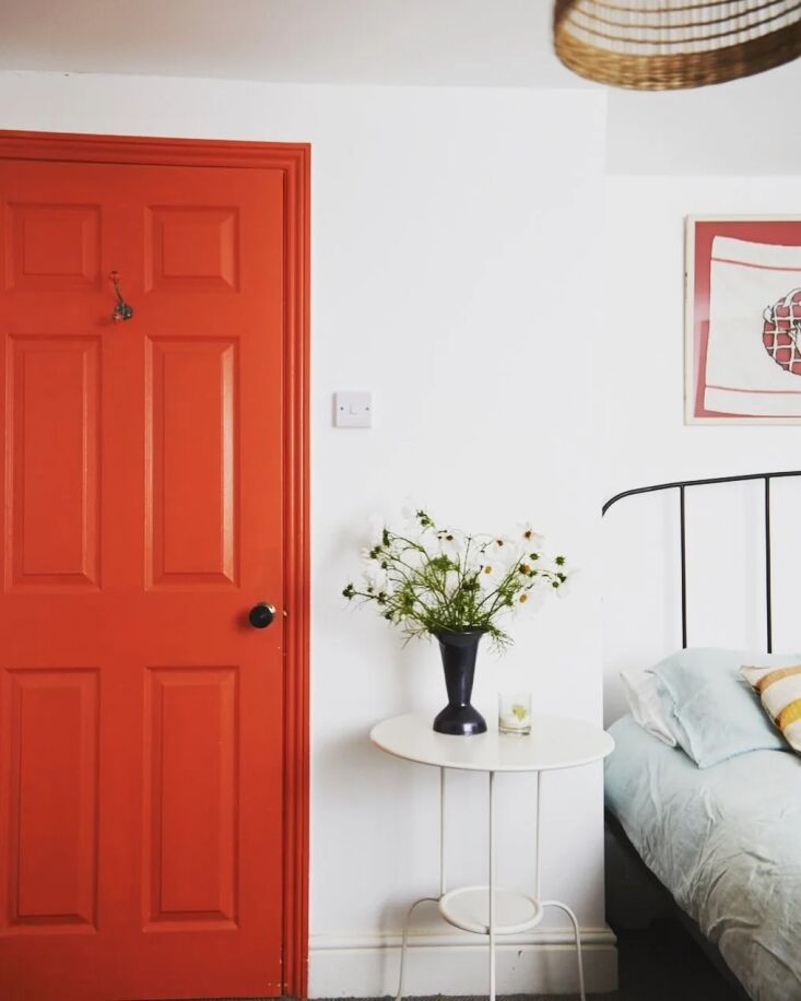
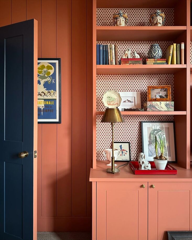
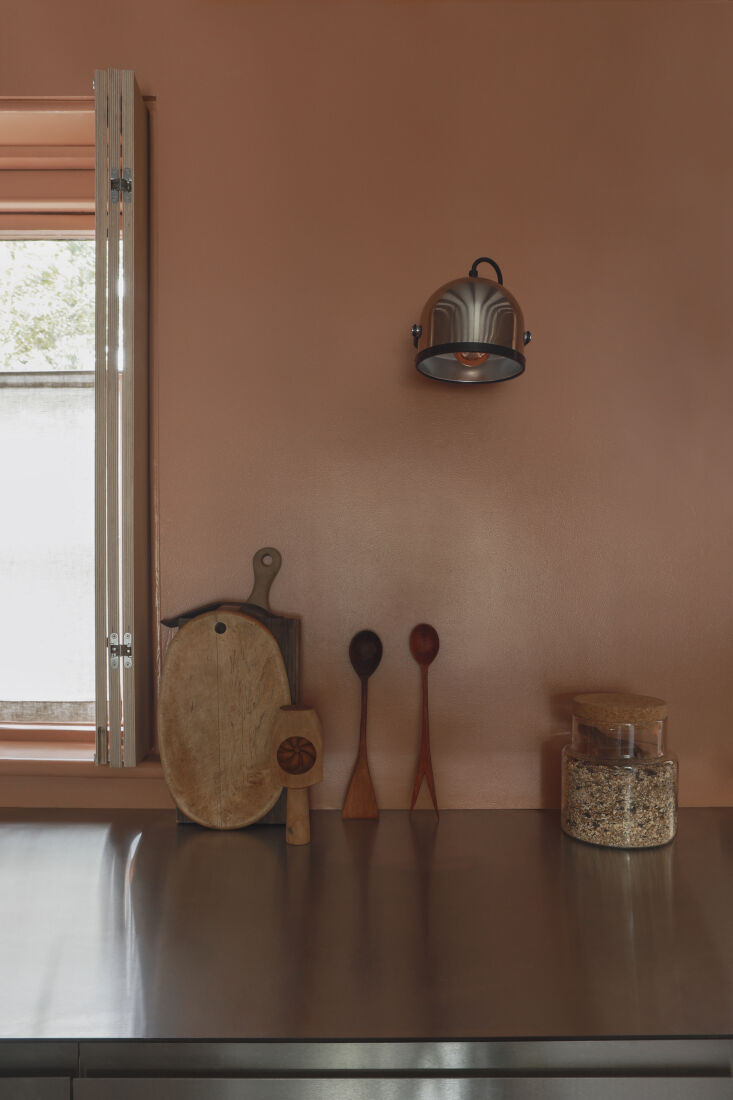
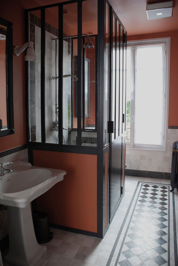
Orange is often the outlier in a palette—too bright, too burnt, or too bold. But for the architects and designers we consulted, the shade brings warmth and character without overwhelming a room. Here are 10 of their favorite shades spanning earthenware and salmon to tangerine.


For more paint picks from architects and designers, see our posts:
- 10 Easy Pieces: Architects’ Barely-There Color Paint Picks
- 10 Easy Pieces: Architects’ Favorite Yellow Paint Picks
- 10 Easy Pieces: Architects’ Favorite Of-the-Moment Green Paint Picks
- 10 Easy Pieces: Architects’ Favorite Red Paint Picks
(Visited 7,483 times, 1 visits today)
Have a Question or Comment About This Post?
Join the conversation