One of our favorite pastimes is observing the ways in which the creative directors at paint brands come up with innovative ways to apply their product. Part of the appeal is the inherent do-ability of paint: It’s affordable and the impact is instant. Which explains why a recent campaign from Farrow & Ball caught our eye:
This spring, the heritage paint brand has released Dead Flat, their “most revolutionary new finish” to date. It is virtually completely matte, meaning the true color registers whichever way you look at it. This new finish is also multi-surface, making it “the ultimate choice for color drenching”, a new trend in which an entire space—from ceiling to radiators to skirting boards—is painted the same, uninterrupted shade.
Our interest piqued, we asked Farrow & Ball’s brand ambassador, Patrick O’Donnell, how to achieve the look. Read on:
1. Start small.
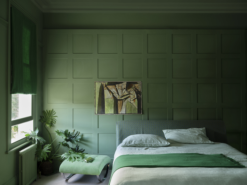
“Having continual color in a small space is a great place to start,” explains Patrick from the comfort of his color-drenched study. “Built-in furniture and even radiators can become quite distracting in small spaces. By eliminating woodwork, there’s less visual noise, and the space becomes a lot calmer.”

2. Lower loftiness.
“Color-drenching loftier rooms has the effect of dropping the ceiling, which helps make a space feel more cocooning,” explains Patrick. This technique lends itself well to entranceways and corridors, transitory spaces which are often overlooked.

3. Choose your color.
Interestingly, Patrick’s advice is to settle on your choice of color quite late in the decorating process. “Everybody will have a favorite color family they are drawn to,” reasons Patrick, who himself admits to being drawn to greens and browns (“I seem to be the only person in the world who thinks brown is the chicest color.”) Depending on your personal preference, the effect will be either one of “drama or softness, both of which are achievable with color drenching.”

Having identified your personal preference, Patrick suggests you carefully consider all the other elements that are going to exist within the space, including the flooring, any artwork or textiles, and furniture. “Think of color as the unifying glue that will bind all these elements together,” he says.

4. Get bigger, better samples.
If you’re committing to a color drench, samples are, of course, essential. “A lot of people make that classic mistake of buying too many samples and painting them all next to each other, often on a stark white background,” says Patrick. “This makes the colors register in a totally different way.”
His advice is to buy a roll of lining paper, rip a large sheet off, and paint the entire surface in two coats. “Then, it’s a moveable feast,” he says. You’ll be able to move the swatch around the space and see how the color responds in different lights and at different times.

5. Do your prep.
“Soul-destroying but necessary” is how Patrick describes this part of the job. “Sanding, sugar soaping, priming—all this will give integrity and longevity to your top coat. You’ve got to do it.” We have been told.
6. Furnish the space.
“For me, every successful room needs lightness, shade, and tension,” says Patrick. “You need focal points in the space that encourage your eye to travel around the room.” A color-drenched room, therefore, will not welcome a same-shade sofa or bedspread, for example. Far better to create contrast. With less visual distraction, furniture and art tends to “register” really well in color-drenched rooms, drawing the eye in, over, and around the decorative layers of the space.

7. Know when to stop.
Supposing you’ve successfully color-drenched one room, should you do the next? “I think you’d probably get away with color-drenching more than one room in your house,” says Patrick. “But do think about the balance of colors throughout your house. The aim is to build an empathetic palette and to think about how the colors respond to each other as you transition from room to room.”
For more expert tips and remodeling insights, head to Remodeling 101.
Frequently asked questions
What is color drenching?
Color drenching is a design technique that involves using a single color or a range of shades from the same color family to create a cohesive and immersive effect in a space. It involves painting walls, ceilings, trim, and even furniture in the same or similar hues.
What are the benefits of color drenching?
Color drenching can create a visually striking and dramatic impact in a room. It can make a space feel more expansive, cozy, or vibrant, depending on the chosen color palette. It also simplifies the decision-making process by focusing on one color scheme.
Which rooms are suitable for color drenching?
Color drenching can be applied to any room in your home, from living areas and bedrooms to kitchens and bathrooms. It's a versatile technique that can be adapted to suit various styles and preferences.
Should I use light or dark colors for color drenching?
Both light and dark colors can be used for color drenching, depending on the desired effect. Light colors can make a room feel larger and more airy, while dark colors can create a cozy and intimate ambiance.
Do I need to use different finishes for color drenching?
Using different finishes, such as matte, satin, or gloss, can add depth and texture to a color-drenched space. However, it's not necessary to use different finishes. The choice depends on personal preference and the desired visual effect.
How do I choose the right color for color drenching?
When choosing a color for color drenching, consider the mood you want to create and the existing elements in the room, such as furniture and flooring. Test paint swatches on the walls and observe how they appear in different lighting conditions before making a decision.
Can I use color drenching in small spaces?
Yes, color drenching can be used in small spaces to create an impactful design statement. Using lighter hues can help make a small room feel more open and spacious.
Have a Question or Comment About This Post?
Join the conversation