Icon - Arrow LeftAn icon we use to indicate a rightwards action. Icon - Arrow RightAn icon we use to indicate a leftwards action. Icon - External LinkAn icon we use to indicate a button link is external. Icon - MessageThe icon we use to represent an email action. Icon - Down ChevronUsed to indicate a dropdown. Icon - CloseUsed to indicate a close action. Icon - Dropdown ArrowUsed to indicate a dropdown. Icon - Location PinUsed to showcase a location on a map. Icon - Zoom OutUsed to indicate a zoom out action on a map. Icon - Zoom InUsed to indicate a zoom in action on a map. Icon - SearchUsed to indicate a search action. Icon - EmailUsed to indicate an emai action. Icon - FacebookFacebooks brand mark for use in social sharing icons. flipboard Icon - InstagramInstagrams brand mark for use in social sharing icons. Icon - PinterestPinterests brand mark for use in social sharing icons. Icon - TwitterTwitters brand mark for use in social sharing icons. Icon - Check MarkA check mark for checkbox buttons.
You are reading

Wilder, in London: 9 Design Ideas to Steal from Terence Conran’s New Forage-Focused Restaurant

Search

Wilder, in London: 9 Design Ideas to Steal from Terence Conran’s New Forage-Focused Restaurant

January 15, 2020

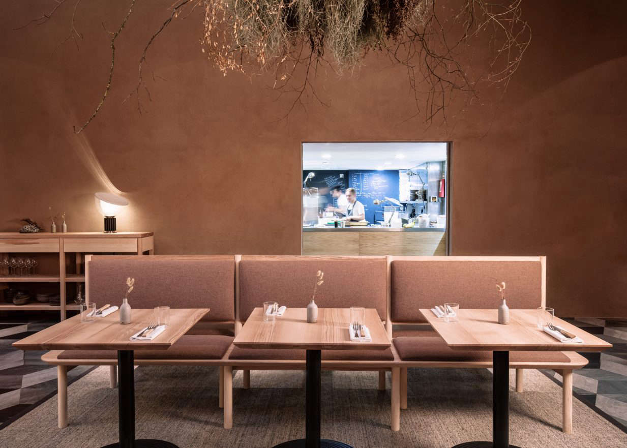
The mission of Wilder, a new restaurant in the basement of Terence Conran’s hotel, Boundary London, is to spotlight the best of British produce. From its website: “We work closely with farms and also grow our own vegetables and herbs. And we use what can be found from the meadows, woods and along the coastlines of these isles.” This forage-focused strategy has also informed its clever, inspired design.

The strategy was in part borne out of necessity: Architecture and design studio Kirkwood McCarthy were given a budget of just £100,000 to work with—an ambitiously low figure considering the room’s size (2,206 square feet). “Bringing intimacy to a very large basement site, and being decisive about what design interventions we could implement given the tight budget,” says co-founder Fiona Kirkwood, were the biggest challenges.

It helped, certainly, that the some of the fundamentals were already in place and in good condition, including a lovely light-colored brick wall and a geometric marble tiled floor. Both of these “found” elements would go on to influence the rest of the design, from the terracotta palette to the furniture.

Below, 10 design ideas to steal from Wilder.

Photography by Fergus Coyle, courtesy of Kirkwood McCarthy.

1. Clay-Plaster Walls

one of the most striking features in the space is the terracotta colored wall,  17
Above: One of the most striking features in the space is the terracotta-colored wall, a new addition. It’s finished with a natural clay plaster that not only subtly references its basement location but also, says Kirkwood, brings “an acoustic hush” to the cavernous space.

2. A Geometric Marble Tiled Floor

the restaurant is divided into three sections—a bar/lounge area ( d here 18
Above: The restaurant is divided into three sections—a bar/lounge area (pictured here), the main dining room, and a private dining area. The original tiled marble floors, laid out in an arresting graphic pattern, remain; while it’s bold, it’s just subtle enough, thanks to muted grays, to play nicely with the minimalist decor.

3. Flexible Partitions

kirkwood designed a partition between the bar and main dining area that can be  19
Above: Kirkwood designed a partition between the bar and main dining area that can be moved to accommodate large events.

4. Light Brick Walls

exposed brick can look dated when too bright; luckily, the original brick walls 20
Above: Exposed brick can look dated when too bright; luckily, the original brick walls here feature a light-colored and matte brick that feels both classic and modern. The round pewter tables were from the previous restaurant in the space.

5. Unexpected Views

portals give diners a peek into the kitchen and offer views that basements gene 21
Above: Portals give diners a peek into the kitchen and offer views that basements generally don’t or can’t.

6. A Hard-Working Console

an \1\1 foot long waiter station is functional and provides storage for the res 22
Above: An 11-foot-long waiter station is functional and provides storage for the restaurant’s glassware and bespoke ceramics. Note the use of a single table lamp, positioned to highlight the wall’s plaster texture.

7. Sisal Rugs

the designer used sisal rugs throughout. they make the space feel cozier and mo 23
Above: The designer used sisal rugs throughout. They make the space feel cozier and more intimate and complement the natural tones and materials selected for the project.

8. Foraged Foliage

hovering over each of the three spaces ( d here is the private dining room) is  24
Above: Hovering over each of the three spaces (pictured here is the private dining room) is a striking suspended arrangement of foliage that features tree branches found on Conran’s home estate in Berkshire, Barton Court, combined with grasses and wildflowers.

9. Furniture Inspired by the Architecture

while some of the existing furniture was reused for the new restaurant, new cus 25
Above: While some of the existing furniture was reused for the new restaurant, new custom furniture was also commissioned—like the olive ash banquettes upholstered in clay-red fabric and featuring rounded corners that reference the soft bullnose bricks and arches of the original building.

For similar content, see:

(Visited 546 times, 1 visits today)
You need to login or register to view and manage your bookmarks.

Have a Question or Comment About This Post?

Join the conversation

v5.0