Icon - Arrow LeftAn icon we use to indicate a rightwards action. Icon - Arrow RightAn icon we use to indicate a leftwards action. Icon - External LinkAn icon we use to indicate a button link is external. Icon - MessageThe icon we use to represent an email action. Icon - Down ChevronUsed to indicate a dropdown. Icon - CloseUsed to indicate a close action. Icon - Dropdown ArrowUsed to indicate a dropdown. Icon - Location PinUsed to showcase a location on a map. Icon - Zoom OutUsed to indicate a zoom out action on a map. Icon - Zoom InUsed to indicate a zoom in action on a map. Icon - SearchUsed to indicate a search action. Icon - EmailUsed to indicate an emai action. Icon - FacebookFacebooks brand mark for use in social sharing icons. flipboard Icon - InstagramInstagrams brand mark for use in social sharing icons. Icon - PinterestPinterests brand mark for use in social sharing icons. Icon - TwitterTwitters brand mark for use in social sharing icons. Icon - Check MarkA check mark for checkbox buttons.
You are reading

Dappled Light: A Slim but Poetic Townhouse on a Tree-Lined Square in Ghent, Belgium

Search

Dappled Light: A Slim but Poetic Townhouse on a Tree-Lined Square in Ghent, Belgium

April 29, 2022

Sometimes we come across a project that, as it turns out, we’ve all, independently, been eyeing. Such was the case with a slim, light-filled townhouse in Ghent, Belgium: When I showed a photo of the pale green, dappled-glass kitchen to Julie a while back, Alexa chimed in to say she’d bookmarked it herself.

The townhouse, in its original form, was built in “the third quarter of the 19th century” on “a quiet square filled with plane trees in the very center of Ghent,” say Belgian architects (and couple) Bram Seghers and Inge Buyse of Buyse Seghers Architecten. The homeowner, a single woman, had her living areas on the street level, and wanted more space, privacy, and the ability to entertain friends and passing houseguests with ease. “Just before we were contacted, the owner had had doubts about it being possible to renovate the former house to a quality home,” the architects say. “The living spaces on the lowest floor were too small and had privacy issues. But she loved the location and the idea of having a place with the best of both worlds: a combination of a quiet, small home with life in the inner city.”

The architects got to work, breaking down the entire house (“we only kept the roof and top floor,” the architects say) and building, piece by piece, “mainly a new house in between an existing fabric of houses.” The reimagined townhouse is contemporary, they say, with nods to old Belgium, the square on which it sits, and “the classic typology of townhouses (in London, Amsterdam),” Seghers says. “Less was put back compared to what was initially taken away.”

Most of all, the townhouse is designed to capture light and calm in the middle of the city: “The quietness and ease is certainly an intention,” the architects say. “We seek tranquillity in the spaces we design. In ‘digital times’ everything moves fast. We need real space to hold onto.”

Join us for a look.

Photography by Frederik Vercruysse.

&#8\2\20;the house was originally part of the house to the left of it,& 17
Above: “The house was originally part of the house to the left of it,” as you face it, the architects say. They broke down and rebuilt the house in stages so that the interior structures still acted as scaffolding for the houses beside.

To fulfill the client’s request for privacy and work with the building’s narrowness—it’s only four meters, or 13 feet, wide in the front—the architects reshuffled the levels of the building. “We discovered in archives that a building permit had been given in the past for a garage on +0 [European shorthand for the ground floor], so we suggested moving the living area to +1 [the next floor up] and renewing the garage on +0,” the architects explain. The effect means more privacy—and light—for the elevated living areas.

The stucco exterior is also new. “We wanted the facade to be distinct enough standing next to the larger and more imposing houses on the same square,” Seghers says. “At the same time, we are using materials which are found elsewhere on the square and which completely fit in. In our work we are inspired by the surroundings of a project and the history of the place we are working in.”

the new facade is two toned, with a &#8\2\20;very light green lacquer paint 18
Above: The new facade is two-toned, with a “very light green lacquer paint covering doors and facade, as if in one plinth,” the architects say, adding that the glossiness of the paint makes it easier to maintain and less apt to show dirt. The balcony is made of concrete, poured on-site, with a railing in polished brass which will “get a natural wear by using it,” they say.
the subtle garage doors. the pale green exterior sets a motif that&#8\2\17; 19
Above: The subtle garage doors. The pale green exterior sets a motif that’s carried throughout the interiors.

inside, the entryway leads back, away from the street. &#8\2\20;the bottom  20
Above: Inside, the entryway leads back, away from the street. “The bottom floor was raised up a few steps so we could create slower and easy-going stairs between the bedroom [on the ground floor] and the living room [on the next floor],” Seghers says. “At the same time, because of the raised floor, the ground floor receives more light, and one looks over the front door toward the trees on the square.”
The steps are a luxe black marble, paired with a black floor mat made of woven coconut fibers.

originally, the interiors were divided into small rooms. &#8\2\20;every fli 21
Above: Originally, the interiors were divided into small rooms. “Every flight of stairs was connected to the next flight of stairs with a corridor. This took up an incredible amount of circulation space,” Seghers says. The architects shifted the bones of the house simply but strikingly, moving the staircase inside the wall (at left) and behind a door, allowing the living room and kitchen to be open and uninterrupted. Moving the living areas to the higher floor also means they get “more light, more sun, better privacy, and a view into the trees and leaves.”

Throughout, the interiors are kept poetically simple. “The wooden floors and joining stairs are new oak, but keeping knots and other imperfections, and whitened and scrubbed with pale soap,” the architects say. “We use materials that don’t need continuous attention nor cleaning. We prefer materials that can be ‘lived.’ At the same time, we believe that we don’t need to use old materials. Our houses are contemporary.”

In the kitchen, black 20-by-20-centimeter floor tiles are set at a diagonal. “Because all walls in the house are crooked and we don’t like losing space by thickening walls, we leave all walls crooked,” the architects say. “That’s why we put our floor tiles diagonal. If you put the tiles straight one would notice, by the joints, that the walls are not running along straight.”

the kitchen cabinets and vent hood were designed by the architects, made bespok 22
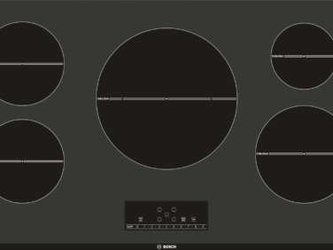
Above: The kitchen cabinets and vent hood were designed by the architects, made bespoke by a cabinetmaker. The white countertop is solid surface, made in Germany by GetaCore. The sink and faucet are by Belgian company Franke, and the cooktop is the Siemens EH 801 MM 11E Induction Range, installed flush with the counter. “You can put a tablecloth on top and use it as a serving counter during dinner parties without level differences beneath,” Seghers says. (The Bosch 500 Series 36″ Induction Cooktop is similar, and available in the US.)
The cabinets are painted in a glossy oil paint. “It’s very sturdy and makes the cabinets more beautiful as they wear,” the architects say.

As for the soft green used throughout the townhouse, the architects say, “We have large sheets of paper with color that we put up in the houses before we paint. It’s a collection we have used throughout our homes. After a while, we know what feeling and effect each color has, but in the end you always have to fix them to fit in a certain space. For instance, the color of the trees as a profound effect.” They use proprietary shades and color codes, mostly from Belgian-based Boss Paints.

the inset upper cabinets are fitted with dappled glass—&#8\2\2\1;atl 23
Above: The inset upper cabinets are fitted with dappled glass—”Atlantic” from AGC’s Imagin collection—which lends an almost watercolor quality. “The great thing about this type of glass is that you can see color and sun through the glass,” Seghers says. “It is used very often in entrance doors of old houses.”
opposite, inset cabinetry makes use of the space behind the wall (which, toward 24
Above: Opposite, inset cabinetry makes use of the space behind the wall (which, toward the front of the townhouse, is where the staircase is set). Kitchen appliances, including an oven and fridge, plus a vacuum, are hidden away neatly within the cupboards.
looking back toward the front of the townhouse, with the tops of the plane tree 25
Above: Looking back toward the front of the townhouse, with the tops of the plane trees showing through the windows and the inset staircase visible at right. These photographs were taken when the homeowner was moving back in; the velvet chairs in sage and rust are the architects’ own, and the small round table, draped with a cloth, is a placeholder.
the stairways, tucked behind the wall. 26
Above: The stairways, tucked behind the wall.
on the ground floor, one flight down, is the master bedroom, set back from the  27
Above: On the ground floor, one flight down, is the master bedroom, set back from the street for maximum privacy. It’s painted in a pale gray, with subtle brass hardware from family-owned Belgian company Jaro Style, which the architects used throughout, and a white ladder-back chair from Dille & Kamille.

Note the entryway visible down the hall: The ochre glass pendant light is an “old piece from the owner.”

beside the bedroom, off the hall, is a small bathroom, painted in a proprietary 28
Above: Beside the bedroom, off the hall, is a small bathroom, painted in a proprietary shade of blue from Boss Paints. The sink is by Duravit and the mirror is the client’s own.

Another trick to capture light, the architects say: “The deep, closed cupboard [which houses the stairs] also conceals a steel tube, bringing an unexpected spot of sunlight to the enclosed stairs.”

Plans

the ground floor of the townhouse, with a garage in front that sets the private 29
Above: The ground floor of the townhouse, with a garage in front that sets the private areas—the master bedroom and bathroom—back from the street. Behind the bedroom is a “silent” patio,” the architects say.
the next floor up, showing the living area and kitchen, with the staircase and  30
Above: The next floor up, showing the living area and kitchen, with the staircase and cabinetry set into the walls. This floor also opens onto the balcony (on the street side) and a sunny terrace (in back). There is a top floor, which the architects say is fitted with “guest amenities.”

In Progress

the project in progress. &#8\2\20;we worked in phases,&#8\2\2\1; segher 31
Above: The project in progress. “We worked in phases,” Seghers says. “The existing floors were taken out only after the new floors were put in, the old floors acting as a free scaffolding holding the adjacent houses from falling in.” Photograph courtesy of Buyse Seghers Architecten.

Before

the house in the \1960s. &#8\2\20;the question &#8\2\16;is it old (exis 32
Above: The house in the 1960s. “The question ‘Is it old (existing) or is it new?’ does touch part of the essence of our work and the continuous contradictions we face,” the architects wrote to me in an email. “We are looking for beautiful light, the right proportions, an airy feeling. It is not our intention to make our interventions noticed or impose architecture. Our work tries to find solutions and at the same time fit in. What is new today is old tomorrow. Everything is new and old.” Photograph courtesy of Buyse Seghers Architecten.

Follow the architects @bramseghers and the photographer @frederik_vercruysse. And, for more from Buyse Seghers Architecten, see A Fairy-Tale Castle in Belgium: The Architects’ Version.

And for more Belgian architecture and interiors, see:

N.B.: This post has been updated with new links and language; the original ran on June 8, 2018.
(Visited 2,239 times, 1 visits today)
You need to login or register to view and manage your bookmarks.

Product summary  

Have a Question or Comment About This Post?

Join the conversation

v5.0