Icon - Arrow LeftAn icon we use to indicate a rightwards action. Icon - Arrow RightAn icon we use to indicate a leftwards action. Icon - External LinkAn icon we use to indicate a button link is external. Icon - MessageThe icon we use to represent an email action. Icon - Down ChevronUsed to indicate a dropdown. Icon - CloseUsed to indicate a close action. Icon - Dropdown ArrowUsed to indicate a dropdown. Icon - Location PinUsed to showcase a location on a map. Icon - Zoom OutUsed to indicate a zoom out action on a map. Icon - Zoom InUsed to indicate a zoom in action on a map. Icon - SearchUsed to indicate a search action. Icon - EmailUsed to indicate an emai action. Icon - FacebookFacebooks brand mark for use in social sharing icons. flipboard Icon - InstagramInstagrams brand mark for use in social sharing icons. Icon - PinterestPinterests brand mark for use in social sharing icons. Icon - TwitterTwitters brand mark for use in social sharing icons. Icon - Check MarkA check mark for checkbox buttons.
You are reading

Kitchen of the Week: A Poetic Apartment Kitchen by Studio Oink

Search

Kitchen of the Week: A Poetic Apartment Kitchen by Studio Oink

March 22, 2018

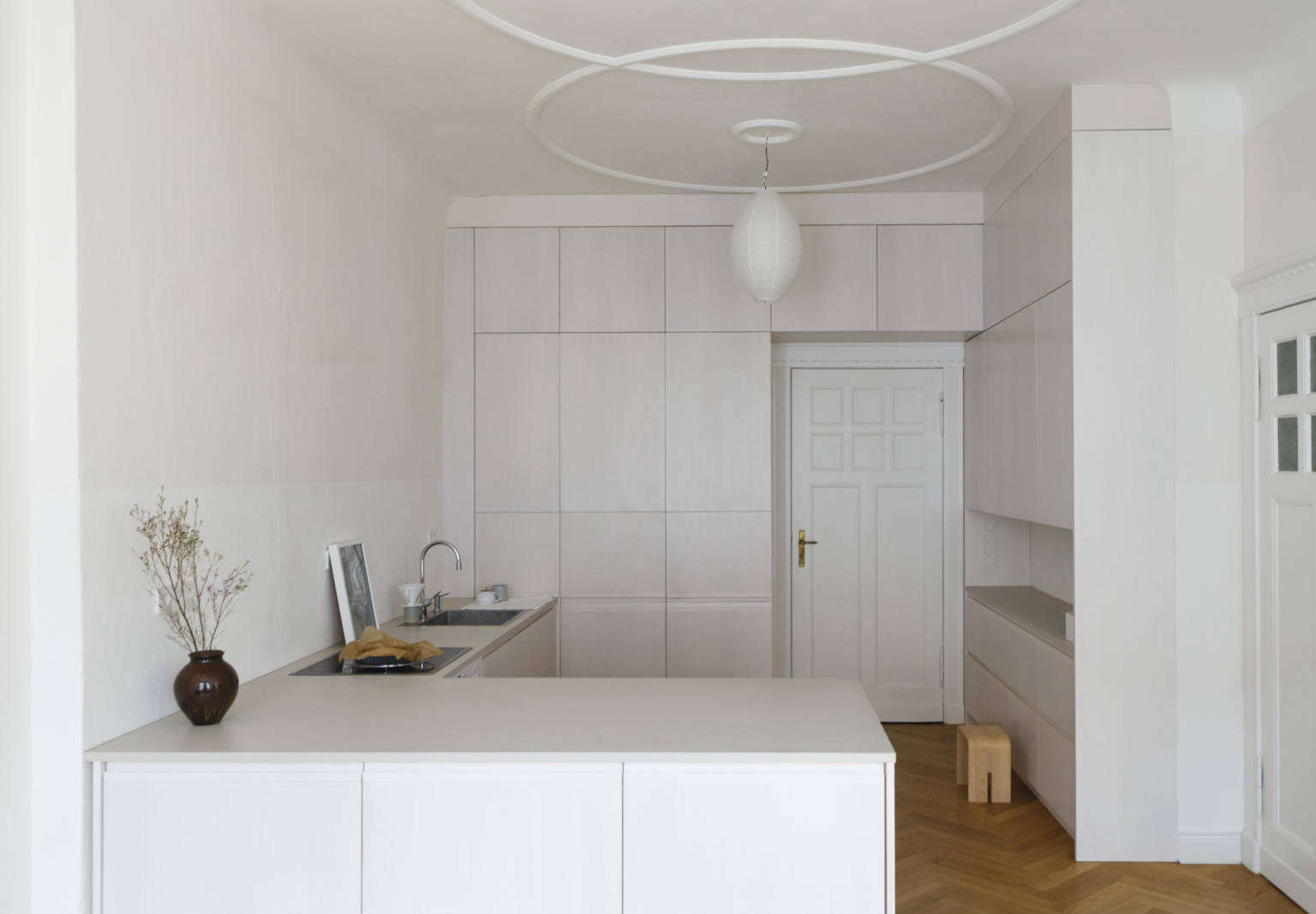
The briefing: to create a “wide and open layout with a calming atmosphere”—oh, and a lot of built-in storage. The space itself, a flat in a late-19th-century apartment building in Berlin’s Wilmersdorf district, came with its original paneled doors and French windows. The wrinkle? The structure was in the midst of being overhauled by its seller-developer. The new owners, a young family of three, decided to break from the builder’s standard program and asked husband-and-wife duo Matthias Hiller and Lea Korzeczek of Studio Oink in Leipzig to step in: “We saw Lea and Matthias’s work online and were drawn to their poetic, rigorous approach.”

Working with the developer at first proved fraught for the designers: “Every custom-made solution from our side was a problem and ‘impossible’ in the beginning,” reports Korzeczek. “We had to find a balance for what is in our mind and what is possible. Some ideas had to be reduced to simple shapes that could be manufactured and were not too expensive.” The serene—and storage-filled—results belie (perhaps even benefited from?) the process. We especially love the streamlined, ethereal kitchen designed around a simple grid. If culinary spaces exist inside clouds, this is what they might look like.

Photography by and courtesy of Studio Oink.

a sunny, centrally located room was selected to be the new kitchen and dining a 17
Above: A sunny, centrally located room was selected to be the new kitchen and dining area. It features the requested counters and built-ins, all visually minimized through the use of seamless white volumes. The grid of cabinets in the back, for instance, “feels more like an existing wall than massive cabinets,” points out Korzeczek.

The plaster walls were stripped of old wallpaper and finished with lime paint from Kreidezeit. Early in the process, when the room’s existing ceiling moldings couldn’t be saved, the owners sketched the circles themselves and had them created by plasterwork specialist Juergen Liebe. In a room composed of squares, rectangles, and zigzags (the herringbone floor is also new), these interlocking rings serve as a grace note.

studio oink selected maple for the cabinetry—&#8\2\2\1;because it ha 18
Above: Studio Oink selected maple for the cabinetry—”because it has a quiet graining”—and sealed it with a white-pigmented wood wax. It’s subtly offset by counters of Forbo Furniture Linoleum in a color aptly called mushroom.

Note that the cooktop and sink mirror each other: “We tried to calm down the overall picture by choosing the same sizes and proportions for each, 60 by 60 centimeters,” says Korzeczek. The white range and ceramic cooktop are by German brand Neff. The dishwasher is concealed in the cabinet to the left of the sink, and the fridge is in the cabinets immediately next to the back door.

 the sink and faucet are both by blanco (see \10 easy pieces: architects&a 19
Above: The sink and faucet are both by Blanco (see 10 Easy Pieces: Architects’ Go-To Modern Kitchen Faucets), and, in lieu of a dish rack, the family takes the minimalist approach and uses a towel.

The black-and-white photograph is by Francis Alÿs.

&#8\2\20;we asked lea and matthias to design kitchen storage that was at on 20
Above: “We asked Lea and Matthias to design kitchen storage that was at once invisible, pleasing, and capacious,” say the owners. “We worked out the final details with our cabinetmaker Doris Goetz; she was a real craftswoman, meticulous in her approach.”

The lower cabinet sections have cutout handles and the upper have touch-latch openings; a ladder with its own slot in one of the cupboards is used to access the upper reaches.

a japanese hinoki bath stool from remodelista favorite analogue life is perched 21
Above: A Japanese Hinoki Bath Stool from Remodelista favorite Analogue Life is perched alongside cabinets used for pantry supplies and small appliances. (To hide “all the technical stuff, such as the toaster and mixer,” Studio Oink designed a cafe curtain still to be installed along the open shelf.)
The paper lantern hanging lights here and in the dining area are the $7.99 Sollefteå from Ikea, placeholders that the owners hung until they find replacements. There’s also task lighting over the sink and stove.

an &#8\2\20;extra warm artificial light&#8\2\2\1; cloaks the side cabin 22
Above: An “extra-warm artificial light” cloaks the side cabinet in what looks like sunlight.
the wall behind the range and sink has an invisible backsplash: it&#8\ 23
Above: The wall behind the range and sink has an invisible backsplash: It’s painted with what the owners’ describe as “a robust, wipeable paint” that rises for approximately three feet and matches the limewash: “Our painter, Sven Bath, did such an amazing job that you can’t see the transition.” As for lime paint in the kitchen, they report, “we used it throughout the apartment and it’s been great; we’ve had no issues with fingerprints.”
the drawers are made of solid maple. 24
Above: The drawers are made of solid maple.
the white electrical outlets are by berker (for other good looking options 25
Above: The white electrical outlets are by Berker (for other good-looking options, see 10 Easy Pieces: Problem-Solving Electrical Outlet Covers).
french doors open to a balcony. 26
Above: French doors open to a balcony.
the family&#8\2\17;s existing table and a set of bentwood chairs &#8\2\ 27
Above: The family’s existing table and a set of bentwood chairs “provide a nice contrast to the simple, geometric kitchen,” says Korzeczek. “They introduce something very private and owner-related to the space.”

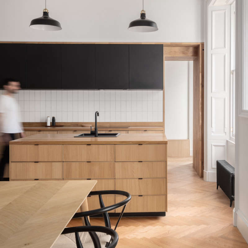
We recently featured Studio Oink’s first US commission: A Luminous, Euro-Style Row House in Washington D.C.

Here are two more of their projects:

(Visited 904 times, 1 visits today)
You need to login or register to view and manage your bookmarks.

Product summary  

Have a Question or Comment About This Post?

Join the conversation

v5.0