Icon - Arrow LeftAn icon we use to indicate a rightwards action. Icon - Arrow RightAn icon we use to indicate a leftwards action. Icon - External LinkAn icon we use to indicate a button link is external. Icon - MessageThe icon we use to represent an email action. Icon - Down ChevronUsed to indicate a dropdown. Icon - CloseUsed to indicate a close action. Icon - Dropdown ArrowUsed to indicate a dropdown. Icon - Location PinUsed to showcase a location on a map. Icon - Zoom OutUsed to indicate a zoom out action on a map. Icon - Zoom InUsed to indicate a zoom in action on a map. Icon - SearchUsed to indicate a search action. Icon - EmailUsed to indicate an emai action. Icon - FacebookFacebooks brand mark for use in social sharing icons. flipboard Icon - InstagramInstagrams brand mark for use in social sharing icons. Icon - PinterestPinterests brand mark for use in social sharing icons. Icon - TwitterTwitters brand mark for use in social sharing icons. Icon - Check MarkA check mark for checkbox buttons.
You are reading

Modernity in Outer Paris: A 1910 House in Île-de-France by Mudo Architecture

Search

Modernity in Outer Paris: A 1910 House in Île-de-France by Mudo Architecture

March 18, 2024

We recently discovered the work of architects Nicolas Mussche and Elodie Doukhan of Paris-based Mudo through photographer Mary Gaudin who shot their latest project in Gentilly, an inner suburb just south of Paris.

Located on a former working class street where factories have been replaced with offices and residences, the house has been lived in for several years  by the client, a landscaper who contacted Nicolas and Elodie about the refurbishment. “The building was in pretty bad shape at the time, with leaks and moisture issues, and a few cracks related to the underground quarries below (they’re very frequent in that side of Paris),” Nicolas explains. It was time for an update. The gut renovation kept most of the concrete and cinderblock structure, built around 1910, intact. “We proposed a very sober and clear architecture, working on some archetypal Parisian pavilion traits while bringing a touch of modernity,” says Nicolas.

Photography by Mary Gaudin.

mudo worked to keep as much ground space in the front yard as possible. the exi 17
Above: Mudo worked to keep as much ground space in the front yard as possible. The existing enclosed carport was replaced with a wooden pergola. The fence was replaced with steel frames and perforated panels finished with zinc plating.

The house is just 75 square meters (about 800 square feet) and includes two bedrooms and one bathroom in addition to a basement floor. “The building was deteriorating, mostly the roof and the existing lean-to,” says Nicolas. “The lean-to was too dilapidated to be preserved, so we had to rebuild it with a timber frame extension, on top of a concrete raft due to the quarries geotechnical constraints.” The roof was rebuilt to create more space on the second floor and the house was “wrapped” in a wood fiber insulation.

the wood cladding on the exterior is douglas fir that mudo chose for its durabi 18
Above: The wood cladding on the exterior is Douglas fir that Mudo chose for its durability. The sliding doors and all windows are framed in spruce to match the interior. The initial proposal was entirely in Douglas fir but due to inflation of cost during the project, the architects opted for a more affordable option.

Having both studied at the École Spéciale d’Architecture in Paris and worked at firms in Paris and Montreal, Elodie and Nicolas founded Mudo in 2020. The duo appreciates architectural solutions that are pragmatic and poetic in equal measure, with sustainability top of mind. In the Gentilly refurbishment, the architects worked to achieve ecological objectives by preserving as much of the existing layout as possible (to reduce the carbon footprint of the construction as well as to preserve heritage). They used a limited range of materials and kept construction as light as possible. Finally, they “wrapped” the house in wood fiber insulation to limit cold bridges.

sliding glass doors open into the kitchen. 19
Above: Sliding glass doors open into the kitchen.
the countertop is a grey romanian marble with deep shades of blue veining, brou 20
Above: The countertop is a grey Romanian marble with deep shades of blue veining, brought to Mudo by the contractor’s acquaintance who owns a quarry in Romania. In keeping within budget constraints, the appliances are all Ikea.
the custom kitchen is built out of 3 ply spruce panels coated with a clear sati 21
Above: The custom kitchen is built out of 3-ply spruce panels coated with a clear satin varnish.
mudo created a 3 ply spruce entryway cabinet surrounding the staircase to serve 22
Above: Mudo created a 3-ply spruce entryway cabinet surrounding the staircase to serves as storage and a partition between the dining and living rooms.
a view of the dining room and an antique settee that was part of the original l 23
Above: A view of the dining room and an antique settee that was part of the original living room.
a view looking into the living room. 24
Above: A view looking into the living room.
the living room is designed with the client&#8\2\17;s furniture that center 25
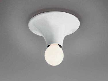
Above: The living room is designed with the client’s furniture that centers around a vintage Artemide chandelier by Toni Cordero.
&#8\2\20;the few concrete structural elements are kept un plastered as a tr 26
Above: “The few concrete structural elements are kept un-plastered as a trace of the structural interventions on the house,” says Nicolas of the exposed concrete window and door framing.
the staircase is original to the house. &#8\2\20;it was covered with many l 27
Above: The staircase is original to the house. “It was covered with many layers of paint, so we had to strip it bare. We matched a green paint for the steps and riser elements that is very close to one of those existing paint layers.
the sconce is a vintage artemide teti sconce. 28
Above: The sconce is a vintage Artemide Teti Sconce.
one of the bedrooms designed simply with selective color and the client&#8\ 29
Above: One of the bedrooms designed simply with selective color and the client’s existing furniture.
&#8\2\20;the two bedrooms are the bathroom benefit from high ceilings under 30
Above: “The two bedrooms are the bathroom benefit from high ceilings under the 3-ply spruce sloping ceilings, bringing warmth and generosity to these small rooms,” the architects explain.
the second, more compact bedroom on the second floor. 31
Above: The second, more compact bedroom on the second floor.
the bathroom is designed with 3 ply spruce storage and romanian marble to echo  32
Above: The bathroom is designed with 3-ply spruce storage and Romanian marble to echo the kitchen.
mudo integrated a circular skylight above the original staircase to bring natur 33
Above: Mudo integrated a circular skylight above the original staircase to bring natural light into the center of the home.
a set of fermob luxembourg tables and chairs in bright red stand out against th 34
Above: A set of Fermob Luxembourg tables and chairs in bright red stand out against the zinc and Douglas fir backdrop.
&#8\2\20;the gate and fence in metal sheet steel provides a gradient of pri 35
Above: “The gate and fence in metal sheet steel provides a gradient of privacy to support future planting,” says Nicolas.
being a landscaper, the front yard is being planted and managed by the client. 36
Above: Being a landscaper, the front yard is being planted and managed by the client.

Before

a view of the former property. photograph courtesy of mudo. 37
Above: A view of the former property. Photograph courtesy of Mudo.

For more French interiors see our posts:

(Visited 16,107 times, 2 visits today)
You need to login or register to view and manage your bookmarks.

Product summary  

Modernity in Outer Paris A 1910 House in ledeFrance by Mudo Architecture portrait 4
Light Bulbs

Teti Wall

More Info from Artemide

Have a Question or Comment About This Post?

Join the conversation

v5.0