Melbourne designer David Flack turned 30 a few months ago and promptly launched Flack Studio, a two-person office: He’s the creative talent and his sister oversees operations.They’re now juggling 12 residential and retail projects in Melbourne and Sydney, including this suave remodel: Phase One (living area, bedrooms, and baths) newly complete just in time for the arrival of the owners’ first child. Phase Two (kitchen and family room overhaul) on the docket.
The young couple, who work in finance and law (and “happen to have exceptional taste,” says Flack) bought a Victorian terrace house that had been stripped of all its period details sometime in the nineties. “I would never have denuded such an ornate terrace,” Flack tells us, “but instead of reinstating these features, I introduced a contemporary materials palette–gray with flashes of black and brass. The look is simple, cohesive, and masculine: It’s subtle yet has a toughness to it.”
Photography by Brooke Holm and Marsha Golemac.

Above: “If walls could talk, the rooms of this Victorian terrace would tell a story or two about the house’s incarnations over its lifetime,” says Flack. “The new scheme’s backdrop is subtle: Soft taupe and white are complemented by natural, textural materials–including a gray-blond European oak floor–and punctuated with flashes of brass and black steel.”
The owners came to the project with a few choice pieces of furniture in search of a good setting, including the living room’s Poliform sofa, which Flack paired with a Poliform coffee table and Cappellini’s faux marble fiberglass Bong Coffee Table. The pleated floor-to-ceiling curtains are Belgian linen from Elliott Clarke. (Scroll down to see Before views of the space.)

Above: British architect Michael Anastassiades’s Tube Chandelier of satin brass anchors the room–”it audaciously occupies the corner usually belonging to a standard lamp,” Flack says. The brass side table is Cappellini’s Gong Lux and the fireplace was already in the room.
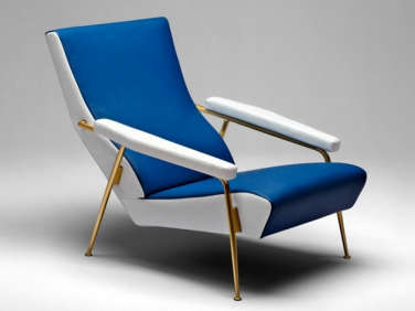
Above: Flack’s favorite chair in the house is this striped re-edition of a 1934 Gio Ponti design for Rubelli: “classic and masculine with brass legs that echo the lines of the pendant light.” The new pale floorboards, he points out, “ensure maximized light.” The walls are painted in Linen from New Zealand paint company Resene.

Above: A Poliform sideboard, another of the clients’ original pieces, displays a vintage “Murano glass, Memphis-style lamp” along with a concrete pipe and other geometric forms.

Above: Without changing the table, Flack dressed up the dining room with linen curtains and Neve Chairs by Pierro Lissoni and Mario Bellini’s black leather Cab Chairs from Cassina. The standing light is the Flos Toio.

Above: The stairs are custom-stained to match the floorboards and carpeted with a bamboo-and-silk runner by Melbourne custom rug maker Bibi Vero.

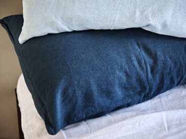
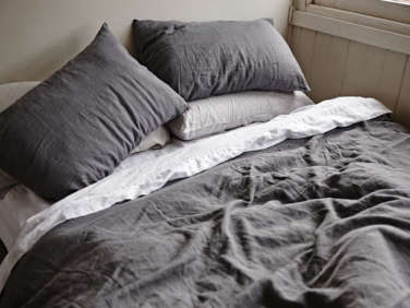
Above: The master bedroom came with its gray carpet and angular walls, which are painted the same taupe as the living room and dining room. The Charcoal Linen Duvet Cover and Linen Pillowslips are from In Bed of New South Wales, Australia. (For linen bedding in the US, consider Rough Linen.) The light is the Oluce Coupé, a sixties classic by Joe Columbo.
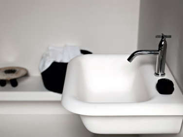
Above: In the guest bath, Flack installed a wall-mounted Agape Ottocento Washbasin against a backsplash of honed Bedonia limestone. Like the look? See 13 Noirish Black and White Bathrooms and consider the Alape Bucket Sink from Germany.
Above: The Matte Black Taps are Australian-made from Astra Walker.

Above: The sandstone-framed bathtub is from Kaldewei. For a similar towel ladder, see New Bath Hardware from Norm Architects.
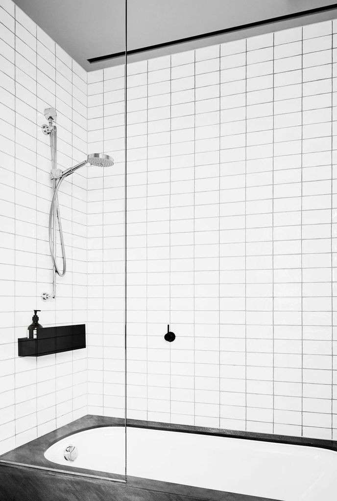
Above: The white subway tiles are set off by dark gray grout. The anodized aluminum shower shelf is from Agape’s Sen Accessories line.
Above: The owners’ child was born just weeks after Phase One of the remodel was complete. The nursery is painted in Resene’s “half-strength Linen” and has a Fiorenza Armchair by Franco Albini from Poliform. Note that all of the house’s curtains hang from black steel rails. The ceiling light is Anna Charlesworth’s Four Shapes Pendant, “a playful take on a hanging mobile,” says Flack.

Above: The nursery’s wall of custom cabinetry is made of American oak veneer with a painted finish. “It’s a recessive piece,” Flack says, “but has a subtle texture with the oak grain showing through.” The sliding white ladder is for accessing the top shelves (but may have to be put in storage when the baby enters the climbing stage).

Above: A glimpse of the master bedroom’s en suite bath: “I wanted the bathrooms to be similar,” says Flack. “I only used a handful of materials throughout the house. I think that’s the most powerful part of its reincarnation: The rooms fit together as one.”

Above: A Duravit sink is set in a counter of honed Bedonia sandstone topped with with a custom mirror and lights trimmed with brass.

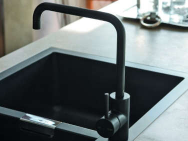
Above: The matte black faucet is from Astra Walker’s Icon Range.

Above: David Flack is ready for more. The house’s remaining rooms are being remodeled this spring.
Before
Above: The living room as it was, with white walls and a pine floor–and a more ad hoc look. (The sofa was moved into another room.)

Above: Flack’s intervention would rely largely on new finishes and furnishings.

Above: The dining room, before, with white walls and chairs.

Above: The master bedroom and bath as they were–the carpet stayed.
- Parts 1-4 of Rehab Diary: A Small House Overhaul in London
- A Charred Wood Cottage on a $45K Budget
- A Hamptons Kitchen with a Custom Island Sourced on Etsy
- Reader Rehab: Danielle’s DIY Kitchen Renovation for Under $500
Frequently asked questions
What was the inspiration behind this Melbourne remodel?
The project was inspired by the history of the Australian city and its unique architecture, which blends old and new styles to create a distinct urban environment.
Who designed the Melbourne remodel?
The Melbourne remodel was designed by David Flack of Flack Studio in Australia. His expertise in creating functional and stylish spaces is evident throughout the home.
What were some of the design challenges faced during the renovation?
One of the main challenges was creating a modern, open floor plan while maintaining the original character of the home. The team also had to work within the confines of a narrow lot and limited space.
What are some of the standout features of the Melbourne remodel?
Standout features include the custom cabinetry, unique lighting fixtures, and the clever use of mirrors to reflect natural light and create the illusion of more space.
What was the approach to color and materials in the design?
The design team chose a neutral color palette with pops of color in the artwork and decor. They also incorporated natural materials such as wood, stone, and leather to add warmth and texture to the space.
What was the timeline for the renovation?
The renovation took around six months to complete, with careful planning and attention to detail required throughout the process.









Have a Question or Comment About This Post?
Join the conversation