The interior designer Beata Heuman’s latest project—a vast, open-plan apartment in London’s Notting Hill—is fizzing with ideas. “This was a real blank canvas for us to play with,” explains the Swedish-born, London-based designer. “The apartment was very much an anonymous shell that was hard to attribute to any particular period. For us, it became the perfect place to experiment.’
Join us for a tour:
Photography by Simon Brown.
The two-story apartment is owned by a couple in their mid-20s. “It was a really exciting opportunity for us, because it’s not that often you get these big, lateral spaces in the heart of London,” Beata says.”Plus, the clients had just got married and weren’t planning on children anytime soon,” she adds. This gave Beata and her team the opportunity to free up bedrooms and create a generous space for living and entertaining—“without having to think about nappy stations!”

Although the apartment block dates from the early 1900s, the lofty interiors had been stripped bare. (Beata described it as “a bit developer-y … kind of soulless.”) With no historical features to enhance or obey, Beata’s singular approach to design came into its own. The result is a combination of styles—a playful pick-and-mix of periods and influences that enliven the space. We asked Beata how she approached this particular blank canvas:
Set the Tone
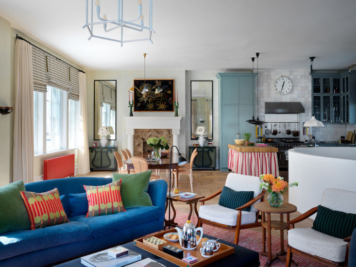
The apartment is arranged over two floors, with the hallway and bedrooms on the first floor, and the living space on the second floor with a large roof terrace above. “As soon as we started looking at the plans, we instinctively felt that the staircase should come up as a curve, rather than at a blocky right angle. It somehow didn’t feel welcoming.”

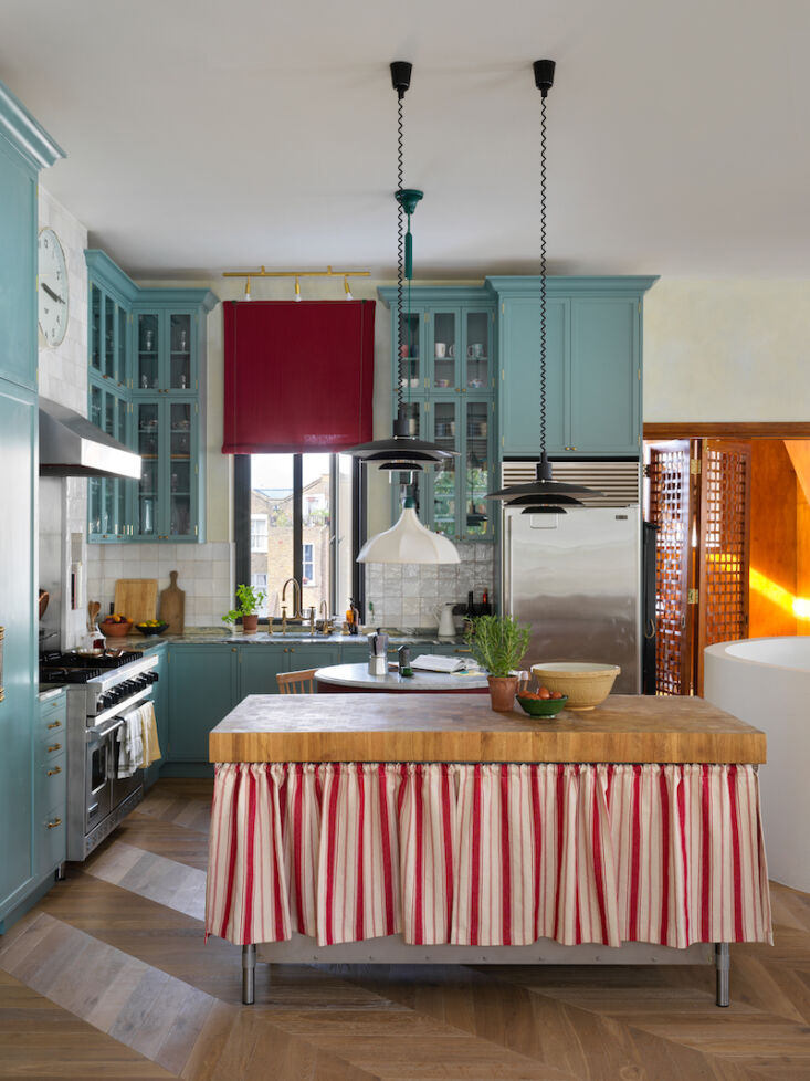
This structural change affected the layout of the existing kitchen, which previously relied on the angular staircase for separation from the living space. “I always try to design kitchens so that they don’t look too kitchen-y,” says Beata. The blue cabinetry was inspired by a visit to Swan House in Atlanta, which was designed in 1928 by Philip T. Shutze. “I wanted to bring the cabinets all the way up to the ceiling, so the proportions became quite warped and exaggerated,” she says.
Careful sourcing of vintage furniture has also helped set a relaxed, informal tone. “They are a young couple so we didn’t want the space to feel too precious,” explains Beata. “We sourced a lot of fairly inexpensive vintage pieces—more than we normally do. It also helped create a sense of accumulation over time. Hopefully, you can’t tell this was pulled together in just four months!”
Create Sight Lines
Beata decided to panel the library and study area off the main living area. “This draws your eye through the space, creating a little vignette and beckoning you in,” she says. “The space is warm and welcoming and captures the evening sun. My clients have told me that whenever they have parties, guests naturally congregate here.” The gridded folding doors were added by Beata. “These add a bit of variation to the space,” she explains. “If you’re here on your own, or if you just wanted to feel a bit different, you can close off the space.”


Color in moderation
“People often think our work is quite colorful,” says Beata. “But if you really think about it, we generally do light walls. For us, achieving a balance is really important. Everything needs to feel under control, so while we had loads of fun adding color here, we actually exercised quite a lot of restraint, making sure that we didn’t go too far.”


Upstairs in the living space, the cast iron radiators have been painted pillar-box red. “In general, we use white radiators, but when we were walking around the space with a paint chart, we thought this red would pack a bit more of a punch, especially as we hadn’t furnished the perimeter of the room.”

Organizing Features
The fireplaces act as organizing features in the open-plan living space. In the sofa area, the fire surround is coated in chalkboard paint with an oak mantle. (“There’s even a little groove that you can keep the chalk in.”) Friends and family are encouraged to graffiti the surround each time they visit. The fireplace dictated the direction of the new chevron flooring (and, consequently, the sofa grouping) which has been laid on the diagonal to create a sense of dynamism. The second fireplace is a homage to Julian Schnables’ Palazzo Chupi in Manhattan.

Creative Conflict
“I always try and have conflicting styles going on,” Beata explains. “Next to the Schutze-inspired kitchen you can see into their studio and library, which has a mid-century aesthetic. And then, if you turn around again, we’ve created this bar that—in my mind—is a bit baroque.”


“There are a lot of different styles going on that both conflict and enhance each other,” Beata concludes. “I’m happiest when I can mix and match styles and different reference points in this way. Hopefully, you can tell how much fun we had with this project.”


Have a Question or Comment About This Post?
Join the conversation