Here at Remodelista, we have often been (accurately) accused of a predilection towards the monochromatic. That said, we are not averse to mixing prints and patterns in a myriad of colors, it’s just that it takes a certain talent. That knack is one that our friend designer Erica Tanov puts to good use: with effortless aplomb, Tanov incorporates multi-patterned prints in charming colors in both her clothing and home collections. We asked her for tips on how she does this–and how we, too, can pull off the look.

Above: Embroidered sheets with a checkered quilt and pinwheel pillowcase from Erica’s 2013 collaboration with artist Emily Payne. Photograph by Erica Shires via Popsugar.
Remodelista: How do you go about mixing print and patterns in your home design collection?
Erica Tanov: There are no set ways or hard and fast rules and it differs from each collection. My current bedding is called the Bookprint collection. I had collected some vintage leather-bound books and inside the end papers are these incredible patterns. I took four of them that I thought somehow all worked together and played around with scale and color. It’s very intuitive for me. The prints are graphic and very different, but by mixing the patterns and keeping a similar color palette and scale it all seems to work.
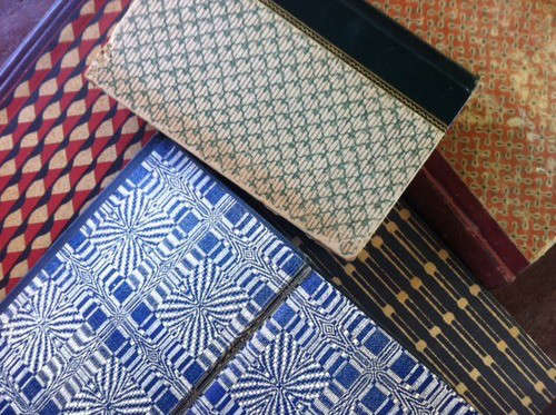
Above: Erica’s journals, the source of her inspiration for Bookprint.

Above: Swatch samples from Erica’s Bookprint collection.
RM: How do you translate this into a home?
ET: If you are unsure of how to mix things then stick with one element like color. You can mix a floral in that color with an ethnic print and then a pattern print, all in the same color. If you’re scared to use a lot of color, keep it monochromatic and bring in patterns in different scales. Right now I’m working with artist Lena Wolff. We’ve taken an eight-point star pattern from a simple dahlia motif and created an abstract print. We’ve also taken half of it and used it on the borders then played with scale. Although the pattern looks different, it all comes from the same original motif. It’s a natural palette with black, ivory, and sepia and then I brought in a pop of bright coral. It’s not about color, but more about graphics and scale. It just feels right.
RM: Tips for a minimalist like me on integrating color, and pattern into the home?
ET: I’m not a minimalist myself, but my home is pretty much a natural palette against which I love introducing pops of color. I feel a shock of color stands out more against a neutral background.

Above: The living room in Erica’s home with a Beni Ouarain rug and hits of pink. Photograph by Kelly Ishikawa for Anthology Magazine.
RM: Any advice on how to work with a patterned rug?
ET: It depends on the space. I love tribal rugs, such as the classic Turkish prayer rugs–they work almost anywhere. I have a Beni Ourain Moroccan rug and I love to introduce ethnic items to a super-clean room, to add something rough hewn to the mix–it’s a great combination.
RM: Favorite Wallpaper?
ET: De Gournay’s Chinoiserie collection. It’s hand painted with tarnished silver and is so gorgeous. It’s like artwork.

Above: The bedroom in Erica’s bedroom with a wall covered in hand-painted wallpaper from de Gournay’s Chinoiserie collection. Photograph by Leslie Williamson.
RM: How do you make wallpaper work?
ET: I used the de Gourney wallpaper in my bedroom as a beautiful backdrop and the rest of the room is white. I like to wake up to white so I only wallpapered the wall behind my bed. The pattern creates warmth and beauty in the room and I can see it as I walk in.
RM: Favorite shade of paint?
ET: I’ve just been asked to decorate a designer suite at the Sir Francis Drakem a San Francisco Hotel. I love white, but in a hotel room you want to feel more romantic, sexy, and warm. I’m thinking of a rich gray that is soothing and beautiful, something like Benjamin Moore’s Nocturnal Gray, a deep gray with a bit of blue.
RM: Your favorite white?
ET: I’ve used a lot of Benjamin Moore’s Super White. It’s a nice white without being too cold. Farrow and Ball’s Slipper Satin is also beautiful.

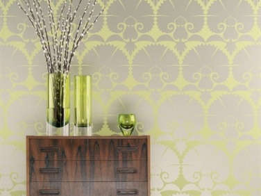
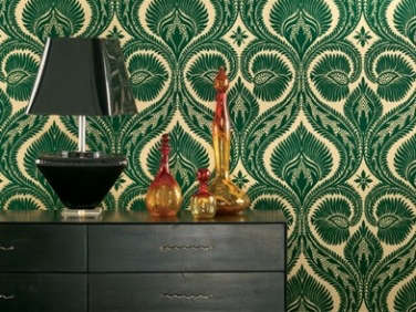
Above L: Erica Tanov in her Berkeley home. Above R: Her upstairs hallway covered in Dryden and Wilde Carnation wallpapers by Osborne and Little. Photography by Leslie Williamson for Martha Stewart.
RM: How did you come up with the contrasting wallpaper in your hallway?
ET: It’s by Osborne and Little. So much of the house is white that I wanted something bright, but not in a room we’re in all the time, so I did the whole hallways in pattern and color. One is flocked forest green with a bohemian royal pattern and the other is a green citron with metallics in a large deco pattern. I didn’t follow any of my own rules, but I love the pattern, color and bigness.
RM: Colored towels or white towels?
ET: I am a white towel person; that’s what I prefer to use, but have a bunch of colorful towels by Layla that my kids use. I love opening the linen closet and seeing the patterns.

Above: A striped coat from the Erica Tanov 2013-2014 Collection.
RM: Stripes versus florals?
ET: I like them together–it’s almost safer than mixing a bunch of florals. But that doesn’t mean any stripe goes with any floral. Graphic stripes with classic feminine florals could work if they’re all done in bright bold colors.
To see more of Erica Tanov’s designs, have a look at our previous posts: The Ultimate California Romantic and Bohemian Luxury in Marin.
Frequently asked questions
What is this article about?
This article is about using color and pattern for the minimalist interior design style.
Who wrote this article?
This article was written by Erica Tanov.
What is the minimalist interior design style?
The minimalist interior design style is characterized by simplicity, functionality, and a focus on creating a clean and uncluttered look.
How can I use color in a minimalist interior design?
You can use color sparingly and strategically, using neutral tones and accents of bold colors to create a focal point or add interest to a space.
What are some examples of patterns that work well with a minimalist interior design?
Patterns that are simple, geometric, and repetitive, such as stripes, dots, and grids, work well with a minimalist interior design.
Can I use bold patterns in a minimalist interior design?
Yes, you can use bold patterns, but it's important to use them sparingly and balance them with neutral or solid colors.
What are some tips for using color and pattern in a minimalist interior design?
Some tips include starting with a neutral foundation, using color and pattern as accents, experimenting with texture, and paying attention to scale and proportion.
What is the key to a successful minimalist interior design?
The key to a successful minimalist interior design is to strike a balance between simplicity and interest, creating a space that is both functional and visually appealing.



Have a Question or Comment About This Post?
Join the conversation