Icon - Arrow LeftAn icon we use to indicate a rightwards action. Icon - Arrow RightAn icon we use to indicate a leftwards action. Icon - External LinkAn icon we use to indicate a button link is external. Icon - MessageThe icon we use to represent an email action. Icon - Down ChevronUsed to indicate a dropdown. Icon - CloseUsed to indicate a close action. Icon - Dropdown ArrowUsed to indicate a dropdown. Icon - Location PinUsed to showcase a location on a map. Icon - Zoom OutUsed to indicate a zoom out action on a map. Icon - Zoom InUsed to indicate a zoom in action on a map. Icon - SearchUsed to indicate a search action. Icon - EmailUsed to indicate an emai action. Icon - FacebookFacebooks brand mark for use in social sharing icons. flipboard Icon - InstagramInstagrams brand mark for use in social sharing icons. Icon - PinterestPinterests brand mark for use in social sharing icons. Icon - TwitterTwitters brand mark for use in social sharing icons. Icon - Check MarkA check mark for checkbox buttons.
You are reading

DIY: How to Mix the Perfect White Paint with LA Designer Michaela Scherrer

Search

DIY: How to Mix the Perfect White Paint with LA Designer Michaela Scherrer

April 23, 2018

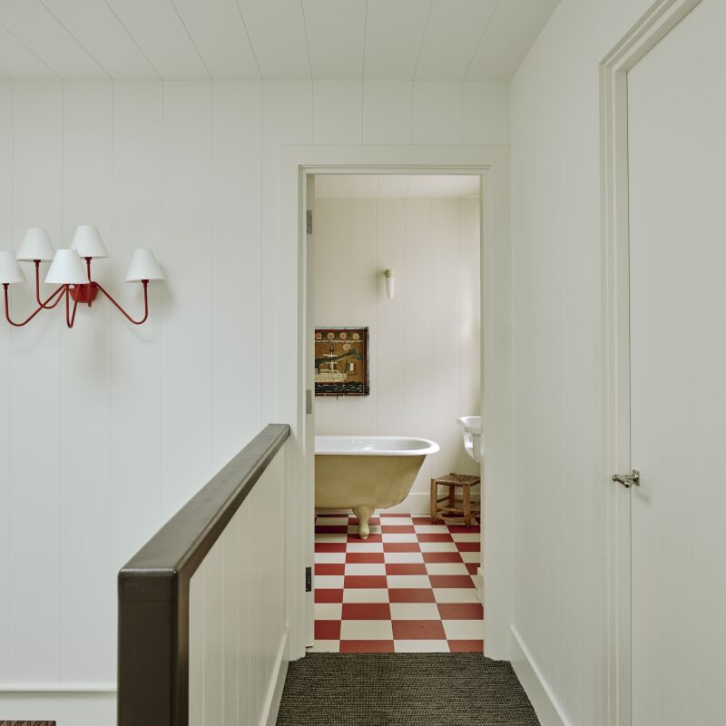
It’s easy to detect warm whites and chilly whites, but interior designer Michaela Scherrer sees an entire rainbow in between. This chromatic sensitivity led her to not only dress in shades of white but live entirely in a world of pales. Chez Scherrer is far from one note: Her serene house, which we featured in the Remodelista book (including on the cover), is a study in the many nuances of white.

Not surprisingly, getting the paint shades she’s after takes some doing. Like many designers, Michaela mixes her own whites, a process she admits can take hours, even days and weeks of experimenting. Here are some tips from the master mixologist.

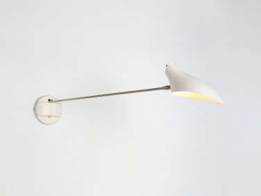
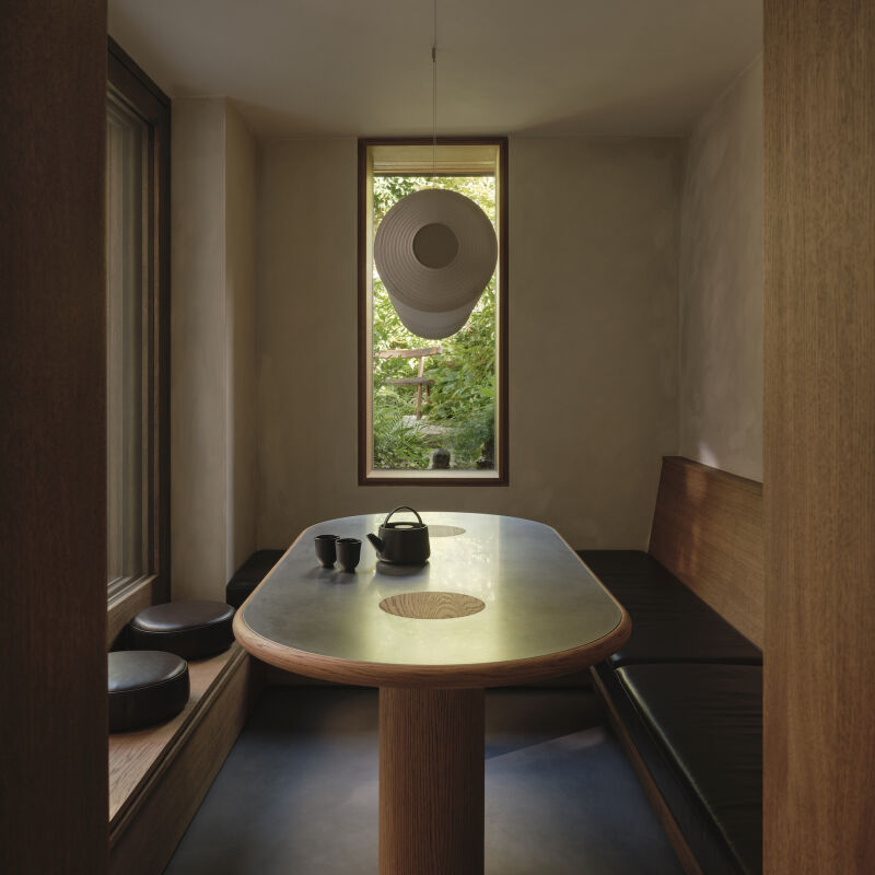
Photography by Matthew Williams for Remodelista.

michaela, shown here in her pasadena, california, office, uses a paint tray to  17
Above: Michaela, shown here in her Pasadena, California, office, uses a paint tray to do her concocting. She begins with a base paint—she has dozens and dozens of cans of white, including Benjamin Moore Regal’s pastel base, Decorator’s White, and Paper White, and the white base from Fine Paints of Europe. To one of these, she slowly introduces universal tints, color by color and drop by drop. “All paint starts out as white,” she points out, “and then has tints added to it.”
michaela&#8\2\17;s mixing tools include plastic containers, white arti 18
Above: Michaela’s mixing tools include plastic containers, white artist’s board for keeping careful track of each shade and formula, and universal tints—a set of Tints-All Universal Tinting Colorants is a good starter kit.

“The undertones in whites, such as green and red, each give off a vibration that has an effect on how the space feels, and to me the wrong whites can make a room feel stressful,” she says. “I like when white tones layer off each other: My living room is a bright white and my dining room is a cozier white. When I mix whites, I often muddy them: I add a bit of umber or black to take away the sharpness and create a more relaxed mood. If you want warmer results, introduce a bit of ochre or yellow. And if what you’ve got is too yellowy, add purples or blues. One shift and your results can be so much more refined.”

a david weeks one arm sconce with pearlized shade fits the mix in michaela& 19
Above: A David Weeks One-Arm Sconce with pearlized shade fits the mix in Michaela’s Guest Room.

To make sure her whites look good in the space they’re intended for, she always mixes her paints on site and tests them on the wall (or on a painted masonite board) at different times of day and night—”but never on a rainy day; you can’t see the proper color.” For one of her clients, Michaela tried out 60 hand-mixed whites throughout the project.

michaela&#8\2\17;s sunny home office is a complex warm white. she expl 20
Above: Michaela’s sunny home office is a complex warm white. She explains that of late it’s become much harder to achieve the shades she’s after because of ingredients restrictions: “We used to have chromium in paint, and we had a chromium tint, a gray-green. It would muddy things to perfection. Here in California, chromium is no longer allowed, so I don’t have that gray-green underlying tone that I love.”

“Now so much white paint has a weird underlying lime green in it,” she adds. “I’m always fighting this one color. It’s citrusy and here in LA that’s the last place I like to go.”

flowers supply the only hints of bright that michaela allows int 21
Above: Flowers supply the only hints of bright that Michaela allows into her home. Vases and pots are always pale—she’s been known to paint the paper bag her potted orchids come in white and use that as an outer container.
even the pens and pencils in her leather desk tray hewn to the palette. 22
Above: Even the pens and pencils in her leather desk tray hewn to the palette.

For more white paint advice, take a look at:

Go to Palette & Paints to find a full spectrum of color posts.

N.B.: This post is an update; the original ran on April 21, 2016.

(Visited 1,011 times, 1 visits today)
You need to login or register to view and manage your bookmarks.

Product summary  

Have a Question or Comment About This Post?

Join the conversation

v5.0