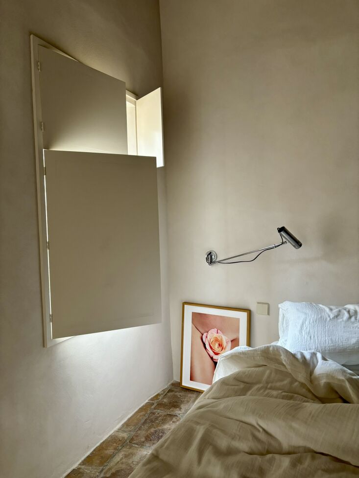
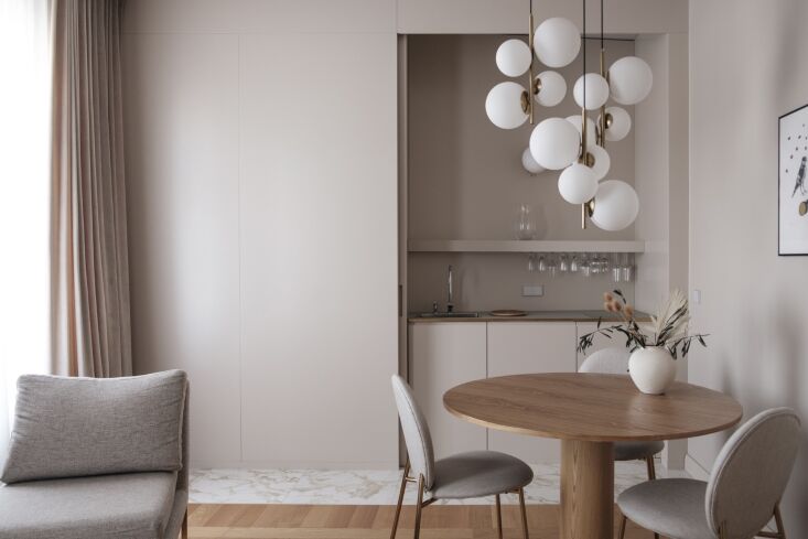
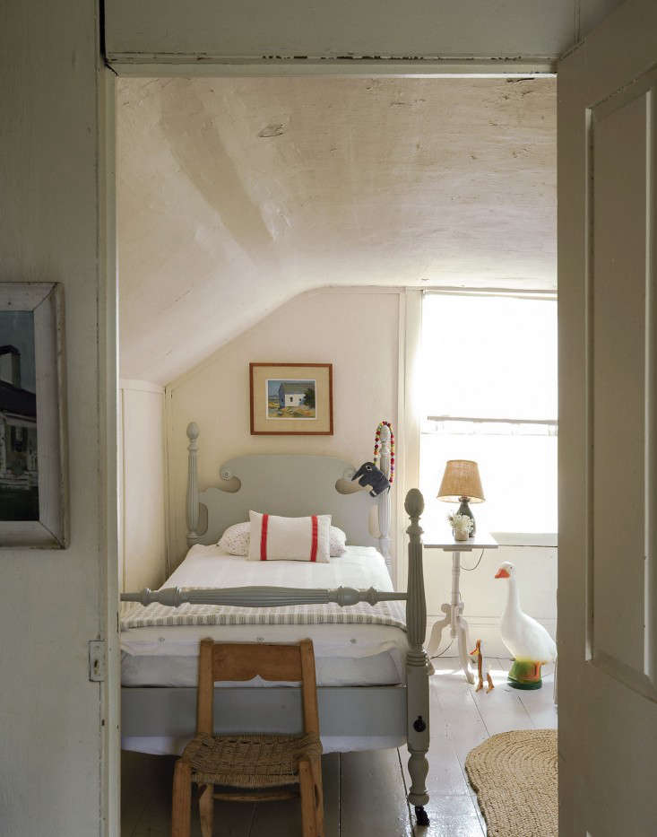
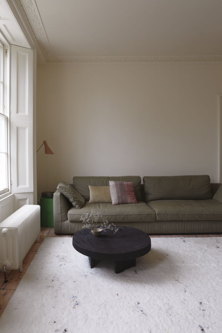
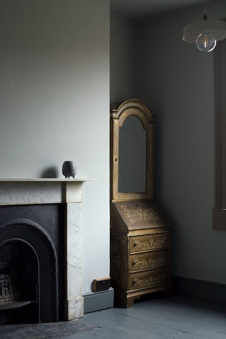
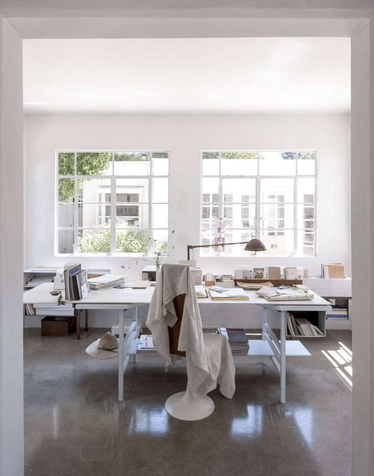
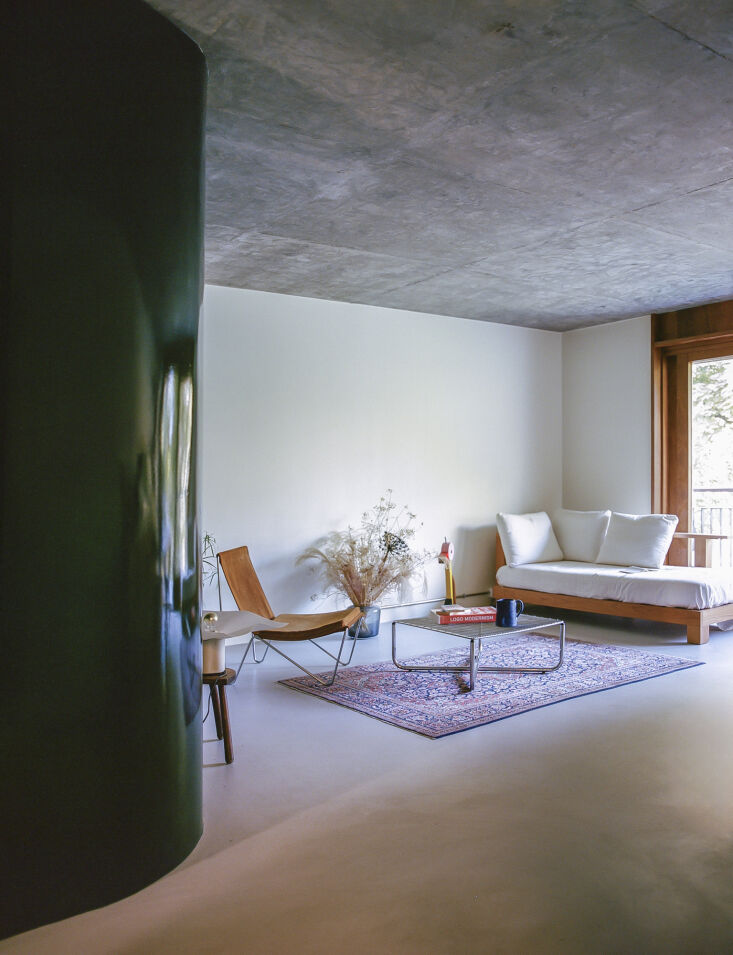
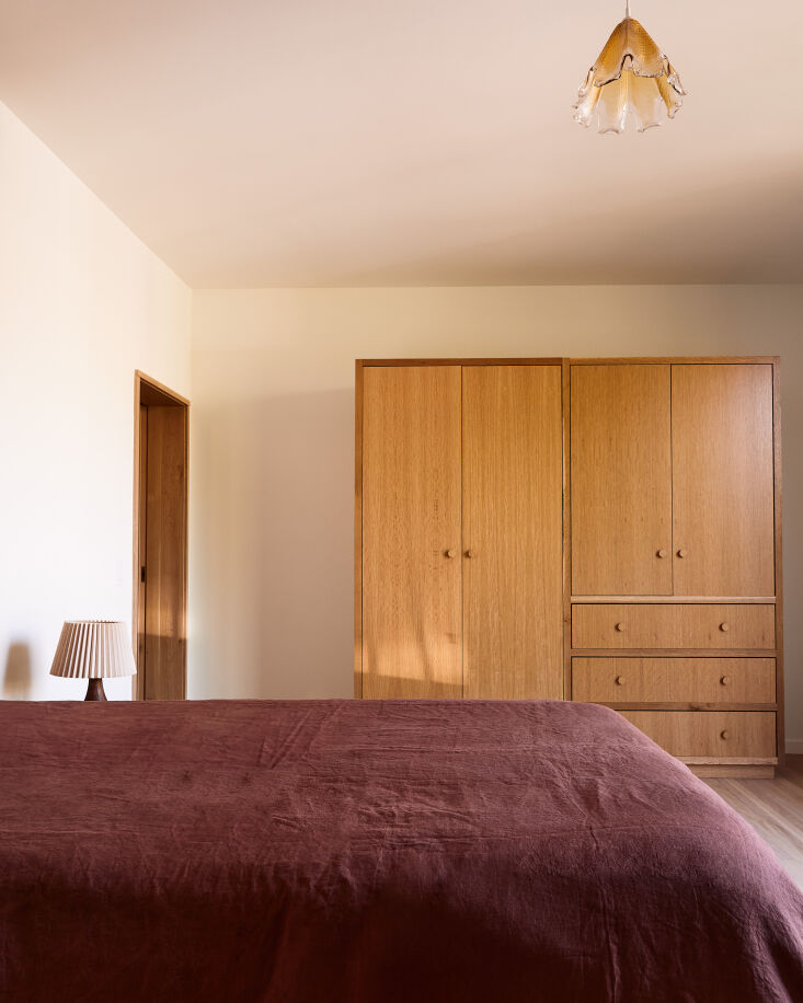
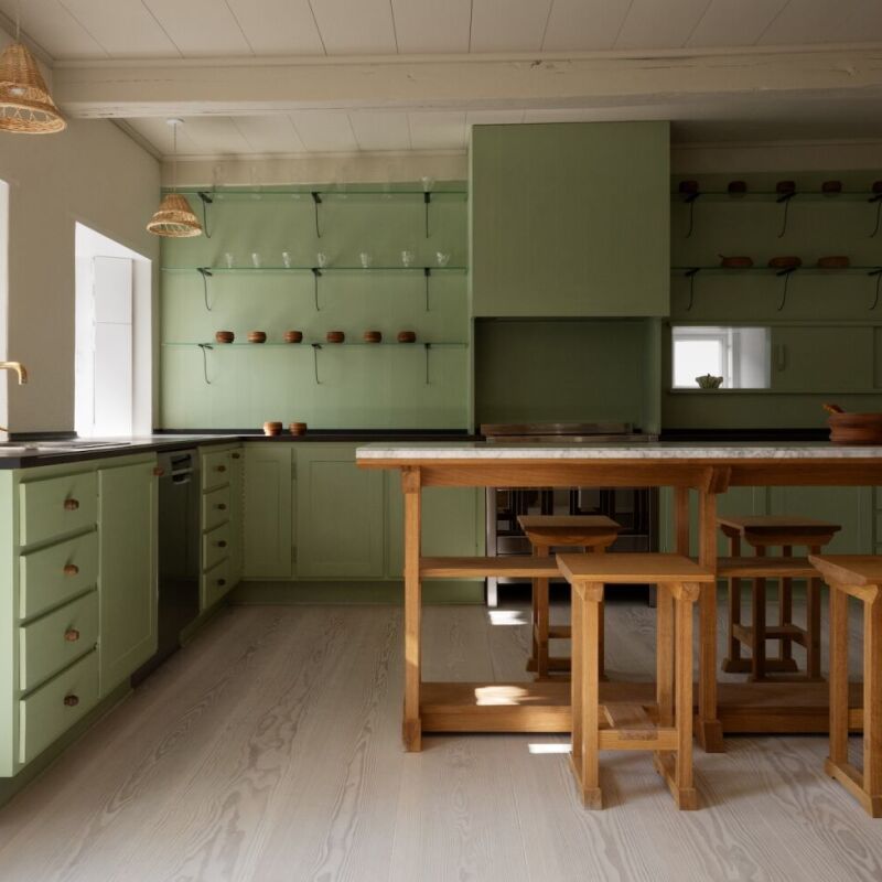
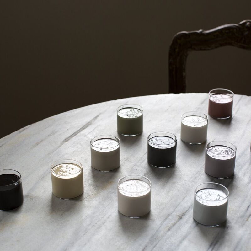
There’s a time for bold color and a time for stark white. Then there are the in-between paint colors—those subtle shades closer to white, yet reminiscent of washed-out watercolor. Barely-there hues can have a real impact—interiors that impart a gentle warmth, a soporific grey, or healthy pinkish glow. Here, we’ve profiled architects and designers for their favorite nuanced shades.


For more light color paint favorites from architects and designers, see our posts:
- 10 Easy Pieces: Architects’ Favorite White Paint Picks
- 10 Easy Pieces: Architects’ Favorite Warm White Paint Picks
- 10 Easy Pieces: Architects’ Favorite Cool-Toned Neutral Paint Picks
- 10 Easy Pieces: Architects’ Favorite Butter Yellow Paint Picks
- 10 Easy Pieces: Architects’ Favorite Blush Pink Paint Picks

Have a Question or Comment About This Post?
Join the conversation