The bane of homebuyers (at least those who also happen to be Remodelista readers) is a beautiful old house that has been updated but in a hodge-podge, piecemeal, and highly unappealing manner. This is a common occurrence in Brooklyn, where beautiful original architectural details are often stripped out or overwhelmed by the “upgrades.” Undaunted design-minded buyers then have to commit to pricey do-overs that modernize the home while honoring its past.
How to avoid a renovation that you’ll regret and future buyers will shun? Today, we showcase tips from Shana Faust, a freelance creative director who oversaw the remodel of the 19th-century Gowanus townhome she shares with her husband, Steven, an executive creative director at Ogilvy; their two kids (Sophie and Leo); and one miniature poodle (Tiger). “When we first saw this house, it was in utter disrepair. Derelict and dark, filled with tight spaces, damaged floors, and original single-paned windows,” recalls Shana. “It was exactly what we were looking for.”
That’s because she had a clear vision for the renovation: “to preserve and celebrate the rich historical elements that remained and merge those with contemporary elements, minimalist design interventions, and lots of natural light.” With the help of architects Alexandra Barker and Chrisina Ostermeier, of BAAO, they did just that.
Below, Shana’s tips on how to transform an outdated property into a minimalist home—all without erasing historical details and without breaking the bank.
Photography by David Mitchell, courtesy of Shana Faust.
1. Always start with a palette—for both colors and materials.

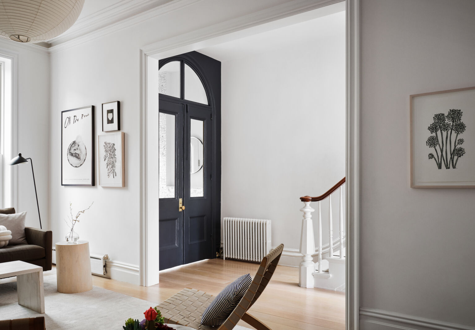
What’s the secret to a renovation that feels cohesive? The answer boils down to one word: planning. And one of the first things to decide (after figuring out the budget) is the materials palette. A materials palette is like a color palette but instead of colors, it involves the set of materials you plan to use throughout the home. Together, they create the home’s visual language. For her materials palette, Shana drew inspiration from the Gowanus’ maritime roots. “The marine-inspired palette of azure, gray, and moody charcoal, as well as materials like socket sconces, brass, sisal, shiplap, marble, and pocket doors, are all references to its seafaring past,” she says.
2. Original details you like are worth preserving.

“The garden level and second floor had been stripped of original details long before we bought the house in 2017, so there wasn’t anything of significance there worth salvaging. However on the parlor level, many of the original architectural details remained, including a marble mantle and elegant staircase with mahogany bannister,” says Shana. “We loved the original interior door, the bannister and staircase, intricate ceiling medallions, and hand plastered crown moldings, so we worked to preserve those elements. But we chose to remove the dark wood wainscotting and pocket doors as we wanted this floor to feel airy, open and connected.”
3. Paint walls white for an instant room refresher.

Painting walls white in an old home is a quick, easy, and cheap way to immediately modernize a space. “We chose Benjamin Moore Decorator’s White for the main rooms because it’s a soft neutral white that looks good throughout the day and in light from north and south exposures. It also serves as a beautiful backdrop for displaying our more expressive items like art, sentimental objects, and classic furniture. And it works well on the decorative and ornamental elements original to our home, giving them the look of being made from sugar icing or a wedding cake effect.”
4. A good reason for knocking down walls: more light.

If you’re going to buy an older home, you better like older homes. Why purchase something if you’re going to radically change it, ripping out its soul? That said, some substantial changes are warranted—replacing an old boiler, updating windows, installing new kitchen cabinets, and, in our opinion, knocking down a wall or two to bring in more natural light.”We took down the wall that separated the kitchen from the main hallway, and the ones that separated the living and dining areas,” says Shana. “We also widened these entryways in order to tie these spaces together and create a natural flow for occupying and entertaining, and in order to maximize the natural light from the front to the back of the house.”
5. Every room should have a splurge.

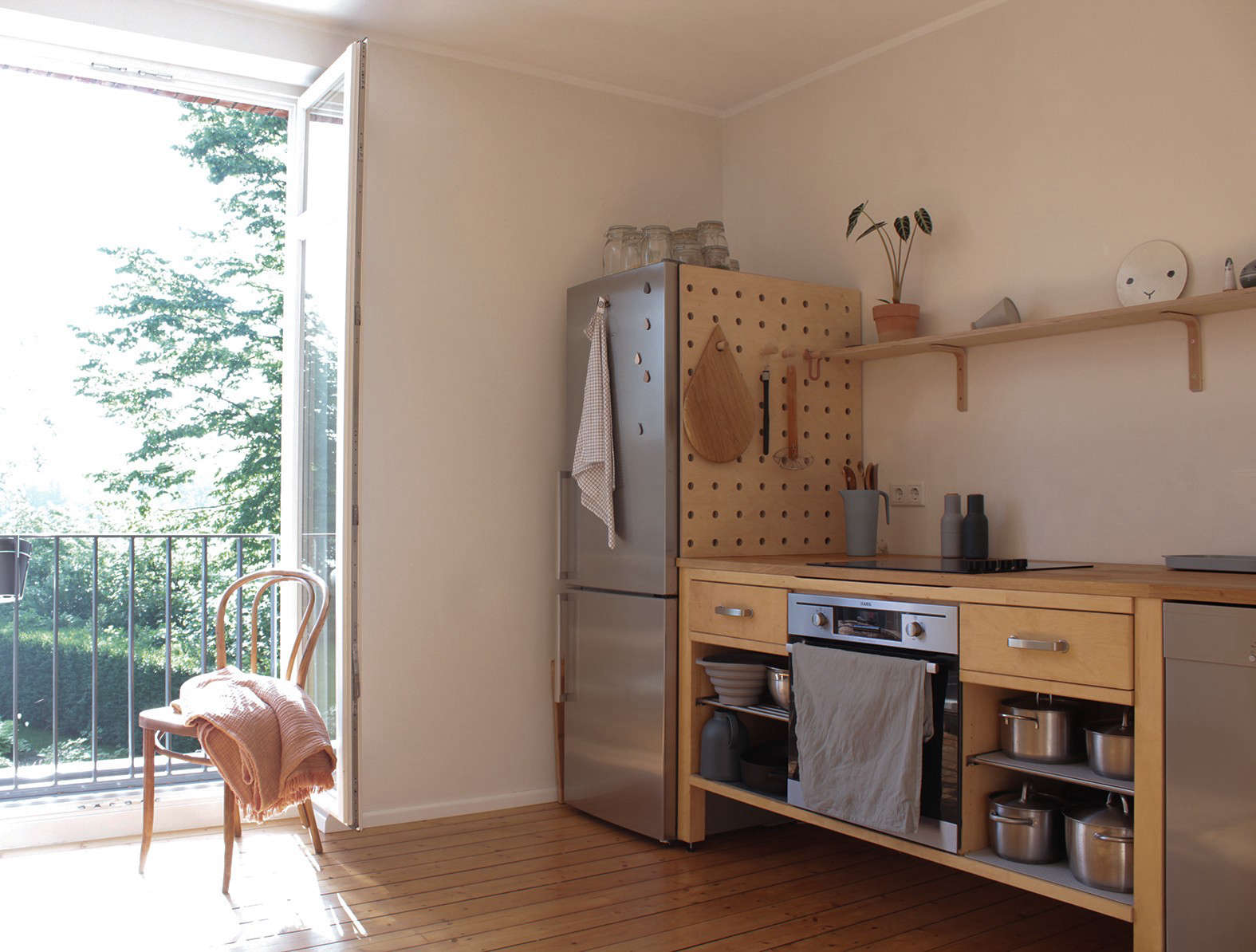
6. The secret to cheaper built-ins? Ikea.

7. Tiles are more affordable than stone and marble.

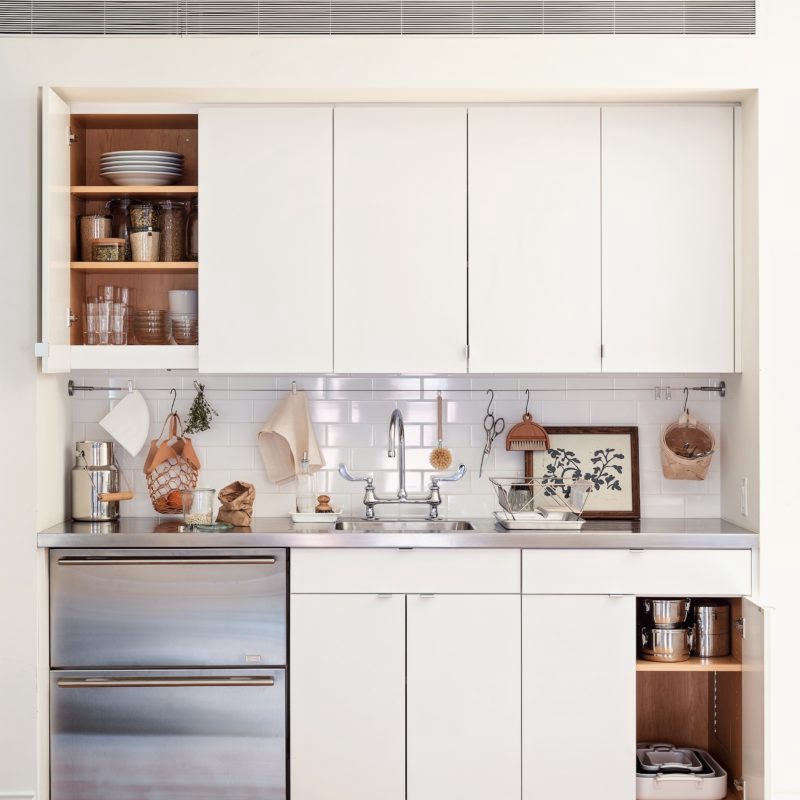
“We chose ceramic tiles instead of stone or marble for budget reasons and practicality. They are economical, super easy to clean, and very durable,” says Shana.
8. Shop the hardware store for stylish lighting.

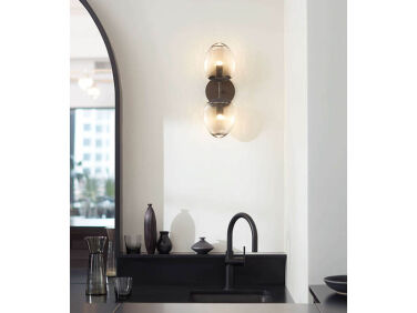
We are big fans of sourcing for the cheap and chic at hardware stores—and so is Shana. In the space next to the powder room, Shana leveraged the classic power coupling of a porcelain light socket with a metal-tipped lightbulb, both readily available at hardware stores. She painted the light socket Benjamin Moore Azurite to match the office (see below) and added a half-dipped brass bulb to further personalize it. “It’s an industrial classic that I love for it’s timelessness and affordability, elevated here with custom paint and bulb choice.” [We do, too—both items appear in our post Shop the Hardware Store: 25 Inexpensive, Surprisingly Good-Looking Design Finds.]
9. Repeat colors to create cohesion between rooms.


10. Make sure to budget for the invisible stuff.

Remember to set aside a substantial chunk of money to update the unsexy, invisible stuff—think windows, HVAC, electrical, insulation and other mundane musts. In fact, address all of these fundamentals first, because you’ll ultimately save money in the long run when you shore up a drafty old home. Shana and Steven swapped out all the old windows for new double-paned windows by Andersen and Marven. They also replaced the flooring with “completely new white oak with micro bevel to accentuate the planks,” she says. Air conditioning was installed, too, via mini splits added to each floor.
See also:
- Industrial Revolution: A New Red Hook Condo In Tune with the Neighborhood’s History
- At Home with C. S. Valentin: French Eclecticism in Cobble Hill, Brooklyn
- A Soulful, Timeless Apartment by Studio Dorion in Brooklyn Heights


Have a Question or Comment About This Post?
Join the conversation