Color reigns when it comes to quick fixes for your home: changing a room’s hue has a profound effect on its light, flow, and energy. But before you commit to a color scheme, how do you get a sense of what shade to choose before buying the paint and rolling up your sleeves?
Cue the Color Visualizer from Sherwin-Williams. Upload a photo of your interior or exterior space and “try on” any of the 1,500 plus Sherwin-Williams colors. It’s the kind of time-saving solution we like (if you don’t count the hours we spent perusing all the shades on offer). Whether you love black and white or dashes of red, the options for transformation are endless.
Here are various looks we created for three interiors using the Color Visualizer.

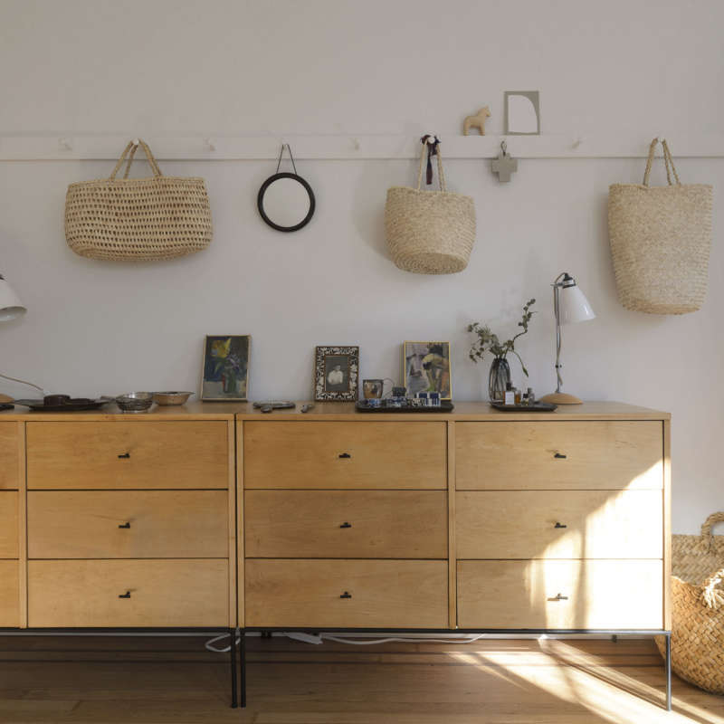
Above: In Janet’s home workspace in San Francisco, the palette is a uniform white; simple and clean. To add a layer of warmth, we tested Garret Gray (middle), a member of the warm neutral family. We saved each by registering and adding them to our favorite scenes and colors file. The bright Scanda (right) adds cool contrast. The color palette now graduates from natural wood, to white, to vibrant blue.

Above: To bring the eye upward (a trick often employed in smaller spaces), we virtually colored a section of Wendy’s walls in Balmy (left), a blue that mirrors the sky. We later tried Heartthrob (right) on the far walls for a cheerful and festive tone.

Above: If you’re in the mood to merely explore color but are lacking your own home images to upload, the Color Visualizer provides you with ample interior or exterior scenes, including this simple sitting area.
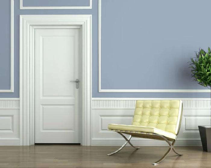
Above: Proof found in the power of paint. Aleutian, a steely blue, adds cool contrast to the wall.

Above: Perhaps the most inspiring aspect of the tool is discovering colors you never before considered. And as evidenced here, no two whites or greens (or any color) are created equal.

Have a Question or Comment About This Post?
Join the conversation