Icon - Arrow LeftAn icon we use to indicate a rightwards action. Icon - Arrow RightAn icon we use to indicate a leftwards action. Icon - External LinkAn icon we use to indicate a button link is external. Icon - MessageThe icon we use to represent an email action. Icon - Down ChevronUsed to indicate a dropdown. Icon - CloseUsed to indicate a close action. Icon - Dropdown ArrowUsed to indicate a dropdown. Icon - Location PinUsed to showcase a location on a map. Icon - Zoom OutUsed to indicate a zoom out action on a map. Icon - Zoom InUsed to indicate a zoom in action on a map. Icon - SearchUsed to indicate a search action. Icon - EmailUsed to indicate an emai action. Icon - FacebookFacebooks brand mark for use in social sharing icons. flipboard Icon - InstagramInstagrams brand mark for use in social sharing icons. Icon - PinterestPinterests brand mark for use in social sharing icons. Icon - TwitterTwitters brand mark for use in social sharing icons. Icon - Check MarkA check mark for checkbox buttons.
You are reading

Kitchen of the Week: ‘SMILF’ Creator Frankie Shaw’s Newfangled Old-Fashioned Remodel by Reath Design

Search

Kitchen of the Week: ‘SMILF’ Creator Frankie Shaw’s Newfangled Old-Fashioned Remodel by Reath Design

September 1, 2022

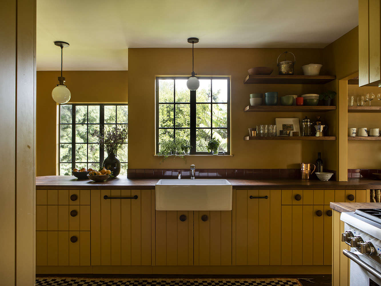
So many renovations we see nowadays entail brightening up interiors and whiting out—quite literally—what was originally there. What we admire about interior designer Frances Merrill, of Reath Design in Los Angeles, is her unique, trend-bucking strategy: rather than open up spaces and painting everything white, she creates cocoons of color, pattern, and moody warmth.

This cozy eat-in kitchen she designed for actress and SMILF creator Frankie Shaw, and her TV writer husband, Zach Strauss, exemplifies her design philosophy. When the couple bought their 1937 Monterey Colonial house, located in the Franklin Hills section of Los Feliz in LA, the kitchen had bland white cabinets. (The rest of the home was similarly uninspired.) They wanted something with more personality and asked Frances to color it in with her trademark design daring.

Frances delivered with a kitchen that’s cheerful without being overly bright, period-sensitive without being kitschy, and bold without being garish. “We spend a lot of time at the beginning of each project coming up with a specific visual language,” she shares. “And then throughout the job we are constantly adding and subtracting colors and materials to get the balance right.”

Let’s take a tour of this singular space:

Photography by Laure Joliet, courtesy of Reath Design.

first things first: frances got rid of the white laminate cabinets and had more 17
Above: First things first: Frances got rid of the white laminate cabinets and had more period-appropriate tongue-and-groove cabinets built in their stead. A coat of Benjamin Moore’s French Horn 195, a muddy yellow, applied to both the walls and cabinets makes the small space feel bigger. A vintage Moroccan checkerboard rug is a graphic counterpoint to the botanical wallpaper in the dining area.
oversized wood drawer knobs from nice knobs add personality, as does the open s 18
Above: Oversized wood drawer knobs from Nice Knobs add personality, as does the open shelving, which allows the couple to display art and some of their more unique kitchen items. A single row of Interceramic tiles (in Wineberry) forms the backsplash.
a curved breakfast bar softens up the hard angles in this nook. &#8\2\20;th 19
Above: A curved breakfast bar softens up the hard angles in this nook. “The windows had been painted white in some parts of the house, so we brought them back to the original color,” says Frances. The pendant lights are from Rejuvenation and feature the bronze and wood Nehalem Fitter Pendant.
a coffee and pantry area is just beyond the kitchen. the skirted sink lends som 20
Above: A coffee and pantry area is just beyond the kitchen. The skirted sink lends some vintage charm.
an unexpectedly pretty side door, thanks to colored glass panels (from sunshine 21
Above: An unexpectedly pretty side door, thanks to colored glass panels (from Sunshine Glass) that replaced the standard clear ones.
the view from the powder room into the pantry. 22
Above: The view from the powder room into the pantry.
the dining area, on the other side of the kitchen. &#8\2\20;the wall betwee 23
Above: The dining area, on the other side of the kitchen. “The wall between the kitchen and dining room had been knocked down in a previous renovation. It wasn’t very elegantly done so we added casing and a bullnose detail to the opening to make it feel more like it was an original detail,” says Frances.
a black naugahyde banquette wraps around a corner of the dining area. klaus haa 24
Above: A black Naugahyde banquette wraps around a corner of the dining area. Klaus Haapaniemi’s Pheasants Wallpaper covers the walls in this section. Ruemmler’s No. 556 pendant light hovers over 4th Period Woodshop’s Maine Table.

For more Reath-designed spaces, see:

N.B.: This post has been updated; the original story ran on May 7, 2020.

(Visited 2,278 times, 1 visits today)
You need to login or register to view and manage your bookmarks.

Have a Question or Comment About This Post?

Join the conversation

v5.0