11 Design Lessons from Eileen Grays E1027 in RoquebruneCapMartin France portrait 2 Icon - Arrow LeftAn icon we use to indicate a rightwards action. Icon - Arrow RightAn icon we use to indicate a leftwards action. Icon - External LinkAn icon we use to indicate a button link is external. Icon - MessageThe icon we use to represent an email action. Icon - Down ChevronUsed to indicate a dropdown. Icon - CloseUsed to indicate a close action. Icon - Dropdown ArrowUsed to indicate a dropdown. Icon - Location PinUsed to showcase a location on a map. Icon - Zoom OutUsed to indicate a zoom out action on a map. Icon - Zoom InUsed to indicate a zoom in action on a map. Icon - SearchUsed to indicate a search action. Icon - EmailUsed to indicate an emai action. Icon - FacebookFacebooks brand mark for use in social sharing icons. flipboard Icon - InstagramInstagrams brand mark for use in social sharing icons. Icon - PinterestPinterests brand mark for use in social sharing icons. Icon - TwitterTwitters brand mark for use in social sharing icons. Icon - Check MarkA check mark for checkbox buttons.
You are reading

11 Design Lessons from Eileen Gray’s E-1027 in Roquebrune-Cap-Martin, France

Search

11 Design Lessons from Eileen Gray’s E-1027 in Roquebrune-Cap-Martin, France

March 30, 2026

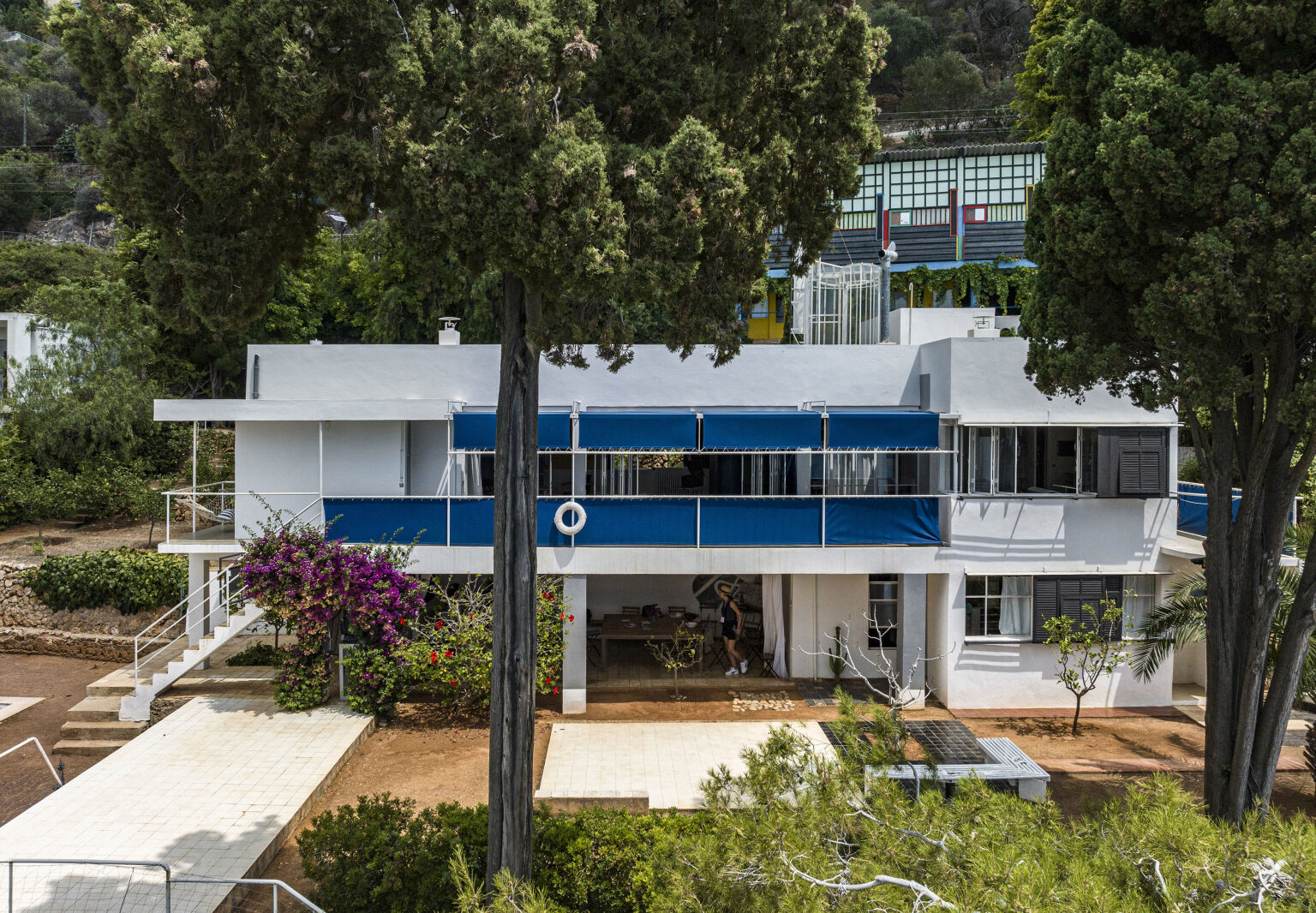
Last fall, I fulfilled a dream of mine: to see pioneering Irish designer and architect Eileen Gray’s E-1027 villa, a modernist jewel with a storied past, opened to the public in 2021 after a lengthy restoration.

I am an architecture tourist and have visited many lovely sites, but the feeling I had on this property was unlike any other. There is a light and airy quality to E-1027 that you have to visit to fully experience (they offer tours from April to November, and it’s a short drive from Nice). One of the most perfect examples of modernist architecture, with its hyper-functional design and nonexistent ornamentation, it is minimalist yet thoughtful and deeply attuned to its environment. The relationship of the house to the light, land, and sea is simply magic.

But the house was almost lost forever. The nearly 100-year-old property changed hands many times, including during Nazi occupation and a brief stint as an 1980s locale for illicit activity, before it eventually fell to squatters. By the time the French State purchased it for restoration in 1999, the house was derelict. Every piece of furniture, including the built-ins and even the plumbing, had been stolen. Thus began an arduous and complicated process of rebuilding and restoring every facet of the home using the same materials and methods of the period, down to the paint. It feels like a miracle that this house could ever exist in the first place, and another miracle that it exists again today in nearly the same condition as a century ago.

E-1027 was far ahead of its time with ingenious design solutions that still feel relevant today; here are some of the most intriguing ones to inform your own projects.

Photography by Manuel Bougot, except where noted.

1. Work with the climate.

the entrance to e \10\27 is surprisingly discrete. eileen gray was born into ir 17
Above: The entrance to E-1027 is surprisingly discrete. Eileen Gray was born into Irish aristocracy, but while her peers lived in grand, Downton Abbey-esque homes, Gray embraced subtlety and pared-back architecture. Her philosophy extended to the way in which guests arrived at her property: Visitors enter from a small, nondescript gate to a dirt footpath that winds through trees and vegetation until finally arriving at the house. Photograph by Stéphane Couturier, courtesy of Centre des Monuments Nationaux (CMN), dist. Scala Archives.

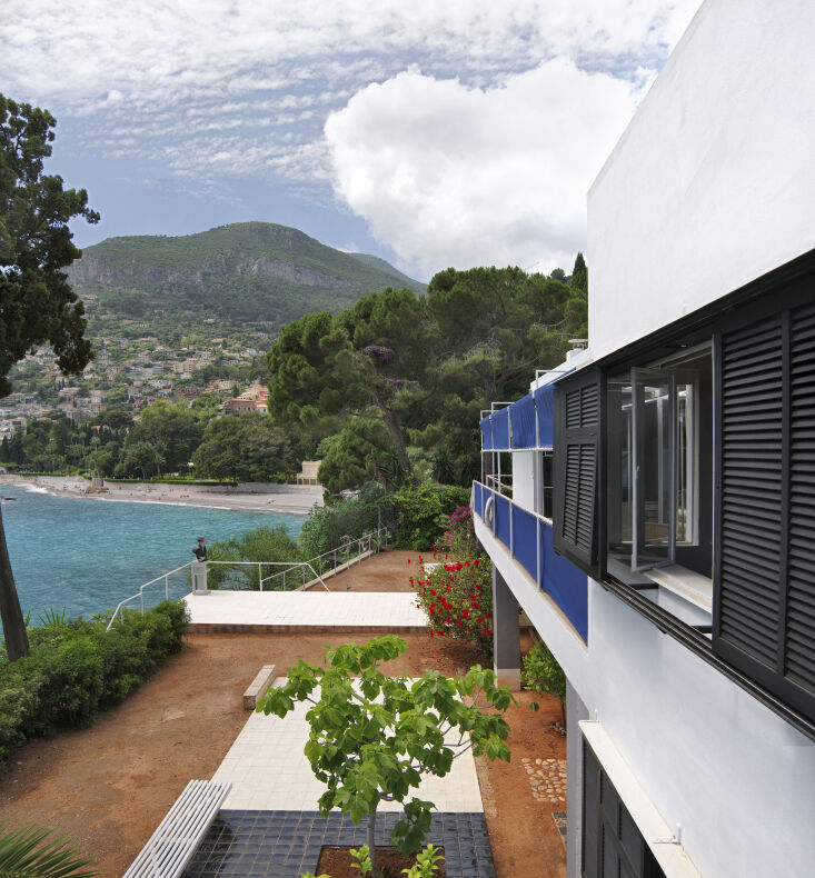
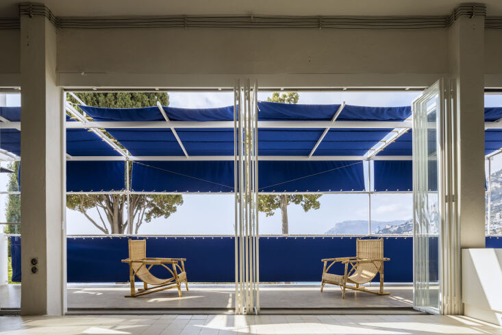
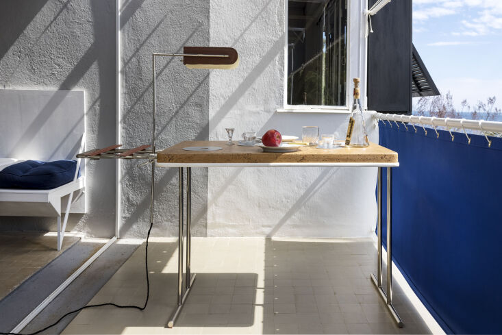
E-1027 was built as a passive house with no air conditioning. The stretched canvases on the terrace were designed to shield the interiors during the heat of the summer without compromising the view; they’re also removable, to allow sun to heat the house in the winter. The accordion doors and windows let air circulate during hot summer evenings.

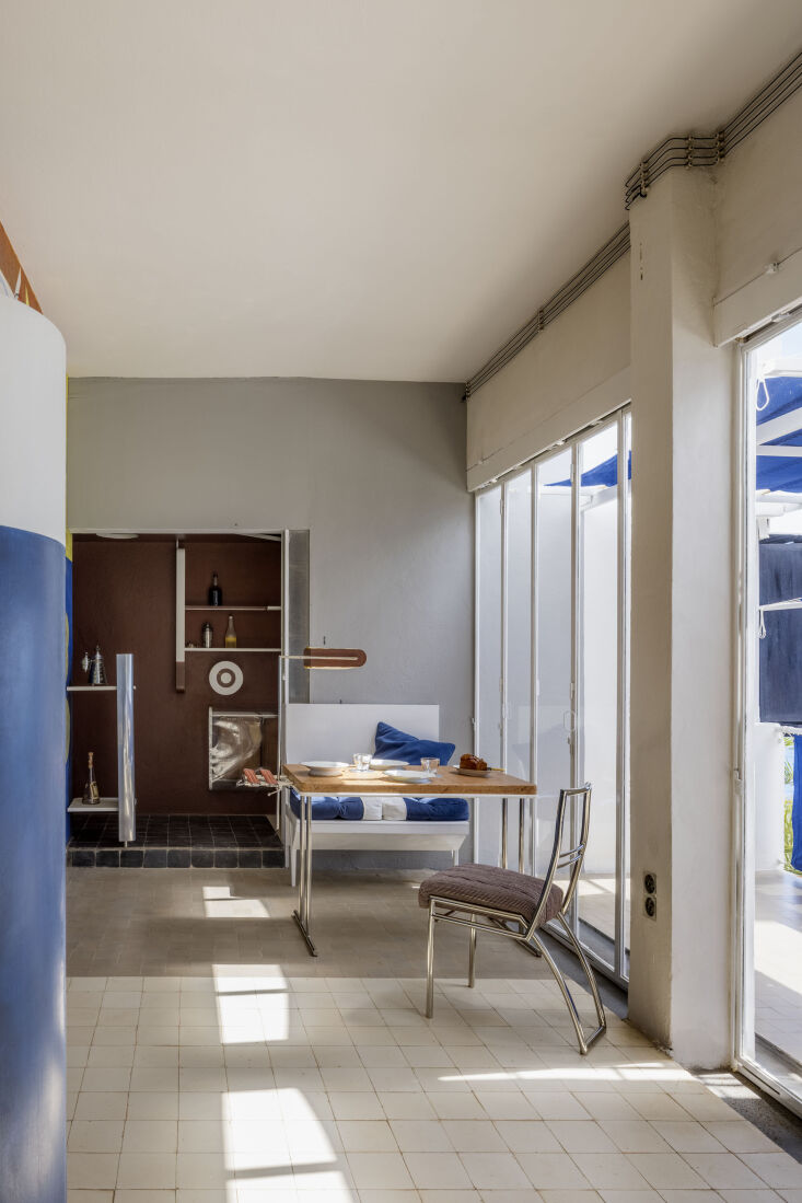
2. Design for proportion.

the villa was built in collaboration with romanian architect jean badovici. whi 18
Above: The villa was built in collaboration with Romanian architect Jean Badovici. While the exact nature of the relationship between Badovici and Gray is not known, we know they had intended to live in the house together. They designed the terrace and its stretched blue canvases to their exact body heights so that they would have a view, when standing, of only water and a perfectly proportioned view of sea, coast, and sky when sitting.

3. Surprise and delight with slow reveals.

gray had her mailbox (visible at left) constructed from leather and mounted nea 19
Above: Gray had her mailbox (visible at left) constructed from leather and mounted near the front door. But she grew tired of needing to walk to the box to check if the mail had arrived, especially if she was impatiently awaiting a letter, so she had a circular opening cut out into the mailbox. That way, if the mail had arrived, it would be visible in the opening. And if there was no mail, she could see it from afar and not bother.

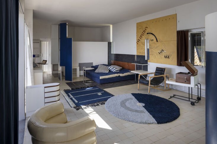
The colorful mural was painted by Le Corbusier, the story of which is one of the great controversies in E-1027’s long and scandalous history. Eileen Gray’s time at the house was short-lived. After only two summers, she moved out and left the house to Badovici, who invited Le Corbusier to visit. Corbusier was stunned by the house’s beauty; some say he was envious of Gray and her forward-thinking design. He painted eight enormous, colorful murals on the walls of E-1027, completely out of harmony with Gray’s pared-back vision.

Many believe this was an act of vandalism, done without Gray’s permission, and an expression of male dominance and female subjugation (it doesn’t help that Corbusier painted the murals in the nude). But some historians have disputed these claims, arguing that Gray had relinquished ownership of the home and the murals were painted with Badovici’s blessing and invitation. It begs the question of whether Corbusier’s murals add to or detract from the property. We’ll leave it to you to decide.

Before Corbusier’s mural was painted, Gray designed this front entrance wall to be entirely white with the inscription “Entrez lentement,” or “enter slowly.”

most of the living space is one large room, but it’s not all revealed immedia 20
Above: Most of the living space is one large room, but it’s not all revealed immediately upon entering. Gray conceived of ways to tuck away parts of the room for slow reveals: For example, there’s no traditional foyer, but there’s a rounded blue wall near the entry, so that you have to turn a corner for more of the home to reveal itself.

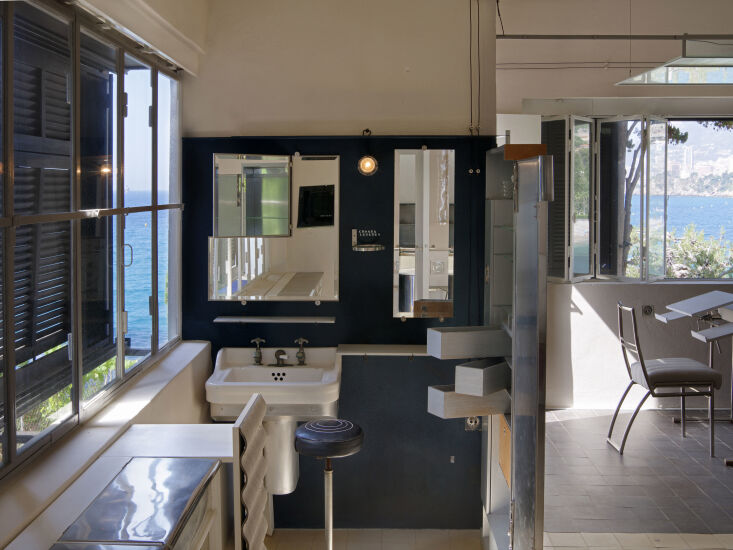
4. Use tile colors to delineate a space within a space.

e \10\27 is only \1,400 square feet, but it feels much larger. one way eileen g 21
Above: E-1027 is only 1,400 square feet, but it feels much larger. One way Eileen Gray achieved this was by using different floor colors to create separate spaces within the open space. Here, the bar area features black tile while the dining area is marked by gray tile to make each space feel like its own.

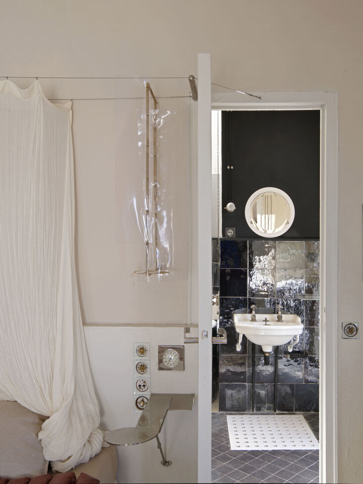
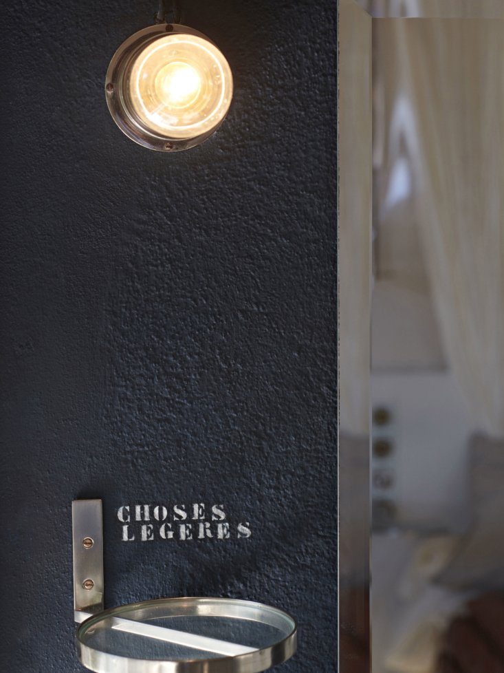
5. Reduce noise, especially in a small space.

eileen gray’s cork top table was designed as a way to muffle noise: she wante 22
Above: Eileen Gray’s cork-top table was designed as a way to muffle noise: She wanted to keep the dining area quiet and not have glasses and plates clanking on the table while others napped or read nearby.

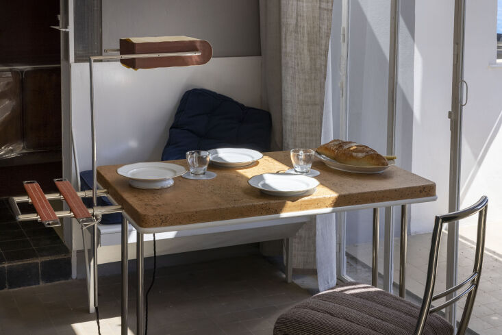
6. Opt for furniture that can be used both indoors and out.

gray’s transat chairs, inspired by transatlantic ocean liner deck chairs, are 23
Above: Gray’s Transat chairs, inspired by transatlantic ocean liner deck chairs, are lightweight and easy to move, designed for both indoor and outdoor use at E-1027. Even her cork breakfast table has a handle so it can be taken into the garden for dining al fresco.

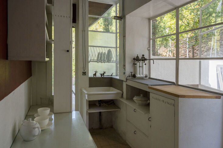
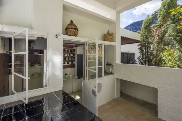
7. Return to the closed kitchen.

gray retained some of her aristocratic roots when she opted to keep the kitchen 24
Above: Gray retained some of her aristocratic roots when she opted to keep the kitchen separate and hidden from the primary living areas. The result is both cozy and elegant—no dirty dishes visible to dinner guests. Photograph by Benjamin Gavaudo, courtesy of CMN dist. Scala.
the kitchen shelving is piet mondrian esque, no doubt inspired by gray’s appr 25
Above: The kitchen shelving is Piet Mondrian-esque, no doubt inspired by Gray’s appreciation of the geometric, clean lines of the Bauhaus and De Stijl movements.

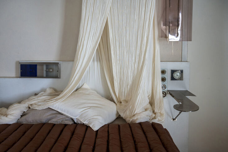
8. Layer your bedside lighting.

in the bedroom, gray designed a light box built into the headboard. it has two  26
Above: In the bedroom, Gray designed a light box built into the headboard. It has two different lights: The white light on the right emits brighter light for reading, while the softer blue light on the left serves as a nightlight. Photograph by Françoise Huguier, courtesy of CMN dist. Scala.
glossy black tiles and black painted walls distinguish the primary bathroom fro 27
Above: Glossy black tiles and black painted walls distinguish the primary bathroom from the bedroom and create spaciousness. Photograph by Stéphane Couturier, courtesy of CMN dist. Scala.

9. Embrace the art of the swivel drawer.

in the bathroom and the living room, gray designed clever swivel drawers that o 28
Above: In the bathroom and the living room, Gray designed clever swivel drawers that open sideways in order to be able to view inside multiple drawers at once—and have visibility into the very back of a drawer. Photograph by Stéphane Couturier, courtesy of CMN dist. Scala.

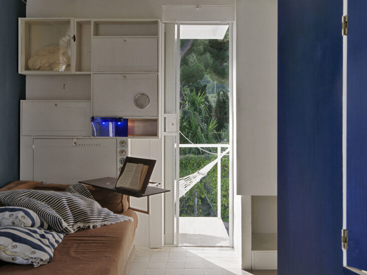
10. Be inventive in the guest room.

gray created an alcove that can be used for lounging or turn into a thoughtful  29
Above: Gray created an alcove that can be used for lounging or turn into a thoughtful guest nook for guests when needed, with a pivoting bedside table, cupboards above to store clothing, a mosquito net tucked away for comfortable sleep (top left), and bedside lamps (in blue). Photograph by Stéphane Couturier, courtesy of CMN dist. Scala.

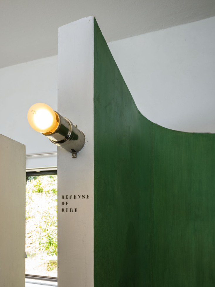
11. Don’t be afraid of a little cheekiness.

Above: There are inscriptions on the walls throughout the house: “choses légeres” (light things), “verres” (glasses), “defense de rire” (no laughing); even the bidet is labeled “bidet.” It adds a cheeky playfulness, but it also serves a more thoughtful purpose: Gray wanted her houseguests to be able to navigate the home and find things on their own so that they could feel independent and self-sufficient. Left photograph by Benjamin Gavaudo, courtesy of CMN dist. Scala; right photograph by Manuel Bougot.
for more info and to plan a visit, head here. 32
Above: For more info and to plan a visit, head here.

And for looks inside more famous homes, see:

N.B.: Featured image by Stéphane Aboudaram, courtesy of CMN dist. Scala.

(Visited 2,982 times, 225 visits today)
You need to login or register to view and manage your bookmarks.

Have a Question or Comment About This Post?

Join the conversation

v5.0