10 Easy Pieces Architects Favorite OftheMoment Green Paint Picks portrait 2 Icon - Arrow LeftAn icon we use to indicate a rightwards action. Icon - Arrow RightAn icon we use to indicate a leftwards action. Icon - External LinkAn icon we use to indicate a button link is external. Icon - MessageThe icon we use to represent an email action. Icon - Down ChevronUsed to indicate a dropdown. Icon - CloseUsed to indicate a close action. Icon - Dropdown ArrowUsed to indicate a dropdown. Icon - Location PinUsed to showcase a location on a map. Icon - Zoom OutUsed to indicate a zoom out action on a map. Icon - Zoom InUsed to indicate a zoom in action on a map. Icon - SearchUsed to indicate a search action. Icon - EmailUsed to indicate an emai action. Icon - FacebookFacebooks brand mark for use in social sharing icons. flipboard Icon - InstagramInstagrams brand mark for use in social sharing icons. Icon - PinterestPinterests brand mark for use in social sharing icons. Icon - TwitterTwitters brand mark for use in social sharing icons. Icon - Check MarkA check mark for checkbox buttons.
You are reading

10 Easy Pieces: Architects’ Favorite Of-the-Moment Green Paint Picks

Search

10 Easy Pieces: Architects’ Favorite Of-the-Moment Green Paint Picks

July 9, 2025

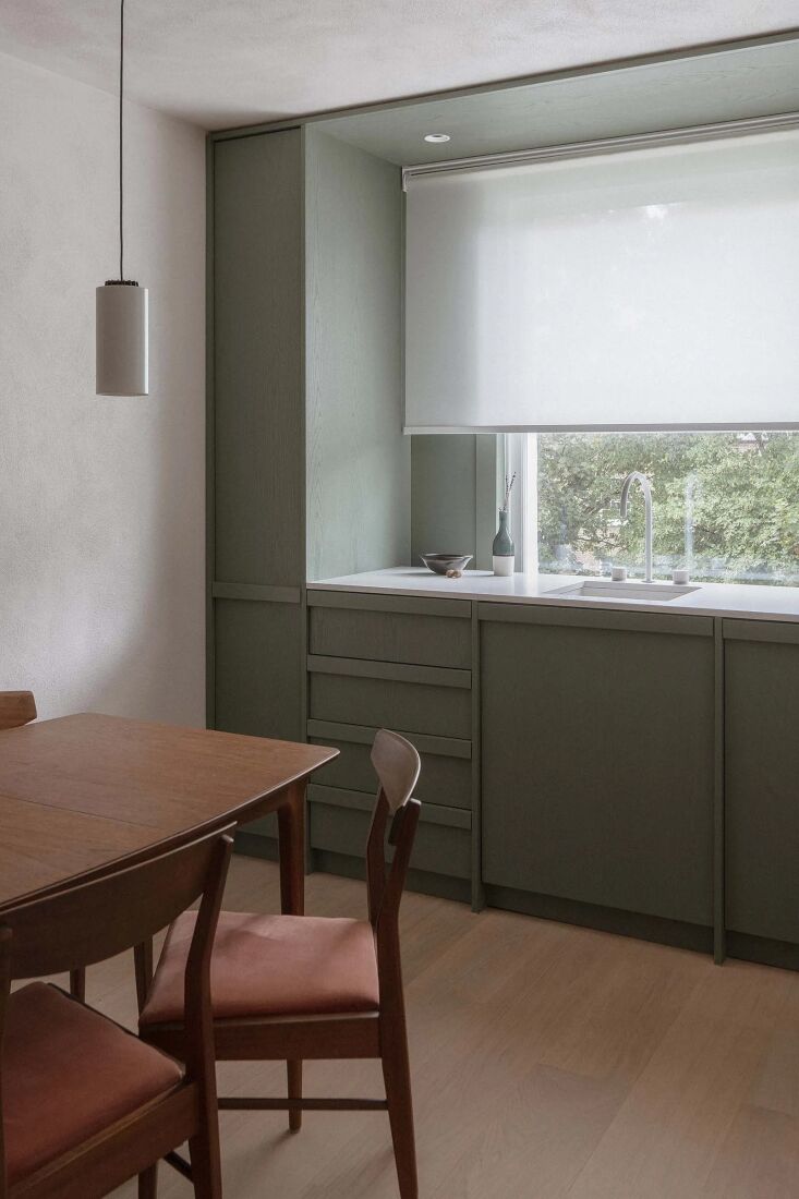
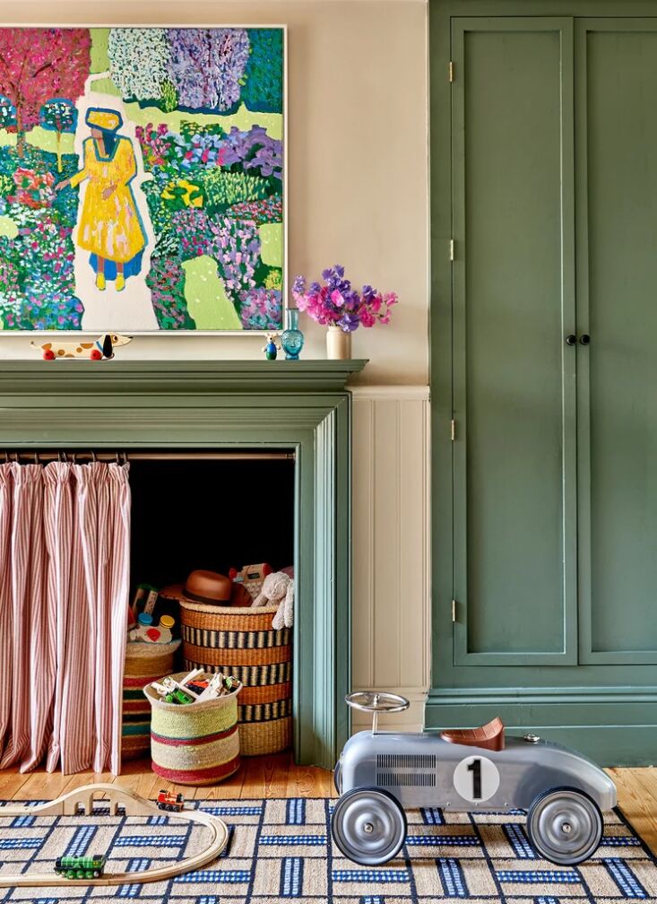
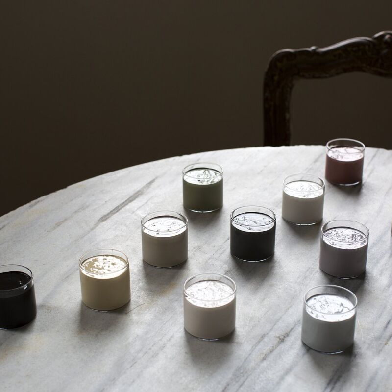
Noticed recently: a distinctive spectrum of green emerging in the latest interior spaces. This unexpected hue, a chic, deep pistachio shade, has become a favorite among architects and designer both stateside and abroad. Here, we profile the variants and explore what makes this unconventional green so compelling.

danish architects mentze ottenstein designed the kitchen of the dinesen country 17
Above: Danish architects Mentze Ottenstein designed the kitchen of the Dinesen country house with Aqualinum paint from Linolie & Pigment in shade Fangussi/8.
london based designer jill mcnair applied farrow & ball&#8\2\17;s cooki 18
Above: London-based designer Jill McNair applied Farrow & Ball’s Cooking Apple Green No. 32 to the walls in her own home office. Photograph from Italianate Modern in Full Color: Interior Design Jill MacNair’s Own Renovation in London.
designer heidi lachapelle prefers benjamin moore spanish olive. &#8\2\20;we 19
Above: Designer Heidi Lachapelle prefers Benjamin Moore Spanish Olive. “We love this color because it’s a bit stealth—sometimes it can look taupe-y and other times very green. For that reason, it can often pass as a neutral without feeling bland,” she explains.
in the kitchen of highbury flat by architecture for london, plywood and ash ven 20
Above: In the kitchen of Highbury Flat by Architecture for London, plywood and ash veneer kitchen cabinets were finished with 2 coats of Rubio WoodCream in Forest Green. Photography by Titas Grikevičius for Architecture for London.
in the guest bedroom of a cobble hill townhouse by shapeless studio, the design 21
Above: In the guest bedroom of a Cobble Hill townhouse by Shapeless Studio, the designers chose Farrow & Ball’s Castle Gray No. 092 “for it’s cool, muted tone; a blue-green that feels both grounded and airy,” explains architect Andrea Fisk. “It’s a shade that invites calm without feeling cold, and playful without tipping into the overly sweet or juvenile.”
french interior architect and designer astrid houssin favors green, overall, an 22
Above: French interior architect and designer Astrid Houssin favors green, overall, and integrated both Little Greene’s Windmill Lane 296 (walls) and Ho Ho Green (ceiling) in a project in Fulham, England.
nickey kehoe opted to coat the living space in a new york city loft with benjam 23
Above: Nickey Kehoe opted to coat the living space in a New York City loft with Benjamin Moore’s Feather Green 625. Photograph by Haris Kenjar for Nickey Kehoe.
designer lonika chande used farrow & ball&#8\2\17;s breakfast room gree 24
Above: Designer Lonika Chande used Farrow & Ball’s Breakfast Room Green on the trim and joinery in a Hackney bedroom. “It’s energetic and vibrant without being overpowering,” she describes. “The neutral walls knock it back. I love the character that painted woodwork brings, particularly to period projects.” Photograph by Milo Brown for Lonika Chande.
painted floors transform the indoor porch of a \19\20s minneapolis craftsman by 25
Above: Painted floors transform the indoor porch of a 1920s Minneapolis Craftsman by designer Anne McDonald who used Farrow & Ball’s Green Smoke for the project.
in a project by daab design, co founding architect anaïs blehaut opted for far 26
Above: In a project by Daab Design, co-founding architect Anaïs Blehaut opted for Farrow & Ball’s Bancha No. 298. “Contrary to misconceptions, this dark color works wonderfully in a north-lit or indirectly-lit lower ground floor,” she explains. “These shades are often associated with magic and a connection to the unseen—adding magic to any space!” Photograph by Jim Stephenson for Daab Design.

For more favorite paint colors of architects and designers, see our posts:

(Visited 11,461 times, 1 visits today)
You need to login or register to view and manage your bookmarks.

Have a Question or Comment About This Post?

Join the conversation

v5.0