Icon - Arrow LeftAn icon we use to indicate a rightwards action. Icon - Arrow RightAn icon we use to indicate a leftwards action. Icon - External LinkAn icon we use to indicate a button link is external. Icon - MessageThe icon we use to represent an email action. Icon - Down ChevronUsed to indicate a dropdown. Icon - CloseUsed to indicate a close action. Icon - Dropdown ArrowUsed to indicate a dropdown. Icon - Location PinUsed to showcase a location on a map. Icon - Zoom OutUsed to indicate a zoom out action on a map. Icon - Zoom InUsed to indicate a zoom in action on a map. Icon - SearchUsed to indicate a search action. Icon - EmailUsed to indicate an emai action. Icon - FacebookFacebooks brand mark for use in social sharing icons. flipboard Icon - InstagramInstagrams brand mark for use in social sharing icons. Icon - PinterestPinterests brand mark for use in social sharing icons. Icon - TwitterTwitters brand mark for use in social sharing icons. Icon - Check MarkA check mark for checkbox buttons.
You are reading

Geometry Prize: 12 Ideas for Tight Quarters (and Others) from Precision Design Stars Casa Josephine

Search

Geometry Prize: 12 Ideas for Tight Quarters (and Others) from Precision Design Stars Casa Josephine

September 11, 2023

Madrid designers Iñigo Aragón and Pablo López Navarro of Casa Josephine edit their work the way certain poets and writers do: “We start with a lot of ideas and we use metaphors from linguistics to understand and define what we’re doing: does it rhyme, how well does this read?” Pablo tells us. “In the end, we decant and filter it all to the few elements that become the identity of the project.”

Such was the case with their much-celebrated country house—see A Design Couple’s Rental in Rioja. Their recently finished second retreat, this one in Segovia province, an hour north of Madrid, is even more precision built. The 1920s two-story townhouse had a cramped and neglected interior that added up to 1,000 square meters. Wanting to transform the quarters into a sophisticated, well composed retreat—while entirely avoiding all rustic cliches—Iñigo and Pablo deployed a design language of checks, grids, and circles. Here are a dozen design lessons to be gleaned from their refined transformation of  1,100 square feet.

Photography by Pablo Zamora, courtesy of Casa Josephine Studio.

1. Turn a small space into an oasis.

located in the the village of la losa, near the riofrío palace, the spanis 17
Above: Located in the the village of La Losa, near the Riofrío Palace, the Spanish royal family’s hunting retreat, the townhouse came with a postage stamp-size courtyard that the designers made the most of: in addition to a dining area, they managed to fit in a plunge pool—with elbow room. The French doors on the front of the house and the balcony are also new additions.

Explains Pablo of the courtyard plantings: “By having tall bamboo along the sides we created a little oasis and an optical illusion: the green wall makes the space look and feel more intimate and at the same time bigger, because it hides the fence. Also, we placed the terracotta floor tiles lengthwise to direct the vision like an arrow to the long side of the courtyard.”

2. Find your collaborator.

iñigo and pablo met as art history students at the university of vallodoli 18
Above: Iñigo and Pablo met as art history students at the University of Vallodolid and following graduation moved together to Madrid. While Pablo worked as an art guide and Iñigo as a fashion designer, they moonlighted on their own remodel and discovered their shared passion.

“Iñigo is in charge of design and art direction; I’m in charge of clients and general management. We’ve been together as a couple for 27 years and as business partners for around 20,” says Pablo. “By trial and error we’ve learned to split tasks efficiently and to work as a team.”

The studio name, Casa Josephine, came from the former owner of their first house. Their many accolades include being named to AD España’s “Magnificent 17” list.

3. Treat tight spaces like jigsaw puzzles.

the interior had been divided into tiny rooms with dropped ceilings. after remo 19
Above: The interior had been divided into tiny rooms with dropped ceilings. After removing some partitions and exposing the rafters, the designers approached the living area “like a miniature puzzle.”

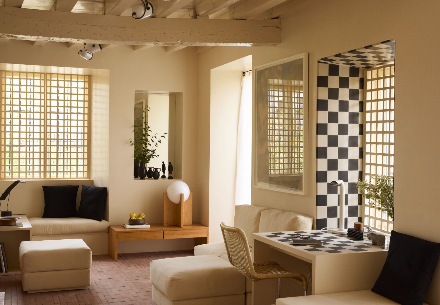
“We used the same custom-made terracotta tiles here as in the courtyard, so that it looks like the space continues without interruption. We designed the living area to be flexible and not look too rigid: the sofa and poufs are modular and can be moved and used as stools. We took advantage of the step below the window and turned it into a seating area.  And since there’s no space for side tables, we carved a few niches on the walls for decoration and mirrors.”

4. Introduce order—and interest—with geometry.

checks, grids, and circles surface in every room. says pablo, &#8\2\20;latt 20
Above: Checks, grids, and circles surface in every room. Says Pablo, “Lattices are common in convents and monasteries in the area, so we decided to use them here as a little element of local flavor. Checks, of course, are fun. Because of the limitations in space, we stuck to a few repeated elements, squares and spheres, oak and terracotta.”

“The goal was to create a coherent, low-key, subtly elegant atmosphere and a clean balance between architecture and decoration,” continues Pablo. “The biggest challenge was to design practical, well-proportioned and integrated living areas in very little space. One way that was achieved was by creating longitudinal axes and placing mirrors that multiply the views. ”

black and white cement tiles frame a living room window and pattern its built i 21
Above: Black and white cement tiles frame a living room window and pattern its built-in desk. The window grids are mainly decorative but add just-enough privacy.

5. Create a design language and repeat what you say.

in the new kitchen, the designers artfully made use of the established material 22
Above: In the new kitchen, the designers artfully made use of the established materials, applying bands of black and white tiles to a niche and circular knobs on the cabinets They also stuck to a defined palette throughout: “we used beige, black, and white to avoid visual interference.”

“We like to work with the idea of cohesion and continuity in our projects,” says Pablo,”but it’s a coherence that is achieved gradually in the design process.”

6. Pay tribute to your elders.

&#8\2\20;the visual influences for this project are luis barragán, gae 23
Above: “The visual influences for this project are Luis Barragán, Gae Aulenti, and the minimalist restorations of Italian monuments in the 1970s and 1980s,” says Pablo. “We also studied examples of Japanese home architecture to find solutions for small spaces.” Here, a Sonora lamp by Vico Magistretti hangs over the dining table.

Wondering about the neutral shade on the walls throughout? “We always work in situ, mixing paint on the spot until we find a color we like,” says Pablo. “This one has beige and pink, and a bit of brown and a bit of yellow.”

7. Display lighting as sculpture.

the geometric oak pieces throughout are from casa josephine&#8\2\17;s weeke 24
Above: The geometric oak pieces throughout are from Casa Josephine’s Weekend Collection, including these table lamps.
casa josephine&#8\2\17;s weekend collection is made to order on request fro 25
Above: Casa Josephine’s Weekend Collection is made to order on request from the designers’ Madrid shop, in the middle of the Rastro neighborhood, and in the US from TRNK.

8. Use tile every which way.

the house&#8\2\17;s \25 by 5 centimeter terracotta tile was custom made by  26
Above: The house’s 25-by-5-centimeter terracotta tile was custom made by Las Losas of Toledo, Spain, and has under-floor heating. Here, it’s deployed as flooring, stair risers, and a ledge/bench.” the house&#8\2\17;s \25 by 5 centimeter terracotta tile was custom made by  27Above: “Adding more materials would have made the space look too busy, so we expanded the landing of the stairs and created this horizontal step around the corner,” says Pablo.

9. Elevate quiet spaces with art.

the top of the stairs landing is detailed with a built in cabinet. the drawing, 28
Above: The top of the stairs landing is detailed with a built-in cabinet. The drawing, by late French artist Robert Ladou, shows a horse and rider: “There’s a long tradition here of horse ranches. We’re in the foothills of the Guadarrama range and often go for weekend rides.”
a central lounge/reading area divides the two upstairs bedrooms. the painting o 29
Above: A central lounge/reading area divides the two upstairs bedrooms. The painting over the sofa is called The Invisible Man; it dates from the 1940s and Iñigo and Pablo bought it on a trip to Toulouse.

Note the continuation of the terracotta tile. That’s the stairwell on the left. The latticework overhead screens a narrow attic that the designers created as a spare room.

10.  Think outside the headboard and closet.

the designers squirrel away textiles they happen upon in their travels. they bu 30
Above: The designers squirrel away textiles they happen upon in their travels. They built their screen-style headboard out of Japanese silk obis purchased years ago in Paris: “we decided to cut the silk into three pieces and frame it.” Their coverlets are made from vintage fabric by Yutes of Barcelona.
a running counter partitions the room from the lounge. iñigo and pablos pu 31
Above: A running counter partitions the room from the lounge. Iñigo and Pablos put under-the-vanity space to use as an extra hanging area: “We had to find a use for it: every inch counts.” The wall rungs serve as a ladder to the attic.

11. Extend walls with mirrors and grids.

the designers&#8\2\17; bathroom has a small footprint but a tall ceiling: & 32
Above: The designers’ bathroom has a small footprint but a tall ceiling: “It has a skylight and we played with optical illusions with mirrors. It looks like the sink is a partition but it’s a niche with a mirror. The wall above (see beams) is also a mirror, so the skylight and the beams are reflected, creating the impression of continuity. The bathroom continues to an area with a toilet and a wall that hides the shower.”
a lattice wall and skylight bring sun and air into the newly created narrow att 33
Above: A lattice wall and skylight bring sun and air into the newly created narrow attic, which the designers built out of unused space, adding the floor and exposing the roof beams. It’s used as a hideaway and is especially appreciated by Iñigo and Pablo’s young nephews and nieces.

12. Design with sight lines in mind, indoors and out.

the pleasing geometric extends indoors and out. note the built in benches that  34
Above: The pleasing geometric extends indoors and out. Note the built-in benches that link the table and pool.

More Spanish countryside inspiration:

(Visited 11,110 times, 8 visits today)
You need to login or register to view and manage your bookmarks.

Frequently asked questions

What is the source of this article?

The source of this article is Remodelista, a website dedicated to home décor and design.

Where can I find more small space design ideas?

Remodelista offers a wide range of small space design ideas on their website. You can explore their articles and posts for more inspiration.

What is Casa Josephine?

Casa Josephine is the name of the house featured in the article. It is a small space that has been beautifully designed and decorated.

How many small space design ideas are mentioned in the article?

The article mentions 12 small space design ideas that can be used to make the most of limited space.

Can I implement these design ideas in my own home?

Absolutely! The design ideas mentioned in the article can be adapted and implemented in any small space to maximize functionality and style.

Are there any specific tips for small kitchens?

Yes, the article provides specific tips for small kitchens, such as utilizing vertical space, opting for open shelving, and incorporating multifunctional furniture.

Are there tips for creating a home office in a small space?

Yes, the article suggests creating a home office in a small space by using a compact desk, selecting space-saving storage solutions, and utilizing natural light.

Does the article provide tips for small bathrooms?

Yes, the article offers tips for small bathrooms, including using a pedestal sink, adding mirrors to create an illusion of space, and utilizing wall-mounted storage.

Are there any tips for maximizing storage in small spaces?

Yes, the article provides tips for maximizing storage in small spaces, such as utilizing vertical storage solutions, incorporating built-in furniture, and using multifunctional furniture pieces.

Can I find visual references in the article?

Yes, the article includes several images of Casa Josephine, showcasing the small space design ideas mentioned in the text.

Have a Question or Comment About This Post?

Join the conversation

v5.0