Even more so than January, autumn—time of new notebooks and wardrobe sort-outs—often feels like the right time to start afresh. In the UK, paint manufacturers have tapped into this urge with a spectrum of new colors that reflect the palette appearing outside our windows. Below, we share some of the new shades that have caught our eye.
Farrow & Ball
It’s been four years since Farrow & Ball updated their signature palette, so this is a much anticipated launch of eleven new shades—all of which take their lead from the existing hues. “The new colors are inspired by moments of joy, comfort, and refreshment to help you feel emotionally at ease, create an energy, and allow the senses to delight in the decoration of your home,” explains Charlotte Cosby, head of creative.


Coat x Laura Jackson Edit
Launched in August, this six-color paint palette is designed by Laura Jackson, tastemaker, broadcaster, columnist, and founder of online homeware marketplace Glassette. “I wanted to create a timeless palette that perfectly represents that feeling of wandering around and finding indescribable inspiration in Paris,” says Jackson, who has joined the Coat paint team as their style consultant. “There’s color everywhere you look in the city, but it’s always simple and effortless.” The new hues The Tobacconist and Brasserie Brown capture this season nicely.


Atelier Ellis
The name of Cassandra Ellis’s latest collection—Waving & Smiling—is enough to have us ordering a clutch of sample pots. As with all of Ellis’s paints, this season’s new colors “encourage us to connect and celebrate individual choice at home.” Evidently, we love them all.

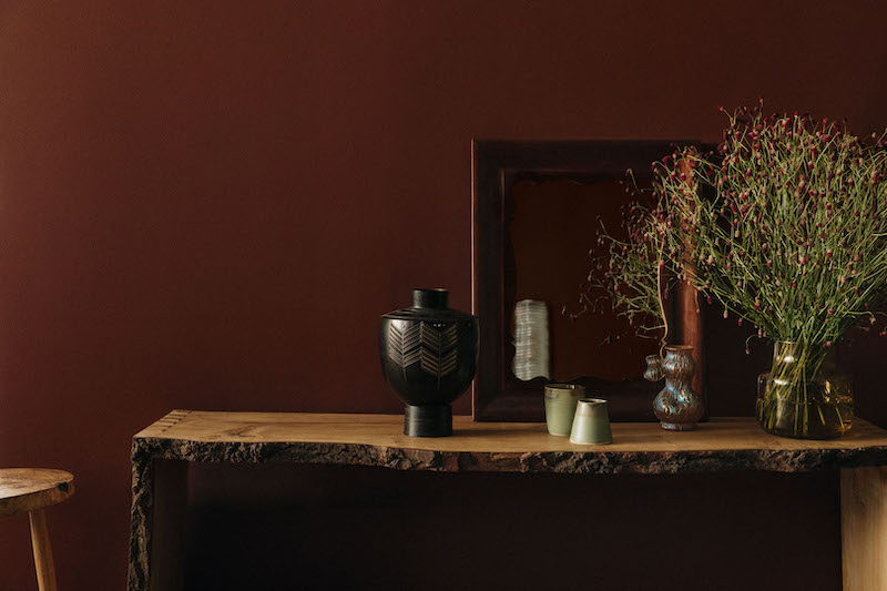
Paint & Paper Library
Big news for designers, architects, and remodelers seeking confident color: The new palette from Paint & Paper Library, established authority on color, includes nine brand new hues, eight shades revived from the Paint & Paper Library archive, and three new “Architectural” families of color (in which each color is provided in varying strengths of the same pigment).


Plain English
Plain English has just announced its fourth color collection, in celebration of their 30th anniversary this year. A succinct assortment of six new shades, the collection has been “influenced by some of the more practical colors used in the vast working kitchens found in great houses and estates, which continue to influence the thoughtful details we are known for,” according to the company. The “elemental” colors—takes on paper, sugar, pottery, tin, linen, and pearl—are inspired by the materials traditionally used to celebrate each anniversary year.

Rose Uniacke
Interior designer Rose Uniacke launched her debut collection of neutral-hued paints a year ago. “I have always been interested in the way that color works and the strong, or subtle, impact it can have,” she says. “It is such an important tool for creating mood, energy, and contrast.” This season, her collection of natural, mineral-based paints gains 27 new shades in rich, moody hues with suitably autumnal names such as Toffee, Hickory, Moor, and Blackbird.


“For this collection, we have introduced some strong, rich shades to complement the neutrals and add versatility,” Uniacke explains. “The warm ‘Toffee‘ and earthy ‘Hickory’ were inspired by my early furniture gilding practice; the deep, mossy green, ‘Moor,’ is a color I have used to create a dark, quiet and enveloping feeling. We have also added some lighter shades that are crisp and lively, like a pale blue ‘Frost‘, which captures the optimism of a clear and uplifting summer sky.”

For more, head to our Palettes & Paints archive.

Have a Question or Comment About This Post?
Join the conversation