
We’ve never met Nate Berkus. Yet we feel, a little, like we know him.
You too?
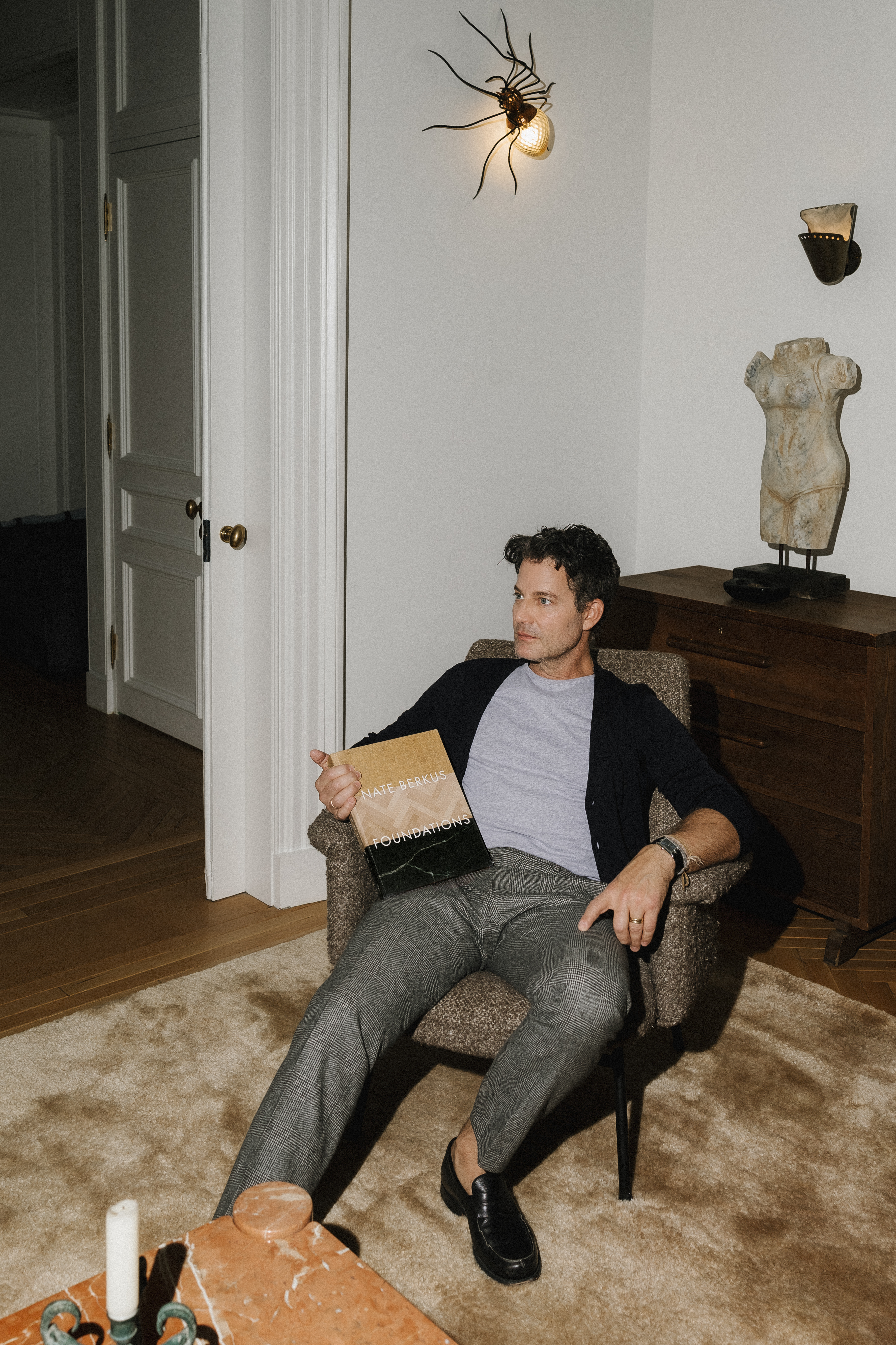
Maybe you’ve streamed all of The Nate and Jeremiah Home Project, the show he co-created with his husband, the designer Jeremiah Brent (of Queer Eye fame). Or maybe you’ve cracked into Nate’s new book, Foundations, just out in November and now a NYT bestseller. Yet despite his star power—his innumerable TV shows, books, and award-winning design projects over the last three decades—Nate has a way of letting us into his own home, too, the one he shares with Jeremiah and their kids. His has a real sense of what makes a home, and it seems to come from this: a knack for understanding the people who live there and creating personal, comfortable spaces for them to spend time in.
Today Nate writes in from NYC with the TV show he goes to for design inspiration, two books he’s never giving up, and a hot design take. Read on.
This year, it’s a copy of my new book, Foundations (that just launched).
A vintage lamp, phone charger, and whatever book I am reading at that moment. Right now, it’s Buckeye by Patrick Ryan.
Jean-Michel Frank (Assouline) or Jacques Grange Interiors by Pierre Passebon.
There is always music playing in our home, usually curated by Jeremiah.
I still love studying Downton Abbey; our 10-year-old has now discovered the show…
@jeremiahbrent, for his unmistakable point of view and the way he sees beauty in absolutely everything: @alyssakapitointeriors; @slow_roads
Great question. We have done some really big renovations, like our previous New York home, where we broke through to a next-door apartment. It massively increased the footprint and, of course, how we then lived in the space.
Painting a small room a deep, moody color. People think it will make the space feel tighter, but it actually has the opposite effect—it becomes intentional. And swapping out cabinet hardware is another favorite. It’s such a simple change, but it can completely shift the feeling of a room.
Warm neutrals like Alabaster (Benjamin Moore) or Seaspray (Benjamin Moore), another chalky off-white.
Ignore trends. They are designed to make you feel bad about what you don’t have.
Thanks so much, Nate! Follow his work @nateberkus and nateberkus.com.
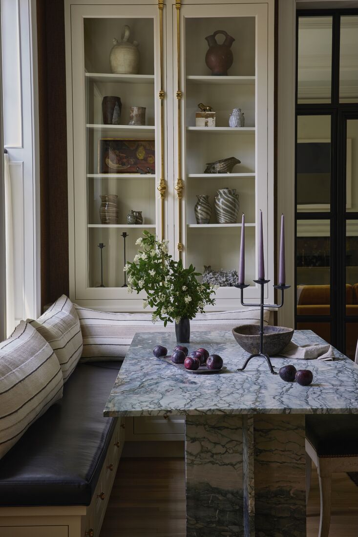
N.B.: Featured image by Erinn Ortiz.
Error: No connected account.
Please go to the Instagram Feed settings page to connect an account.

Have a Question or Comment About This Post?
Join the conversation