Powerhouse creative couple Natalia Swarz and Armando Mesías each have their own careers—she’s the founder of travel site Hôtel Weekend and a kids concept store, while he’s a visual artist—but they also collaborate on interior projects through their rental venture Hilma Homes. They reimagine old Madrid apartments for “slow, inspired living” by employing warm neutral hues, textured materials, and restrained furnishings. Their studio unit, which was dated and separated into multiple rooms before they stepped in, “draws from the serene minimalism of Japan and the quiet elegance of Scandinavia—especially Denmark,” Natalia says. So refined, slab-front Surface cabinets from Copenhagen-based kitchen brand Reform were a perfect fit.
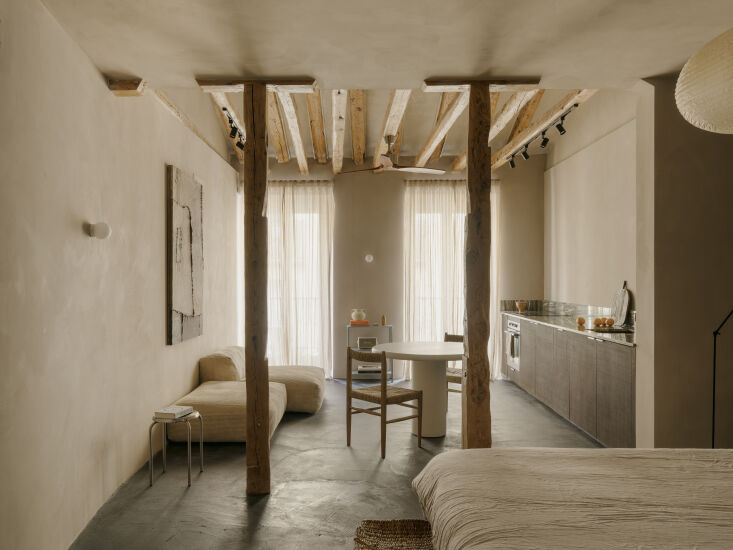
The smoked oak cupboards, along with dark-stained cement floors, offer a contemporary bent that’s balanced by rustic honey-toned wood beams and creamy lime wash walls. They also make the 484-square-foot space feel bigger than it is. “The cabinets read more like high-end furniture, and as a long bar along the wall, they blend seamlessly into the room, keeping it open and neat,” says Natalia. “Our approach is always choose less, but choose well—and then add personal touches that bring soul without clutter.” Let’s take a look—and keep scrolling to see the apartment before.
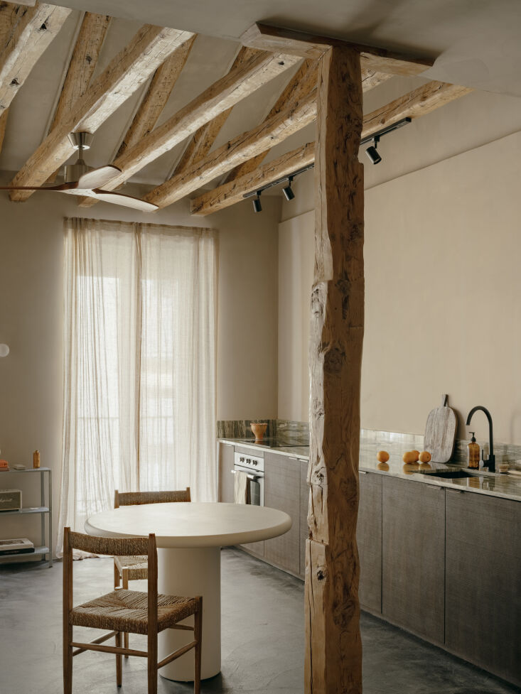
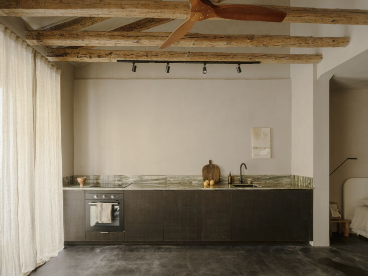
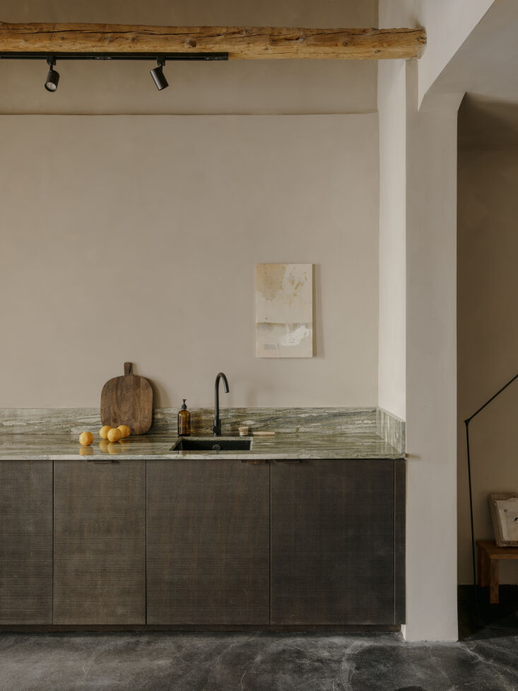
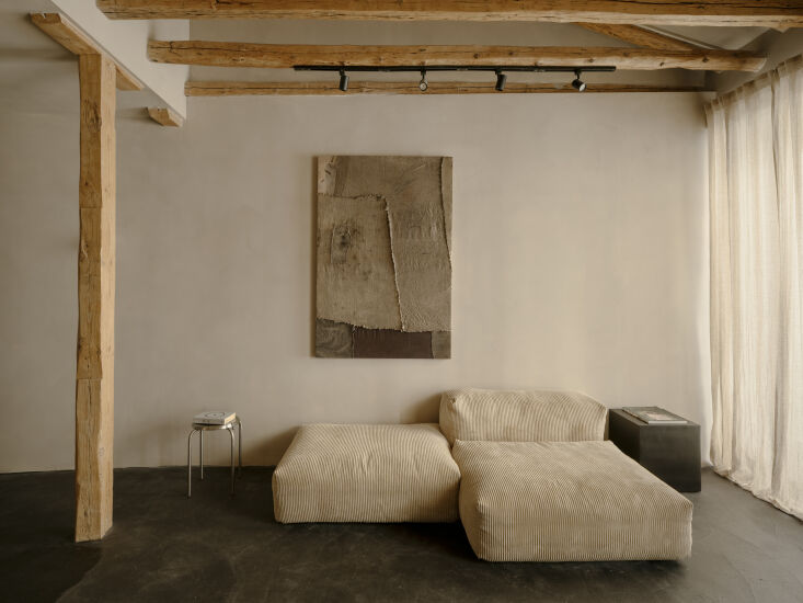
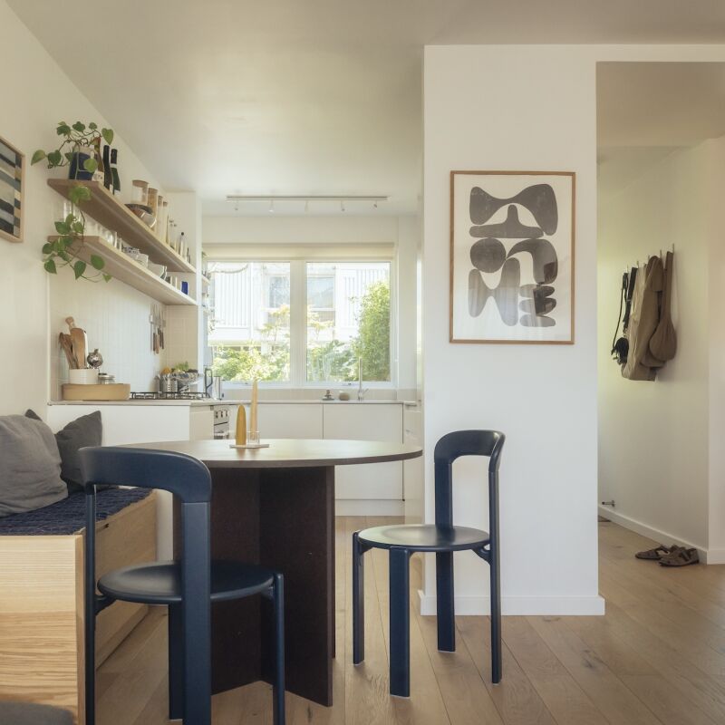
Above: Natalia and Armando knocked down nearly all the internal walls to create an airy studio that accommodates two people. “We bought it to renovate with the idea of renting to friends and friends-of-friends visiting Madrid for seasonal stays,” Natalia says. “Occasionally, we use it for house swaps. It’s also ideal for remote workers and creatives looking for a peaceful, inspiring base.” Above: The linear kitchen, with its deep brown veneered oak cabinet fronts and veiny green Vert d’Estours marble countertop, is the centerpiece of the apartment. “We wanted something minimal, sculptural, and unobtrusive, since it had to blend harmoniously with the living and sleeping areas,” Natalia explains. “We decided on a ‘no-kitchen kitchen’ look—and Reform was perfect for it.” Above: The simple-yet-sophisticated cupboards are a collaboration with Norm Architects. Above: Functionality was also a chief concern. “Since it would be used by guests, everything had to be intuitive and easy to maintain,” says Natalia. “The biggest challenge was balancing utility with visual restraint—everything had to work perfectly without looking busy. Skipping upper cabinets allowed the space to breathe. We prioritized concealed storage, durable materials, and a strong sense of material tactility to make it feel refined yet grounded.” Above: One of Armando’s large artworks hangs above an ivory corduroy Vetsak sofa, which is “a favorite because it’s modular, endlessly adaptable, and the removable covers make it incredibly practical for a space that will host many different guests,” says Natalia.
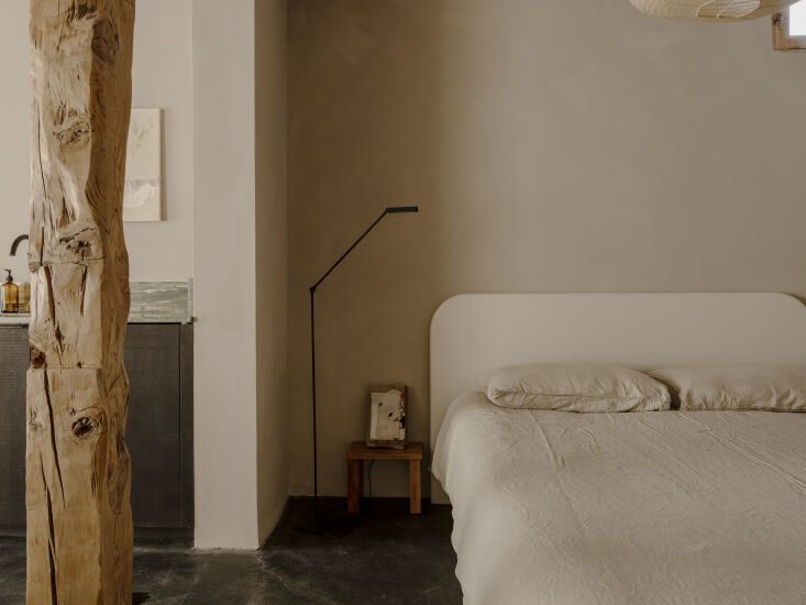
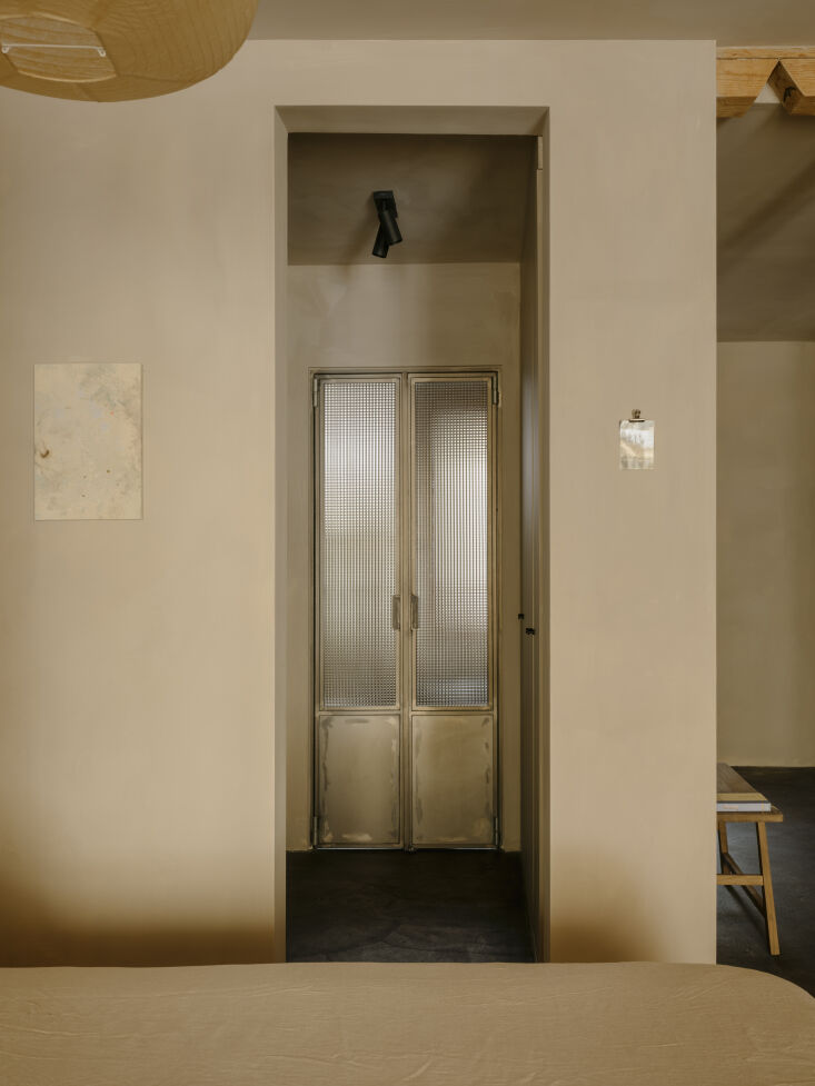
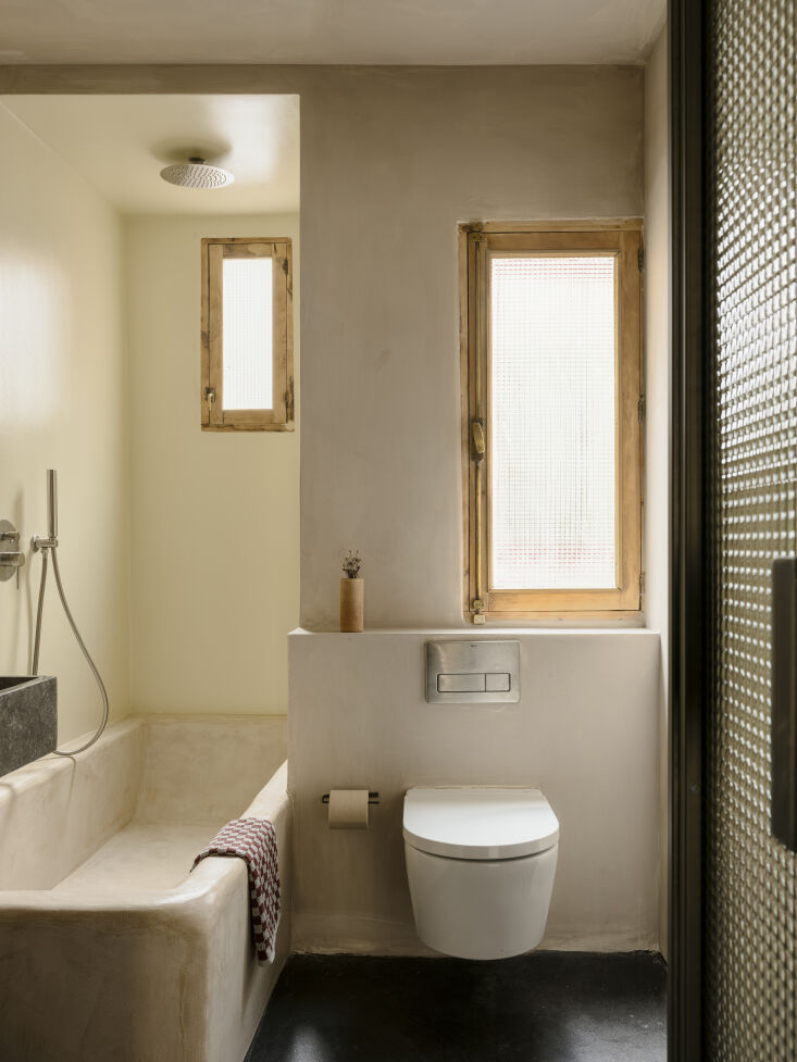
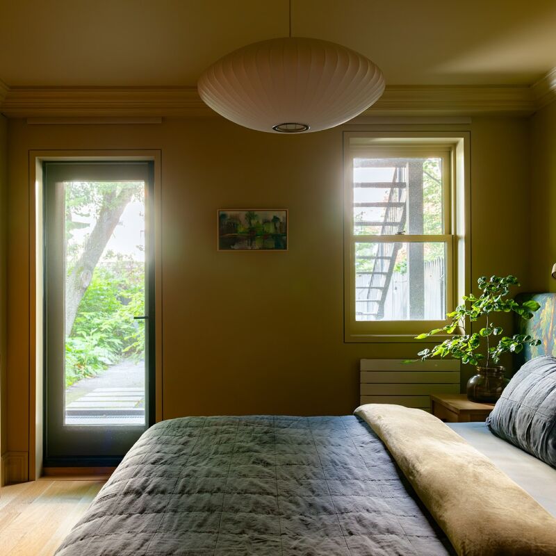
Above: When visitors aren’t luxuriating in the well-appointed apartment, they can explore the vibrant, historic La Latina neighborhood that awaits outside. “Just steps away, there’s a flower shop, record store, bookstore, artisan ice cream, and a tiny coffee spot—it feels like a little village within the city,” Natalia says. Above: Both the headboard and the round dining table are by Barcelona-based furniture brand Marlot Baus. “We love their craftsmanship with microcement,” says Natalia. “Their pieces feel architectural, almost like part of the space itself.” Above: Metal doors lead to the bathroom.
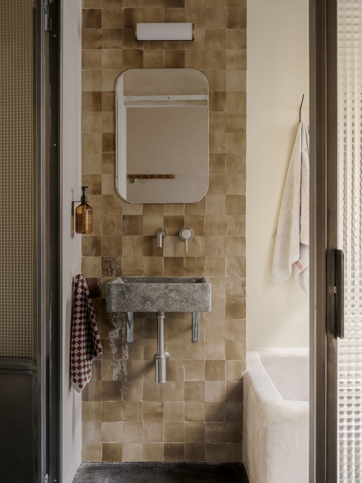
Above: The couple used milky tea-colored Mosaic Factory zellige tiles to fabricate a floor-to-ceiling backsplash behind the floating stone sink. Above: Textured glass in the windows and door allows light to flow in while maintaining privacy.
Before
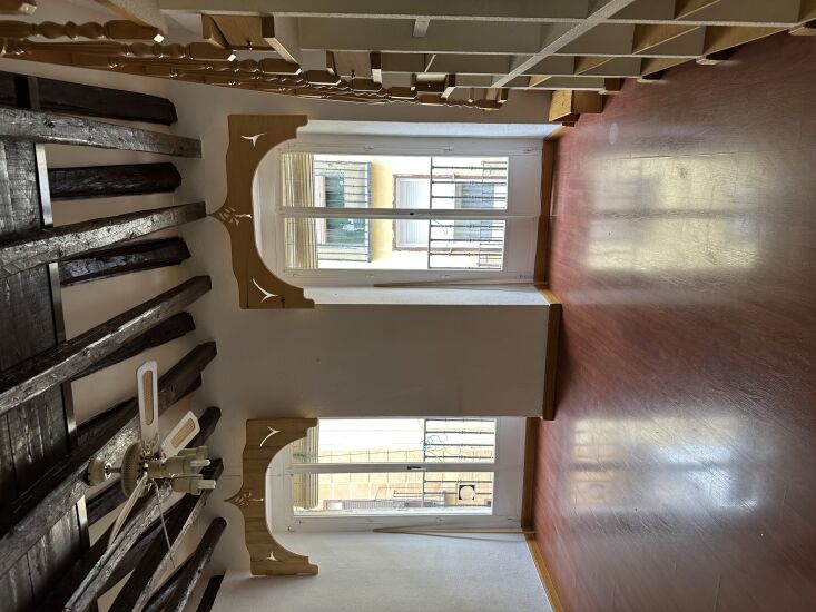
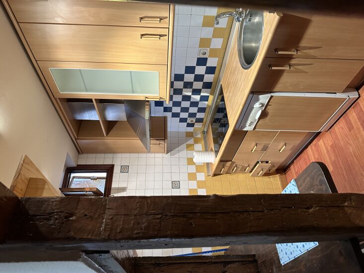
Above: Before, the beams were nearly black and the floors were red. “The element we loved most—and definitely kept—are the exposed beams,” says Natalia. “They had been tinted dark, so we sanded them down to bring back their natural warmth.” Above: And the kitchen before: closed-off, cramped, and worn.
This error message is only visible to WordPress admins
Error: No connected account.
Please go to the Instagram Feed settings page to connect an account.
v5.0
×
Join the Remodelista Family of Websites
Become a Member at no charge
When you register as a free Member of the Remodelista family of websites (Remodelista, Gardenista, and The Organized Home), you gain access to all current posts plus 10 archived posts per month, our internal bookmarking tool, and the community bulletin board.
Access 10 archived posts (older than one year) per month on each site
Use of our internal bookmark tool, so you can save products, posts, and other pages for quick reference
Access to our community bulletin board so you can ask and answer design-related questions
Unlimited access to the Product Catalogs, Design Travel sources, and Architect & Designer Directory listings
Choose from our ten newsletters to keep up with the latest on the sites
Or Subscribe for Maximum Value!
For $5/month ($59.99 paid annually) you'll enjoy unlimited, ad-free access to Remodelista, Gardenista, and The Organized Home and all the benefits of Membership.
Annual subscribers pay 50% off the monthly subscription price of $9.99
×
Subscribe to the Remodelista family of websites
For $5/month ($59.99 paid annually) you'll enjoy unlimited, ad-free access to Remodelista, Gardenista, and The Organized Home and all the benefits of Membership.
Annual subscribers pay 50% off the monthly subscription price of $9.99
×
Sorry! As a registered member you get 10 free posts from our archive (posts more than a year old) every 30 days. You have reached your limit for this 30-day period. If you would like to access unlimited posts from the archive (ad free, too), become a subscriber today, and keep reading as many articles as you want.
Full Access Individual Subscription
Benefits include:
Unlimited access to Remodelista, Gardenista, and The Organized Home sites
Ad-free browsing environment
Unrestricted access to 30,000+ archived posts
Receive the full-text daily newsletters
All features that Members have access to
Annual subscribers pay just 50% off the monthly subscription price of $9.99
Sorry! You have reached your limit of three (3) free posts from our archive every 30 days. You can increase this to 10 posts by joining as a free Member, or read unlimited posts with no ads by becoming a paid Subscriber.
Subscribe to the Remodelista family of websites
For $5/month ($59.99 paid annually) you'll enjoy unlimited, ad-free access to Remodelista, Gardenista, and The Organized Home and all the benefits of Membership.
Annual subscribers pay 50% off the monthly subscription price of $9.99
Become a Member at no charge
When you register as a free Member of the Remodelista family of websites (Remodelista, Gardenista, and The Organized Home), you gain access to all current posts plus 10 archived posts per month, our internal bookmarking tool, and the community bulletin board.
Congratulations on becoming a Subscriber to Remodelista, Gardenista and The Organized Home! You now have access to many great features across the sites:
Unlimited access to all three sites
Ad-free browsing environment
Unrestricted access to 30,000+ archived posts
Receive any of the newsletters, including the the full-text daily Remodelista and Gardenista newsletters
Use of our internal bookmark tool, so you can save products, posts, and other pages for quick reference
Access to our community bulletin board so you can ask and answer design-related questions
Congratulations on joining as a free Member of Remodelista, Gardenista and The Organized Home! You now have access to many great features across the sites:
Access to all posts published in the past year
Access 10 archived posts (older than one year) per month on each site
Use of our internal bookmark tool, so you can save products, posts, and other pages for quick reference
Access to our community bulletin board so you can ask and answer design-related questions
Unlimited access to the Product Catalogs, Design Travel sources, and Architect & Designer Directory listings
Choose from our ten newsletters to keep up with the latest on the sites
If at any time you want to become a Subscriber and enjoy unlimited, ad-free access to all our content, just go to the My Account link and choose Subscribe.
We use cookies to ensure that we give you the best experience on our website. If you continue to use this site we will assume that you are happy with it.

Have a Question or Comment About This Post?
Join the conversation