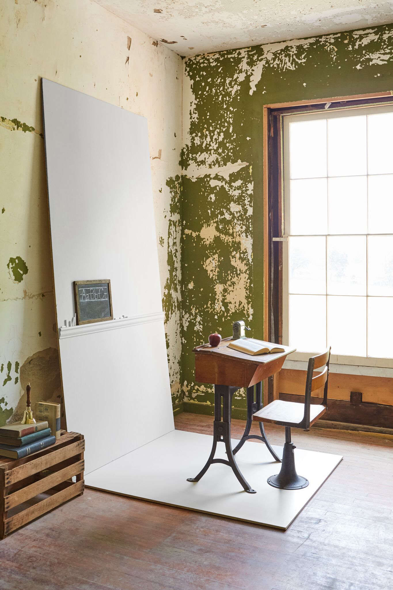

Creative set design & photography by Zio & Sons.
Creative set design & photography by Zio & Sons.
Dorset-based Farrow & Ball recently released nine new colors, ranging from an exotic pink and a deep red, to a soft off white and down-to-earth blue—the company’s first release since 2016.
Dorset-based Farrow & Ball recently released nine new colors, ranging from an exotic pink and a deep red, to a soft off white and down-to-earth blue—the company’s first release since 2016.
Working with Charlotte Cosby, Farrow & Ball’s creative director, Anthony created nine vignettes in the Oliver Bronson’s characterful spaces, sourcing props from around Hudson and working with local design outfits such as Hawkins NY and Source Adage, with florals from Flower Kraut.
Working with Charlotte Cosby, Farrow & Ball’s creative director, Anthony created nine vignettes in the Oliver Bronson’s characterful spaces, sourcing props from around Hudson and working with local design outfits such as Hawkins NY and Source Adage, with florals from Flower Kraut.
“”Named after Japanese tea leaves, Bancha, like a cup of green tea, provides a feeling of security. According to Farrow & Ball, “Bancha, a mid-century modern green, is a darker version of the much loved archive color, Olive.
“”Named after Japanese tea leaves, Bancha, like a cup of green tea, provides a feeling of security. According to Farrow & Ball, “Bancha, a mid-century modern green, is a darker version of the much loved archive color, Olive.
“School House White is a vintage, taupey white with cool undertones inspired by the colors used in old school houses,” Anthony says.
“School House White is a vintage, taupey white with cool undertones inspired by the colors used in old school houses,” Anthony says.
According to Farrow & Ball, “Sulking Room Pink is a romantic and muted rose with enormous warmth, its powdery feel makes it incredibly soft and easy to use with complementary tones. It’s evocative of the colors so often used in boudoirs, a room named after the French ‘bouder’—to sulk.”
According to Farrow & Ball, “Sulking Room Pink is a romantic and muted rose with enormous warmth, its powdery feel makes it incredibly soft and easy to use with complementary tones. It’s evocative of the colors so often used in boudoirs, a room named after the French ‘bouder’—to sulk.”
A chic red-based black, “Paean Black conjures up the shade of old leather hymnals and is named after a song of praise,” according to Farrow & Ball.
A chic red-based black, “Paean Black conjures up the shade of old leather hymnals and is named after a song of praise,” according to Farrow & Ball.
“Preference Red is the deepest and richest of our reds and is named in honor of our original trade name, Preference Paints,” according to Farrow & Ball.
“Preference Red is the deepest and richest of our reds and is named in honor of our original trade name, Preference Paints,” according to Farrow & Ball.
“Treron, inspired by the Treron pigeon, is a dark gray green; it’s a darker version of Farrow & Ball classic Pigeon, hence it’s named after the green variety of the same species,” according to Farrow & Ball.
“Treron, inspired by the Treron pigeon, is a dark gray green; it’s a darker version of Farrow & Ball classic Pigeon, hence it’s named after the green variety of the same species,” according to Farrow & Ball.
“Jitney is named after the bus that whisks New Yorkers out of the hot city to the sandy beaches of the Hamptons,” according to Farrow & Ball.
“Jitney is named after the bus that whisks New Yorkers out of the hot city to the sandy beaches of the Hamptons,” according to Farrow & Ball.
“Rangwali is an exotic, happy, and vital pink; it’s the most adventurous of our pinks,” according to Farrow & Ball.
“Rangwali is an exotic, happy, and vital pink; it’s the most adventurous of our pinks,” according to Farrow & Ball.
“De Nimes is a quietly elegant blue that feels wonderfully down to earth; the exact shade is rooted in a regency palette but is inspired by the cloth of everyday workwear made in the French city Nîmes.”
“De Nimes is a quietly elegant blue that feels wonderfully down to earth; the exact shade is rooted in a regency palette but is inspired by the cloth of everyday workwear made in the French city Nîmes.”

