Why reinvent the wheel every time you need to paint a room? Even architects and designers turn to their favorite colors—versatile and universally flattering—again and again. The members of the Remodelista Architect and Designer Directory were generous enough to let us in on their secrets.
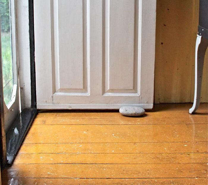
1. Simply White from Benjamin Moore
Shown here, architects Gregory Merkel and Ana Catalina Rojas used Simply White throughout their remodel featured in Two Young Architects Tackle Their Own Brooklyn Townhouse. Photograph by Carl Bellavia, courtesy of Gregory Merkel.
(For much more on what to know about white, see 10 Things Nobody Tells You About Painting a Room White.)
2. Hague Blue from Farrow & Ball

Star London chef Skye Gyngell used Hague Blue on her British Standard kitchen cabinets, shown here and featured in In the Kitchen with Skye Gyngell, London’s Chef du Jour. Photograph by Alexis Hamilton, courtesy of British Standard.
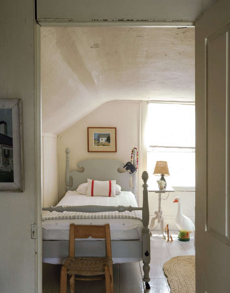
3. White Dove from Benjamin Moore
It’s also the color chosen by architect John Alee and designer Hannah Childs in Before & After: A Summer Cottage Reborn on the Connecticut Coast.
4. Iron Mountain from Benjamin Moore

Tatum Kendrick of Studio Hus in Los Angeles used the color in the Venice Beach bedroom shown here. “It can go classic, modern, or earthy depending on your environment and furniture,” she says. Photograph courtesy of Studio Hus.
5. Chantilly Lace from Benjamin Moore

Architect Elizabeth Roberts used Chantilly Lace in this Williamsburg townhouse featured in A Whole-House Overhaul in Brooklyn with a High/Low Mix. Photograph courtesy of Elizabeth Roberts.
6. Nimbus from Benjamin Moore

Remodelista contributing editor Justine Hand used Nimbus on the bed frame in her daughter Solvi’s room, shown here and featured in The Soulful Side of Old Cape Cod: Justine’s Family Cottage. Photograph by Matthew Williams for Remodelista.
7. Thunder from Benjamin Moore

Justine Hand used Thunder to create a forest pattern in her son Oliver’s room. See more at DIY: The Stenciled Kid’s Room, Boreal Forest Edition. Photograph by Justine Hand.
8. Clunch from Farrow & Ball

Paint expert Eve Ashcraft and writer Heather Smith MacIsaac also picked Clunch as a favorite soft white in our story Expert Advice: Living in Black and White.
9. Pitch Black from Farrow & Ball

It’s also a favorite of NYC architect Steven Harris, who chose the color for our story Black Magic: Architects’ 8 Top Paint Picks.
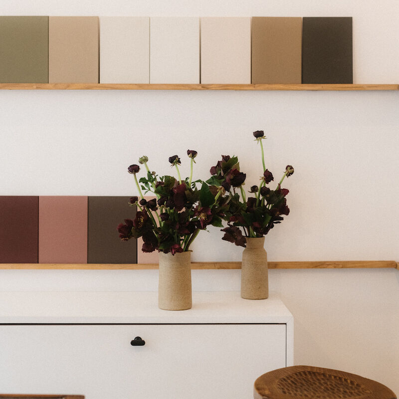
10. Calamine from Farrow & Ball
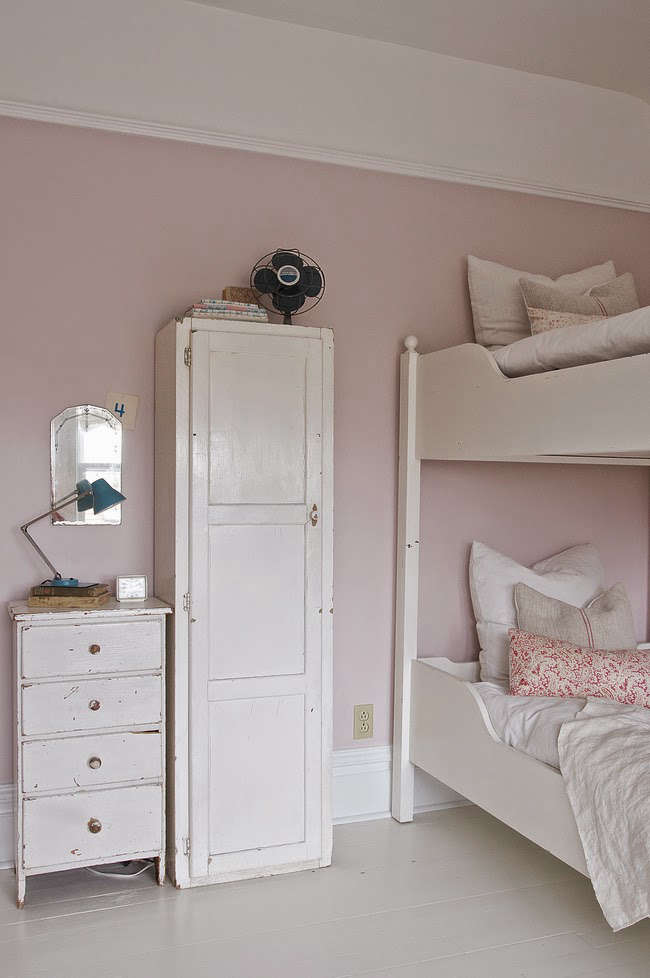
Candace Partain used Calamine in her daughters’ bedroom in their Bozeman, Montana, home, shown. Photograph by Vanessa Pleasants, featured in An Inspirational Montana Home, courtesy of Vintage Whites.
For more on paint, see:
- Expert Advice: 12 Essential Tips for the Perfect Paint Job
- How to Paint Kitchen Cabinets: 5 Tips from a Master Painter
- 10 Easy Pieces: Architects’ White Exterior Paint Picks
N.B.: This post is an update; the original story ran on June 13, 2016.
Frequently asked questions
What are some paint colors with cult followings among architects and designers?
Some paint colors that have gained cult followings among architects and designers include:
Farrow & Ball "Elephant's Breath"
Benjamin Moore "Revere Pewter"
Farrow & Ball "Railings"
Sherwin-Williams "Agreeable Gray"
Farrow & Ball "Hague Blue"
Benjamin Moore "White Dove"
Farrow & Ball "Down Pipe"
Sherwin-Williams "Repose Gray"
Benjamin Moore "Gray Owl"
Farrow & Ball "Stiffkey Blue"
These colors are highly regarded for their versatility, timeless appeal, and ability to create a sophisticated atmosphere.
Why do architects and designers gravitate towards these paint colors?
Architects and designers often gravitate towards these paint colors due to their ability to enhance various architectural styles, create a sense of depth, and complement a wide range of design elements. These colors are known for their versatility, which allows them to be used in different spaces and lighting conditions.
Are these paint colors suitable for all types of interiors?
While these paint colors have garnered a cult following, their suitability for a specific interior depends on factors such as lighting, surrounding elements, personal preferences, and desired mood. It's always recommended to test paint samples in the actual space and observe how they interact with the existing design elements before making a final decision.
Can these paint colors work well in both residential and commercial spaces?
Yes, these paint colors can work well in both residential and commercial spaces. Their popularity stems from their versatility and ability to adapt to various architectural styles and design aesthetics. However, it's essential to consider the specific requirements and desired atmosphere of each space before selecting a paint color.
Do these paint colors have specific undertones?
Yes, many of these paint colors have specific undertones that contribute to their unique appeal. Undertones can range from warm or cool hues to subtle hints of other colors. Understanding the undertones of a paint color is crucial for achieving the desired ambiance and ensuring it harmonizes with other design elements in the space.
Can I use these paint colors as accent colors or for specific architectural features?
Absolutely! These paint colors can be used as accent colors or for specific architectural features to add visual interest and create focal points. For example, using a deep blue like Farrow & Ball's "Hague Blue" on a feature wall or incorporating Benjamin Moore's "Revere Pewter" as a contrasting color for trim can enhance the overall design and bring attention to specific areas.
Are there any recommended color combinations or palettes using these paint colors?
While the paint colors mentioned have their individual appeal, they can also be combined with other colors to create harmonious palettes. For example, pairing Farrow & Ball's "Railings" with soft neutrals like Benjamin Moore's "White Dove" or using Sherwin-Williams' "Agreeable Gray" as a backdrop for vibrant accents can result in visually pleasing combinations.


Have a Question or Comment About This Post?
Join the conversation