With my husband, two boys, and one dog, I had been Living Small in London, comfortably and happily in our 1,500-square-foot modern townhouse for over a decade. And then, seemingly overnight, my sons became teenagers–bigger, messier, and definitely hungrier. Our open kitchen and dining area, which we had remodeled a few years back when they were much younger, had always been the center of family life. While I wholeheartedly embraced my sons forays into cooking, I was dismayed by how crowded it suddenly felt. How was I going to get more space without extending into the back garden or moving? One day, as I bumped into my son (again) by the sink, I had an epiphany–it wasn’t actually more space that we needed.
What we really needed to do was to make better use of the space we had. When we had originally converted the ground floor to the kitchen and dining room, we designed it so that the cooking area with sink, stove, oven, dishwasher and refrigerator was contained within 10 linear feet of galley kitchen. Desperate for more counter space, I realized that by knocking down the wall between the kitchen and dining area, we could have one long continuous counter run, which in turn meant we could extend food preparation into the dining area.
As is often the case with construction-related matters, every decision impacts another, and before we knew it, knocking down one wall turned into knocking down two to further streamline the space. Many decisions (cabinets, countertop, backsplash, color, handles, sinks, fixtures, appliances, etc.) later, we were ready to go. See the results below and scroll down for before photos.
Unless otherwise noted, photography by Kristin Perers for Remodelista.

Above: A view of our new kitchen area, looking toward the rear garden. The uniformity of lacquered cabinets, sprayed with one color (Ice V by Paint and Paper), hides a multitude of sins: the washer and dryer, microwave, boiler, water tank, shoes, and dirty laundry. With so many cabinets, I wanted to avoid the clutter of protruding handles, and, inspired by the kitchen cabinets in In Praise of the Shadow House by Liddicoat and Goldhill, I specified a flat door with a recessed finger pull.

Above: Another decision that made a big difference was moving the refrigerator and freezer out of the cooking area and into the dining area. While we didn’t change the dining area, we did install a two-arm Tolomeo Basculante Suspended Pendant by Artemide.
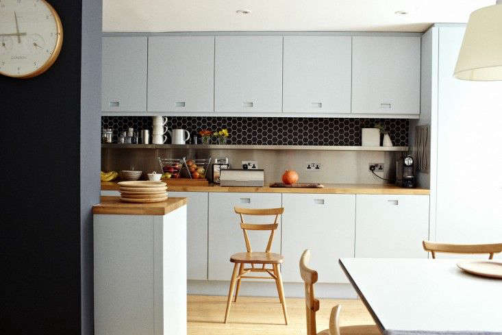
Above: Instead of attempting to hide electric outlets above our new counter, I had them installed at regular intervals so that no matter what anyone was doing or using (phone charging included), there would always be an easily accessible and available outlet.
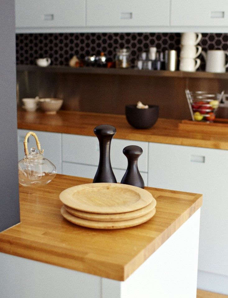
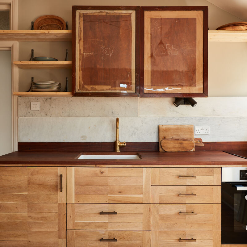
Above: Removing the wall actually allowed us to extend the counter on both sides of the galley. Because both counters were extending into the dining area, I chose wood countertops (1.5-inch solid oak) for their warmth. In Remodeling 101: 5 Questions to Ask When Choosing Your Countertops, I elaborate on some of the other factors that helped me decide.
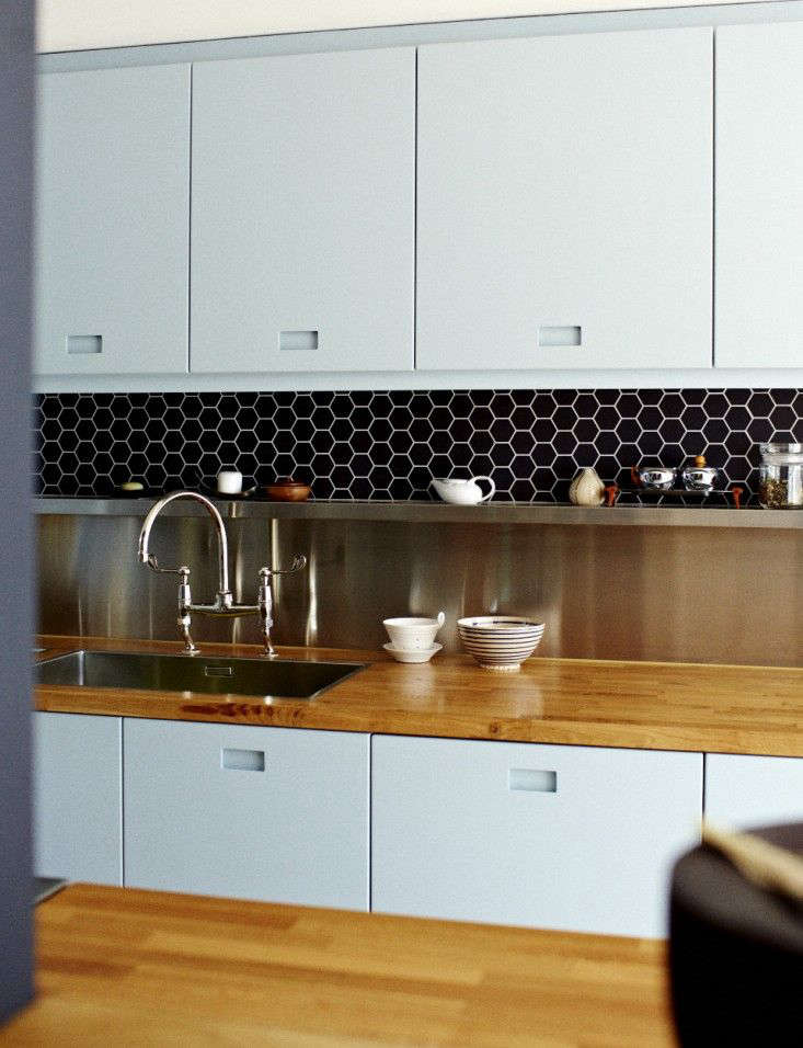
Above: After many years of fantasizing about open shelves, I realized that because of space constraints, as long as I stayed in this house, open shelves were out of the question. With our contractor, Sean Gould from YII Designs, I worked out a compromise. Our stainless steel backsplash folds over into a small shelf where I display items I use frequently. Above the shelf, we introduced a contrasting texture with handmade black ceramic hexagonal tiles from France, sealed with Lithofin KF Stainstop. (For more information on the 2″ matte black ceramic tiles, contact YII Designs.)

Above: Because we always seemed to be crowded around the sink, I harbored a fantasy of having two sinks. Instead, I chose the largest stainless steel sink I could find, the Blanco Claron 700. I also wanted a deep sink for tall pasta pots but had concerns about under-mounting a sink with a wood countertop, so I gained the height I wanted with a deck-mounted gooseneck faucet, the Lefroy Brooks Connaught Bridge Mixer. The faucet swivels so for brief moments with a little shifting, more than one person can use the sink at the same time.
BEFORE

Above: While we always saw the dining area as an extension of the cooking area, the reality was that moving beyond the wall was too much of a psychological barrier and more often than not, all four of us would be cooking and cleaning in the small cooking area while the dining room sat empty.

Above: By removing the existing wall (shown above), we created one long counter run, extending the cooking area into the dining area. One of the reasons we didn’t take down this wall in the original renovation is that the ceiling heights on either side were different, and making them even was cost prohibitive. As a result, the counter in the dining area was rarely used for food preparation, and over time, it evolved into a place of storage and display that had a tendency to become filled with clutter. Photograph by Christine Chang Hanway.

Above: Looking through the cooking area as the builders begin to remove the wall. We also moved the wall between the cooking area and laundry room beyond. Photograph by Christine Chang Hanway.
Refuting all common wisdom and advice, we lived through the construction. The builders installed a makeshift kitchen upstairs in the living room and for six weeks, we cooked creatively with a microwave and an electric kettle, more useful than you could imagine (see 10 Easy Pieces: Electric Tea Kettles to find the one for you).
Christine is also the writer of new website Fabulous Fabsters, celebrating women who are FAB (Fifty and Beyond) and sharing their stories.


Have a Question or Comment About This Post?
Join the conversation